Polls: 3rd Jersey Crests Semifinals
 Monday · May 17 · 2010 | 6:01 AM PDT Comments Off
 MINI-TOURNAMENT of LOGOS
Polls close Sunday, May 23 at 11:59 PM
 San Jose Sharks |
 Buffalo Sabres |
NHLTOTJC 38
|
 Vancouver Canucks |
 St. Louis Blues |
NHLTOTJC 39
|
Tie-breaking Since the playoff format is not points-based, the winning/advancing logo will be determined by the total number of votes received rather than the percentage. In the unlikely event of an exact tie, a 24-hour run-off poll will be held the following day.
Tournament Notes By popular request, the playoff format was changed to advance four teams from each group to the playoffs. ... The Blues won by the closest margin (51-49%) while the Sabres won by the widest (77-23%) in the Quarterfinals.
BONUS LOGO POLLS
Polls: Relocated NHL Franchises
Notes The above group of logo polls feature the six current NHL franchises which have relocated at some point. The logos featured are those used right before and right after the relocation. (The Stars are the only exception as the Minnesota North Stars switched to the logo Dallas would later use two years before relocating.) ... In future weeks, you'll be able to vote on other logos used by these and other unrelocated franchises.
Commenting Feel free to add your comments about the polls below. Keep it short, relevant and friendly. Currently, commenting is unmoderated. Abuse it and commenting will go away. I'd prefer to offer an open discussion but not at the expense of civility. Also, if you choose to announce the logos you've voted for, do it in paragraph form. Comments with long lists will be removed.









Reader Comments (58)
Nice idea for the new tournament.
But can someone please explain to me what the heck the Nordiques logo is supposed to be?
Jonny W- It's just an "N" with a hockey stick and puck next to it... you know, "N" is for "Nordiques"
3rds
------
I will pick the most likely losers in both. I like the Sharks and Canucks. I think it is because of my general aversion to circular logos. However, I do like the Sabres logo. The Blues logo pisses me off because I hate the laziness of just throwing a circle with words around a perfectly good logo. Why? The blues have a fantastic logo and they do this to it?
Relocations
-------------
Calgary gets the nod over Atlanta because a C just lends itself better to flames than an A does.
Hartford by miles. Just no comparison there.
Quebec again by miles. I hate the Avs logo.
Minnesota. But even that is not a great logo. I just don't like either of these much, but the North Stars is a little better.
New Jersey because that is a wicked logo.
Winnipeg. Not that it is a great logo, but that Coyote is probably my vote for worst logo ever. God I hated that. And the jerseys that logo was placed on was just as bad.
the norniques logo is suppose to be the shape of an igloo, and also forming an n, because nordiques means nothern men
I picked Sabres and Blues because of my general bias towards circular logos. Plus, I think that Blues logo is nearly perfect - makes me wants a David Backes third jersey.
As much as I love the Flames logo now, I think the Atlanta Flames logo is much cooler. I do love how Calgary uses it for their A,though. Very cool.
One thing of general note - the new banner for the Blues logo being voted 2010's best should read 2009-2010's best, since at least one team (the Sabres) will have a "brand-new" primary logo next season...which starts in 2010.
I thought the new primary logo for the Sabres next year is the current third (pictured)? They will of course have a new white sweather to go with the current blue, and yet another 'third'.
On the 3rd Semifinals:
Sharks 3rd is better than their primary, but Buffalo's classic logo will win out.
St. Louis has a great 3rd; the Gateway Arch beats the stick-in-rink anyday.
On the Relocation polls:
Atlanta-Calgary: Something about the "A" speaks to me in a way the "C" does not.
Hartford-Carolina: Whale Tale hands-down over "Flush-Puck"!
Quebec-Colorado: Outdated 70s vs. Outdated 90s? The "A" stands out better than the "n", I suppose.
Minnesota-Dallas: NORTH Stars. The Dallas logo will always carry the stigma of Norm Green's shenanigans.
Colorado-New Jersey: Not that crazy about the Devils' logo, even if it is creative. I like the state flag theme of the Rockies.
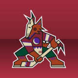
Winnipeg-Phoenix: What kind of a jet is that? The Delta Dagger? The XB-70? Still, better than that faux-native crap the 'Yotes came up with.
... that should be "Whale Tail"... O_O;;
TheTick, that's exactly why I used quotation marks...easier than saying the new but really old but slightly changed logo.
Where is the poll for the Scouts and Rockies?
The Whalers logo makes a "H" between the "W" and the tail...never saw that...
I absolutely love the Jets and their logo. Bettman has got to bring them back.
I honestly don't know how anyone can prefer the Nordiques logo. It's the ugliest thing to ever grace a jersey. Same goes for the Canes, but at least that's losing.
As hilarious as it would be to see St.Louis take both titles, (and deserving of it) the updated Sabres logo is just too sharp to not win. Like Boston, its a subtle change that makes a huge difference.
Atlanta's logo looks more pleasing to the eye in this contest because of its size and proper balance of white/yellow inside the box.
HOWEVER, as a crest on the same jersey template, Calgary takes the cake.
Honestly, this is just a "which team do you like better?" contest. No offense to you Chris, it's just a shame people don't choose based on the logos.
The Nords logo is also an igloo.
SJ/BUF-I really like this version of the Shark. But even though I am a Shark fan, the Sabres logo is the only alternate logo that I think is better than SJ. I said from the beginning that the Sabre logo will win and I stand by that.
VAN/STL- Neither of these are great but I guess the Blues are better than a stick in a rink.
----------------------------------------------
ATL/CAL-Both are nice. I'll go with the Flames............... oh yeah the Calgary one.
HAR/CAR- No explanation needed, Whalers should win big.
QUB/COL-Never really cared for Quebecs logo so the Avs get my vote by default.
MIN/DAL-NorthStars are a little plain, but Dallas has never really come up with anything good as a logo.
COL/NJ- I like the Rockies logo but it cant beat the Devils.
WIN/PHX-I might pick the Coyotes new logo but nothing can make me choose that. Jets in a landslide.
GO SHARKS!!!!!!!!!!!!!!!
Quebec is, more specifically, an "n" in the shape of an igloo.
Man, that Coyotes logo, and the unis they were on, were awful. It's like the designer had never seen a hockey sweater before.
The Nordiques logo could also, if looked at sideways, be a "q" for "Quebec"...or maybe a question mark? ;)
My biggest complaint with the Blues logo is the 'blue note' isn't even centered in the circle. It drives me bonkers and for that reason alone, Iw ill never vote for it.
Hartford has the best logo EVER!
I figured it was an N, but the igloo makes me understand why it looks like that. Really, though, I'm not a fan. Maybe its because I just wasn't a hockey fan back when the Nordiques existed. That may also explain why the Jets logo doesn't really strike me either.
Also, and I know this probably ruins my credibility with most of you, but I loved the old Phoenix logo. It was so perfect for the team. Yeah, the logo and jerseys are kind of ridiculous, but so is the idea of a hockey team in Arizona! At least the psychedelic coyote was interesting. Their new logo and jerseys are so boring.
I picked the Blues logo because I feel like they stole my idea. :P Back in the day, I liked to create concept alternates, and that was similar to the blues logo I had. Just mine had a retro font and no arch.
Ahhhhh...
Good to see my Whalers back!
smonkman, have you gone nuts? The Note is as centered as it can get. The reason it appears uncentered is because of the visual weight of each side.
I agree with johnny w being from the phoenix area i loved that logo because it was diffrent. i was sad to see it go
The Blues logo is not centred. The right side of the note is clearly touching the edge of the ciricle while the left side clearly is not. Though to be honest, I did not notice that until smonkman pointed it out
Never knew the Nords logo was an igloo. Even better!
The Nordiques logo is pretty fricking dumb.
Absolutely love the North Stars, Nordiques, and Rockies logos. With the North Stars, I hope that Dallas, Minnesota, and the NHL can work out a deal that can see the Stars' name shared between the two clubs, ie. North Stars name(with Minnesota history) to the Wild and Dallas uses the name, Lone Stars. Baseball has the Red and White Sox.
The only good thing about the Rockies was their logo and their uniforms. The rest was a joke.
The Nordiques are a classic. It took me over ten years to figure out their logo, but I loved it for its simplicity and that the Nords had sharp uniforms.
Could someone please explain to me where the 'N' is in the Nordigues logo?
Why have the Canucks passed the Blues.
I think the jets emblem may have been the avero arrow. Canuck fans actually care about thier team. The stick in the rink is very Canadian and looks better than a note and a arch with St Luois.
I love the nordiques logo. Whaler's logo is pretty sweet when i look at it now, back when i was a kid though i thought it was ugly as hell. rockies logo is probably the worst one there, devils truly deserve to win that one. While i am probably in the minority I do like the coyote's logo, just not enough to beat out the jet's classic logo, but seriously that thing sticking out of the J in the jets logo looks like a nipple or something... ima round it out by saying the C does lend itself better to the flames and while the dallas version looks sleeker it just doesnt do it for me, so north stars ftw there.
For some reason i love the blues primary logo but i despise their third jersey logo....
I prefer the original Jets logo to the one shown here. Even though I'm a Canuck fan, that logo should in no way be beating the Blues' alternate. The stick-in-rink in the finals would be a travesty. But as other posters have pointed out, a lot of Canuck fans like to spam just 'cause.
I'm a huge Canucks fan, so I'm biased, but I really don't understand the hatred for the stick in the rink. Sure, it's a little simple, but the colors are good, and it makes a "C" - that's not a bad logo in my book at all. As well, I remember when I was a kid, I'd sit in class and draw hockey logos all day - my favourite ones were the ones that were easy to draw. I loved the Hartford, Montreal, Calgary, Boston, and New Jersey logos for that reason - Canucks were using the flying skate at the time, which I thought was too complicated.
Look at corporate logos - Nike, Boeing, Adidas, GE, Coca-Cola, Microsoft, Apple, Mcdonalds (I can go on) - they're all simple. You don't have multi-coloured feathers, or circles with text around the real logo, or any of that. A good logo should be recognizable immediately, and frankly, I prefer the ones that I can doodle.
If that makes me a homer, then so be it. But frankly, I like the Canucks, and I like their logo - but I like them individually.
Funny how almost all the original logos are beating their relocated counterparts.
I don't quite understand why everyone is so hard on the Hurricanes logo. I actually like their logo a lot, to be honest. It's not nearly as bad as some of the logos we have these days(Buffalo, Anaheim, Toronto, I hate Toronto's logo so much. It's a leaf. Big deal. Nothing creative about it.)
I am a Canucks fan and therefore voted for the stick and rink logo but I also hate the Blues logo (both 3rd and Primary). I would also like to point out that on the front page of the Canucks website it shows 10 or so of the new subjects from the forum pages and yesterday one of the threads was about coming to this website and voting for the Canucks logo. Canucks fans (me included) hate to seem them lose anything. I think that this pool is just being used as a consolation for getting knocked out of the playoffs in the second round again.
I have been coming to this site for a very long time and it still amazes me what people can do. I just wish I could contribute more often. II would also like to thank Chris for all his hard work keeping this site running and keep up the good work.
You know, as much as there is probably Canucks fans spamming the polls, I doubt it is all spam. Have you read the comments? There are a lot of people who seem to agree with me that although they love the bluenote logo, they hate the third logo. It is annoying that they ruined such a good logo with that circle crap.
So as much a Canucks fans are passionate, do not think it is all because of poll spamming.
Thank God the Blues logo is losing. I can't stand those logos. They suck so much.
As a Canucks fan, I echo Jim's comments. It's a well-known fact: simple is more. The modified stick 'n rink has more definition to the 'C' and the angled stick gives the crest the kind of "edge" that the speeding skate logo had. The colours are great. I just wish that either the stick logo or Johnny Canuck replaces the orca ASAP.
I really can't understand how the stick-in-rink logo is beating the Blues logo. It doesn't appeal to me at all. Its boring. There I said it. Sabres will win anyway so it doesn't really matter, but still.
Well, its just unfortunate if the stick in rink logo beats the blues 3rd logo. Absolutely unfortunate. Just because you are a fan of a team, doesnt mean you vote for said logo. If it is actually better fine, but have some reasons besides "Im a fan of team A, therefore OMGZ ITZ THE BESTSZ. There is ABSOLUTELY NO way the Canucks logo should be beating the Blues 3rd at this present moment.
@Jim, theres no hate for the Canucks logo, its good, its simple, it has great colours, but its just not as good as the Blues 3rd.
That old Coyotes logo is one of the best logos in all profesional sports. PHOENIX COYOTES FOREVER!!
Why are the avalanche losing to the freaking nordiques? they had a terrible logo, the avalanche one is so much cooler looking
The avalanche logo is one of my favorite logos, and I am a detroit fan.
I don't like either of the stars logos, but I think the stars is worse. I don't like that they put both the city and the team's nickname in the logo.
Sabres hands down on the thirds.
The Atlanta Flames and Hartford Whalers are two of the best all time for me. Calgary did a great follow up on their flaming "C" though. The Carolina logo is absolutely foul! What's the deal with that one? It's so bad I would have figured it would have gone in the circular file years ago. The Nordiques and Av's are about an even draw to me but I'll give the Av's the slight nod here. I always liked the North Stars logo. The Dallas version is plain bland. I'm in the minority here but the Rockies look better than NJ. And definitely Winnipeg over that thing from PHX.