


Monday
Sep202010
Polls: NHL ASGToL Week 1
 Share
Share Polls close Sunday, September 26 at 11:59 PM
The current Icethetics logo tournament features NHL All-Star Game logos from the past two decades. Read more about the format here.
Group A
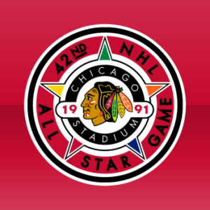 Chicago 1991 |
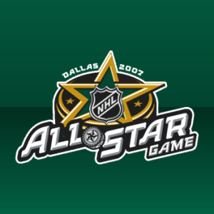 Dallas 2007 |
ASGToL 01
|
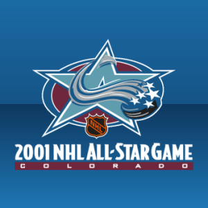 Colorado 2001 |
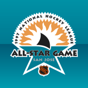 San Jose 1997 |
ASGToL 02
|
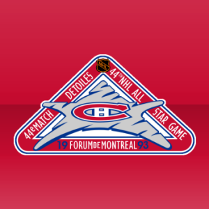 Montreal 1993 |
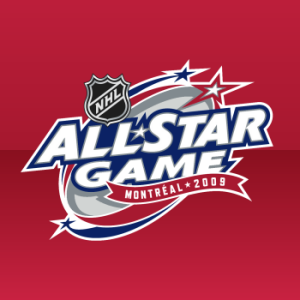 Montreal 2009 |
ASGToL 03
|
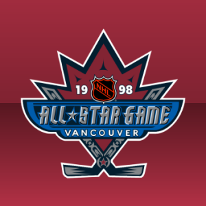 Vancouver 1998 |
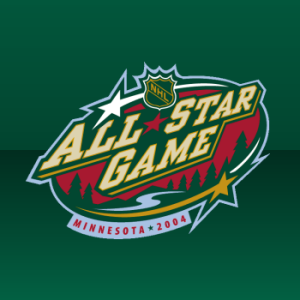 Minnesota 2004 |
ASGToL 04
|
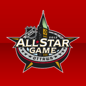 Ottawa 2012 |
 Generic 1980 |
ASGToL 05
|
Group B
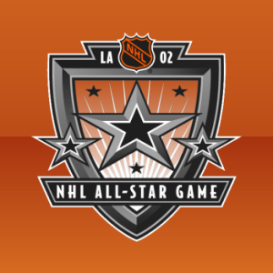 Los Angeles 2002 |
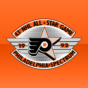 Philadelphia 1992 |
ASGToL 06
|
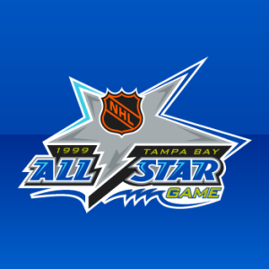 Tampa Bay 1999 |
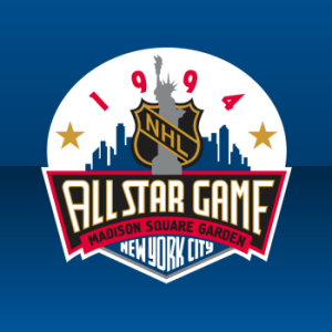 New York City 1994 |
ASGToL 07
|
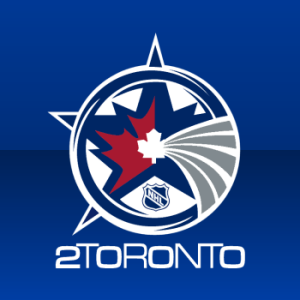 Toronto 2000 |
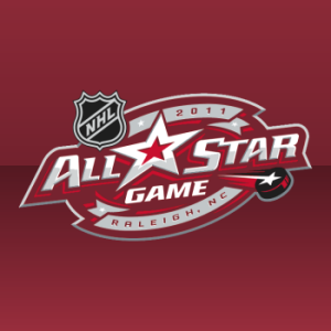 Raleigh 2011 |
ASGToL 08
|
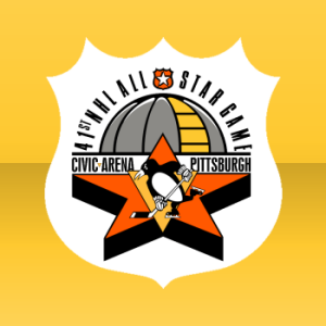 Pittsburgh 1990 |
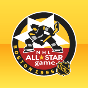 Boston 1996 |
ASGToL 09
|
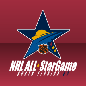 South Florida 2003 |
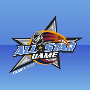 Atlanta 2008 |
ASGToL 10
|
Commenting Feel free to add your comments about the polls below. Keep it short, relevant and friendly. Currently, commenting is unmoderated. Abuse it and commenting will go away. I'd prefer to offer an open discussion but not at the expense of civility. Also, if you choose to announce the logos you've voted for, do it in paragraph form. Comments with long lists will be removed.

Reader Comments (27)
Toronto 2000 FTW!! No one else has a chance. Between the combination of the Maple Leaf and the star, and the the 2T0R0Nt0 wordmark, this one is a winner.
I hate to admit it, but it's hard to disagree with Glen's choice of Toronto 2000; very nice design. I was surprised, though, at how many of the pairings that disagreed with the leading choice.
ughhh, why did the toronto 2000 one have to go against carolina?
all bias for being a canes fan aside, i actually think the logo is better for the 2011 one.
@ Glen - Agreed, end the competition now.
Hate to be the one to disagree... while the logo itself isn't that bad, I'm not by any means crazy about "20t0r0nt0". Not sure why, but it just looks weird.
Some tough calls. Figures you'd go for the two Montreal logos head-to-head first. Call me crazy, but I've always liked the '93 logo... it's tough for me to go against it. The '09 logo is sharp in and of itself, and I'd definitely vote for it over many of the others, but...
The San Jose logo was definitely a vast improvement over the one they would've used for the cancelled '95 game, but the Colorado logo's better still.
The Pittsburgh logo works because it complements the generic shield that was still in use on the uniforms at the time. It also has the Igloo, which will certainly raise sentimental feelings (even if the place has been showing its age very badly for many years).
I
reallywanted to vote for the "80s Generic" every round, but....Well, it seems likely that my hopes for the 80's generic to win it all are doomed. Too bad.
the 80's generic logo is still a good logo, but compared to the modern logos, it doesn't stand a chance. and i like 2000 and 2001 to go to the end
There are only 3 of these that I kinda like:
San Jose, Florida, and Toronto
Toronto though is by far the best.
90 and 96 matchup: ouch.
There are a lot of good ones though. Toronto is great, Chicago is possibly my favorite, Ottawa is classy, New York is cool, I'm a big fan of the Flyers one, but I seem to be in a minority there, though LA's is certainly neat as well.
The NHL's logo department seems to do a good job on these pretty consistently.
I like this logo tornament, it's someting new!!
Pretty good idea. There are some really good logos here, and the only ones where I disagree with the majority are polls 1, 2, and 10.
Ottawa has the best one to date.
1994 baby
Not really fair to put the Toronto logo up against the new Raleigh logo. The Toronto 2000 logo is not the best looking of the bunch, but the the vast number of unique elements it is able to seamlessly incorporate make it a classic. The Raleigh logo doesn't stand a chance against such a thoughtful, yet simple design.
Colorado and San Jose are probably my two favorites. I like how they incorporated the Avalanche without just throwing the logo in there. And San Jose using the shark fin as part of the star. Both really creative.
Toronto 2000 has a good logo, but it doesn't say 'all-star game' to me. If I were to see that out of context, I would immediately think 'olympics' or 'some sort of expo'.
Toronto's is the best. I guess this contest is something the Leafs have a shot to win...
@canuckstar... except for the nhl logo inside of it, yeah
^hahaha nice...
@ adamedg, that was mean and funny all wrapped into one. i needed a good laugh today
wow i love the 2002 LA logo. awesome
I like the ones that aren't obvious logos but you can still tell where the game is being played - Minnesota...Ottawa...NYC...Tampa -- The not so good being ones that have nothing to tell...not even a hint of logo - Carolina...Boston...Montreal '09
so i'm pretty sure Minnesota had one of the best ones ever. Its so classy, while still repping the team colors. pretty much perfect.
Idea for a micro-poll: 1995 San Jose vs. 1997 San Jose and 2005 Atlanta vs. 2008 Atlanta - the Canceled ASGs vs. the ASGs actually played!
Im appaled!!...Ive thought about each one..and with the exception of atl 08 and MAYBE tampa 99, the older logo should be killing it right now in every contest. All these newer all-star logos are mostly generic and not very creative...They don't seem like much thought went into them. But hey thats just my opinion.