Third Jersey Fan Renderings
 9 Comments
  Monday · Jul 21 · 2008 | 11:24 AM PDT
 It's been mostly quiet on the third jersey news front so far today. But several fans have been hard at work designing sweater concepts based on the rumors that have been swirling lately. There's a lot to get to so I'll dive in.
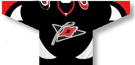
The Hurricanes may adopt a third jersey this season that looks a little something like this.
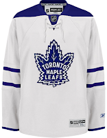
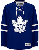
Meanwhile the Maple Leafs will likely take a more traditional path.
It's more likely they'll end up with a white sweater, but blue is certainly a possibility as well.
The Bruins have sort of already leaked their third jersey design and it looks like this.
The Oilers will probably go with a retro look...
...same as the Sabres.
Still other teams may ditch the historical look for something more contemporary. If the Stars go with a green third, it could look like this.
And the Lightning and Senators might go with informal nicknames on the front — the Bolts and Sens.
Not sure about the gold Ottawa sweater. I like black better for them. I also wouldn't expect to see the 2D logo on the front of a jersey anytime soon, but that's just me. I've been wrong before.
I'll have more later today including the next division in the IHA branding project.


Reader Comments (9)
Number over the logo? Wow. Why?!
wow, those all, (except the confirmed) Suck.
Let me say again that I hate nubmers on the front of hockey jerseys. Back of the jersey and both sleeves/shoulders aren't enough?!?!? It's like states that have license plates on the front and back of the car. I just don't get it. None of these designs inspire much confidence. If thirds are necessary, I hope they're at least interesting. I do like the Bruins third and hope that is what we see next season for them.
The Sens jersey is equivalent to the Canucks "V" jerseys. Putrid.
Hard at work, huh? Not very hard to steal someone's design (the first Cane's jersey is just a recoloring of my Sabres' jersey design), slap some different logos on it and call it your own. Shame on you submitter.
Chris, are you going to post some of the artwork you got for the Atlantic Division when you post the next division?
The Sens and Bolts (sorry Chris) are awful. I am a Sens fan and already think they have one of the worst jersey's in the league...that Gold one would make them much much worse. As for the Lightning that just has way to much going on. I argee, numbers should not be on the front of jersey's.
I'm unhappy with the Senators rumoured choice of a wordmark for their third Jersey.
I have to disagree with you Chris, I love the Sens in gold.
I really hope the rumors are untrue about Tampa and Ottawa going with the Bolts and Sens wordmarks on their 3rds. I did these concepts with the rumors in mind, and really did try my best to make them look good, but after a few tries I realized that was probably impossible (especially as the Sens jersey was rumored at the time to be gold. I am glad to see that has changed.)