Freak Out Friday XL
 11 Comments
  Friday · Jul 25 · 2008 | 2:20 PM PDT
 This is the 40th installment of the Freak Out Friday series. And the Roman numeral for 40 suggests I'd better have an extra-large helping of freaky hockey artwork this week. Let's hope I can deliver.
The biggest real-life freak out of the last couple weeks has been the public unveiling of the Iowa Chops along with their new logo. But someone's made an improvement.
(Apologies for the low image quality, but this is what was sent to me.)
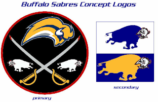
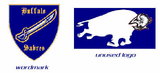
It seems that with the Buffalo Sabres, when it comes to fan made concept art, you either love it or hate it. I wonder what you guys will think of these.
But wait, there's more.
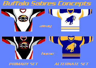
There have even been jerseys designed for them.
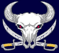
And more along the lines of Matt's recent rebrand of the Stars, check this out.
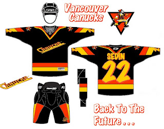
Something else I got this week that made me chuckle were concepts for the Vancouver Canucks.
Don't get me wrong, I appreciate the effort someone put into this but wow, you can't help but shake your head in amazement.
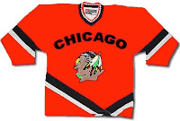
Here's a concept jersey for the Chicago Blackhawks.
Don't shoot the messenger.
Sometimes folks send in team-branding concepts that miss the mark a little.
I can only imagine the nightmares the children of Cleveland would have to endure.
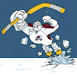
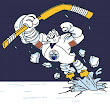
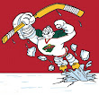
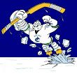
Speaking of nightmares, if you recall about a month ago I started a series within a series for the Freak Out Friday. One reader created 30 logos based around the Mighty Ducks' third jerseys from the mid-90s — one for every NHL team. Last week I posted the Atlantic Division and the week before was the Ducks' own Pacific. Today we're going to the Northwest.
Be sure to notice the half-stripes on the Oilers logo. Yes, all of these are based on last year's new Rbk EDGE jerseys.
And that's all folks. We're back with another Freak Out Friday in two weeks — assuming you get all your ridiculous artwork sent in! My big thanks to everyone who's submitted work — good and bad alike!




Reader Comments (11)
MMMM Pork Chops!
LMAO at the Chops. I'd been thinking that open mouth was just screaming for an apple. The ham marks are just icing on the cake. Slap an #4 on its side...
That Barons one is truly the stuff of which nightmares are made.
Those Canucks concept ideas were mine...lol.
thanks Chris for posting them.
I tried to incorporate the old 80's style Flying V and Skate logos as well as the new rumored Johnny Canuck lumberjack.
yeah,yeah I know, im stuck in the 70's & 80's...sorry but I loved those halloween colored duraflame jerseys.I own 5 Flying V jerseys and wear them everywhere...kind of strange since I live in Pittsburgh,eh?
I have a few more Canucks 80's style skate era concepts,here are 2 more...
http://img440.imageshack.us/img440/5120/skaterha5.jpg
personally, I think the skate was the best logo in Canucks history,the team wore it from 1977 to 1995.Its definity the most identifiable logo with the franchise.The team should bring it back.Thank God that stupid cartoony whale is finally gone! it was an abomination.
lol the chops one is great, the canucks, and sabers stuff is pretty bad, and the ducks things, are getting old
Well it's quite obvious that somebody went crazy with goat-head bullafoes. For what it's worth, it was just last week that I figured out which way the goat-head is facing. That logo never gets old.
Now the logo that's "along the lines of Matt's recent rebrand of the Stars".. that one actually looks pretty wicked!! It's very intimidating and downright scary looking.
I made the one "along the line of Matt's rebrand of the Stars" (for the record, I sent it last Friday, so it was before his was released.) I tried to think of something completely different from what they've had. I also took some inspiration from some skull and crossbones ideas that I drew up for the Sabre's new affiliate, the Portland Pirates.
This is mostly a proof-of-concept design and I would redraw and simplify it ... make it more logo-like ... before calling it a real logo concept.
Note: though modified, the skull is not original and came from this design: http://tatsandtags.com/images/med129.jpg
That buffalo skull with the crossed sabres is hot.
Shy.
*freaks out*
*grumbles something about the EIG being too cheap to afford the whole sleeve*
I did the barons one I wanted to see what someone with the talent like gfb or sigma or any of the other great artists we have on here can do with the initial concept i started.
Chicago is just a rip-off of the University of North Dakota's Fighting Sioux logo, although UND did rip-off Chicago's logo as its first team logo so I suppose it is only fair for Chicago to return the favor. :)