Design Tweaks
 21 Comments
  Sunday · Jul 6 · 2008 | 2:24 PM PDT
 If you've been paying any attention at all over the last few days, you've certainly notice that I've been doing a lot of tweaking to the design of the blog. I'm interested in some feedback. Let me know if you guys think I'm heading in the right direction.
I'm also introducing new logo graphics for the various polls and tournaments. I've debuted the new design with the two polls currently posted for the QMJHL Tournament of Logos. Have a look and tell me what you think.
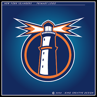
It's been a lot of work for me this weekend but I still felt like finding the time to put together a concept post for you. We're starting with a new artist with work labeled under King Creative Design. First, check out the Islanders logo he's come up with.
Outstanding, if you ask me.
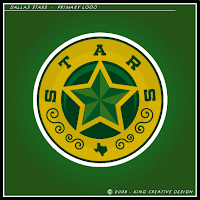
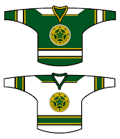
He's also got a cool new mark for the Stars and even a set of jerseys to go with it.
I'm a fan I hope to receive more from this guy to share with you all.
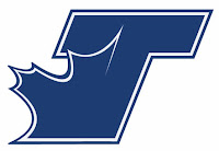
But moving on, here's an interesting Maple Leafs logo that turned up in my inbox.
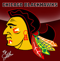
And as you know, I've always got room for a new Blackhawks logo.
Obviously it's a tweak of the current logo. I wouldn't say it's better, but it's no worse really. Just something to look at.
I'm not sure if I do it enough, so let me take the time here to express my appreciation to all the talented artists who submit their work for me to post. You guys make this blog what it is. Anyway, that's it for today. Gotta get back to work on the site design now.
 blackhawks,
  concepts,
  fan art,
  islanders,
  jerseys,
  logos,
  maple leafs,
  stars
stars 



Reader Comments (21)
I like the new design for the site, but the only downside for me is the Icethetics logo. I thought we were against wordmarks around here. Plus the background of the logo being the same background as the actual background seems kind of awkward to me. Maybe make the background of the logo white. I dunno just a couple of suggestions, but I'm only one person so don't stress about it if I'm the only who feels that way.
all of these are pretty good, except the black hawks one
i like the stars one alot
The isles logo kicks ass! stars, and blackhawks i'm not so fond of... and unfortunatly, whoever the artist was, sure missed the mark on that leafs logo.
The site itself looks fantastic. great job man!
oh wtf "the kyle".... i've got "the shawn" trademarked... actually, its an inside joke between me and my siblings. but its all good man.
http://picasaweb.google.com/nhlconcepts/NewYorkIslanders/photo#5125397937828817858
These are still the best islanders jerseys I've ever seen other than the fact that the circle is a little off on the logo. And lol the blackhawk logo has a black mohawk. That's creative, but I still don't like it much.
Myself... i don't see the difference between the current NHL logo set and the QMJHL logo set...
Myself... i don't see the difference between the current NHL logo set and the QMJHL logo set...
If that's the case, you may need to refresh the page because the old images are still in your cache.
WOW.
That Islander logo is perfect. Somebody call up Wang.
Ditto for Jackson and Hull. Woohee is that Stars logo be-a-utiful.
hey i love the site, but the white in the middle is a little hard on the eyes in my opinion, i really liked the darker theme, im not a big fan of alot of white.
and about the logo up top, how about hosting a competition for photoshop greats to design you a logo? the winner gets their Icethetics logo on the top of the page?
I too am a fan of a darker background. Maybe use a dark blue as the background with light blue accents (like you have now) and gray for the sides with off-white lettering?
and I like the older versions of the logos for the tourney. The new ones are a little distracting, but it's no big deal.
keep up the good work man!
I second the idea of having a contest for the Icethetics logo. Anyone can send in their ideas, then Chris can pick the 3 he likes the most, and we can all vote for the one we like the most. Or something.
The wordmark is just a filler until Chris pics the logo he likes best. The site is really nice, I like the white background it's better than the black, it makes everything brighter, The burnt orange used with the headers on the side and the site slogan at the top would be better if it was light blue or gray. I like the navy, light blue, black and gray colors alot better than the black, yellow and gray of the past site. I've been also wondering what happened to the site template you revealed along with the launch of the "Worst Logo Ever" contest, is this a variation of it or did you scrap it and redoo it into this, because I liked the original template alot.
how bout a dark grey like the last blog and lighter blue
Hey Chris... i think that you should put the previous championship banners on this site too.
Hey guys. Just thought I'd reply to a few of your comments. First thing is this "logo" you're all talking about. The banner at the top of the page is for the title. This isn't a sweater, it's a blog. The name goes at the top. Find me a good site that doesn't have its name at the top.
As far as taking reader submissions for designs for the banner, I did that back before the launch and I didn't get anything I liked enough to consider posting. If someone designs a good logo to go with the banner I've got, I'd be happy to include it.
Next, I decided on white for the background of the text areas because it brightens up the page and allows the artwork I post to stand out more. For the most part, I liked the design of NHLToL but at times, it just seemed too dark to me. Plus, most things we read are dark text on a white page anyway.
I went with blue and orange for the colors because I got tired of the monochromatic look of the old blogs. Also, these colors tend to not draw your eye away from the logos and other concept art — one reason why I didn't go with http://bp0.blogger.com/_r8tWGVHrjGI/R4KwhpI-VrI/AAAAAAAADgc/T7jrqQ6rUgs/s1600-h/nhltolredesign.png" REL="nofollow">this design. It's incredibly distracting.
And finally, about the championship banners, I haven't decided what I'm going to do for sure yet. I will tell you that the banners that are on NHLToL right now will not make the move here. Should I design new banners, I'll add them here but technically those logos won tournaments at NHLToL, not Icethetics.
I think that answers most of the questions. If you've got anything else, don't hesitate to ask. And thanks for all the comments and suggestions!
I love what you've done with the site. I like the white background with the blue and gray. It looks sharp.
I like the Stars concepts jerseys and Isles logo, not a fan of the Blackhawks or Leafs.
I like the Stars look a lot...sort of like a wild west law badge. Very clever and relevant to Texas and its heritage.
The Isle look is excellent as well.
And to people concerned about the Aesthetics of Icethetics, please give Chris some time to iron out the wrinkles of your viewing experience!
The leafs logo there is just the "Toronto Loyalists" logo from the movie "Bon-Cop, Bad Cop", which didnt have an NHL license and had to use pseudo teams and jerseys.
the Stars logo is absolutely PERFECT... as for the jerseys... theyre ok
Josh (or anyone), got a picture of the Bon-Cop, Bad Cop logo so I can see? I designed the Leafs logo and have never seen the movie before (wasn't exported to the States).
the hawks logo reminds me of mel gibson O.O