Around The League
 12 Comments
  Tuesday · Sep 16 · 2008 | 8:13 AM PDT
 Time to get caught up on a bunch of news items from around the NHL. Get comfortable. This is a long one.
 Vancouver Canucks goalie Curtis Sanford has decided on the fan-designed mask he'll be wearing this season. Hundreds of designs were submitted and the winner was announced yesterday on the team's web site.
I'll follow up when pictures of the final mask start popping up.
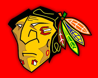
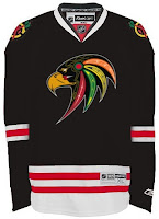
 The Chicago Blackhawks recently attended a White Sox baseball game — I'm guessing to show the other hometown ball club that they don't love them any less than the Cubs even though they'll be playing in the Winter Classic at Wrigley Field. But they were wearing some unusual jerseys for the occasion.
See what I mean? Let's just hope they never make it on the ice.
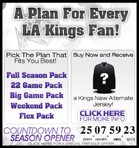
 The Los Angeles Kings continue to pimp their season tickets by offering a free third jersey no one's ever seen. Guess that's one way to avoid complaints. You can't whine about something that's free (...oh, wait a minute). There's an ad on their web site showing that ol' question mark jersey.
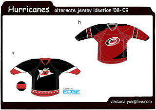
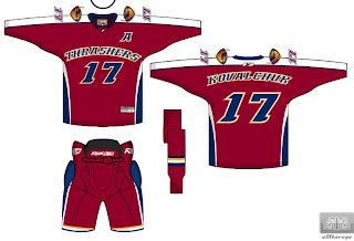
 I got an email from an Atlanta Thrashers season ticket holder who asked his account rep about when the team would be unveiling their third jersey so he could get tickets for that game. He was told Friday, November 14 when they play the Hurricanes. That date coincides with what I've had in the sidebar.
 Recently, a handful of new Phoenix Coyotes logos leaked and now it seems the team's own web site has some confirmation of at least one of them. A version of the new script logo in that post can be seen in the CoyotesFest logo.
The event is this Saturday at 11 AM. The team hasn't indicated any plans to unveil their third jersey... but neither did the Bruins.
Speaking of third jerseys, aside from the Sabres and Coyotes, a handful of other teams are holding fan events this weekend. Only the Sabres have mentioned anything about unveiling their third jersey, but it'll be worth keeping an eye on these other guys.
 The Ottawa Senators will have their Fanfest on Saturday from 8 AM to 1:30 PM. They really want you waking up early for a Saturday morning. Anyway, on the agenda for the day is the grand opening of The Sens Store. Might they have certain new merchandise for sale? (Wink, wink.)
 The Chicago Blackhawks have Training Camp Festival 2008 on the books for Saturday from 8 AM to 4 PM. The Bruins unveiled their new third jersey to very little fanfare. I'd expect the same from the Blackhawks who are likely to go with their standard black alternate that's been in service for over a decade now. Will they have it on display at this event?
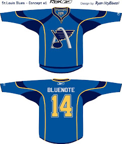
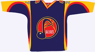
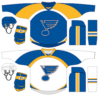
 The St. Louis Blues will hold FANfest on Sunday from 11 AM to 4 PM. There's a Q&A scheduled with head coach Andy Murray and president of hockey operations John Davidson with season ticket holders at 1:45 PM. I can almost guarantee someone will ask about third jerseys. What will the guys say?
That wraps things up for today. I wanted to get as much new information as I could in this post since it might be the only one I write today.


