Thursday
Nov152012

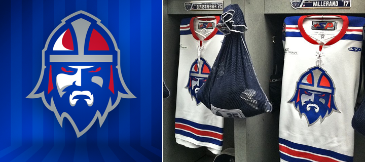
Last Chance to Own a Lagers Jersey

Have you ordered your Milwaukee Lagers IceHL jersey from RinkGear yet?

If not, what in the world are you waiting for? The clock is ticking and pre-orders will only be taken until this Sunday, Nov. 18. (You get an extra week! The deadline has been extended to next Sunday, Nov. 25.) So this is your last chance to own an IceHL jersey!

If the $95 price tag has you a little hesitant, just know that it's only because RinkGear is providing a high quality product. The logos are fully embroidered and you can have it customized with a name and number at no extra cost.

Here are some examples of the detail work on other RinkGear jerseys.

If you'd like to see the higher-resolution photos, just shoot me an email and I'll be happy to pass them along.

Beer League Team Borrows Lagers Look

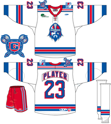
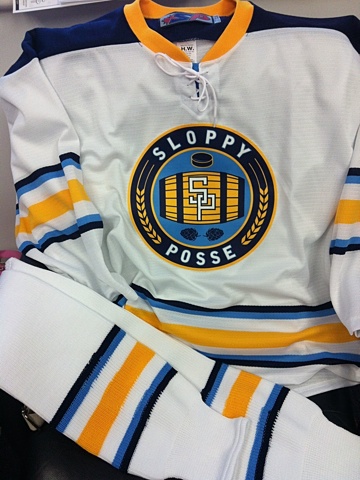
Sloppy Posse jerseyWhile we're on the subject of Lagers jerseys, I had to share this.

We see beer league teams borrow pro jerseys all the time. But check this out. One team will look a lot like one of our IceHL franchises this season.

The Sloppy Posse loved the look of the Milwaukee Lagers so I put them in touch with Josh Frederick, who designed the Lagers logos. Josh customized the logo for their team and this is the jersey they ended up with.

Based on this photo (right), it looks great! And I asked the team to send some game photos along so we can all see an IceHL logo in action.

For what it's worth, the Brossard, Quebec-based Sloppy Posse received their jerseys just before Halloween. And according to their schedule from the Adult Safe Hockey League website, the team won its first game in the new uniforms, 4-2. They won again this past weekend in overtime, too.

Kudos to them and to Josh Frederick on his design work. It sometimes amazes me to see what comes out of The IceHL Project.

Tuesday
Nov132012

Road Warriors' New Third Mimics Rangers

Photo from Greenville Road Warriors (Facebook page)

The ECHL's Greenville Road Warriors unveiled their new third jersey earlier this month and it's practically identical to that of their NHL affiliate, the New York Rangers. The sweater debuted Sun., Nov. 4 to a 4-3 Warriors win over the Florida Everblades.

Here's what the team is saying about its new threads:

“We wanted these jerseys to reflect the strong partnership we’ve built with our NHL affiliate the New York Rangers. We’d like to thank the Rangers organization for their help and support in the development of these new jerseys,” said Chris Lewis, Road Warriors Executive Vice President and General Manager.

“The Rangers’ jersey has become iconic in the hockey world. It evokes a rich history of one of the NHL’s storied franchises and we are proud to celebrate our affiliation by wearing these jerseys this season.”

The alternate uniform will be used for each of Greenville's Sunday home games this season.

The Rangers and Road Warriors have had an affiliation agreement since the club's relocation to Greenville in 2010. (Until then, they had been the Johnstown Chiefs, a founding member of the ECHL in 1988.)

What do you think? Do you like when minor league teams emulate their NHL partners? Or is it like giving the players the chance to wear the big league's uniforms before they've earned it?

Friday
Nov092012

Dallas Stars Owner Wants New Look

If you're a regular reader, you know that Icethetics has been closely following the Dallas Stars rebrand slated for 2013. We got another little nugget yesterday straight from team owner Tom Gagliardi. And it's safe to say this new look is definitely happening.

Gagliardi spoke with Norm Hitzges on The Ticket 1310 AM in Dallas. He expressed his dislike of the team's current uniforms and logos. You can listen to the full interview on the Stars' website. Or read an excerpt here:

NH: There are rumors about the Stars might be designing a new uniform. True?

TG: It's true, yes.

NH: Any tips?

TG: Yeah, I think that it's been speculated that we're doing that. We've been an interesting team because I guess we've changed our jerseys quite often. And we end up in a place now with our current jerseys, which I quite like. I think they're very simple and attractive and modern.

But a couple things bother me. And one is the fact that we're the only team of 30 teams* that don't wear their primary logo on their chest. So I don't like that. I'm a bit of a hockey purist. And so that would be the one criticism I have of our current jersey. And I think a bit of a lack of color with our current kit. So we're looking at all those things up to and including whether we want to modify our primary logo as well.

Everything's in play right now. It's not something that's around the corner in terms of a solution or where we're going. And the earliest that you might see something is in the '13-14 season. So we might get something done for then or we might not, but it's a process that actually the franchise was going through before I even came. And so we're visiting with that right now.

But I'm a purist as I say and I'd like to see us with really a timeless, classic jersey. With timeless, classic colors. And again, that may feature a logo that's different from our current logo today. That's all in play right now, but those are my preferences for where I'd like to see the team end up. Doesn't mean that's where we're going to end up. We've got some nice history here in Dallas with some of the older jerseys that I think are really quite attractive. So we're visiting with all that stuff and our roots and trying to figure out what the best thing is for our franchise going forward.

* He's forgetting the New York Rangers, who haven't worn their logo on their chest since 1978. And even then, that was only for a few years.

It's nice to finally here the Stars talking like this somewhat officially. I know he kept hedging in that interview by saying it may or may not happen, but I can't see them pouring a bunch of money into research and development only to throw it all away in the end. I think it's safe to say the Dallas Stars will look completely different in 2013.

By the way, next year will be the club's 20th anniversary in Dallas. Can you believe it's been 20 years since the North Stars left Minnesota? How time flies.

On Tuesday, Stars Inside Edge blogger Mark Stepneski tweeted that the team was looking at new designs.

If you're curious what some Icethetics readers think the Stars should look like, check out our Concept Archive (and scroll down because the first two are Freak Out Friday posts). Also, be sure to check back on the Concepts page this coming Monday for a brand new Dallas Stars concept that involves a play on the team's own history.

Wednesday
Nov072012

Have You Seen Los IceHogs?

Images from Rockford IceHogs (official website)

Novelty promotions are commonplace in the minor leagues. But sometimes you just have to shake your head. And the AHL's Rockford IceHogs are really standing out right now.

Over the weekend, the team gave away bobbleheads bearing that looked like to the two dudes at the center of last night's onslaught of news coverage. (Was there an election or something?) Then later this month, the one and only IceHogs will transform into Los IceHogs. (The same, right, but more... Mexican-ish.)

These were two things that deserved some blog time. I couldn't resist. Especially the specialty jersey, which will be worn next Friday, Nov. 16. And get this, the first 2,500 fans are getting free maracas. How much do you not want to be at that game? Ah, but you might change your mind when you learn who's making a special visit.

Dora the Explorer. The celebrity from whom every hockey fan dreams of getting a visit.

Anyway, this gave me a good laugh and I hope it'll do the same for you. Tell me. What do you think of Los IceHogs? And what other cultural stereotypes could these guys use to mask their big pig of a mascot?

Tuesday
Nov062012

Blazers Aim for Modern-Retro Mix

Photos from Kamloops Blazers (via Facebook)

The string of great new WHL third jerseys continues with the Kamloops Blazers. The club debuted these new blue sweaters on Sept. 21 (and yes, I'm just now getting to them). And while they may look rather familiar, there's nothing wrong with that.

The looks is based on the fantastic green third jersey of the Minnesota Wild. From the script crest to the simple striping, it's hard to go wrong with a classic feel such as this. But that's not the only reason for the new alternate uniform.

Blazers director of sales and marketing, Dave Chyzowski, tells me that part of the reason for the new sweater was to give a little love to the city of Kamloops. And while that required a move away from the traditional Blazer "B," the new crest does include a variation of the primary logo to "give it that subtle flavour of the Blazers."

Photos from Kamloops Blazers (via official website and Facebook page)

Chyzowski says the blue of this jersey is darker than the normal Blazers blue to help the new logo stand out. Basically, the team was looking to keep it simple and clean with a design that mixes retro and modern design elements. I'd say they succeeded.

Do you think the Blazers hit the mark with their new third jersey?