Tuesday
Apr122011

Icethetics Playoffs Preview 2011

I'm sure I echo most hockey fans when I tell you this is undoubtedly my favorite time of year. I love the Stanley Cup Playoffs — whether my team is in them or not. So much drama and excitement. 

But typically, blog content dries up and I can't be bothered to peel myself away from the TV long enough to care (and now I even have CBC games!). Of course, the playoffs haven't started yet and I need to entertain myself. I don't know how Icethetics "previews" the playoffs, as it's never happened before, but that won't stop me from trying. So forgive me if I start to ramble.

Who's wearing third jerseys?

Obviously the first thing everyone wants to know: Which teams are wearing their dark third jerseys at home for the playoffs? Since the Age of Reebok, the NHL has frowned upon any team sporting more than two uniforms during the playoffs. Not sure why.

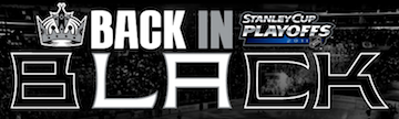
Last year the Los Angeles Kings wore the black third jersey throughout their postseason run (all of one round) — a decision supposedly made by the players. I have every reason to believe they'll do it again this year, especially considering it is supposed to become the home uniform in 2011-12.

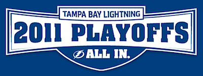
Speaking of next season, we're all familiar with the rebranding the Tampa Bay Lightning are undergoing. Because the blue BOLTS alternate jersey is the only one of the current set that will carry over, it sort of makes sense they'll wear it this postseason. But there's been not confirmation of that yet.

One team that has confirmed intentions to wear their thirds in the 2011 playoffs is the San Jose Sharks — who did so via Facebook this week. Though it should be noted that technically they said, "Taking a lead from what the players wanted, the Sharks will wear their black jerseys when the playoffs open."

You could take that to mean they'll only wear it for the opening game then switch back to teal, but I doubt it. I think the NHL would disapprove. By the way, that brings us back to the Kings. It seems both teams will wear their black alternates in their quarterfinals series. How dull. But if it's "what the players wanted..."

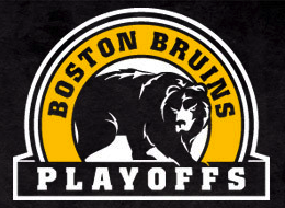
The only other team I think may do the third jersey thing in these playoffs is the Boston Bruins. I may not like it, but it is popular amongst the fans. The sweater in question has been all over their playoff marketing, especially on their website. Could just be promotional, could be a subtle hint.

As for the rest, the Capitals, Flyers, Canadiens, and Red Wings are all without third jerseys. The Sabres just re-retro-branded (that's what I'm calling it). The Penguins' third is too polarizing. The Coyotes' and Ducks' alts are too blah (biting critique, I know). And the Blackhawks and Rangers are Original Six, and like all the NHL ads say, history will be made. Neither of these teams would be caught dead carrying the Cup in anything but those historic, classic threads. (Nor would we want that.)

That just leaves Nashville and Vancouver. And you know what? I wouldn't mind seeing either the Canucks or Predators in their thirds for the playoffs. Guess we'll find out for sure this week.

Cups by jersey era

The important stuff now dealt with, I asked what you guys what else should be in the "preview" post. Via Twitter on Monday, @NateBrowntown asked, "If tampa wins this year, it's 2 jersey eras, 2 cups. Any other teams that have won a cup for each jersey style?”

Indeed, the Lightning have only redesigned their uniforms once — in 2007. The team won the Cup in 2004 with the original design (except for the number style which changed frequently from 1992 to 2001). This is their last chance to win it before starting a third "jersey era" next season.

But Nate's question is a hard one to answer — whether any team has "won a Cup for each jersey style." All these uniform changes — it's really a recent development born from the marketing world along with the need to sell tickets and pay players millions of dollars.

But instantly Montreal comes to mind. The Canadiens have basically worn the same uniform since the 1920s. And they've won a Stanley Cup in every decade except the 2000s. Like the Habs, the Red Wings have hardly changed their uniform design since the 1930s. They've won 11 Cups since 1936.

The Anaheim Ducks have had two distinct uniform eras with the rebrand that came in 2006. In the first, they made it to the Stanley Cup Final (2003) and in the second, then won it all (2007). The Hurricanes have had only one uniform set since moving to North Carolina in 1997. They won the Cup with it in 2006. The Whalers never did.

The New Jersey Devils began life in 1982 with a red/green color scheme. When they swapped the green for black in 1992, they started winning championships — in 1995, 2000 and 2003. There are so many little things like this you could go on forever. But I'm ready to move on.

Playoff marketing ploys

Another tweeter called @Bazurkk asked, "What [do] teams put on the towels or t-shirts handed out to fans pre-game?"

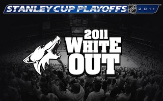
Obviously I can't answer that myself. I don't even live in an NHL city. But I post the question here so those of you who do can answer. How is your team promoting itself? I know Phoenix and Pittsburgh are going the "White Out" route. The Lightning have a T-shirt with a dumb slogan that says "Hunt It Now." What else is out there? Add it to the comments.

A Retrospective gallery

Nate's question earlier got me thinking. Which NHL uniforms have actually skated around with the Stanley Cup? It can't be that many, can it? So I tracked down some photos. This gallery of grail-lifting captains goes back 15 years.

And let me point out that the winning jersey has alternated between darks and whites every three years like clockwork going back to 1998. This means in 2011, we're due for a dark (home) jersey win. (In 2003-04, the NHL switched the whites from home to road.) Prior to Detroit taking the chalice at Mellon Arena, the Stanley Cup champion claimed their prize on home ice for six consecutive seasons starting in 2001.

The one other thing I wanted to point out is how the reflective surface of the polished Cup seems to take on the colors of the winning team. That's just flat out cool.

Jonathan Toews / 2010 Sidney Crosby / 2009 Nicklas Lidstrom / 2008

Scott Niedermayer / 2007 Rod Brind'Amour / 2006 Dave Andreychuk / 2004

Scott Stevens / 2003 Steve Yzerman / 2002 Joe Sakic / 2001

Scott Stevens / 2000 Derian Hatcher / 1999 Steve Yzerman / 1998

Steve Yzerman / 1997 Joe Sakic / 1996


Jersey Competition Once we know which jerseys each team is wearing, I'll set up a few polls asking which jersey is better in each series. We'll see if those results are able to accurately predict the winners. But I think that's all I have for now.

Monday
Apr042011

The Postseason Push in Logo Form

With just nine days until the Stanley Cup Playoffs begin, no one is interested in hockey uniforms or logos anymore. I can tell because since the news has dried up, most of you have checked out. But that's all right. I'm just as guilty. Would much rather watch my Bolts shut out the defending champs than write a blog post.

Still, it's coming up on two weeks since I freshened up this page and heck, I've actually manufactured some content today. Fans of playoff-bound teams may have noticed new temporary logos popping up around the arena as well as team websites. Postseason marketing is in high gear!

Almost a dozen teams have special playoff-promoting logos and I'm going to give into homerism by starting with the Tampa Bay Lightning.

As with all of the Bolts' current marketing, it's nothing but blue and white featuring the new logo and the "All In" slogan. It's very simple, just like the team's new look — which doesn't actually take effect on the ice until the fall.  Of course the club's newfound fetish for blue makes one wonder whether they plan to use the blue BOLTS jersey for home games this postseason rather than the blacks.

The NHL permits teams to use only two sweaters during the playoffs, but does allows dark alternates to stand in for dark home uniforms. The Kings have taken advantage of that in recent years. It would be a good opportunity for the Lightning, who have only worn the sweater for Saturday home games during the season.

The Boston Bruins have a simple 2011 playoffs logo which takes advantage of the bear in the secondary mark. It's a great looking drawing that should get used more. Glad to see it here.

Of course the nice thing about this logo is that it's evergreen in that it doesn't include a year. So it's possible it's been used before this season. I'll be honest in saying that I've never really paid attention before. (I just needed blog filler today.)

If you check out the Bruins' splash page, you'll notice David Krejci next to this logo sporting his third jersey. A subtle hint that the B's may be among those clubs donning alternates in these playoffs?

The Anaheim Ducks appear to have put the most effort into their 2011 postseason logo.

The "webbed D" is used in place of the 0 in 2011. Clever customization. They've also put the NHL's Stanley Cup logo into use here.

Nothing crazy but then the Ducks haven't exactly nailed down that playoff berth yet, have they? They sit at 7th in the West with three different teams nipping at their heels.

Speaking of which, the Dallas Stars are one of those heel-nipping teams. Despite sitting in 10th place, their playoff logo encourages fans to believe that the postseason is possible.

And really, it's not out of the question as they're only three points out of that final spot. I'm enjoying watching the Western Conference playoff race, but that's only because my team is in the East — and has already clinched. Less stress that way.

Still, I pity the West team that ends up in 8th because I get the feeling it'll be a short ride for them. Then again, the Canucks did just get whomped by the last-place Oilers over the weekend.

There were no graphic artists straining themselves on this one. The New York Rangers are employing the simplest of 2011 playoff logos with a simple "just add text" directive.

Simplicity aside, the mark is nicely assembled. Getting that spacing just right can be a great irritation on any design project. And the Rangers are one of two teams with a corporate sponsorship for the their playoff run.

I'm not certain this counts as a logo exactly, but it's a well-designed playoff slogan anyway. (I think I just like the font.)

It's the Countdown to the Playoffs for the Montreal Canadiens, who also have yet to clinch, technically.

The other team with a sponsored playoff run would be the San Jose Sharks. Of course they don't exactly have a special logo for the playoffs. Really, it's just an opportunity to use another one of their half-dozen 20th anniversary logos.

What slipped under my radar until I was researching for this article was the fact that the Sharks have only missed the playoffs five times in their 20 NHL seasons. That's impressive. Other expansion teams haven't been quite so lucky.

But speaking of 20 years, it should come as a surprise to no one that the Detroit Red Wings are touting their 20th consecutive playoff appearance. They've been ridiculously good for a lot of years now and have a decent amount of hardware to show for it.

I was trying to remember the last time the Wings weren't in the playoffs and the problem was they've never missed them since I've been a hockey fan. They last time they missed was 1990. And they've only missed twice since 1984. Though again, I'm sure no one is surprised by those numbers.

One question though: What happened in 2003? Should it count as a playoff appearance if you get swept in the first round by the 7th seed?

And not to leave out all the teams that didn't qualify, the Florida Panthers, for example, have not qualified for postseason play since 2000 when they were swept by the Devils in the quarterfinals. The Cats haven't won a playoff game since 1997 and even then they only got the one. And that was only a year after their Stanley Cup Final appearance — in which they were swept.

Playoff disappointment banner / On Frozen PondSo Miami Herald writer George Richards, via his blog On Frozen Pond, asked Panthers' fan(s) to channel their decade of disappointment into a work of art.

You know, every year teams raise banners to the rafters commemorating divisional, conference and of course Stanley Cup championships. Richards held a contest amongst his readers for a banner commemorating 10 seasons of futility.

The winning entry, Richards said, wouldn't fly as a uniform patch. The runner-up (right) was really quite brilliant, however.

Anyway, did I miss any legitimate logos? My research wasn't exhaustive but it gives us something look at for the next week or so while we wait for the playoffs to begin.

Wednesday
Mar232011

Sens Offer Glimpse of Heritage Jersey

Sneak peek at new Sens sweater / SenatorsThe Ottawa Senators have offered fans a glimpse at their new Heritage Jersey, set to replace the current alternate sweater in 2011.

These screenshots (right) were taken from a video posted on the Sens' website. The club was hosting a Hot Stove event this past Saturday, in which season ticket holders get access to team bigwigs to ask questions and share comments.

In a modest PowerPoint slideshow at the event, the team displayed this sneak peek of the new sweater. Sales VP Mark Bonneau was keen to point out the cleverness of the marketing team, showing the jersey without giving away the farm.

It's folded up in such a way that we really can't get an idea of what the overall jersey actually looks like. But there are a few things we can tell from the image the team provided:

  • The Heritage Jersey will primarily be black.
  • There will be no "vintage white." (Long live actual white!)
  • It will not feature the full barber-pole striping as some suspected.
  • There will be a new logo of some kind.

Also appearing in this modest PowerPoint presentation seems to be the Senators' 20th anniversary logo.

While we may not be able to see it very clearly, we can tell that they're using the same font as the Vancouver Canucks have used on their uniforms since 2007. Weird.

By the way, it may be nothing, but of the three logos in use on the Heritage Jersey slide, none of them is the current primary mark.

They've got the 2012 All-Star Game logo (they're hosting), their 20th anniversary mark, and the secondary "O" logo. Perhaps a hint as to what logo we might find on the front of this new uniform? Time will tell.

Speaking of logos, note the bottom still in the image to the right. Notice it has all of the logos that the franchise has used since being awarded in 1990 — including the "Ottawa" wordmark. Just a nod to their history or something more?

What do you guys think of what we see here? What are you envisioning for this new alternate uniform?

Monday
Mar212011

Kings Confirm Uniform Changes

The best source for Los Angeles Kings jersey news continues to be blogger Rich Hammond of LA Kings Insider, who's talking of changes for 2011.

Sneak peek at Kings' prototypes?On Sunday, Hammond confirmed our suspicions regarding the uniform changes the Kings will undergo for the 2011-12 season, saying that the black alternate sweater will become the new home jersey. He also says there will be a white version for the road. This is the first we're hearing of it officially since photos leaked last year.

Regular readers will recall getting an early look at prototypes of white Kings jerseys back in October. This photo (right) was taken from outside Luc Robitaille's office window at the team's practice rink. Robitatille is the Kings' president of business operations.

Now as for the third jersey in 2011, there's a twist. Here's an excerpt from his post:

It seems that the vintage purple-and-gold jerseys will go into mothballs for a while now. This has been a very poorly kept secret, but the Kings are likely to change their primary uniforms next season.

The current third jersey — the black jersey with the “LA” logo — is scheduled to become the full-time home jersey, while a newly created white version of that jersey would become the full-time road jersey. The current home jersey, the black-and-purple jersey with the crown logo, would become the third jersey. Is that confusing enough?

The only thing that confuses me is the idea of dropping the purple-and-gold crown jersey instead of the purple-and-black one. (The throwback was used for the last time this season over the past weekend.) Perhaps they felt it too soon to drop a jersey they've only been wearing for four seasons. However, it does look like this will be the swan song for the current road sweater.

Promotional graphic / KingsCouple of things to note. Rich Hammond's blog is affiliated with the Kings' official website so as far as I'm concerned, his information is practically team confirmation.

And speaking of the team's official site, the marketing images being used to promote 2011 season tickets (right) prominently features the current third jersey — and no purple at all.

So I'm sure I already know what most of you think of the Kings' possibly dropping this year's throwback sweater, but do you think hanging onto the current home jersey is a good idea?


Related: Los Angeles Kings jersey gallery

Saturday
Mar192011

Jerseys Meant to Make a Buck

Have you ever spent time browsing the official online store of the NHL? I mean really digging around. There's some pretty wild stuff in there and that's before you get to the team-branded hammers and tape measures (clearly an early push for Father's Day). I'm just talking about the jerseys.

Flyers "replica" jersey / NHL.comIcethetics reader Brad M. emailed in Friday wondering about this Philadelphia Flyers jersey (right) he saw at Shop.NHL.com.

It's white with minimal striping and comes with player customization. But it's unlike anything the Flyers have ever worn on the ice. And what's more, it couldn't look more generic. And they want $80 off of you for it.

Another reader says he's seen a Bruins jersey in a store based on this same template. But who would really pay for that? You're only saving $35 compared to a Reebok Premier jersey that actually looks like what the players wear.

Shop.NHL.com lists the product as a "replica jersey." What is it replicating exactly? A jersey? I hope it's not just a baggy, long-sleeve T-shirt.

The official product description says the letters and numbers are heat-sealed on but that's no surprise. What would be is if they sold any.

If it seems like I'm riding this topic pretty hard, it's only because stuff like this dilutes brands. It's a cheap ploy to sell junk with logos on it. And I think NHL logos deserve better.

So after seeing that "jersey," I started digging around in the Flyers store a bit. As we just celebrated St. Patrick's Day this week, the NHL has introduced a line of St. Patty's Day branded jerseys for a handful of teams. Again, it'll never see ice time in an NHL game, but the league figures it can charge you $100 for one.

Only six teams had St. Patty's Day jerseys in stock. I'm not sure how many other teams have been made, but you have to figure your biggest Irish-American populations are in the northeast and surrounding regions. Take note of the Lady Liberty logo on the Rangers jersey. I keep holding out hope that old third jersey will find its way back. All of the logos on these jerseys are screen printed.

I also included the green Blackhawks jersey which has been around for ages. It's basically the home sweater with the red swapped out for green. That's available in addition to new St. Patty's Day line. It's never been used in a game, but I know it's a popular one with fans.

A few teams even have digital camo jerseys available. They'll run you $100 as well. These actually have seen ice time as teams often sport camouflage jerseys during warm-ups on the various military appreciation nights held around the league throughout the season.

And the last oddball line of apparel which annoys me more than all of the above combined — are these.

If you're a baseball fan, buy a baseball jersey. Hockey players wear hockey jerseys. I want to slap people I see wearing hockey logos on baseball attire. Again, these were the only teams I saw that were offering the "Majestic Button Front Baseball Jersey" on the website. Let's hope they're at least smart enough to keep them out of non-MLB markets. But it's still no excuse.

By the way, I may be mocking these jerseys, but of course any fan is well within his right to spend his money on any item with his team's logo on it. I'm actually curious to know how many — if any — Icethetics readers have bought any of the above jerseys. And what else have you come across that just should not have had an NHL team's logo on it?