Saturday
Apr302011

Seattle's Stanley Cup History

Seattle's sports history started with a Stanley CupI feel bad about going so long between blog posts. But then the Lightning made it to Round 2, so I don't feel that bad. You know what I mean? Still, here's something to hold you over for now.

Today, my wife and I had lunch at this Seattle sports pub we frequent called Sport. It's one of those places where they hang various sports memorabilia on the walls alongside dozens of TVs tuned exclusively to sporting events.

As you walk in, there's a timeline of Seattle sports history. I'd never noticed before that the first event is a Stanley Cup championship. 

Even more surprising to me, the Seattle Metropolitans, a member of the Pacific Coast Hockey Association from 1915 to 1924, were the first U.S. hockey team to win the Stanley Cup, which they did in 1917.

With that nugget, I learned that my vast hockey knowledge lacked a very cool little detail. My new city was the first in America to claim the Cup. And they did so against the legendary Montreal Canadiens, 3 games to 1.

Not only that, but the Metropolitans played for the Cup two more times in 1919 and 1920. (There was no Stanley Cup champion in 1919 due to the series cancellation by the flu epidemic.)

In case you can't read that placard behind the glass in the photo — sorry about the glare, we're having one of those unusual sunny days — here's what it says:

The Seattle Metropolitans, in only their second season, grabbed the most prized possession in professional hockey, the Stanley Cup. The Metropolitans were the first U.S. team to win the Stanley Cup and did so behind the efforts of star forward Bernie Morris who scored an unprecedented 6 goals in a 9-1 victory in the series clincher. The Metropolitans went on to play in two more Stanley Cup Finals before disbanding in 1924.

Despite all these championship appearances during their relatively short existence, Seattle was not the first American city represented in Stanley Cup play. If Wikipedia is to be trusted, the PCHA's Portland Rosebuds did that in 1916. They lost the series to the Canadiens, 3-2.

The Stanley Cup became an NHL-exclusive championship trophy in 1927. The first American NHL team to win it was the New York Rangers in 1928. The Boston Bruins played for it and lost in 1927.

I know none of this is related to uniforms or jerseys (except that there's a mock-up of the Metropolitans' sweater crest in the photo) but I thought it was a neat tidbit to share during the Stanley Cup Playoffs about my city's hockey history. Now if only we could get an NHL team here. (First need a new arena, though.)

One more thing. GO BOLTS!

Saturday
Apr232011

Does Mask Design Hint at New Logo?

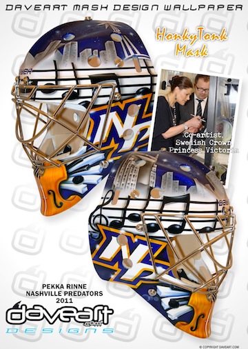
Pekka Rinne's new mask / daveart.comSwedish airbrush artist Dave Gunnarsson paints goalie masks for some of the best netminders in the world. His most recent work was done for Pekka Rinne and was revealed to the world via his blog this week.

Gunnarsson creates new masks all the time, but what makes this one noteworthy to Icethetics readers is the never-before-seen logo featured on both sides of the freshly painted helmet.

We already know the Nashville Predators are redesigning their home uniforms (presumably, the road ones as well). What we don't yet know is what they will look like.

The NP lettermark on Rinne's new mask does not look like any mark that the Predators have used before. So here's the question: Is it a future Predators logo that has yet to be publicly released? Or did it simply spring from Gunnarsson's mind?

[UPDATE 2:26 PM: For the record, if this is an actual Predators logo, my guess is that it would be nothing more than a shoulder patch or helmet decal or something.]

In his blog post, Gunnarsson talks about the HonkyTonk theme of the paint job but makes no reference at all to the NP logo. Is that because technically it's not supposed to be seen yet? Or are we reading way too much into this?

From what little I've seen of Gunnarsson's work, it seems he mostly adapts existing or past logos rather than creating new ones. This could be a departure from that. Or not. Don't know.

Your thoughts? Is this a sneak peek at a new Preds logo? Or am I making a mountain out of a goalie mask?

For a better look at the design, check out the mask gallery at daveart.com. My thanks to Nick F. and Kevin H. for sending along this information.

Thursday
Apr212011

Saying Goodbye

Wednesday night brought a couple of possible "last times" in the NHL.

For example, with the Red Wings' sweep of the Phoenix Coyotes, it could turn out to be the last time fans gathered to watch an NHL game in Glendale, Ariz. Rumors have run rampant that any deal to keep the team in the desert has dried up (I intended that pun) — paving the way for a relocation back to frosty Winnipeg.

Those pesky rumors also suggest that such an announcement would be imminent as soon as the club's playoff run ended — which it has, in rather short order. It could be today (Thursday) or even as soon as tomorrow. On one hand I'm hoping they don't move because I can only imagine the devastation for the few hardcore Coyotes fans. But then again, I'd be fascinated to see another rebranding this offseason — and thrilled to see Canadians getting one of their teams back.

Another last time: If the Tampa Bay Lightning don't turn things around in their series against the Penguins, Wednesday night could prove to be their last time wearing black jerseys for the foreseeable future. Icethetics readers are well aware of the rebranding efforts unveiled in January, which eliminated the black from the team's identity

Imagine if the Bolts were to win the Cup wearing black (again). It would make it a lot harder to see them completely lose that color scheme in the following season. But if they keep playing the way they have been, that won't be an issue. They face elimination in Game 5 first thing Saturday in Pittsburgh.

One more thing hockey fans are saying goodbye to are the WHL's Chilliwack Bruins. It's official. They played their final game on April 2 in a 6-4 loss to the Spokane Chiefs.

At a media conference today, the league announced the sale and relocation of the club to Victoria, B.C. The ECHL's Victoria Salmon Kings are expected to be sold or folded, according to the Times-Colonist. Either way, it boils down to two groups of fans losing their teams.

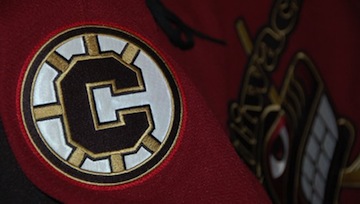
Chilliwack Bruins third jersey / BruinsA website has already launched — www.vicwhl.com — for the Victoria franchise. By the way, the Chilliwack Bruins' website has been wiped from cyberspace and you'll find no reference to the team on the WHL's website. It's kind of annoying, actually. But I digress.

Currently, the new owners of Victoria's WHL team are holding a poll on their website asking fans what name they prefer for the team. The choices are Victoria Capitals, Dragons, Force, Royals, Tide and Thunder. (They do not offer a "none of the above" option. But Royals would probably be for the best.)

My guess is that poll couldn't matter less. The jerseys are probably already headed into production along with a load of knick-knacks with the new name and logo — whatever that may be. Though it could just be my cynical side saying that.

What else are we saying goodbye to in 2011?

Monday
Apr182011

Sabres' New Owner Keeping Look

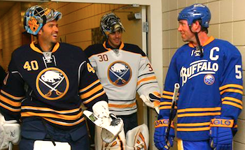
No changes to Sabres uniforms in 2011 / SabresThe Buffalo Sabres will retain their current home, road and alternate uniforms for at least another season, according to the club's new ownership.

This is old news but it deserves a place on the blog for posterity. Sabres blog Die by the Blade recently did a write-up on an online chat between fans and new president Ted Black, speaking on behalf of owner Terry Pegula. Among the topics were two that will please Icethetics readers.

Quoting Die by the Blade's Andy Boron:

  • The slug will be taken off the scoreboard, and they team is considering some sort of fun "Slug Appreciation Day" for that event. He did not mention whether this would involve the proposed jersey trade-in/discount program.
  • There will be no changes to the primary or third jerseys for next year.

Despite the sweeping uniform changes this season (back to something a little more traditional), the slug has persisted in some places, most notably, the arena. Totally unacceptable, right? Sounds like the new brass will be doing some house cleaning.

And of course, it's great to see that the current uniform set will remain unchanged. As it should be. But don't count out the possibility that the new owner may want to put his stamp on the club with a new third jersey in 2012-13 or beyond.


Related: A Look Back at the Infamous Buffaslug | Sabres Debut New Uniforms

Thursday
Apr142011

Thrashers Retire Third Jersey

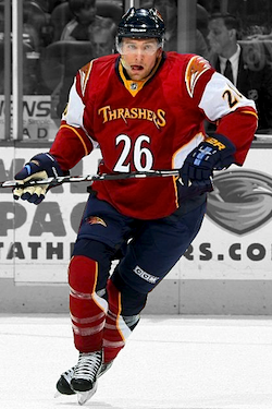
Thrashers retire 3rd jerseyAfter three long seasons, the Atlanta Thrashers have mercifully announced they are retiring their football basketball third jersey.

Blueland Blog, an arm of the Thrashers' official website, posted the news today and added that the team will NOT wear a third jersey at all in the 2011-12 season. Blogger Ben Wright wrote:

Some fans loved them, and others weren’t big fans. Whether you were a fan of the red third jerseys or not, they were unique, but their time has come to an end.

After launching in the fall of 2008 and being worn for three seasons as an alternate home jersey the red Thrashers jersey is being retired. The Thrashers will return to the basics next season and stick with their regular home and road uniforms with no third jersey in 2011-12.

Were you a fan? Will you miss it?

I may not be a Thrashers fan. But as someone with an appreciation for hockey uniforms, I think it was a wreck. But that wasn't always the case.

When it was first unveiled on Oct. 8, 2008, I wrote, "this is a great jersey if you can look past the front of it. I like sleeves, the logo element on the shoulders and the striping looks great. I just can't quite get past the text and the giant number on the front."

I still mostly stand by that. I like slightly oversized shoulder patches and the stripes on the sleeves. And I was always on the fence about the socks and the odd elements on the sides of the jersey.

But after years of seeing it over and over again I've been unable to reconcile the front of that uniform. It's just not what a hockey uniform should look like. Not that I'm any kind of authority on that. I'm a fan like anyone else. And coloring outside the lines is usually a good thing.

I just won't miss this one. Will you? Will you miss the Thrashers having a third jersey option? Should they take another stab in 2012-13 or stick with two for a while?


Related: Atlanta Thrashers jersey gallery