Been following a variety of news around the Hockeyverse these days. Thought I'd take a moment to share a bit of what's been going on. (Because apparently, I can only write new posts really late at night now.)
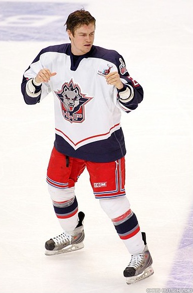
Wild officially unveil 10th birthday logo
 Since the Minnesota Wild are not in the playoffs, the big news on their website this week was the unveiling of the 10th anniversary logo.
It's not the first time we've seen it, by the way. We got a preview on a few weeks ago when it started showing up in season ticket ads on the Wild's website. Despite that, the "official" unveiling was Thursday.
The following details were included in the online press release:
The Wild's 10th anniversary mark will be worn on the right chest at all games next season except for the two contests in Finland, where it will be replaced by the NHL Premiere patch.
The mark uses a stylized Roman numeral “X” to represent the ten years of the Wild in Minnesota. The “X” has an added touch of the crossed hockey stick look connecting it back to the State of Hockey.
The mark incorporates the team colors of Minnesota Wheat, Iron Range Red and Forest Green and was developed in partnership with SME in New York.
Wild fans won't be able to miss it next season. By the way, the release also points out the the 10th anniversary celebration culminates with the club hosting the 2011 NHL Entry Draft next June.
Blue Jackets' red-and-yellow mystery
 The other team ready to celebrate ten years is the Columbus Blue Jackets, who joined the NHL in 2000 with Minnesota. And like the Wild, they will be opening their 10th season overseas. And we already have a jersey mystery brewing.
Columbus Dispatch beat writer Aaron Portzline regularly updates a CBJ blog called Puck-Rakers and a recent post about a preseason game in Sweden has some of us scratching our heads.
He wrote the following last Friday (April 23):
The Blue Jackets and the Malmo/Rogle club will wear custom designed red and yellow uniforms, the colors of the province of Skane, where the game will be played.
That sort of gratuitous use of specialty jerseys sounds like something out of the minor leagues. Ah, but wait. Is that even true? The release on the Jackets' own website tells another story. Here's an excerpt from that:
The Blue Jackets will play a unified team comprised of two Swedish hockey teams – the Malmo Redhawks, who in 2009-10 played in HockeyAllsvenksan, and Rogle BK from Angelholm, who played the 2009-10 season in the Swedish elite league Eliteserien.
The best 10 skaters and one goaltender from Rogle BK will join forces with the top 10 skaters and one goalie from Malmo to square off against the Blue Jackets. Coaches from each side will lead the team. The players will be outfitted in custom-designed red and yellow uniforms, the official colors of the province of Skane.
That says that ONLY the unified Swedish team (comprised of the two aforementioned clubs) will wear custom-designed red and yellow uniforms. Obviously they couldn't wear their own jerseys as there would appear to be three separate teams on the ice.
If indeed the Blue Jackets were also meant to be wearing specially-designed jerseys for that game — and why would they? — I would expect the release to be more specific about it. But it begs the question, why would local fans want to see an American hockey team dressed in their home colors? You want to pay homage, wear a special patch.
That's my take on it. I've emailed Portzline for clarification on the subject. I'll let you know when/if I hear back. But at the moment, I would presume a miscommunication on the part of the newspaper and that the Blue Jackets will NOT be wearing anything but their own uniforms in Sweden in September.
Name Greenville's new hockey team
 Name the ECHL's new Greenville teamThe new and yet unnamed Greenville ECHL hockey team, the relocated Johnstown Chiefs, is holding a name-the-team contest at HockeyGreenville.com right now. If your name is selected, you win a pair of season tickets for life. Pretty sweet deal.
Here's the actual form to fill out if you have an awesome name to submit. Entries will be accepted until Friday, May 28. And even if you don't submit your suggestions, feel free to share them here in the comments.
Greenville News says the name suggestions will be "presented to a selection committee made up of team owners, as well as area dignitaries, for final determination of the team's new name." The newspaper also confirms that the new name, colors and logo will be unveiled on Friday, June 25.
 We are tracking one other relocated minor league team this summer. The Edmonton Oilers' AHL franchise begins play once again this fall, now in Oklahoma City. The Oklahoman has a web page set up with "ongoing coverage" of hockey's return to OKC.
I'll keep an eye on it, but so far there's nothing new. No name. No colors. No logo. All we know is that there will be a hockey team in the fall. A naming contest ran Feb. 9-20 but no official announcement has been made yet.
However, some industrious fans at Copper & Blue have discovered a handful of web domains recently purchased by Prodigal Hockey, the company that will operate the new Oklahoma City AHL team. They include names like OKC Oilers, Oil Kings, Oil Barons, 89ers, Hawks, and even Roadrunners. Others that have cropped up: Tornadoes, Bison, Wildcatters, and Roughnecks.


 19 Comments
 After weeks of knowing but not really knowing, now we know. The Edmonton Oilers' AHL affiliate is named the Oklahoma City Barons. And the logo is exactly as leaked.
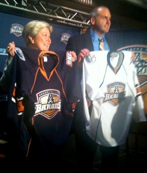 Barons uniforms unveiledIcethetics readers were not surprised by the logo, but likely disappointed by the uniforms. Instead of being bold and creative, the Barons will wear the same, poorly designed home and road uniforms their parent club debuted in 2007 with the introduction of the Age of Reebok (right).