Entries in ahl (88)

Sunday
Oct242010

Around the AHL

Another Sunday brings another massive American Hockey League post. This particular article has been in the pipeline all week.

And I would like to start by thanking all the great readers who have contributed tips and links, as I am not the greatest at keeping track of the minor leagues on my own. But there really is a lot to get to so I'll move it along.


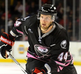
Photo credit: Derek PhilipponThe Portland Pirates sported their cancer-fighting pink jerseys last night.

They did so to the tune of a 2-1 victory over the Bridgeport Sound Tigers. For a good cause and win. Who could complain?

The sweater was unveiled last month. I mentioned it on the blog because I thought the crest was a bit clever, playing on the Pirates' own throwback logo along with that of their NHL affiliates, the Sabres.

For another look at the jersey in action on goalie David Leggio, go the Pirates' website. For details on how to bid on one, also go the Pirates' website.

And my thanks to Phil K. for sending along this photo too.


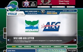
Whale Pack gets web revampThe Hartford Wolf Pack started implementing their new brand by recently revamping their website.

Later this fall — right in the middle of the hockey season — the team will take on new colors and a new name when they become the Connecticut Whale, prompting the nickname Whale Pack in the interim.

The rebranding efforts have already begun online, but the new look isn't expected to hit the ice until after Thanksgiving, but certainly before Christmas — banking on holiday shoppers and their kids, no doubt.

For the record, www.connecticutwhale.com has been reserved but doesn't yet take you anywhere. On the other hand, www.ctwhale.com works. Thanks to Jeremy M. for the tip on the web revamp.
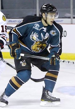

Moose get new road lookThe Manitoba Moose debuted a new road jersey this season.

The old black jerseys have basically been swapped out with brand new green threads. In fact, that's exactly what's happened. The jersey design remains the same with the black and green swapped.

Let's be honest. If your color scheme is that good, why wouldn't you take advantage of it? It's good to see all the black jerseys starting to disappear from hockey. (I said "starting," there's still a long way to go.)

This photo comes from the weekly photo gallery on the AHL's official website. Great way to get a look at a variety AHL sweaters in action during the season.

Ian K. actually emailed me about this more than a month ago but I somehow overlooked it — even during the Season Preview. Jeremy M. reminded me in an email this week.

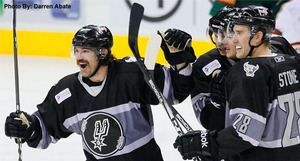
Rampage don Spurs jerseysIt finally happened. A hockey team actually wore a basketball jersey in the Age of Reebok.

All right, technically the San Antonio Rampage were still wearing hockey sweaters last night, but they were wearing a basketball logo.

It was "Spurs Night at the Rampage" for the team's 2-0 win over the Houston Aeros. Rampage players were on hand prior to the NBA's San Antonio Spurs game earlier in the week, wearing their own jerseys, by the way. (And someone has to tell me who's the guy with that crazy 'stache.)

For another look at the jersey, Ryan H. emailed in the splash page promoting Spurs Night from the Rampage's official website.

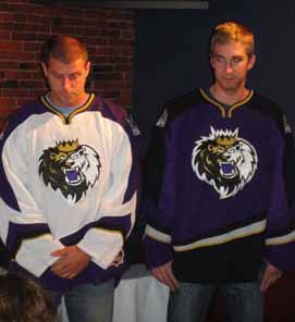
Monarchs' new uniforms unveiledThe Manchester Monarchs are rocking new home and road jerseys this season.

I've had difficulty finding any game action photos, so we'll just have to live with the terribly-lit pictures posted on the Monarchs' website when the sweaters were unveiled earlier this month.

For a side-by-side comparison of the previous set of uniforms and the new ones, I've nabbed these renderings from the AHL's online store. Thanks to Jeremy M. again for the tip.

They're affiliated with the Los Angeles Kings so I have just one question. Why in the world would they try to look like the Anaheim Ducks?! At least the old uniforms had that crown stripe on the sleeves.
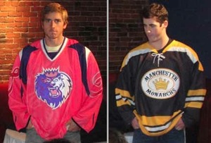
Monarchs unveil specialty sweatersBy the way, that same article I linked to earlier also revealed the Monarchs' 10th anniversary logo along with a pair of specialty jerseys that will see action this season (left).

The pink one is obviously for Pink in the Rink Night. Along with the sweaters, the ice at the Verizon Wireless Arena will be painted pink. That all goes down on Saturday, Jan. 22, 2011.

As for the black and gold jersey, I'll let the team explain in a blockquote:

On Saturday, December 4, the Monarchs will be celebrating the rich hockey history in New Hampshire with their final New Hampshire Legends of Hockey specialty jersey. The team will don throwback jerseys from the 1970s original Manchester Monarchs team when they host the Springfield Falcons at the Verizon Wireless Arena that night.

To be honest, I never knew there was another Manchester Monarchs team from the 1970s. Anyone have any information they can share?


Now we'll wrap up this epic post where it began — pink hockey sweaters.

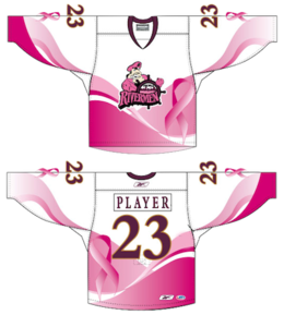
Rivermen unveil pink jerseyThe Peoria Rivermen unveiled their Pink in the Rink Night specialty jersey this week.

In a rather appropriate twist, the Rivermen will sport their pink-infused threads the night before Halloween, next Saturday, when they host the Oklahoma City Barons.

I'm all for breast cancer awareness and I'm not bothered by one-off pink jerseys, but there are better ways of doing this. For instance, Portland got it right.

Still, it's good that they're doing this. The jerseys will be auctioned off after the game and the proceeds will benefit Susan G. Komen for the Cure.

Thanks to Drew S. for the email tip on this jersey.

By the way, the Wilkes-Barre/Scranton Penguins have four new jerseys this year, like the Monarchs, so rather than making this post even longer the Baby Pens will get their own post later this week.

Sunday
Oct172010

AHL: 75 Years of Identity Issues

Over the past two weekends, the AHL has been celebrating its 75th anniversary by calling on its six oldest teams — sort of — to sport special throwback uniforms. Some for the better, others not so much. 

For those of you that enjoy Icethetics history lessons, boy do I have a doozy, but first let's review what these six teams looked like in their retro threads.

Springfield Indians vs Providence Reds

Why is it the Peoria Rivermen should've played as the Indians, instead of the Springfield Falcons? And do the Connecticut Whale really have a better claim to the Reds than the Providence Bruins?

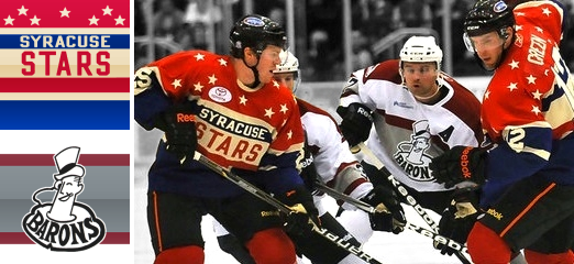
Syracuse Stars vs Cleveland Barons

Plus, are the Buffalo Sabres responsible for killing the Syracuse Stars? And are the Worcester Sharks more worthy of skating as the Barons than the Lake Erie Monsters?

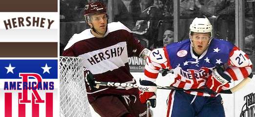
Hershey Bears vs Rochester Americans

And finally, two teams just the same as they've ever been for more than a half-century. What more could you need to know?

All of these questions will be answered. It's time for that history lesson.

When the AHL was formed in 1936, known then as the International-American Hockey League, eight cities were represented, six of which have teams today that took part in the anniversary festivities: Springfield, Providence, Syracuse and Cleveland. Hershey and Rochester joined later but most of the other teams are suffering through an identity crisis of some kind. Let's break this down.

Springfield Falcons

The Springfield Falcons were founded in 1994 so they certainly aren't among the AHL's oldest franchises. But last weekend, they played as the Springfield Indians, who were. In fact, the current Falcons team has no ties to that original franchise, which now exists as the Peoria Rivermen. So how did that happen?


The city of Springfield, Mass. has had pro hockey since before the AHL formed. The Springfield Indians were founded in 1926 and played in the Can-Am, or Canadian-American Hockey League, under that name until 1951 when they were renamed the Warriors. That lasted only three years before the club reverted to Indians moniker.

In 1967, the name was changed again, this time to the Springfield Kings. But a classic name dies hard and this time seven years passed before the Indians name was brought back once more. Then finally, in 1994 the franchise was relocated to Worcester, Mass. and dubbed the IceCats. Because it was the '90s and minor league teams did that sort of thing. Not willing to go down without a fight, ex-Indian players were granted a new franchise, now named the Falcons.

The IceCats moved to Peoria, Ill. in 2005 and so goes the story of the Indians franchise. However, the league couldn't very well dress the Rivermen in their old Indians uniforms while hockey was still going strong in Springfield. So the Falcons paid tribute to their city's past in style.

Providence Bruins

The Providence Bruins franchise was founded in 1987 but has only been playing in Rhode Island since 1992. Again, it's definitely not one of the league's original teams. Actually, just like Springfield, this city had pro hockey long before the AHL in the form of the Providence Reds, who are now about to become the Connecticut Whale. What?


Just like Springfield's story, it all began in 1926 in the Can-Am. The Providence Reds were one of the eight teams that joined the new International-American Hockey League in 1936. They were successful and stuck around a long time. But when they affiliated with the New York Rangers in 1972, things were changing. And it started with a new arena.

Then in 1976, the team name was changed to Rhode Island Reds. But that would be the team's final season in the Union's smallest state. When the North American Hockey League folded in 1977, the owners of a Binghamton, N.Y.-based franchise, called the Broome Dusters (not kidding), bought the Reds and shifted them about 300 miles west and appropriated their own name for the club.

The Binghamton Dusters became the Binghamton Whalers in 1980. Then a decade later, they were named after their NHL affiliate, the Rangers. In 1997, the team became the Hartford Wolf Pack, and later this year, Howard Baldwin will officially rename them the Connecticut Whale. What a lineage. Ouch.

Once again, the Providence Bruins will only wear Reds jerseys as a tribute to their town rather than their own team heritage — a team which began life in 1987 as the second incarnation of the Maine Mariners and relocated in 1992.

Syracuse Crunch

The identity crises don't end in Providence. The Syracuse Crunch is a franchise only slightly older than the Falcons, having been established in 1992. And would you believe this? The team once known as the Syracuse Stars was actually killed by the Buffalo Sabres in 1970.


The Stars' story is long, but not all that complicated. Founded in 1930 as a member of the International Hockey League, the team from Syracuse, N.Y. hooked up with the I-AHL in 1936. By 1940, they were on the move, however, to Buffalo. Renamed the Bisons, the new team was a replacement for the club of the same name which disbanded in 1936 when its arena collapsed.

The Buffalo Bisons were effectively sent to slaughter in 1970 at the announcement of the Buffalo Sabres NHL franchise. They vacated the Memorial Auditorium for the new major league team and that's the end of their story.

Meanwhile, the Syracuse Crunch were founded as the Hamilton Canucks in 1992. After just two seasons in Ontario, the club relocated to New York. Just like the Falcons and Bruins, they don Stars attire not as a tribute to their own past but to their city's and that of the AHL.

Lake Erie Monsters

Once again, we have a club still in its teens masquerading as one of hockey's oldest. The Lake Erie Monsters franchise was founded in 1994 but only moved to Cleveland, Ohio in 2007. The actual Cleveland Barons were founded in 1929 and the lineage of that name can be quite confusing as you're about to learn.


The Cleveland Indians were a member of the International Hockey League from 1929 until 1936. However, they were known as the Cleveland Falcons for the last two years in the IHL and in their first season as a charter member of the I-AHL.

The following season, in 1937, the Cleveland Barons were born. And that's where things get interesting. Everything was fine until 1972 when the WHA and the Cleveland Crusaders came along. This spelled instant death for the minor league franchise, which was forced to relocate midway through the 1972-73 season. Unfortunately, they moved to Jacksonville, Fla. so they only got in one more full season before folding. The bloodline ends there.

As a side note, the Cleveland Barons name was revived in 1976 when the NHL's California Golden Seals relocated to Cleveland, forcing the Crusaders to St. Paul, Minn. But the Barons lasted only two seasons in the NHL before disappearing again. Ironically, the players from the disbanded team went to the Minnesota North Stars.

One more attempt was made to revitalize the Cleveland Barons moniker when the AHL's Kentucky Thoroughblades were bought by the San Jose Sharks in 2001 and relocated. Five years later, the Sharks moved the club to Massachusetts and renamed it after themselves. So technically, the only existing team that came claim the Cleveland Barons name in their heritage is the Worcester Sharks.

Yet the Lake Erie Monsters, founded in 1994 as the Denver Grizzlies, donned Barons duds last weekend. The Grizzlies played in Colorado only one season before the Quebec Nordiques announced they were to move there. So the Grizzlies went to Salt Lake City, Utah for the next 10 years.

The club suspended operations for two years while it looked for a new owner, who would then put the club in the home of the departing Cleveland Barons. By the way, don't confuse these Utah Grizzlies with the ECHL club of the same name. They have a long history of name changes and relocations but actually began life as a charter member of the East Coast Hockey League.

Hershey Bears

At last, a true original AHL franchise. Almost. The Hershey Bears joined the I-AHL in 1938, two years after its founding. End of story, right? Not quite.


The Bears were actually founded in 1932 as the Hershey B'ars. Then it was changed the following season to Hershey Chocolate B'ars in case the original name was too subtle for you. Then back to Hershey B'ars once again in 1934.

The Bears nickname actually came about by way of New York sportswriters who thought the B'ars name was overtly commercial. Gee, you think? In 1936, it stuck. Officially. And though the Hershey Bears have endured minor uniform, logo and color alterations over the last 72 years, the name has remained the same. 

Rochester Americans

The Rochester Americans didn't join the American Hockey League until 1956, but at least they're not masquerading as some other team just to celebrate an anniversary.


Now in their 55th season, the Amerks, like the Bears, have been through logo and uniform changes over the years but have always kept the name. It's refreshing to see that some teams can exist over long periods of time like this. We could all wish for more of them, but that would just make for a much duller history lesson, wouldn't it?

Hope you enjoyed this post, by the way. Spent over two hours working on it this afternoon. But it was rather fascinating.

Wednesday
Sep222010

Amerks Unveil Third Jersey

Americans unveil new third jerseyThe AHL's Rochester Americans unveiled a new third jersey at a press conference on Tuesday.

The throwback sweater is a replica of what the Amerks wore back in the 1960s. Team president Lewis Staats called it a "symbol of returning to [the team's] roots."

Members of the American Spirit Dance Team were on hand to model the new jerseys. I like how minor league teams always use the pretty girls on staff to launch a new sweater. Almost guarantees people will look at it.

You can find more information about the new alternate uniform in an article posted yesterday on the team's website — it includes a picture of a bunch of dudes holding up the jersey.  Thanks to all the great Icethetics readers who sent this in.

Pirates Prepare for Pink in October

Pirates unveil special pink jerseyThe AHL's Portland Pirates will wear a special pink sweater for Breast Cancer Awareness Night.

This image (right) comes directly from the splash page of the Pirates' official website, which indicates the jersey will be worn on Oct. 23.

It's actually a really neat design that borrows both from the team's history as well as its NHL affiliate, the Buffalo Sabres and their new uniforms.

The jersey design itself is almost an exact replica of the Sabres' new home sweater with some colors replaced — blue changed to black, gold to pink. But the coolest part may be the crest, which is a fusion of the vintage Pirates and Sabres logos. Replacing the white buffalo above the crossed sabers is the primary mark the Pirates wore from 1990 to 2000.

We've seen some bad breast cancer night jerseys on this blog, so this one is kind of refreshing. I have to applaud the designer for a job well done. And thanks to everyone for emailing it in.


That's all I've really got time for today. But just so you know, there's been a lot going on that just hasn't made it to the blog yet — despite these daily posts lately. So I recommend following @icethetics on Twitter, or at least keeping an eye on the Twitter feed in the sidebar for frequent updates of jersey/logo news.

Friday
Aug272010

Loose Threads: News & Notes

When jersey news accumulates, I find the blog in need of an outlet with some kind of generic title. This is first of likely many editions of Loose Threads. Just a quick rundown of anything the blog may have skipped over earlier in the week.

Flyers to "unveil" new road sweater

Claude Giroux #28They're not making a big deal about it, but the Philadelphia Flyers will "unveil" their new road jersey when training camp opens on Sept. 17.

I use the "sarcastic quotes" because it's no secret that the Flyers will be promoting last year's Winter Classic sweater to full time road jersey — as first reported by Icethetics back in January.

The Flyers confirmed the date with the following posting on their website:

On Friday, September 17 at 3:00 p.m. the Flyers will officially open training camp and unveil the new 2010 road jersey.

They don't specifically say that it will be the Winter Classic jersey — maybe in order to be mysterious to folks unlike ourselves who do not follow this aspect of the sport so closely — but I'd be shocked if they actually designed something new. Plus, readers say it's already been seen in EA Sports' NHL 11 video game as the road uniform.

Presumably, the old white jersey will disappear while the black one will continue serving as the alternate sweater next season.

Baby Penguins try on another new third jersey

WBS Penguins unveil new thirdThe AHL's Wilkes-Barre/Scranton Penguins are redesigning their third jersey for the new season.

The new sweater was unveiled last week and the Penguins tweeted a link to this photo. Didn't realize blue was one of their colors.

Despite the color mismatch, it's not a terrible sweater overall. I like the idea of breaking the penguin out of the stripe-y circle, though the stick sticks out awkwardly.

But it does make me wonder if it might have a link to what the Pittsburgh Penguins will wear in January at the 2011 Winter Classic. Are the Baby Pens giving us a preview here? Something to think about.

By the way, earlier this month, the AHL Pens posted images of past third jerseys to their website. You can check out the 2006-07 design as well as the more recently 2008-09 alternate. See a pattern developing? Next new Baby Pens third coming in 2012.

Falcons reveal Indian throwbacks

Falcons throw back to IndiansAlso in the AHL this week, the Springfield Falcons unveiled a special throwback jersey, paying tribute to the Springfield Indians of 1936.

Here are a few details from the announcement on the team's website:

As part of their annual summer barbeque exclusively for ticket package holders and corporate partners, the Springfield Falcons unveiled the special throwback jersey they will be wearing for their first two regular season games on Friday, October 8 at Providence and Saturday, October 9 at home against Providence.

The special jersey unveiled pays homage to the 1936 Springfield Indians and will be highlighted during the American Hockey League’s 75th Anniversary weekend.

As mentioned there, this jersey will be one of a handful of throwback sweaters being worn by AHL teams to mark the 75th anniversary of the league. Also being included in the opening weekend celebration are the other five oldest AHL cities, which are Providence, Syracuse, Cleveland (Lake Erie), Hershey and Rochester.

This probably means we'll see the following throwback transformations:

  • Lake Erie Monsters → Cleveland Falcons/Barons
  • Providence Bruins → Providence Reds
  • Syracuse Crunch → Syracuse Stars/Warriors
  • and of course, Springfield Falcons → Springfield Indians

The Hershey Bears and Rochester Americans have never had any other names — nor have the cities — but they certainly have vintage jerseys I'm sure we'll see.


And finally, in case you don't follow the Facebook page, Eric B. posted a link to photos of Marty Turco's new Blackhawks masks — seeing Turco leave the Stars is a lot like seeing Modano leave.

If I missed anything else, drop me an email and I'll update this post.

Saturday
Aug212010

A Tail of a Whale

With word coming down this week that merchandise emblazoned with that classic Hartford Whalers logo is among the hottest selling in the NHL, it's only fitting that we talk about its inexorable return to professional hockey.

It's been 13 years now since the Whalers left Connecticut for Raleigh, N.C. Despite that, T-shirts, hats and jerseys with that iconic blue-and-green mark continue to sell like that of a team that just won the Stanley Cup.

Howard BaldwinHoward Baldwin is a man bent on bringing back his team. And he may get his wish sooner than we think.

In June, Icethetics reported on Baldwin's plans for Whalers Hockey Fest 2011. A day of outdoor hockey featuring Connecticut's best college teams. But he's not nearly done.

Howlings, a blog dedicated to the AHL's Hartford Wolf Pack, has been following some interesting developments. Blogger Mitch Beck says Baldwin will be taking over the Wolf Pack and renaming it the Connecticut Whalers.

As many have read in local newspapers, or here on Howlings, the last hurdle has been cleared for Howard Baldwin and his Whalers Sports & Entertainment to take over operation of the Hartford Wolf Pack.

Well, it is only a matter of time now, as early as next week, that it should become official. When that happens, the Hartford Wolf Pack will be no more and the new team will be the Connecticut Whalers.

This will be a huge moment for the city of Hartford and for the players as well. With Baldwin running things there should be a renewed interest in the team and making it an event once again. Expect the team to once again start drawing big crowds and become the place to be.

Connecticut Whalers T-shirtThat was posted about a month ago. While we wait for something official, Beck at Howlings continues to stress the inevitability of the change as recently as a week ago.

[The] Greenville Road Warriors will be the new ECHL affiliate for the Rangers and the Connecticut Whalers… Technically they’re still the Hartford Wolf Pack, but that’s only a matter of time.

And even now you can buy a Connecticut Whalers T-shirt from Baldwin's website, WhalersProShop.com — complete with a brand new logo and everything. The potential new logo for a rebranded Wolf Pack franchise?

It's not a great logo, but how much can really stand up to that original HW design? Some people go years before even noticing the H in the negative space. It's a logo so great, it gets featured in a book titled Design Principles and Problems, published in 1995 and referenced by Paul Lukas on Uni Watch last December.

Whalers logo evolutionWhen the WHA folded in 1979, the New England Whalers were forced by the Boston Bruins to change their name before they could enter the NHL. That meant the need for a new logo. The following is an excerpt from Design Principles and Problems:

When Peter Good was commissioned to create a new logo for the Hartford Whalers hockey team, he was given a specific message to convey. Good's challenge was to give the H of Hartford and the W of Whalers equal billing in a design that suggests whaling and the feeling of a partnership between a dynamic team and a dynamic city.

The trial sketches and the final solution reveal Good pushing this basic idea through a variety of solutions until a design evolved that conveyed the desired message well. The first solution shown (a) was accepted by the client but unsatisfactory to Good because the H repressed by the enclosed, unfilled area was stronger than the W.

In the second sketch (b), Good softened the impact of the H by opening it to look more like harpoons than in the first solution. In the third sketch (c) he extended the attempt to soften the H, pushing the harpoons to the side. This possibility he rejected as ugly. In the fourth sketch (d) Good tried omitting the harpoons. The result balanced the W and H but was not particularly exciting.

The fifth sketch (e) reveals the sudden inspiration of using a whale's tail. Sketch after sketch followed, with Good trying to develop a more flowing interlock between the tail and the W. When he hit on the final solution, he wrote, "Eureka! Good 'W' and good 'H' living happily together."

Finally, Good notes a special effect created in the "empty" H space: Light seems to flow into the H legs from the outside, becoming trapped in glimmering optical pools of brightness at their base. This heightens the contrast between the straight-based H and the curved both of the W, giving the design an exciting look.

Stories like this always help me find inspiration when designing.

Anyway, though Baldwin might get his wish with the Wolf Pack, the chances of the NHL returning to Hartford in the near future are slim. Let's not forget the nature of expansion in the NHL over the past decade. This has been the league's most stable period since the 1960s.

Brian Favat of SB Nation Boston also makes a good point:

Thirteen years later, the primary factors that caused the Whalers to leave town — a viable market and lack of modern playing facilities — are still present. When the Whalers were in town, Hartford was the smallest market in the NHL. As Hartford straddles both the New York and Boston markets, their marketability was severely limited by geography.

In addition, Hartford still doesn't have a new hockey arena. The city's XL Center is 35 years old and there are no plans to build a new arena. The AHL's Hartford Wolf Pack ranks only 18th in the AHL in attendance, drawing a little over 4,000 fans a night.

Hartford's limited appeal as a viable NHL market isn't the city's only hurdle to overcome. Today, the city faces increased competition from cities like Kansas City, Winnipeg, Quebec and Hamilton, all vying for their own NHL franchise. Despite these obstacles, however, Baldwin remains positive about his chances.

Icethetics will continue to track any Howard Baldwin-related Whalers news, including any possible name change for the Wolf Pack.