Entries in ahl (88)

Wednesday
Nov072012

Have You Seen Los IceHogs?

Images from Rockford IceHogs (official website)

Novelty promotions are commonplace in the minor leagues. But sometimes you just have to shake your head. And the AHL's Rockford IceHogs are really standing out right now.

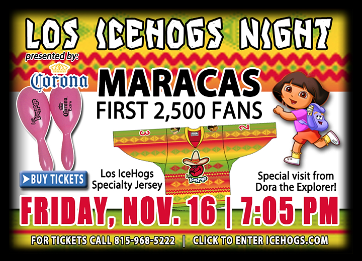
Over the weekend, the team gave away bobbleheads bearing that looked like to the two dudes at the center of last night's onslaught of news coverage. (Was there an election or something?) Then later this month, the one and only IceHogs will transform into Los IceHogs. (The same, right, but more... Mexican-ish.)

These were two things that deserved some blog time. I couldn't resist. Especially the specialty jersey, which will be worn next Friday, Nov. 16. And get this, the first 2,500 fans are getting free maracas. How much do you not want to be at that game? Ah, but you might change your mind when you learn who's making a special visit.

Dora the Explorer. The celebrity from whom every hockey fan dreams of getting a visit.

Anyway, this gave me a good laugh and I hope it'll do the same for you. Tell me. What do you think of Los IceHogs? And what other cultural stereotypes could these guys use to mask their big pig of a mascot?

Thursday
Oct182012

A Team of Too Many Jerseys

Photo from WBS Penguins (Instagram)There's a good reason why a site like NHLUniforms.com doesn't exist for the American Hockey League. It's called the Wilkes-Barre/Scranton Penguins. Thanks to them, no one would ever be able to keep track.

Last week, the Penguins posted this photo (right) on Instagram. At first glance, it just looks like players signing autographs for fans. But look closer and you'll notice the guys are sporting sweaters we've never seen before.

No one should be surprised. This team typically wears a large number of jersey designs throughout the season — apart from their standard home and road sets. In fact, they proudly display most of the dozens of designs from their 13 years of existence on a special section of their website.

The other reason I wanted to get this new checkerboard-sleeved jersey on the record is that just over a month ago, we got a look at yet another alternate sweater that would be worn this season.

Chirps from Center Ice — a Penguins fan blog — treated us to photos on Sept. 7 of a Pittsburgh Hornets-inspired third jersey apparently on display at PensFest.

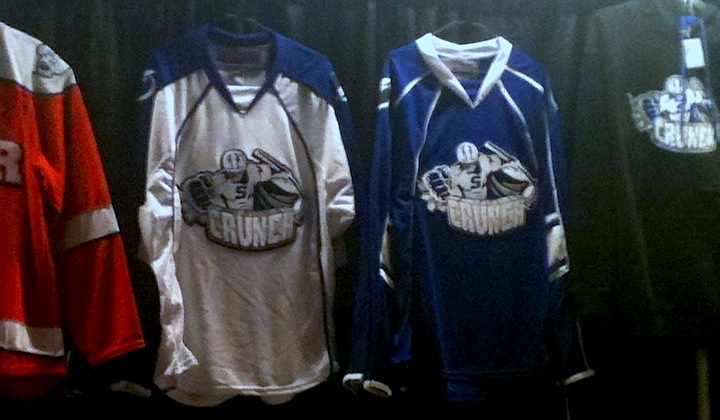
So the question is this: How many alternate jerseys could one AHL team possibly need? (And are they solely responsible for keeping Reebok in business?) Even as I ask the question I realize I should be posing the same question to the Syracuse Crunch. (That was No. 5 — even though it only saw preseason action this year.)

I never really paid attention to how many difference jerseys AHL teams use in a season until the NHL went away.

I really want the NHL back.

Monday
Oct152012

Barons Sync Up With Oilers for New Uniform

Photo from Oklahoma City Barons official website

The AHL's Oklahoma City Barons unveiled their new third jersey last week and it looks rather familiar. The Barons are syncing up with their NHL parent club, the Edmonton Oilers, with this new look. It's essentially the Oilers' home sweater with some logos moved around.

From the Barons' press release:

The Oklahoma City Barons unveiled a third jersey at their annual Open House at the Cox Convention Center late Tuesday [Oct. 9] evening.

The third jersey uses the same color combination worn by the Barons parent club, the Edmonton Oilers. The royal blue and orange combination features one of the Barons alternate logos on the crest, the letters “OKC” with an oil drop just above the middle of the logo.

It's a sharp look and I think we were all ecstatic when Edmonton brought it back. Great to see Oklahoma City carrying it on this season.

Saturday
Oct132012

New Sweaters with Ties to Tampa

With no Tampa Bay Lightning hockey to follow at this point in the fall, I'm a little lost and turning to the minors for comfort. And it just so happens the Bolts' AHL and ECHL affiliates are sporting new uniforms this season. So let's have a look.
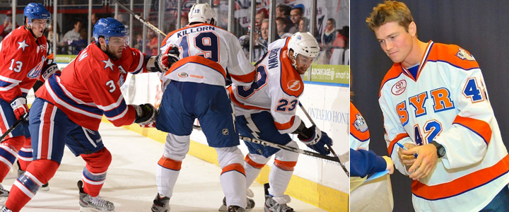
Photos from Rochester Americans and Syracuse Crunch official websites

It happened with the Norfolk Admirals a few years ago and now it's happening to the Syracuse Crunch, who opened their season last night wearing not quite what you'd expect. For a team that just unveiled a very blue logo this summer, I'm surprised to still see so much orange in their uniforms.

But who knows what goes on behind the scenes with these teams? It could very well be that the rebrand happened too late in the game to get the uniforms completely overhauled. (Plus, they probably still have a lot of orange gear leftover that they need to sell, right?)

What's cool: The lightning bolt down the pants. Crunch players are actually wearing the same pants as their NHL affiliate. (You can even see the NHL shield on them in the photo above.) This is useful for two reasons. For one thing, it ties the branding of the two teams together. But more practically, players who are getting called up already have a key piece of their gear in tow.

What's not cool: The white Lightning logo over orange on the right shoulder. Someone at SME has to be shaking their head over that. I would've at least used the blue bolt if the shoulders had to be orange. Which brings me to my other point: Why not make the shoulders blue? These are obviously not recycled jerseys. They're new, with the blue piping added all over the place. Fix it.

That's all I have to say on Syracuse for now. Their home opener is tonight so I assume we'll get to see the other jerseys. I'll add photos as an update to this post later on.
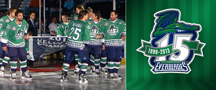
Photo from Florida Everblades (Facebook)

Also this season, the ECHL's Florida Everblades are celebrating their 15th anniversary along with their 2012 Kelly Cup championship. You can see both represented in the photo above as the team hit the ice in their new green anniversary sweaters and raised a special banner last night.

By the way, that Blades game was also the first time that expansion team Orlando Solar Bears hit the ice. You can see what their uniforms looked like in action for the first time on their Facebook page. The Orlando Sentinel also has a neat side-by-side shot of both teams' uniforms.

Interestingly, both of these games required extra time to decide. The Everblades won on a goal 26 seconds into overtime while the Crunch fell to the Rochester Americans in a shootout.

Monday
Oct012012

Marlies Get Three New Sweaters

At the end of last week, the AHL's Toronto Marlies revamped their uniform set across the board, adding new home and road jerseys as well as the sharp new third jersey seen above.

On Saturday, the Marlies hosted an event for season ticket holders and unveiled this retro alternate uniform, which is a tribute to the Toronto Marlboros — an organization that's been around for nearly 110 years. (They currently exist as the OHL's Guelph Storm, actually.) The Marlies produced this video to explain that history.

For those without video, here's the transcript:

The Toronto Marlboros are deeply enriched in Canada's hockey history, with a focus on developing talent since franchise inception in 1903. The Toronto Marlboros have been home to hockey's elite, including George Armstrong, Ron Ellis, Mike Palmateer, Charlie Conacher, Steve Thomas and many more. Now, the symbol worn proudly on their chests, become a beacon of hope for today's Toronto Marlies. With a nod to our past, it's time to turn our eyes to the future with the official unveiling of the Toronto Marlies' third jersey. 

It's insightful if you can look past the bad writing. For example, the first line says "enriched in Canada's hockey history" when they obviously meant "entrenched" (and even then, there are more appropriate terms such as "rooted"). But none of that is the point of this post. I'm just being a grammar snob.

I say it's insightful because I truthfully didn't know anything about this team or where its name came from. I never took the time to look into it either, but I guess that's the point. I always enjoy learning about the history of hockey franchises in Canada. There's just so much there.

Prior to the third jersey unveiling, on Thursday the Marlies gave us our first official look at their new home and road uniforms — which aren't exactly a huge departure from what they've been wearing.

This change was simply to put their look more in line with that of their parent club, the Toronto Maple Leafs — who made some upgrades in 2010. All that really means is the collar has changed and a pair of waist stripes have been added.

So while technically the Marlies will be sporting three new jerseys this season, they won't really be sporting anything "new" this season. It's all about recognizing where they come from (Marlboros) and where they're going (Maple Leafs, hopefully, right?).

Hard for this team to go wrong with sweaters like these. What do you guys think? 

Page 1 ... 4 5 6 7 8 ... 18 Next 5 Entries »