Entries in ahl (88)

Saturday
Sep292012

The Lake Erie Monsters of Cleveland

The AHL's Lake Erie Monsters want you to know that they play in Cleveland, Ohio. So much so, in fact, that they've added the city's name to their logo. It's a Los Angeles Angels of Anaheim kind of situation we have here in the minors now.

By all accounts, the team name has not changed. They're still the Lake Erie Monsters, but on Sept. 18, they unveiled new jerseys featuring a revised crest — Cleveland has been added to the bottom of the logo. The revised primary mark is now in use on the team's online outlets as well.

The Monsters logo, which has been with the team since the original launch in 2007, will now include “Cleveland” written into it below the “Monsters” wordmark. Moving forward, this logo will be seen on all uniforms, including home, road and alternate.  The home white jerseys have also been revised for the 2012-13 season.

Aside from the crest, the road jersey isn't changing. And the alternate uniform is also getting the updated design.

Now Cleveland, help me out here. This logo revision just seems silly. What's really going on here? It seems like the Monsters are spending a lot of marketing dollars just to "show their commitment" to their town. There has to be another reason, right?

Thursday
Sep272012

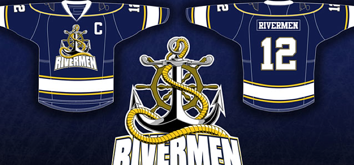
Rivermen to Sport Fan-Made 3rd Jersey

The AHL will very likely benefit from an influx of temporary new fans this season if this NHL lockout business keeps up. But the Peoria Rivermen are already benefitting from their existing fans in the form of a newly designed third jersey.

On August 27, the team unveiled this creation — the winner of a jersey design contest held over the summer. It beat out three other submissions with about 40% of some 1,400 votes cast over a three-week span.

The jerseys will be worn by the Rivermen in their game on Dec. 15 at Carver Arena against the Milwaukee Admirals. The jerseys will be auctioned off to the public following the game.

“I would like to say thank you to the Peoria Rivermen staff for creating such a unique opportunity,” said [winning designer Ryan] Malaschak. “Being a graphic artist and a passionate hockey fan my entire life, it has been a dream of mine to create a game-worn jersey at a professional level.”

The contest was opened on July 1 and these four finalists were revealed a month later.

It seems to me they were all great options. But I was partial to this one by Erik Kuhre.

Think you can do better? Submit your concept to icethetics@gmail.com and it may just show up on Concepts page someday soon.

Wednesday
Aug292012

Hershey Bears Unveil New Logo!

It's official. The AHL's Hershey Bears unveiled their revamped look this afternoon, which includes all new logos and uniforms. The new image is all about making old new again.

A team video unveiling the new look, says it's all about going back to chocolate and white again. But the way I see it, less is more and this new set of logos looks positively incredible. Take a look at some of the alternate and secondary marks.

Definitely beats the old logo — by a lot! Naturally, the new look was created by The Joe Bosack Graphic Design Co. (As though it could've been anyone else.) Bosack is also responsible for, well, just about every good modern sports logo out there.

The Bears' new color scheme also puts the 2013 Outdoor Classic logo into context. Hershey will be hosting the event this season.

So what do you think of this new look for the Hershey Bears?

Monday
Jul232012

Providence Bruins Update Logos

The parade of new minor league logos this summer continues with the AHL's Providence Bruins, who made their updated look official on Monday.

The new primary and secondary marks have been in use on the team's alternate jersey since 2010 and the upgrade is a welcome change. And it's all about simplifying the club's look, which is derived from its NHL affiliate, the Boston Bruins. Presumably, that third jersey will become the primary dark sweater now alongside a new white one.

The new secondary logo is based on the mark used in Boston since the Bs' 2007 facelift.

Founded in 1992, the Providence Bruins are celebrating their 20th anniversary. Perfect time for a sharp new identity. Even if it isn't completely original. Here's a blurb from the press release:

This new logo also represents a fundamental shift in focus for the Providence Bruins brand towards a more traditional, “old-time hockey” look and feel. This move coincides with the 2013 Dunkin’ Donuts AHL All-Star Classic, hosted by the Providence Bruins the weekend of January 25-28, which also reflects the new direction of the team’s visual identity.

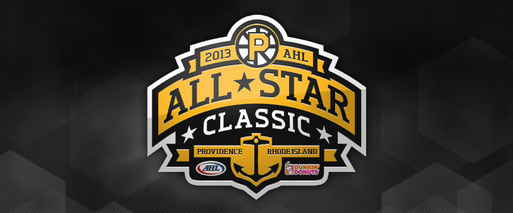
Ah, yes the 2013 AHL All-Star Classic. We have the logo for that, too.

No surprise it features the Bruins' new refined spoked P logo. It's a really nice All-Star mark, actually. Too bad it had to be marred by a corporate sponsor who's colors are neon orange and hot pink. So how do you feel about the new look of pro hockey in Rhode Island?

Monday
Jul022012

Syracuse Crunch Unveil New Logo

The AHL's Syracuse Crunch unveiled their new logo today. And this is it.

As rumored on Wednesday, it's a reboot of the club's original superhero mark from 1994 with the colors of its new NHL affiliate, the Tampa Bay Lightning. (Hey, by the way, are those lightning bolts on his helmet?)

For an upgrade, it's not bad. I would've liked to have seen the CRUNCH font get a bit of a modernization as well, but that might be too much to ask. Of course it is the thing that ties the team's various identities together. It hasn't changed since 1994.

New uniforms will be unveiled in October when the AHL season gets underway. And for those of us who didn't know, Syracuse's superhero dude is named Crunchman. He replaces Al, the (world's only) Ice Gorilla who has reigned as the team mascot since 1999.

Honestly, I don't have much more to say about it. It's underwhelming even if I can't say it's terrible. Though many readers tend to react to new logos in hyperbole so I'm sure we'll see that in the comments. Beyond that, what are your thoughts?

Page 1 ... 5 6 7 8 9 ... 18 Next 5 Entries »