Entries in ahl (88)

Sunday
Oct092011

AHL: New Thirds for Bears, Stars

While I was away on vacation last week a couple of AHL teams unveiled new third jerseys.

The Hershey Bears announced they are bringing back another retro look as their new alternate sweater for the 2011-12 season. It will make its game debut on Saturday, Oct. 15 for the club's home opener as they host the Norfolk Admirals.

On Wednesday, the Bears tweeted a graphic that showed the design, though an actual photo of the jersey itself has yet to surface. It features the "skating bear" logo that's been seen on a number of sweaters throughout the club's long history.

The Bears previously wore a maroon version of this jersey as their alternate. Presumably they're switching to white to make it easier to wear at home. In the AHL, teams wear dark uniforms on the road, so if a club wants to don a dark alternate on their home ice, they need to work out logistics with the visitor in advance.
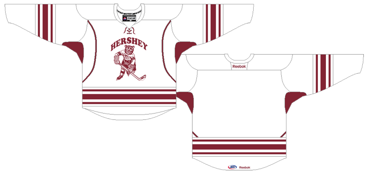
Lately, it seems whenever a new Reebok Edge jersey is introduced, the game we play is which NHL team's template is it based on? I'll give you a minute. If you came up with the Buffalo Sabres home/road jerseys, you got it. The colors may be different, but the design is the same.

AHL Stars' new jersey and logoThe Texas Stars are also introducing a new white third jersey this season. 

Like the Bears, the Stars unveiled their new sweater online on Wednesday. But just over a week earlier, they first showed the new alternate logo seen on the shoulder. It's a wordmark that reads TEXAS with a star replacing the X.

Though this week's press release doesn't mention a specific date for the new sweater's debut, it does reference tonight's home opener a number of times. I'll keep an eye out for game photos.

Now a couple of pull quotes. Here's what the team says about the new secondary logo:

The new design was developed in coordination with the Texas Stars marketing department and the official jersey provider, Reebok. The new design will feature a centered two-tone gold star as the ‘X’ in Texas and will be comprised of the team’s existing colors with the addition of a new dark gold. 

“We are excited to unveil the new secondary logo for the Texas Stars,” said Texas Stars President Rick McLaughlin. “The new design is important to our team’s branding and establishing a new way to identify us. The new design looks great and will help us stand out in the league.”

And the new jersey:

The alternate jerseys are primarily white and dark green, with gold accents. The Texas Stars primary logo serves as the jersey crest, while the Stars new alternate logo (unveiled earlier in the off-season) serves as the shoulder patch on the new jerseys. The nameplates will consist of dark green lettering on the backs of the jersey.

The numbers on the sleeves and the backs of the sweater will be dark green with gold trim. The Stars will wear black pants, black gloves and white helmets with their new alternate jerseys.

“We are excited to unveil the new alternate jersey for the Texas Stars,” said Texas Stars President Rick McLaughlin. “The new jersey is an important extension of our brand in central Texas, using a combination of our original logo and our new secondary logo. Fans will be able to identify us in a whole new way.”

This one uses the template of the Phoenix Coyotes' third jersey. It's not a bad look and I like that they're using their actual logo on the front of this one rather than the text they use on their home and road sweaters much like the Dallas Stars.

UPDATE (9:05 PM): The Stars did not debut their third jersey during tonight's 7-0 blowout of the Oklahoma City Barons. Guess we'll have to keep an eye on them over the coming weeks to get a glimpse of it in action. Their next home game is Friday, Oct. 14.

Any AHL fans reading? What do you think of these new thirds? 

Thursday
Sep222011

IceCaps Unveil Familiar Uniforms

IceCaps jerseys unveiled / Dave SalterThe AHL's St. John's IceCaps officially unveiled their uniforms today. It should surprise no one that they are identical to those of their NHL parent club, the Winnipeg Jets.

IceCaps owner Danny Williams and player Jason King were on hand this morning to model the new sweaters for cameras. And for an AHL team, they look incredibly good.

Now a moment ago I said "identical," but obviously that would be silly. The IceCaps have their own primary logo on the front and the Jets' logo on the shoulders. Add in an advertisement or two and that's it as far as differences.

Here's how the new look was described in a press release on the AHL's website:

The jerseys, which are modeled after the parent Winnipeg Jets uniforms, consist largely of two shades of blue. The primary navy blue base of the home dark jerseys is referred to as Polar Night Blue. The lighter, secondary blue is called Aviator Blue. Each jersey includes sleeve piping, accenting the colors. 

The IceCaps will wear the white jerseys at home and the blue jerseys for road games. 

“I could not be more pleased with the final product we are unveiling today which will be the signature look of the St. John’s IceCaps,” said Mr. Williams. “These are incredibly sharp looking jerseys that are sure to catch the eye throughout the league.”

If you haven't been following along this summer, the IceCaps were known as the Manitoba Moose until that club was displaced by the purchase and relocation of the Atlanta Thrashers to Winnipeg. The team, still owned by True North along with the Jets, moved to St. John's, Newfoundland and unveiled their logo on July 29.

As I said yesterday, I like the Jets' new uniforms, so naturally I like the IceCaps' as well. I almost like them better because I like their primary logo better. But despite my understanding that advertising is necessary to the business aspect of an AHL franchise, I've never liked it on the uniforms. Otherwise, solid look.

IceCaps uniforms nearly identical to Jets / AHL

But wait, there's more minor league news...

San Francisco Bulls joining ECHL in 2012

San Francisco Bulls joining ECHLYesterday, the ECHL Board of Governors approved the membership of a new franchise to begin play in the 2012-13 season. They're called the San Francisco Bulls and appropriately, they'll play at the Cow Palace.

But before you get too excited, the logo being used to represent the new California club on the ECHL's website is absolutely atrocious. It's not design. It's just a sad mess.

The bull head looks like some sort of futuristic, metallic thing while the font couldn't look more dated. And the crossed hockey sticks look like a tacked-on afterthought. Painful is what it is.

I'm hoping that by the time next summer rolls around, they'll have a real logo to show us. And maybe a revised color scheme? Who thought gold, red and black used in this way was a good idea? The 49ers do it right. This doesn't.

In any case, next year the ECHL celebrates its 25th anniversary and it's cool to see them adding new teams in west coast markets after so many have come and gone in the recent past. Heck, if the Florida Everblades were to visit, I might even fly down to see a game. 

Thursday
Aug252011

Aeros Unveil New Uniforms

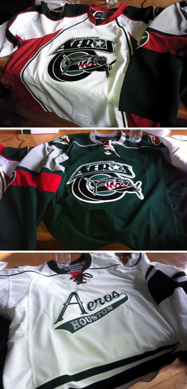
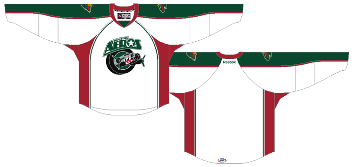
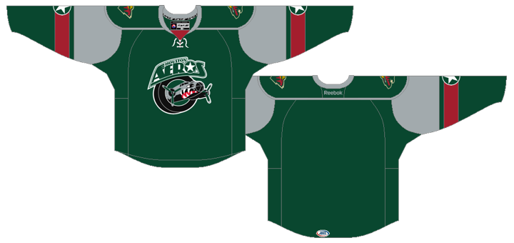
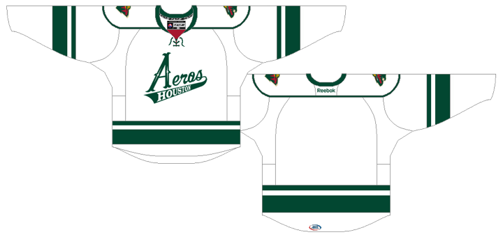
Aeros unveil new jersey / AerosThe AHL's Houston Aeros unveiled new uniforms today which include a further integration of their brand with their NHL affiliate's.

The updated sweaters were unveiled at a press conference today and pictures were posted on the team's Facebook page. They're already getting great feedback from fans. Lots of compliments and excitement.

Here are some direct links to the original photos they posted:

Because of the way the jerseys are laid out in these photos, it's difficult to make out some of the details. The white and green jerseys look like hybrid Reebok Edge templates while the the third jersey is a reversed version of the Wild's.

The Aeros have even modeled their alternate logo off of the Minnesota Wild's. Now we know what their green jersey would look like in white. Not a bad look but I prefer their current white sweater. It's the only one that retains any of their original look from 2000.

But back to Houston. Their previous home and road jerseys, matched those sweaters the Wild used when they joined the league 11 years ago. They were nice, but I can see the Aeros wanted to advance their own brand a little. Still, there's no question the alternate was inspired by Minnesota's.

I think it's a nice mix of originality and paying tribute to their parent club. What do you guys think of them?

Now a couple of quick NHL-related stories...

Blackhawks dropping 3rd jersey in 2011-12

The Chicago Blackhawks will not be sporting a third jersey at all this season, according to ESPN Chicago.

This information was previously reported on the blog but it's worth noting that others are now reporting it as well. Here's an excerpt from Monday's "mailbag" post on the Chicago Blackhawks Report by Jesse Rogers:

Q: I cannot wait for the season to start. Do you know if the Blackhawks will ever bring back the black alternate jerseys or are they sticking with the Winter Classic alternate look again this year? -- Andrew (Chicago)

A: The answer is neither. The Hawks are going with just two jerseys this season -- the home red and road white.

Apparently, the Hawks front office weren't huge fans of the 2009 Winter Classic jersey which had been adopted as a third in 2009-10. Personally, it was my favorite Blackhawks jersey. I'll be sorry to see it go. Still, we got two good years out of it and that's better than none.

Kings to wear four jerseys during 2011-12

We also have more confirmation from the Los Angeles Kings on the four uniforms they'll be wearing throughout the 2011-12 season. That's right, four.

Yesterday on the LA Kings Insider blog, Rich Hammond laid out the Kings' new wardrobe for fans. He confirmed the old black-and-purple home jersey will now be the new alternate and the vintage purple-and-gold sweater will get a reprieve after we spent most of the summer thinking it was a goner.

Kings COO Chris McGowan told Hammond that the throwbacks will be worn on three occasions during the upcoming season. He didn't specify which games. I recommend a read of that post, but if you're too lazy to click, here are a couple of interesting excerpts:

McGowan: “We’re introducing a new look, but in a way we’re not. The look has already been introduced, with the alternate jersey, the black version of it with the L.A. crest on the front. So we simply just produced a reversed version of that, in white, because of positive feedback from multiple people that are involved with the jerseys, including our fans, our ownership group, the players, the NHL, Reebok. … Then we will still keep the purple elements in our organization. Not primary, but we still want to keep them because there are people who like the purple part of the Kings brand.”

Also, McGowan talked about the players' input on the new look.

Question: I’d heard that the players actually voted to wear the black jerseys in the playoffs the past two seasons. Is that true? Did that factor into things?

MCGOWAN: “They did vote. If you notice, the last two years we wore the black jerseys in the playoffs. You want the players being comfortable with what they’re wearing, and you want them to like what they’re wearing. They didn’t dislike our old jerseys. They just simply liked the alternates better. Then we started showing them mock-ups of what a reverse, a white version, of that would look like. We did the camera tests and the designing of it. You could just see it in their eyes, that that’s the one they want to wear primarily. They definitely played a part in the decision. ..."

Nice to hear the guys who wear the uniforms actually get to have a say in them. Though I worry what the league would look like if the players got to make every uniform decision. Perish the thought.

That's all for now. I know the Winnipeg Jets jerseys are still at the top of everyone's mind. Shouldn't be more than a couple of weeks now.

Friday
Jul292011

St. John's IceCaps Unveil Name, Logo

The worst kept secret in the American Hockey League became official this morning. True North's Manitoba Moose have officially become the St. John's IceCaps. (Note that's one word, not two. And in upper and lowercase, reads like this: St. John's IceCaps.)

As you'd expect, the IceCaps' colors line up with their NHL parent club, the Winnipeg Jets. Two shades of blue and two shades of gray/silver. Only the IceCaps wisely left out the red maple leaf.

The primary logo makes heavy use of the wordmark, but that's not surprising considering the name. And it's not a bad name, it just doesn't lend itself well to imagery the way that, say, "Jets" does.

Perhaps the best thing about this mark is its easter egg. At a glance, it's merely snow cover atop a rugged mountain. But when you really look, there's a sort of stylized "N" and "L" carved out for Newfoundland and Labrador — which also happen to be shaped like the actual map boundaries. That's a very cool feature. (Pun.)

St. John's IceCaps logos / @markdenineIf you're like me, you're satisfied — even pleasantly surprised — by this logo but just hoping they drop the "St. John's" bit at the top when it comes time to slap it on a sweater. Regulars may be a bit surprised to find that I like a logo that's basically a wordmark, but there are always gray areas.

I don't care for the Anaheim Ducks' wordmark because, well, a duck is an easy thing to put into a textless image. IceCaps can be more challenging. You don't want to lose your brand identity trying to create a logo that's too clever for its own good. Especially in the minors.

And you can argue all you want with the name choice, but I can't say I mind it. Yes, it breaks some critical rules by including the word "ice" and running it all together with a capital letter in the middle, but it's just one of those throwback things.

From the press release:

“Caps” not only perfectly complements the name in the literal translation of an icecap, it is also pays tribute to the St. John’s Caps, a Newfoundland Amateur Hockey Association team which played in the former provincial senior hockey league. 

Along with this logo, the IceCaps unveiled a new wordmark, which includes the same elements as the primary — just repositioned. You can see it on the poster used at this morning's unveiling event (above) thanks to Mark Denine, who tweeted this photo for us.

There were no secondary marks revealed today, but I'm sure at least one shoulder of the uniforms will get the new Winnipeg Jets logo. Speaking of jerseys, they were not unveiled today either and will probably come out closer to the start of the season. I'd bet they use the same design as the Jets' jerseys, and we're not expecting to see those until early September. Maybe we see both at the same time.

I'll grant you this logo is no replacement for the Manitoba Moose, but it's certainly not as weak in terms of design as the Jets' new primary. Now it's your turn. Hit or miss by True North?

Thursday
Jul282011

Trenton Titans Return to ECHL

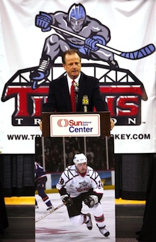
The ECHL welcomed the Trenton Titans back into the league today, filling the gap left in New Jersey's capital city with the demise of the Trenton Devils.

The team has already launched its new website — which at this point, merely links you to its Facebook and Twitter pages. Today's announcement also confirmed the Titans will be affiliated with the Philadelphia Flyers. And the club's new logo will be the same as the one introduced when they first hit the ice 12 years ago.

ECHL commissioner Brian McKenna at Trenton Titans press conference / Martin Griff, The TimesThe franchise played under the Titans name from 1999 until 2007 — a tenure which included a 2005 Kelly Cup championship — at which point the New Jersey Devils bought the franchise and rebranded it, just as they'd done the year before with the AHL team in Lowell, Mass.

All the Devils' affiliates were called the Devils and basically had the same logo and uniforms for the next few years. Last summer, when the Albany River Rats became the Charlotte Checkers, the Lowell Devils headed to Albany. They then became the Albany Devils.

On July 6, the New Jersey Devils gave up on their ECHL player development plan and shut down the Trenton franchise. It was then bought up by new owners who rebranded it with that familiar Titans moniker. So Trenton hockey fans aren't missing a beat here.

So like the resurrection of the Winnipeg Jets, what's old is new again in hockey this year. And full credit to Chris Creamer over at SportsLogos.net for predicting the return of the Titans more than a month ago! Included in a blog post was the revelation that the ECHL has re-registered the Titans trademark on June 21. He assumed either the ECHL was getting into the retro gear business, or the Titans were staging a comeback.

But wait, there's more...

St. John's AHL Team Unveiling Name & Logo

When True North moved the Atlanta Thrashers to Winnipeg, it caused a ripple effect that impacted several other leagues, including the AHL. The arrival of the Jets displaced True North's Manitoba Moose, who have since found a new home in St. John's, Newfoundland. Now they're getting a name and logos.

The AHL tweeted this morning that the new St. John's franchise will officially unveil its branding identity (meaning name and logo) on Friday morning at 11 AM local time. That's 9:30 AM Eastern and 6:30 AM on the west coast — which is far too early for me. It's widely believed the team will be named the St. John's Ice Caps.

The Ice Caps would obviously be affiliated with the Jets. And because the Moose were previously affiliated with the Canucks. But there's an easy fix. The Thrashers' departure left the Chicago Wolves without an affiliate, so naturally Vancouver is filling that void.

Unrelated to the Jets' move, there was another three-way affiliate swap this summer. The Buffalo Sabres are once again joining forces with the Rochester Americans. Their former affiliate, the Florida Panthers, have hooked up yet again with the San Antonio Rampage. (Didn't I just say what's old is new again?) That left the Portland Pirates and Phoenix Coyotes without partners so they just sort of looked at each other and said, hey why not?

This will all be explained again in graphic form in the Icethetics Season Preview in September.

What about the Jets' jerseys?

With the question of the logos fully answered, what now remains is this: What will the new Winnipeg Jets jerseys look like?

Details have been eking out at a slow pace, but a pace set by the franchise itself, for a change. Icethetics reader Jacob McInnis tweeted what he heard True North chairman Mark Chipman talking about on FAN 590 on Tuesday.

For one thing, Chipman said the only red on the uniforms will be in the maple leaf on the logos. Now that extra shade of blue in the alternate wordmark makes sense. He also said the secondary mark, the wings, will be the shoulder patches.

New Jets in new T-shirts / JetsAs far as when the new sweaters will be unveiled, I still haven't seen anything official, but the expectation is still early September.

One thing worth noting however, are the new Jets T-shirts which you can find in both light blue and dark blue — keeping us guessing about which color the home jersey will be. This photo (right) was tweeted by the team earlier today.

Frankly, the logo looks better on dark blue, but I would love the irony of the Jets using the same color jerseys as the Thrashers did. Though I'm sure Atlanta fans wouldn't find it nearly as funny.

Jacob also said Chipman talked about a desire to honor old Jets jersey numbers, similar to what the Toronto Maple Leafs do. This makes more sense that all out retiring numbers for players who never actually suited up for this particular franchise.

Got any other Jets nuggets I've missed? I'd love some links if these details are in print somewhere.

And there's a reason that this final link is at the end of this post. Lots of folks went nuts-o when they thought this alleged "NHL 12 leak" was the Jets new uniform. I'm not saying it again. But obviously, it isn't. It's a Capitals jersey. That is all.

By the way, I do hope my contempt for these EA video game "leaks" is coming through. I wouldn't want to downplay it at all. Just saying.

Page 1 ... 7 8 9 10 11 ... 18 Next 5 Entries »