Entries in echl (67)

Monday
Jul302012

New Sweaters Around the Minors

One after another this summer, teams across the minor leagues have been overhauling their looks. We've mostly been focusing on logos lately, so today we're switching gears. Check out some of the new jerseys that have been recently unveiled.

On Friday, the ECHL's Wheeling Nailers not only unveiled new sweater designs, but a revamped logo and color palette. Most notably, red is no longer one of the team's primary colors.

The Nailers' have been red, gold and black for as long as I can remember. But beginning in 2012, they switch to black and gold, just like their NHL affiliate, the Pittsburgh Penguins. In fact, their new home and road uniforms look awfully familiar.

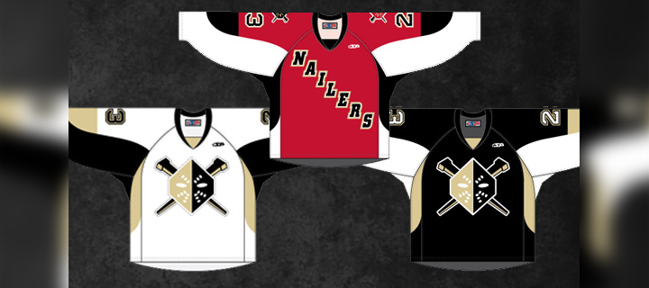
The new dark jersey (right) was actually introduced as a third last season. It gets the full-time treatment this fall along with a white version to match. Of course the red isn't completely disappearing. The Nailers will wear a red alternate uniform (center) which features the old logo on the shoulders.

A bit of a downgrade here, if you ask me. Shrinking the color palette often provides a cleaner look, but in this case, it just sort of flattens the Nailers' logo. As we've seen with the Penguins, Vegas gold is just too bland to be a team's only color.

For those not familiar with the ECHL, teams wear white at home for the first half of the season and switch for the second half. The Nailers say the red jersey will be worn on Sunday afternoons at WesBanco Arena.

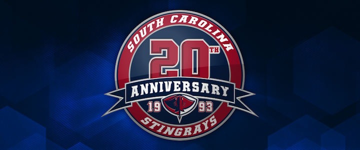
Elsewhere in the ECHL, the South Carolina Stingrays unveiled their 20th anniversary logo along with a pair of new jerseys for 2012. The North Charleston-based club made the announcement on May 31.

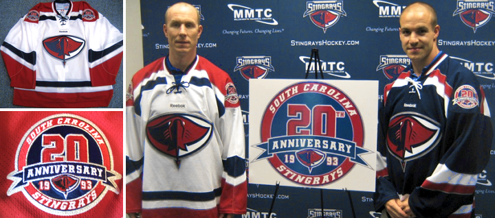
The Stingrays have done it right. These are some great-looking uniforms — even if the anniversary logo is a little too busy. Fans should be thrilled to see them hit the ice this fall. By the way, if you find yourself needing to add one of these to your collection, they're available.

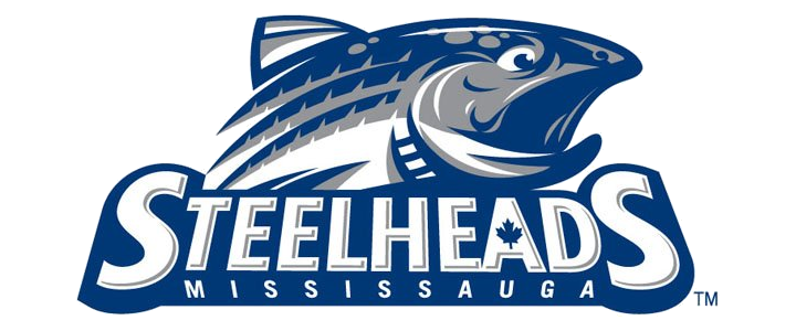
And finally, the OHL's recently rebranded Mississauga Steelheads officially unveiled their uniforms last Friday. Here's a closer look at their new secondary logo.

And they'll look a lot like the nearby Toronto Maple Leafs when they hit the ice.

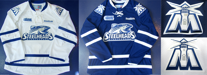
If you need a recap on where this team came from, see this blog post from May 31. Before the name change, the Steelheads were known as the Mississauga St. Michael's Majors. 

Now what do you think of all the new threads hitting the lower leagues this fall?

Thursday
Jul052012

Las Vegas Wranglers Launch New Logos

We may be light on new NHL logos and uniforms this summer, but the same can't be said for the minors. Today, the ECHL's Las Vegas Wranglers unveiled a brand new set of logos.

The Wranglers are celebrating their 10th anniversary in Sin City and have decided a revamped look is in order. Gone is the shadowy cowboy and his bull. In its place, well, what the team is still calling a cowboy — wearing an old time hockey mask.

Have to be honest. His head covering looks a lot more like a fedora than a Stetson. Combined with the creepy mask, that's almost unquestionably a Freddy/Jason hybrid depicted in that logo. And overall, it does feel like a downgrade from the Wranglers' previous visual identity.

Las Vegas joined the ECHL's ranks as an expansion member in 2003. So 2013 marks a decade in action. And while I may not be able to offer a glowing review for the new primary mark, I absolutely love the creativity behind the 10th anniversary mark — fives on a pair of dice. When have we ever seen an anniversary logo do anything so outside the box?

The two secondary wordmark-infused logos show us that the Wranglers are retaining a portion of their original identity. Basically, the font's not changing.

So how is the team spinning their new look?

“It’s a simple and bold new look to celebrate a terrific ten-year run in one of the greatest cities in the world,” said Wranglers president and COO Billy Johnson.

“We have always striven to bring a major league caliber experience to Las Vegas through sights, sounds and entertainment, and the new branding is the next step up.”

I don't know if a couple of logos can really do that, unless they think people are less likely to buy a ticket with John Wayne on it.

So it is certainly a simple design and that always wins points in my book. I just wish it looked a little more like a cowboy. What's your take on the new look?

Tuesday
Jun052012

Minor League Event Logos Revealed

Two big 2013 events in minor league hockey officially have logos now.

The ECHL is marking its 25th birthday with a new mark for the 2012-13 season. The logo was unveiled yesterday. It's your standard anniversary logo.

Here's what the league says: "The logo has the traditional ECHL logo surrounded by the number ‘25’ enclosed in a classic circle flanked on the left side by 1988 and on the right side by 2013 with the Premier ‘AA’ Hockey tagline on the bottom."

It'll be featured on all sorts of merchandise and anything related to the ECHL for next 12 months. Exciting stuff.

Like clockwork, we can count on the ECHL to celebrate an anniversary every five years. Here are the logos they've used over the last 15 seasons.


Elsewhere, the Hershey Bears unveiled the logo for the 2013 AHL Outdoor Classic, an event they'll be hosting next winter. And it looks very chocolatey.

The Bears will host the Wilkes-Barre/Scranton Penguins in the elements on Sun,, Jan. 20, 2013. This year also happens to be the Bears' 75th in existence. So mark another anniversary divisible by five.

By the way, back in the ECHL, the Colorado Eagles are celebrating their 10th anniversary. And of course there's a logo to go with it.

Thursday
May312012

Mississauga Steelheads Unveil Logo

Earlier this month, the OHL's Mississauga St. Michael's Majors were sold to new ownership who decided the nine-syllable name was too much of a mouthful. Beginning this fall, the team will be called the Mississauga Steelheads, and will have a sharp new logo to go with the new name.

The name was selected through fan voting and announced just after the sale of the franchise. Then on Tuesday, the new Steelheads logo was unveiled.

After the previous blog post — the unveiling of the Denver Cutthroats logo — I have to ask why trout are suddenly taking over hockey branding. Is it just the names? Granted, Steelheads and Cutthroats sound pretty menacing but when your logo is a silly-looking fish... Is it just me?

By the way, just because the fish looks silly doesn't mean the logo does. I'm a big fan of this one — you know, as far as fish logos go. And it's miles beyond the Cutthroats logo. Uniforms for the Steelheads are still to come.

In other news...

The ECHL is in the middle of another one of its growth spurts. Aside from the two expansion teams beginning play this year — whose branding efforts we've been following over the past few months — the league as also picked up two more graduations from the Central Hockey League.

Joining the Orlando Solar Bears and San Francisco Bulls as newcomers in 2012 are the Fort Wayne Komets and Evansville IceMen. I don't expect any significant logo or uniform changes for these teams as the graduate into a bigger league. By the way, the Colorado Eagles made the jump from the CHL to ECHL last year and now they're hosting next season's ECHL All-Star Classic.

As of the 2012-13 season, the ECHL has 23 teams in 16 states — including Alaska!

Tuesday
Apr102012

Solar Bears Unveil Jerseys

The Orlando Solar Bears officially unveiled their home and road jerseys today. The Solar Bears are one of the ECHL's two expansion franchises for the 2012-13 season. The San Francisco Bulls, just unveiled theirs last month.

As you can see from the photo provided by the team, they are very brightly colored. But I think we probably could've assumed that when we first saw the logos back in January. There's lots of purple and teal and orange and yellow.

If it all feels like something from the '90s, well, it kind of is. The Solar Bears are a reincarnation of an International Hockey League team that existed from 1995 to 2001. The look is basically the same... just, you know, updated for 2012.

I have to say that, personally, I'm a fan. Would I want to see every hockey team start dressing this flamboyantly? Of course not. But it's a nice breath of fresh air in a sport that thinks black is cool. It isn't. Plus, it's ice hockey in Florida. You gotta stand out. So I applaud the Solar Bears for their efforts here.

The teams says the jerseys are designed and manufactured by SP Appareal in Quebec. As is standard practice in the ECHL, the white one will be worn at home for the first half of the season, then purple the rest of the way.

One debate I'm sure we'll see is over the team using two different crests on these jerseys. I know a lot of readers prefer the uniformity (pun) of using the same logo on both sweaters. I'm on the fence. But if I had to choose one or the other, go with the logo on the white jersey. No need for all that text.

What do you think of the set?

Page 1 ... 3 4 5 6 7 ... 14 Next 5 Entries »