I admit it. I failed October. It's not fair to say there was no Icethetics-related news in the tenth month of 2011. It is fair to say I was too busy to write about it. When I wasn't at work I was on vacation or watching hockey games (best excuse for this crowd, probably) or otherwise preoccupied. It was good to have that little break, but it's time to get back and update everyone on what's been going on.
Pittsburgh to Host 2012 Entry Draft
 In a press conference held on Oct. 27, the NHL announced the Pittsburgh Penguins and their new CONSOL Energy Center would host the 2012 NHL Entry Draft this summer. And more pertinent to Icethetics readers, the league unveiled the event logo as well.
The logo is sticking to the same format first introduced in 2010 in Los Angeles which was followed up by the 2011 draft in Minnesota. Same font design and overall layout with some tweaks to customize the mark for the host city in some way.
Seems like the only way the NHL has to indicate the city of Pittsburgh graphically is with its bridges. The 2011 Winter Classic logo featured a stylized version of the Fort Pitt Bridge. It appears the 2012 draft logo is depicting one of the Three Sisters, or at least the tower design they all share. (Pittsburghers, correct me if I'm wrong.) Of course the skyline makes an appearance here as well.
I believe next summer's draft will be held June 22-23. Pittsburgh last hosted the NHL Draft in 1997.
Team Canada Goes Retro Again
 Team Canada alums Jeff Shantz, Martin Gelinas and Gord Sherven model the new third jersey
Canada's 2012 IIHF World Junior Championship team will be sporting throwback jerseys for at least one game when the tournament kicks off in a couple months. The alternate sweater is a refined version of one worn by the team between 1982 and 1994 and was unveiled on Oct. 25.
Here's the word from Hockey Canada:
The three maple leafs on the front of the jersey represent the three steps of the Program of Excellence, which is celebrating its 30th anniversary this year — the regional under-17 program, National Men’s Under-18 Team and National Junior Team.
In addition, the bottom trim includes a graphic that incorporates the logos from each of the 15 IIHF World Junior Championships that Canada has won since 1982, and the current Hockey Canada logo appears on each shoulder.
I especially like the detail in the bottom trim. Wish I had a better picture of that to share.
Canadians, do you approve?
ECHL Expands to Orlando
 Now we go back south of the border. Way south. Back to my home state, which has just been approved for another ECHL franchise. Orlando — home to Disney World and, at one time, the IHL's Solar Bears — will join the minor pro hockey ranks once again.
On Tuesday, the league's Board of Governors approved the Orlando expansion giving Estero's Florida Everblades their first in-state rival since the Pensacola Ice Pilots went away a few years ago. The club will play home games starting next fall at the Amway Center, which they'll share with the NBA's Orlando Magic should they solve their differences by then.
The Tampa Bay Lightning and St. Louis Blues met for a preseason tilt at the Amway Center and I recall the Lightning broadcasters gushing about the building and how perfect it is for hockey.
 At the moment, the new team doesn't have a name or logo, but their new website is decked out in Orlando Solar Bears colors. That team played their first season in 1995 and disappeared when the old International Hockey League did in 2001.
The Solar Bears had such a kooky name and logo. A polar bear wearing sunglasses? You can't beat that. Plus the color scheme seemed intent on irritating hockey traditionalists of every stripe — as if it weren't already bad enough they had to deal with hockey in Mickey Mouse land. And by the way, those colors had names like Solar Eclipse Black, Solar Purple and Sunset Orange. How can it not leave you with a silly grin? But it's certainly not the mid-90s anymore, so I'll expect something a bit tamer when the time comes.
Along with Orlando, you'll recall San Francisco will be entering the ECHL stage as well next fall. In September it was announced that the San Francisco Bulls will hit the ice for the 2012-13 season.
That's all I've got. If I've missed something, shoot me an email. (By the way, I know I said I'd get to Jacob Barrette's interview today, but I'm going to put that off until Friday in lieu of today's blog update.)
Update on Friday · Nov 4 · 2011 | 10:19 AM PDT by
 Chris
Chris
One more thing on the new ECHL club in Orlando. A reader named Justin pointed out in the comments that the domain solarbearshockey.com was bought by the new owners in September. More specifically, the buyer was The Bold Marketing Group, whose president is Bob Ohrablo, one of three partners in the group that owns the Orlando franchise. (For what it's worth, his bio says he previously worked with Howard Baldwin and the AHL's Connecticut Whale. So there's that.)
Yesterday I thought I'd follow up with a trademark search. And as luck would have it...

Filed on September 13, 2011, the ECHL now owns the Orlando Solar Bears trademark and logo. So maybe my wish to see the Solar Bears make a comeback wasn't so outlandish. Hey, they brought back the Trenton Titans. Granted, the Solar Bears haven't existed in 10 years, but I'm sure there are still plenty of fans that remember them fondly.
Unfortunately, I can't offer you a direct link to the page seen in the above screenshot, as that's not how the Trademark Electronic Search System (TESS) works. But a quick search will get you there.


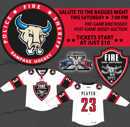 Over in the AHL, former Icethetics concept contributor Aaron Masik designed this specialty jersey for the San Antonio Rampage.


