Entries in jerseys (170)

Monday
Jul302012

New Sweaters Around the Minors

One after another this summer, teams across the minor leagues have been overhauling their looks. We've mostly been focusing on logos lately, so today we're switching gears. Check out some of the new jerseys that have been recently unveiled.

On Friday, the ECHL's Wheeling Nailers not only unveiled new sweater designs, but a revamped logo and color palette. Most notably, red is no longer one of the team's primary colors.

The Nailers' have been red, gold and black for as long as I can remember. But beginning in 2012, they switch to black and gold, just like their NHL affiliate, the Pittsburgh Penguins. In fact, their new home and road uniforms look awfully familiar.
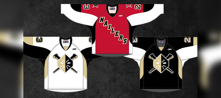
The new dark jersey (right) was actually introduced as a third last season. It gets the full-time treatment this fall along with a white version to match. Of course the red isn't completely disappearing. The Nailers will wear a red alternate uniform (center) which features the old logo on the shoulders.

A bit of a downgrade here, if you ask me. Shrinking the color palette often provides a cleaner look, but in this case, it just sort of flattens the Nailers' logo. As we've seen with the Penguins, Vegas gold is just too bland to be a team's only color.

For those not familiar with the ECHL, teams wear white at home for the first half of the season and switch for the second half. The Nailers say the red jersey will be worn on Sunday afternoons at WesBanco Arena.

Elsewhere in the ECHL, the South Carolina Stingrays unveiled their 20th anniversary logo along with a pair of new jerseys for 2012. The North Charleston-based club made the announcement on May 31.
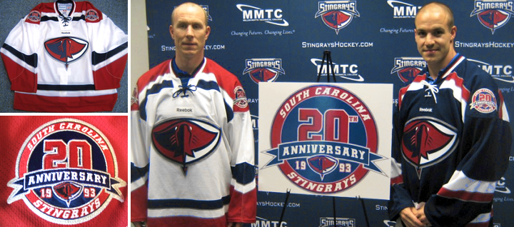
The Stingrays have done it right. These are some great-looking uniforms — even if the anniversary logo is a little too busy. Fans should be thrilled to see them hit the ice this fall. By the way, if you find yourself needing to add one of these to your collection, they're available.

And finally, the OHL's recently rebranded Mississauga Steelheads officially unveiled their uniforms last Friday. Here's a closer look at their new secondary logo.

And they'll look a lot like the nearby Toronto Maple Leafs when they hit the ice.
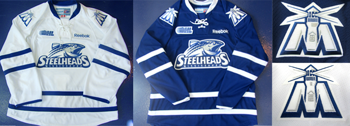
If you need a recap on where this team came from, see this blog post from May 31. Before the name change, the Steelheads were known as the Mississauga St. Michael's Majors. 

Now what do you think of all the new threads hitting the lower leagues this fall?

Tuesday
Apr102012

Solar Bears Unveil Jerseys

The Orlando Solar Bears officially unveiled their home and road jerseys today. The Solar Bears are one of the ECHL's two expansion franchises for the 2012-13 season. The San Francisco Bulls, just unveiled theirs last month.

As you can see from the photo provided by the team, they are very brightly colored. But I think we probably could've assumed that when we first saw the logos back in January. There's lots of purple and teal and orange and yellow.

If it all feels like something from the '90s, well, it kind of is. The Solar Bears are a reincarnation of an International Hockey League team that existed from 1995 to 2001. The look is basically the same... just, you know, updated for 2012.

I have to say that, personally, I'm a fan. Would I want to see every hockey team start dressing this flamboyantly? Of course not. But it's a nice breath of fresh air in a sport that thinks black is cool. It isn't. Plus, it's ice hockey in Florida. You gotta stand out. So I applaud the Solar Bears for their efforts here.

The teams says the jerseys are designed and manufactured by SP Appareal in Quebec. As is standard practice in the ECHL, the white one will be worn at home for the first half of the season, then purple the rest of the way.

One debate I'm sure we'll see is over the team using two different crests on these jerseys. I know a lot of readers prefer the uniformity (pun) of using the same logo on both sweaters. I'm on the fence. But if I had to choose one or the other, go with the logo on the white jersey. No need for all that text.

What do you think of the set?

Friday
Mar022012

WHL Player Wears Jerseys He Designs

Taylor Vause, Swift Current BroncosIt's probably a safe bet that most of the jersey concept designers here at Icethetics play hockey at a level no higher than recreation.

But there's always an exception. You should really get to know the captain of the WHL's Swift Current Broncos, Taylor Vause.

Vause emailed me this week to talk about a couple of the specialty sweaters his team has worn recently and subsequently auctioned off to benefit charities. What's interesting about these sweaters? He designed them. 

I'm sure more than a few Icethetics readers can claim they've worn jerseys they've designed for their beer league teams, but how many can say their work has raised nearly $15,000 for charity?

Vause, 20, wrote: "I have followed your site for a very long time [and] have always been a fan of jersey design. ... Over time, you've [written] posts about major junior hockey with regards to special event jerseys. For me, this is very interesting because I play at that level and I'm directly involved with those jerseys."

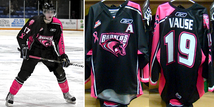
He's not kidding. Vause tells me he approached the Broncos last season about using a sweater he designed for Broncos Beat Breast Cancer Night on Feb. 4, 2011. As it turned out, the team liked his design — so they used it.

"I scored in that game while wearing the jersey I designed," Vause said. "Quite an awesome experience for me." Unfortunately, it was the Broncos' only goal as they fell 6-1 to the Medicine Hat Tigers.

Broncos Beat Breast Cancer Night / courtesy Taylor Vause

Between the jersey auction and the in-game sale of pink carnations, the Broncos raised $6,400 for the Canadian Breast Cancer Foundation. For the record, Vause's jersey sold for $755. That number was second only to the $1,000 one dedicated fan spent on Justin Dowling's jersey.

The story doesn't end there. "I was preparing for my fourth and final season of major junior hockey," Vause said of this year, "and I had already talked to my team's front office about doing another jersey for this season.

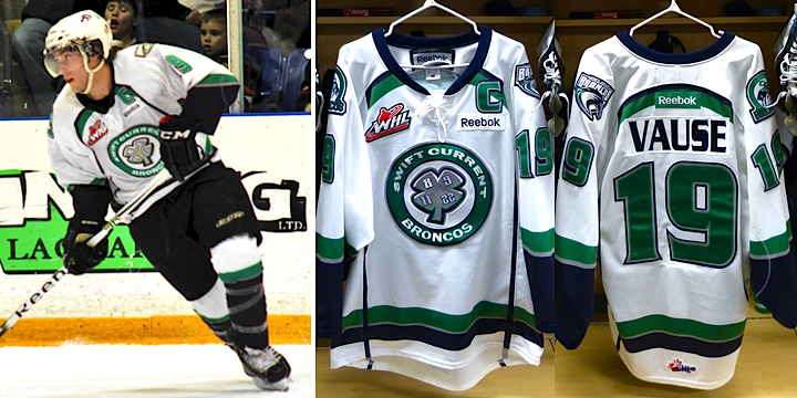
"I'm not sure if you know much about the Broncos history," said Vause. "There was a terrible bus accident 25 years ago and four [Broncos] players died. Since then we've always worn a four-leaf clover with the four players' numbers on it. Seeing as it was the 25th anniversary of the crash I thought it would be a great honour to do a Four Broncos memorial jersey."

Broncos Memorial Jersey / courtesy Taylor Vause

Once again, the Broncos used his jersey design. And again, "I scored in this game," said Vause. "Another amazing feeling to score in the jersey that I designed." And to complete the trifecta of history repeating itself a year later, Vause's goal was only one the Broncos scored in the Feb. 11 game, falling 4-1 to the Regina Pats.

Regardless, Vause is quick to point out that it was still a special night. "I was very proud of this jersey because of what it meant to the community," he said. "We did another jersey auction and this time around we raised $8,153.67 for our Education Fund."

You can read more about this jersey and see Vause wearing it in a photo shoot on the Broncos' website. 

"I'm hoping to continue designing jerseys for the Broncos and branch out to other teams in the league as well," Vause said. "Whether that happens or not remains to be seen but jersey design will continue to be a passion of mine either way."

Taylor's story is pretty cool and I appreciate him sharing it with us. He's on Twitter at @wizardofvause if you want to give him a follow. And if you want to check out some of his quirky Photoshop creations, here's a link.

Wednesday
Dec072011

NHL Recycling 2011 All-Star Jerseys?

Sens Town posts photo of apparently leaked 2012 All-Star jerseys — which look quite familiar

According to Ottawa-based blog Sens Town, the 2012 NHL All-Stars will wear the same uniforms they donned in 2011 in Raleigh. The blog claims to have "gotten ahold" of photos that prove this. The shot above shows the old jerseys with the 2012 All-Star Game logo on the shoulders.

In the blog post, Stephen Smith writes: "It appears the only difference is a few minor touches on the sides."

2011 NHL All-Star jerseysI'm not sure what he means by that unless he has other photos he didn't publish. From what I can see here, the design of both jerseys appear to be exactly the same as last year's — sides and all.

While the sweaters were highly unpopular with readers last year, personally, I was a fan. I love seeing the league try new things. It annoys me that ultra-traditionalists think every hockey uniform should look exactly like it did in 1960s. How perfectly dull. There's a time and place for it — the Winter Classic, for example.

So we'll see if this turns out to be true. I have no reason to believe it won't. In fact, in my Nov. 28 post about the Rangers' Winter Classic jersey unveiling, I flat out said I wouldn't be surprised if the league just recycled last year's All-Star look. It's a good one. It deserves to stick around another year or two.

That brings me to one last thought. Despite the NHL realigning next year, there won't be any need to reformat the Fantasy Draft/All-Star Game since players aren't divided up by conference anymore anyway. Having said that, I'm sure not everyone would agree. So after realignment in 2012, should the 2013 All-Star Game be reformatted? And if so, how?

Monday
Nov282011

Rangers Unveil Winter Classic Threads

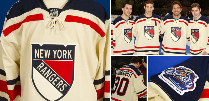
Today, the New York Rangers officially unveiled their 2012 Winter Classic sweater. And I'm happy to report that every so-called "leak" along the way proved wrong, leaving us all surprised this afternoon. For the most part.

While no fan concept or Chinese knock-off scored on the details, some of the larger, more obvious ideas are on display here. For example, the jersey is vintage white — in other words, not white. It's got a tie-up collar and a traditional striping pattern.

It's a very simple design but there's something about the oversized stripes that make the players almost look like kids. Not sure if that was intentional. But if it was, it's kind of brilliant. Part of the draw of the outdoor game is to recapture that feeling of children playing on the pond in tattered old sweaters. The vintage white adds to that, making the jerseys look unwashed.

Rangers unveil Winter Classic jerseyMany are likely to cry foul at the notion of the Rangers wearing the shield on their chest. For two short seasons between 1976 and 1978, the team stepped away from the text-only sweaters they'd worn for 50 years. And then of course in the late '90s they introduced the Lady Liberty jerseys, which were quite a hit. But other than that, they've basically used the same uniform design since, well, forever.

Much like the Boston Bruins' Winter Classic jersey from 2010, the Rangers' 2012 edition isn't based on any single design from their history, but is rather a combination of elements from the past spruced up with some new ideas.

Despite that, you have to ask yourself, when you look at it, do you immediately know it's a Rangers jersey? And I'd have to say yes. Regardless of seeing the crest, how can you call this anything but a Rangers sweater? Could be the colors. Could be the shoulders. Whatever it is, it works.

Time for links. In their official release, the Rangers credit the design to a partnership with Reebok. Our friends at the Hockey Uniform Database have the Rangers' complete sweater history on display for you. And you can find a few more pictures of the new threads on the team's Facebook page. And a lot more on Blueshirts United.

And if you've been living beneath a rock, the 2012 NHL Winter Classic at Citizens Bank Park in Philadelphia between the Flyers and New York Rangers takes place on Jan. 2 at 1 PM ET. Both jerseys are now officially out. (For those keeping score at home, we now have all of the new uniforms expected for the 2011-12 season — that is, unless the NHL breaks out new All-Star threads, which I don't expect.)

Anyway, what are your thoughts on what the Rangers will wear to the Winter Classic? It's close to what we had been expecting. Is that a good thing or a bad thing?