 Senators unveil Heritage third jersey / Senators
 Today, the Ottawa Senators officially unveiled their new Heritage Jersey, their alternate sweater from here forward. The new look syncs up with the leaks that have trickled out this summer, as the team previously confirmed.
The uniform design is a clever mix between modern aesthetics and the classic sweaters worn by the original Ottawa Senators club a century ago. While those early uniforms had stripes from top to bottom, nowadays, we see that as a rather garish look. So it's been simplified to a black jersey with wide stripes of red and "vintage white" around the chest, sleeves, waist and socks.
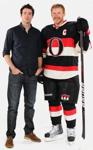 Jacob Barrette, the fan who helped develop the jerseyIn the past, I've maligned the overuse of this "retro" shade of white — meant to evoke aging fabric — but in this instance, it works very well. And regarding the question of whether it actually is off white, let me quote the team: "The uniform features the club’s official colours of black red and white, with the heritage jersey using an antique white that reflects uniforms of the past."
Senators Heritage Jersey photo gallery
Possibly the best part about this whole uniform is that it was a fan's concept that got the ball rolling on it.
The Senators not only credit graphic designer Jacob Barrette with helping to develop the uniform, but even included him in their press releases. In paying attention to their fans this way, I think the franchise just made a bunch of new fans here among Icethetics readers.
And I'm one of them. Bravo!
Unlike Barrette's concept, which featured the 2D version of the Senators logo introduced in 2007, the shoulder patches of this jersey are modeled after the "World's Champions" patches that the old Sens would sport after winning one of their many Stanley Cups.
Each patch reads "Ottawa Senators," but while the one on the right shoulder is in English, the one on the left is in French. Would that make this the NHL's first bilingual uniform?
If you haven't seen it yet, I recommend watching the video the Sens produced. It goes into detail about the history of the original uniform and how this one was developed. There's even a shot of Icethetics in it!
They show the third jersey poll we held a couple years ago. (It pops up at the 1:35 mark if you're looking for it.) Unfortunately they've framed out the name of the site. Still, Icethetics gets its first reference on an NHL team's official website, so I'll take it.
 Daniel AlfredssonOne last thing. The Sens also released a 13-game schedule for the Heritage Jersey. Several of the dates are quite different from the partial schedule I posted back in August.
- Thurs., Oct. 13 – vs. Colorado Avalanche
- Sun., Oct. 30 – vs. Toronto Maple Leafs
- Fri., Nov. 4 – vs. Montreal Canadiens
- Wed., Dec. 14 – vs. Boston Bruins
- Fri., Dec. 16 – vs. Pittsburgh Penguins
- Tues., Dec. 27 – vs. Montreal Canadiens
- Tues., Feb. 7 – vs. St. Louis Blues
- Sat., Feb. 11 – vs. Edmonton Oilers
- Fri., Mar. 2 – vs. Chicago Blackhawks
- Wed., Mar. 14 – at Montreal Canadiens
- Fri., Mar. 16 – vs. Montreal Canadiens
- Sat., Mar. 17 – vs. Toronto Maple Leafs
With four games on the schedule, it's the Habs who will face this jersey most often. They won't get to see the Sens' standard red at all, in fact. And the only time Ottawa will sport the Heritage look on the road will be in Montreal. So how about that.
Now that you've seen the new alternate uniform in full, has your opinion changed from the first leak of the design? I'm of the opinion this is the best sweater the Sens have ever worn. Am I on my own there?


 55 Comments
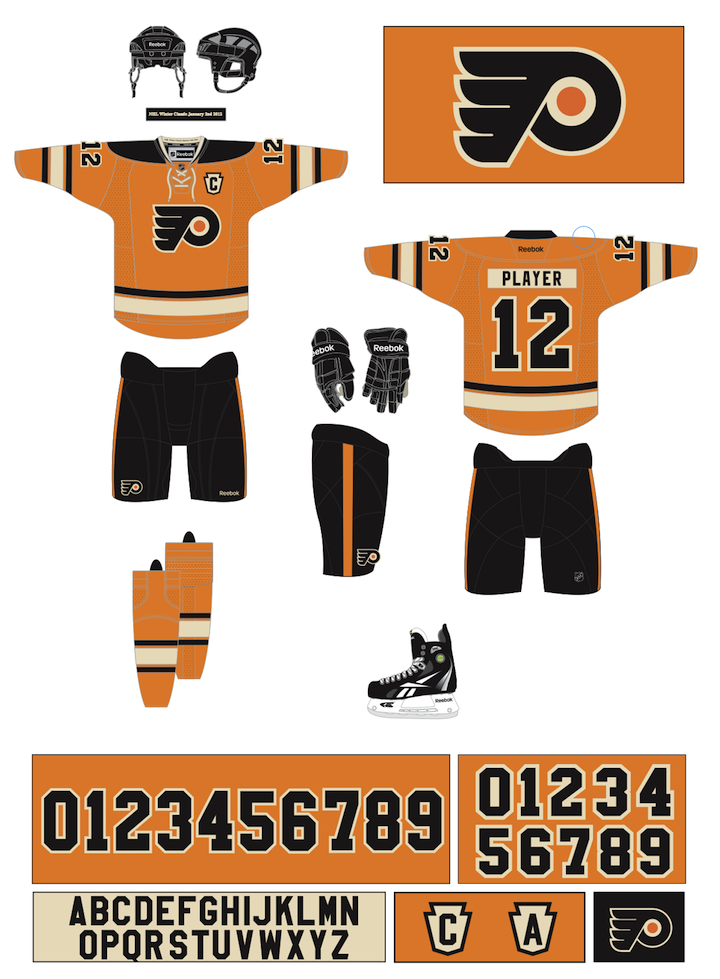
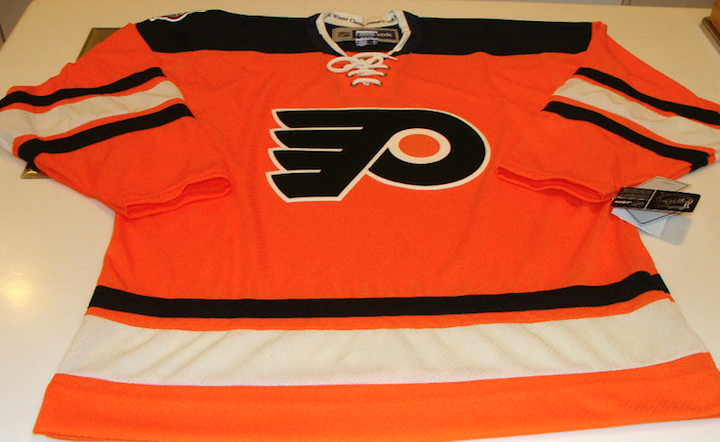 Could this really be the Flyers' 2012 Winter Classic jersey?