Entries in minors (159)

Tuesday
Jun052012

Minor League Event Logos Revealed

Two big 2013 events in minor league hockey officially have logos now.

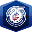
The ECHL is marking its 25th birthday with a new mark for the 2012-13 season. The logo was unveiled yesterday. It's your standard anniversary logo.

Here's what the league says: "The logo has the traditional ECHL logo surrounded by the number ‘25’ enclosed in a classic circle flanked on the left side by 1988 and on the right side by 2013 with the Premier ‘AA’ Hockey tagline on the bottom."

It'll be featured on all sorts of merchandise and anything related to the ECHL for next 12 months. Exciting stuff.

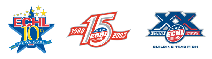
Like clockwork, we can count on the ECHL to celebrate an anniversary every five years. Here are the logos they've used over the last 15 seasons.


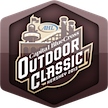
Elsewhere, the Hershey Bears unveiled the logo for the 2013 AHL Outdoor Classic, an event they'll be hosting next winter. And it looks very chocolatey.

The Bears will host the Wilkes-Barre/Scranton Penguins in the elements on Sun,, Jan. 20, 2013. This year also happens to be the Bears' 75th in existence. So mark another anniversary divisible by five.

By the way, back in the ECHL, the Colorado Eagles are celebrating their 10th anniversary. And of course there's a logo to go with it.

Thursday
May312012

Mississauga Steelheads Unveil Logo

Earlier this month, the OHL's Mississauga St. Michael's Majors were sold to new ownership who decided the nine-syllable name was too much of a mouthful. Beginning this fall, the team will be called the Mississauga Steelheads, and will have a sharp new logo to go with the new name.

The name was selected through fan voting and announced just after the sale of the franchise. Then on Tuesday, the new Steelheads logo was unveiled.

After the previous blog post — the unveiling of the Denver Cutthroats logo — I have to ask why trout are suddenly taking over hockey branding. Is it just the names? Granted, Steelheads and Cutthroats sound pretty menacing but when your logo is a silly-looking fish... Is it just me?

By the way, just because the fish looks silly doesn't mean the logo does. I'm a big fan of this one — you know, as far as fish logos go. And it's miles beyond the Cutthroats logo. Uniforms for the Steelheads are still to come.

In other news...

The ECHL is in the middle of another one of its growth spurts. Aside from the two expansion teams beginning play this year — whose branding efforts we've been following over the past few months — the league as also picked up two more graduations from the Central Hockey League.

Joining the Orlando Solar Bears and San Francisco Bulls as newcomers in 2012 are the Fort Wayne Komets and Evansville IceMen. I don't expect any significant logo or uniform changes for these teams as the graduate into a bigger league. By the way, the Colorado Eagles made the jump from the CHL to ECHL last year and now they're hosting next season's ECHL All-Star Classic.

As of the 2012-13 season, the ECHL has 23 teams in 16 states — including Alaska!

Thursday
May172012

Denver Cutthroats Unveil Logo

After losing the Colorado Eagles to the ECHL last season, the Central Hockey League is expanding back into the Centennial State in 2012 with the addition of the Denver Cutthroats.

The CHL made the announcement about an expansion team in Denver last month, but the team officially unveiled its name, colors and logo today. Interestingly, the new look was created by Denver-based Adrenalin, the same agency also responsible for the Colorado Avalanche and Phoenix Coyotes logos in the NHL.

So it's troubling to see them really miss the mark on this logo. But let's face it, this is a CHL team so I'm assuming they didn't exactly put their "best people" on it. They probably have bigger fish.

So it's a trout in a D with mountains and river rapids. Not a bad idea, but for some reason it ended up looking like it was drawn by an amateur for a logo contest you might find here on Icethetics.

That critique may have been a little harsh, so I'll balance it out. I love the color scheme. Nobody in hockey really uses that shade of green and I don't understand why not. I like that the blue is muted but not necessarily navy. And together with those two colors, the red accent really pops off the screen.

Here's some extra stuff from the team's press release:

“We wanted to be sure the logo included elements and colors that depict the state of Colorado and the city of Denver,” said Adrenalin President Dan Price. “The trout maintains a position between white mountain peaks and river rapids, and breaks through a forward moving ‘D’ — representative of Denver's progressive population.”

The Cutthroat Trout was named Colorado's state fish in 1994.

Jersey designs will probably be unveiled later this summer, but no specific mention was made in the press release.

For more about the team, check out their Facebook page, Twitter feed and official website.

Meantime, what do you think of the logo? Am I being too critical or does it deserve to be fileted? (Sorry, that was the last pun.)

Tuesday
Apr102012

Solar Bears Unveil Jerseys

The Orlando Solar Bears officially unveiled their home and road jerseys today. The Solar Bears are one of the ECHL's two expansion franchises for the 2012-13 season. The San Francisco Bulls, just unveiled theirs last month.

As you can see from the photo provided by the team, they are very brightly colored. But I think we probably could've assumed that when we first saw the logos back in January. There's lots of purple and teal and orange and yellow.

If it all feels like something from the '90s, well, it kind of is. The Solar Bears are a reincarnation of an International Hockey League team that existed from 1995 to 2001. The look is basically the same... just, you know, updated for 2012.

I have to say that, personally, I'm a fan. Would I want to see every hockey team start dressing this flamboyantly? Of course not. But it's a nice breath of fresh air in a sport that thinks black is cool. It isn't. Plus, it's ice hockey in Florida. You gotta stand out. So I applaud the Solar Bears for their efforts here.

The teams says the jerseys are designed and manufactured by SP Appareal in Quebec. As is standard practice in the ECHL, the white one will be worn at home for the first half of the season, then purple the rest of the way.

One debate I'm sure we'll see is over the team using two different crests on these jerseys. I know a lot of readers prefer the uniformity (pun) of using the same logo on both sweaters. I'm on the fence. But if I had to choose one or the other, go with the logo on the white jersey. No need for all that text.

What do you think of the set?

Wednesday
Mar282012

Solar Bears Prep Jersey Unveiling

The ECHL's Orlando Solar Bears recently announced they will officially unveil their uniforms on Tuesday, April 10 — six months before they take the ice for the first time.

This announcement was made a week ago but I kept forgetting to get it on the blog. It was made as part of a contest the team is referring to as a local "star search." They're launching a marketing campaign for their inaugural season that centers on the tag line "I am a Solar Bear" and they want about a dozen fans to be the faces of it.

That event is being held on Monday at the RDV Sportsplex in Orlando, Fla. (The Solar Bears will play their home games at the Amway Center, home of the NBA's Magic.) The winners of the "star search" will be the first to see the new Solar Bears jerseys as they'll be photographed wearing them. Presumably, the campaign will be ready to launch the following week when the jersey is shown publicly for the first time.

I would ask that, if there are any Icethetics readers in Orlando planning to take part, you clue us in on some of the design features of the new sweaters. But more than likely, if you got the chance to see it early, you'd be required to sign an agreement that would restrict you from sharing details with a blog like this one.

Once upon a time, this is what was worn by a team called the Orlando Solar Bears.

These Solar Bears played in the International Hockey League for six seasons and won the last Turner Cup championship before the IHL disappeared in 2001.