Entries in minors (159)

Thursday
Sep272012

Rivermen to Sport Fan-Made 3rd Jersey

The AHL will very likely benefit from an influx of temporary new fans this season if this NHL lockout business keeps up. But the Peoria Rivermen are already benefitting from their existing fans in the form of a newly designed third jersey.

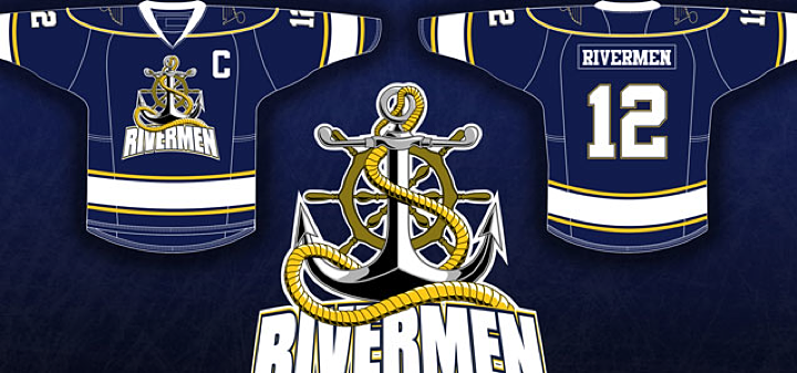
On August 27, the team unveiled this creation — the winner of a jersey design contest held over the summer. It beat out three other submissions with about 40% of some 1,400 votes cast over a three-week span.

The jerseys will be worn by the Rivermen in their game on Dec. 15 at Carver Arena against the Milwaukee Admirals. The jerseys will be auctioned off to the public following the game.

“I would like to say thank you to the Peoria Rivermen staff for creating such a unique opportunity,” said [winning designer Ryan] Malaschak. “Being a graphic artist and a passionate hockey fan my entire life, it has been a dream of mine to create a game-worn jersey at a professional level.”

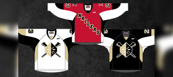
The contest was opened on July 1 and these four finalists were revealed a month later.

It seems to me they were all great options. But I was partial to this one by Erik Kuhre.

Think you can do better? Submit your concept to icethetics@gmail.com and it may just show up on Concepts page someday soon.

Monday
Sep242012

Gladiators Mark 10 Years in Georgia

Before we dive in, two things: 1) I'm back. The The IceHL 2012 Yearbook — a labor of love and some intense work over the last few months — is finished! And 2) that means I'm getting back to the blog. And even though it's been a quiet year, I'm determined to find ways of keeping Icethetics interesting. Even if I have to make up news.

For today, however, I don't have to make anything up.

The ECHL's Gwinnett Gladiators unveiled their 10th anniversary logos last Thursday. During the 2012-13 season, they'll be celebrating "A Decade of Excellence and Achievement," as they put it. Of course that's ignoring the eight previous years the club spent in Alabama as the Mobile Mysticks.

The Gladiators primary 10th Anniversary Season Logo is a stylized number ten with the distinctive Gladiators head profile logo incorporated into the zero. It also features roman numerals along the side denoting the years of operation, 2003 to 2013. The Gladiators will also utilize a secondary logo that features a roman numeral "X" incorporating the classic "G" shield/sword logo version and stylized banner indicating the team’s tenure.

The Gladiators are affiliated with the Phoenix Coyotes. And most of the people at their games used to be Thrashers fans, right? There's gotta be a joke in there somewhere about fans getting shafted. I'm just not clever enough to find it.

Guys, the IceHL Yearbook was a huge weight off my shoulders and I'm tired of seeing this page so static. There's been a lot of news I haven't covered over the last month or so and it's my goal to put it here with new posts every day or at least every other day for the next several weeks.

After that? I don't know. Maybe we get some Top 10 lists going. We all like lists, right?

And let there be NHL hockey before 2013... please!

Wednesday
Aug292012

Hershey Bears Unveil New Logo!

It's official. The AHL's Hershey Bears unveiled their revamped look this afternoon, which includes all new logos and uniforms. The new image is all about making old new again.

A team video unveiling the new look, says it's all about going back to chocolate and white again. But the way I see it, less is more and this new set of logos looks positively incredible. Take a look at some of the alternate and secondary marks.

Definitely beats the old logo — by a lot! Naturally, the new look was created by The Joe Bosack Graphic Design Co. (As though it could've been anyone else.) Bosack is also responsible for, well, just about every good modern sports logo out there.

The Bears' new color scheme also puts the 2013 Outdoor Classic logo into context. Hershey will be hosting the event this season.

So what do you think of this new look for the Hershey Bears?

Monday
Jul302012

New Sweaters Around the Minors

One after another this summer, teams across the minor leagues have been overhauling their looks. We've mostly been focusing on logos lately, so today we're switching gears. Check out some of the new jerseys that have been recently unveiled.

On Friday, the ECHL's Wheeling Nailers not only unveiled new sweater designs, but a revamped logo and color palette. Most notably, red is no longer one of the team's primary colors.

The Nailers' have been red, gold and black for as long as I can remember. But beginning in 2012, they switch to black and gold, just like their NHL affiliate, the Pittsburgh Penguins. In fact, their new home and road uniforms look awfully familiar.

The new dark jersey (right) was actually introduced as a third last season. It gets the full-time treatment this fall along with a white version to match. Of course the red isn't completely disappearing. The Nailers will wear a red alternate uniform (center) which features the old logo on the shoulders.

A bit of a downgrade here, if you ask me. Shrinking the color palette often provides a cleaner look, but in this case, it just sort of flattens the Nailers' logo. As we've seen with the Penguins, Vegas gold is just too bland to be a team's only color.

For those not familiar with the ECHL, teams wear white at home for the first half of the season and switch for the second half. The Nailers say the red jersey will be worn on Sunday afternoons at WesBanco Arena.

Elsewhere in the ECHL, the South Carolina Stingrays unveiled their 20th anniversary logo along with a pair of new jerseys for 2012. The North Charleston-based club made the announcement on May 31.

The Stingrays have done it right. These are some great-looking uniforms — even if the anniversary logo is a little too busy. Fans should be thrilled to see them hit the ice this fall. By the way, if you find yourself needing to add one of these to your collection, they're available.

And finally, the OHL's recently rebranded Mississauga Steelheads officially unveiled their uniforms last Friday. Here's a closer look at their new secondary logo.

And they'll look a lot like the nearby Toronto Maple Leafs when they hit the ice.

If you need a recap on where this team came from, see this blog post from May 31. Before the name change, the Steelheads were known as the Mississauga St. Michael's Majors. 

Now what do you think of all the new threads hitting the lower leagues this fall?

Monday
Jul232012

Providence Bruins Update Logos

The parade of new minor league logos this summer continues with the AHL's Providence Bruins, who made their updated look official on Monday.

The new primary and secondary marks have been in use on the team's alternate jersey since 2010 and the upgrade is a welcome change. And it's all about simplifying the club's look, which is derived from its NHL affiliate, the Boston Bruins. Presumably, that third jersey will become the primary dark sweater now alongside a new white one.

The new secondary logo is based on the mark used in Boston since the Bs' 2007 facelift.

Founded in 1992, the Providence Bruins are celebrating their 20th anniversary. Perfect time for a sharp new identity. Even if it isn't completely original. Here's a blurb from the press release:

This new logo also represents a fundamental shift in focus for the Providence Bruins brand towards a more traditional, “old-time hockey” look and feel. This move coincides with the 2013 Dunkin’ Donuts AHL All-Star Classic, hosted by the Providence Bruins the weekend of January 25-28, which also reflects the new direction of the team’s visual identity.

Ah, yes the 2013 AHL All-Star Classic. We have the logo for that, too.

No surprise it features the Bruins' new refined spoked P logo. It's a really nice All-Star mark, actually. Too bad it had to be marred by a corporate sponsor who's colors are neon orange and hot pink. So how do you feel about the new look of pro hockey in Rhode Island?