Entries in minors (159)

Friday
Jul132012

Pensacola Ice Flyers Get Revamped!

For three years, they were the team with — unquestionably — the worst logo and uniforms in all of professional hockey. That all changed on Thursday.

The Pensacola Ice Flyers unveiled a brand new identity that's millions of miles beyond the monstrosity they entered into the world upon joining the Southern Professional Hockey League in 2009.

If you're struggling to remember said monstrosity, allow me to remind you. It was terrible. Objectively terrible, if that's even possible. I'm not sure that thing could actually be considered "design" as we know it. But now it is no more, I'm happy to report.

The Florida panhandle team still has a pretty awful name, but it has meaning to the people of Pensacola and, heck, these phenomenal logos just make the "Ice Flyers" moniker look cooler, if nothing else. This is a definite win in the minor league logo design department. And it may well be the best logo in the SPHL at this point — which, to be fair, isn't exactly saying much.

I'm very excited to see this team recognize the need for a revamp and hire a pro to make it happen. Incidentally, I haven't been able to track down the name of the designer or creative firm. If anyone knows, I'd love to be able to add a link to this post.

Here's a look at the new secondary marks designed for the Ice Flyers.
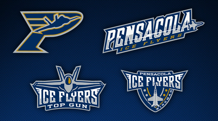
Certainly playing up the Top Gun theme. I sense some specialty jersey nights in the seasons ahead. All of these elements just look great — at least in comparison to their predecessor.

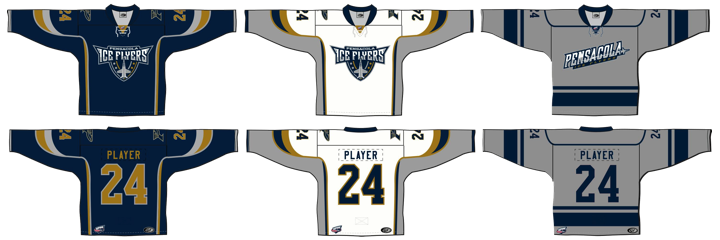
Anyway, enough gushing from me. Time for you to weigh in. While you put your thoughts together on this new look, I'll leave you with Pensacola's new set of sweaters.
Thursday
Jul052012

Las Vegas Wranglers Launch New Logos

We may be light on new NHL logos and uniforms this summer, but the same can't be said for the minors. Today, the ECHL's Las Vegas Wranglers unveiled a brand new set of logos.

The Wranglers are celebrating their 10th anniversary in Sin City and have decided a revamped look is in order. Gone is the shadowy cowboy and his bull. In its place, well, what the team is still calling a cowboy — wearing an old time hockey mask.

Have to be honest. His head covering looks a lot more like a fedora than a Stetson. Combined with the creepy mask, that's almost unquestionably a Freddy/Jason hybrid depicted in that logo. And overall, it does feel like a downgrade from the Wranglers' previous visual identity.

Las Vegas joined the ECHL's ranks as an expansion member in 2003. So 2013 marks a decade in action. And while I may not be able to offer a glowing review for the new primary mark, I absolutely love the creativity behind the 10th anniversary mark — fives on a pair of dice. When have we ever seen an anniversary logo do anything so outside the box?

The two secondary wordmark-infused logos show us that the Wranglers are retaining a portion of their original identity. Basically, the font's not changing.

So how is the team spinning their new look?

“It’s a simple and bold new look to celebrate a terrific ten-year run in one of the greatest cities in the world,” said Wranglers president and COO Billy Johnson.

“We have always striven to bring a major league caliber experience to Las Vegas through sights, sounds and entertainment, and the new branding is the next step up.”

I don't know if a couple of logos can really do that, unless they think people are less likely to buy a ticket with John Wayne on it.

So it is certainly a simple design and that always wins points in my book. I just wish it looked a little more like a cowboy. What's your take on the new look?

Monday
Jul022012

Syracuse Crunch Unveil New Logo

The AHL's Syracuse Crunch unveiled their new logo today. And this is it.

As rumored on Wednesday, it's a reboot of the club's original superhero mark from 1994 with the colors of its new NHL affiliate, the Tampa Bay Lightning. (Hey, by the way, are those lightning bolts on his helmet?)

For an upgrade, it's not bad. I would've liked to have seen the CRUNCH font get a bit of a modernization as well, but that might be too much to ask. Of course it is the thing that ties the team's various identities together. It hasn't changed since 1994.

New uniforms will be unveiled in October when the AHL season gets underway. And for those of us who didn't know, Syracuse's superhero dude is named Crunchman. He replaces Al, the (world's only) Ice Gorilla who has reigned as the team mascot since 1999.

Honestly, I don't have much more to say about it. It's underwhelming even if I can't say it's terrible. Though many readers tend to react to new logos in hyperbole so I'm sure we'll see that in the comments. Beyond that, what are your thoughts?

Wednesday
Jun272012

New Look Coming for Crunch

Say goodbye to this logo. The AHL's Syracuse Crunch will unveil a completely new look on Monday, July 2, according to the Syracuse Post-Standard.

The rebranding efforts apparently come as part of the Crunch's new affiliation agreement with the Tampa Bay Lightning. So presumably, the Crunch will start wearing blue next season and my tongue-in-cheek recolor from the weekend is looking less ridiculous.

Specifically, the article says, "The Lightning deal allows Syracuse to rebrand its look, starting with a new logo and colors it will unveil on July 2." Meaning along with the new colors, we will see a new primary mark. That's probably the best news of all.

But then it may not be all that new. I'm told the Crunch could be looking at something from their history. The franchise began life as the Hamilton Canucks in 1992, moving to Syracuse, New York in 1994. At that point, they introduced the comic book-style logo seen here in purple, gold and green.

Obviously, my crudely recolored version of that logo won't be what we get. But it will probably be the basis. I imagine the new look will be a modern update that looks less like it came off the pen of a cartoonist. But I'm just guessing. I've also been told the new colors are blue, white and silver.

Now the history lesson. I've already mentioned Hamilton and the 1994 relocation to New York. Five years after that, on Sept. 30, 1999, the Crunch entered into an affiliation agreement with the Columbus Blue Jackets and changed their logo and colors to match their new parent club — a full season before the Jackets would ever hit the ice, by the way. That was also the introduction of the abominable snowman ice gorilla.

In 2010, the Crunch hooked up with the Anaheim Ducks and changed their colors again. So this rebranding shouldn't surprise us. The Crunch have a track record of taking on the look of their NHL affiliate. 

Elsewhere in the AHL, the Hershey Bears are apparently getting new uniforms with a redesigned logo. Can't tell you much about the source of this info, so take it for what it's worth. Also expecting a new third jersey for the Wilkes-Barre/Scranton Penguins (no surprise there), so we should certainly keep an eye on these teams throughout the summer for any news.

Saturday
Jun232012

Lightning, Ducks Swap AHL Affiliates

Earlier this week, the Tampa Bay Lightning announced a new AHL affiliation agreement with the Syracuse Crunch. That will lead the Anaheim Ducks to align with the Bolts' former affiliate and 2012 Calder Cup champion Norfolk Admirals in the fall.

I've since gotten a lot of questions about whether either of the Crunch or Admirals will redesign their jerseys to match their new NHL affiliates. The short answer is: I don't know. The funny answer is this...

Obviously, I just made this graphic for fun. I have no reason to believe either team will change their colors. If they were to do any sort of redesign, I don't see it happening this season. But I'll keep an eye on it, of course.

Meantime, what do you think about the new color treatments I gave the Crunch and Ads?