Entries in minors (159)

Saturday
Aug212010

A Tail of a Whale

With word coming down this week that merchandise emblazoned with that classic Hartford Whalers logo is among the hottest selling in the NHL, it's only fitting that we talk about its inexorable return to professional hockey.

It's been 13 years now since the Whalers left Connecticut for Raleigh, N.C. Despite that, T-shirts, hats and jerseys with that iconic blue-and-green mark continue to sell like that of a team that just won the Stanley Cup.

Howard BaldwinHoward Baldwin is a man bent on bringing back his team. And he may get his wish sooner than we think.

In June, Icethetics reported on Baldwin's plans for Whalers Hockey Fest 2011. A day of outdoor hockey featuring Connecticut's best college teams. But he's not nearly done.

Howlings, a blog dedicated to the AHL's Hartford Wolf Pack, has been following some interesting developments. Blogger Mitch Beck says Baldwin will be taking over the Wolf Pack and renaming it the Connecticut Whalers.

As many have read in local newspapers, or here on Howlings, the last hurdle has been cleared for Howard Baldwin and his Whalers Sports & Entertainment to take over operation of the Hartford Wolf Pack.

Well, it is only a matter of time now, as early as next week, that it should become official. When that happens, the Hartford Wolf Pack will be no more and the new team will be the Connecticut Whalers.

This will be a huge moment for the city of Hartford and for the players as well. With Baldwin running things there should be a renewed interest in the team and making it an event once again. Expect the team to once again start drawing big crowds and become the place to be.

Connecticut Whalers T-shirtThat was posted about a month ago. While we wait for something official, Beck at Howlings continues to stress the inevitability of the change as recently as a week ago.

[The] Greenville Road Warriors will be the new ECHL affiliate for the Rangers and the Connecticut Whalers… Technically they’re still the Hartford Wolf Pack, but that’s only a matter of time.

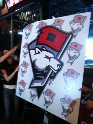
And even now you can buy a Connecticut Whalers T-shirt from Baldwin's website, WhalersProShop.com — complete with a brand new logo and everything. The potential new logo for a rebranded Wolf Pack franchise?

It's not a great logo, but how much can really stand up to that original HW design? Some people go years before even noticing the H in the negative space. It's a logo so great, it gets featured in a book titled Design Principles and Problems, published in 1995 and referenced by Paul Lukas on Uni Watch last December.

Whalers logo evolutionWhen the WHA folded in 1979, the New England Whalers were forced by the Boston Bruins to change their name before they could enter the NHL. That meant the need for a new logo. The following is an excerpt from Design Principles and Problems:

When Peter Good was commissioned to create a new logo for the Hartford Whalers hockey team, he was given a specific message to convey. Good's challenge was to give the H of Hartford and the W of Whalers equal billing in a design that suggests whaling and the feeling of a partnership between a dynamic team and a dynamic city.

The trial sketches and the final solution reveal Good pushing this basic idea through a variety of solutions until a design evolved that conveyed the desired message well. The first solution shown (a) was accepted by the client but unsatisfactory to Good because the H repressed by the enclosed, unfilled area was stronger than the W.

In the second sketch (b), Good softened the impact of the H by opening it to look more like harpoons than in the first solution. In the third sketch (c) he extended the attempt to soften the H, pushing the harpoons to the side. This possibility he rejected as ugly. In the fourth sketch (d) Good tried omitting the harpoons. The result balanced the W and H but was not particularly exciting.

The fifth sketch (e) reveals the sudden inspiration of using a whale's tail. Sketch after sketch followed, with Good trying to develop a more flowing interlock between the tail and the W. When he hit on the final solution, he wrote, "Eureka! Good 'W' and good 'H' living happily together."

Finally, Good notes a special effect created in the "empty" H space: Light seems to flow into the H legs from the outside, becoming trapped in glimmering optical pools of brightness at their base. This heightens the contrast between the straight-based H and the curved both of the W, giving the design an exciting look.

Stories like this always help me find inspiration when designing.

Anyway, though Baldwin might get his wish with the Wolf Pack, the chances of the NHL returning to Hartford in the near future are slim. Let's not forget the nature of expansion in the NHL over the past decade. This has been the league's most stable period since the 1960s.

Brian Favat of SB Nation Boston also makes a good point:

Thirteen years later, the primary factors that caused the Whalers to leave town — a viable market and lack of modern playing facilities — are still present. When the Whalers were in town, Hartford was the smallest market in the NHL. As Hartford straddles both the New York and Boston markets, their marketability was severely limited by geography.

In addition, Hartford still doesn't have a new hockey arena. The city's XL Center is 35 years old and there are no plans to build a new arena. The AHL's Hartford Wolf Pack ranks only 18th in the AHL in attendance, drawing a little over 4,000 fans a night.

Hartford's limited appeal as a viable NHL market isn't the city's only hurdle to overcome. Today, the city faces increased competition from cities like Kansas City, Winnipeg, Quebec and Hamilton, all vying for their own NHL franchise. Despite these obstacles, however, Baldwin remains positive about his chances.

Icethetics will continue to track any Howard Baldwin-related Whalers news, including any possible name change for the Wolf Pack.

Saturday
Aug072010

Falcons Saga Isn't Over Yet

Many were outraged by the blatant logo theft by a certain NAHL team last month. Now, the story gets even more pathetic as they throw everything at the wall to see what sticks.

NAHL's Port Huron Fighting Falcons 2010-11 identity package

On Friday, the NAHL's Port Huron Fighting Falcons officially unveiled not one, not two... but three new logos. And the worst part, is that the primary mark is the same one — with more minor alterations — that got them in trouble in the first place.

Nothing has ever really made sense about this team's branding decisions.Times Herald beat writer Paul Costanzo has been covering the team throughout Falconsgate. He says the logo above labeled "road crest" has been designated by the club as the official primary logo. The secondary logo, which presently appears on the team's website, will be worn on the home jersey.

The logo posted on Icethetics last week will more fittingly be a shoulder patch on both sweaters. By the way, not to add to the confusion, but the NAHL's website has it flipped, saying the home crest is the primary mark. And it would be odd if the home sweater gets the secondary logo. But nothing has ever really made sense about this team's branding decisions.

Which brings me to my next point: Who thought these three logos made for a single cohesive identity? Holy mismatch, Batman! They all use the same colors, mercifully, but not in the same manner. Only the home crest and shoulder patch appear to be in the same neighborhood, and you'll find out why in the next paragraph.

Having said my peace, I do like the new home crest. It is very much a solid minor league logo. In fact, I learned tonight that it was created by an Icethetics concept artist. Chad Stilson, who is also active in Icethetics contests, was hired by the Falcons to create the home crest and shoulder patch. You can see his full identity package here. (For the record, he says the team hired someone else to rework Mike Ivall's logo again.)

My thanks to Mike B. for keeping on top of this epic saga and introducing the term Falconsgate into the Icethetics lexicon.

By the way, this week's minor league wrap-up continues below, so keep reading.

Admirals go black on the road

Milwaukee Admirals unveil road jerseyThe AHL's Milwaukee Admirals unveiled a brand new road sweater on Thursday.

The Ads will wear the black jersey to the right for away games starting in the fall as they retire the grey one which has been in use for the past four seasons. Here's an excerpt from the release posted on the team's website:

The new jersey features the traditional Admirals colors (white, black, and ice blue) with black being the most prominent. Just like the home white jerseys, an Admiral skull adorns the chest, while blue accents run down the sides and also on the sleeves. The name and numbers on the backs of the jersey are white with a blue outline.

“We are excited to unveil this new look for Admirals hockey for the 2010-11 season,” said Greenberg. “The new black jerseys represent the toughness and ‘Never Say Die’ attitude by which our team plays and we look forward to playing in them for our 10th season in the American Hockey League.”

In case you don't have instant recall of the old gray sweater, all they did was fill in the gray parts with black and add a blue outline to the crest. The striping remains the same.

Kudos to C.J. for the heads-up on this one!

Chilliwack finally adds third jersey

Chilliwack unveils third jerseyThe WHL's Chilliwack Bruins unveiled their first-ever third jersey on Tuesday.

The maroon sweater will make its debut in October, according to the team. It will mark the club's 5th anniversary in the WHL. Additional details in this block quote:

For the first time in franchise history, the Bruins will wear a third jersey. The jerseys will debut on October 2nd versus the Kamloops Blazers as part of the Bruins First Nations Night. The jerseys worn that night will be auctioned off during the game and winning bidders will receive their jersey immediately following the game.

In other words, the Bruins like their new alternate jersey so much, they're giving them away as soon as the game is over. No, but seriously, if you're a Chilliwack fan, get one!

The Canadian junior clubs tend to be pretty good about designing awesome uniforms. It's those shady Americans you have to watch out for.

Thanks to Matt M. for the tip!

When Third Jerseys Attack!

Lastly, the OHL's Owen Sound Attack will also debut their first-ever third jersey this fall. The announcement, made on July 22, says the jerseys will be unveiled in "mid August."

Owen Sound Mercurys, 1951The alternate sweater will pay tribute to area's original hockey team, the Owen Sound Mercurys, which played from 1947 to 1957. They wore blue and orange, in contrast to the Attack's red and gold.

This team photo of the 1951 Allan Cup champion Mercurys (right) was the best image I could find on short notice depicting the historic uniforms the Attack will replicate this season.

The PR director had this to say on the team's website:

“Reebok has done an exceptional job in making this come to life”, says Brent Fisher, Director of Marketing and Public Relations.

“The jersey is an exact replica right down to the heavy stitching and felt crest and they have matched the pants and gloves perfectly. I wasn’t around during that time, but hopefully those who were or had relatives play on the team will be proud to see the uniform again. I hope it means something to them.”

“This is the first time the Attack have worn a third jersey and I know many of the fans and also the players are very excited about it. We can’t wait for the guys to hit the ice on September 25th,” said Fisher.

The jerseys will be worn for every Wednesday night home game throughout the season, plus the home opener on Saturday, Sept. 25. Replicas will be sold in the team store and game-worn sweaters will be auctioned off throughout the season.

Thanks to C. McPhee for the link!

Saturday
Jul312010

The Minor League Report

Because I'm pretty awful at keeping up with minor league news, things tend to pile up. When that happens, I usually end up with a patchwork post featuring a wide variety of items. Such as this one.

Everblades jersey history on a poster

Everblades jersey history posterWhile working an event today at Germain Arena, home of the ECHL's Florida Everblades, I noticed the team was handing out a neat new poster (right).

It's the History of the Everblades Jersey — not that it's a very long one. The Blades hit the ice in 1998 and only changed their uniform once in their first decade, after a run to the Kelly Cup Finals in 2004. They wore special 10th anniversary sweaters throughout the 2007-08 season, my first year living in Southwest Florida.

Since then, I haven't seen this team wear the same uniform for more than a single season. So it makes me wonder whether they'll bring back last season's sweaters for 2010-11 or come up with something new again and end up expanding this poster. I guess I'll let you know in October.

Crunch unveil new uniforms

Syracuse Crunch get new sweatersIn case you missed the mention on Twitter this week, the AHL's Syracuse Crunch unveiled their new uniforms for 2010-11 on Thursday. They now feature the team's new colors — those of their NHL parent club, the Anaheim Ducks.

The Crunch were previously linked up with the Blue Jackets and as such, wore their colors. This season they'll be orange, bronze and black. And the sweaters are pretty sharp, considering. All right, in all fairness I never thought the Ducks had a bad color scheme, just a bad logo.

Which brings me to the shoulder patch on the new Crunch jerseys. It's just further evidence the webbed "D" is awesome on its own. No one likes the "UCKS" part anyway. Disney's out of the picture — no more "Mighty" — we get it!

Hopefully this is something the Ducks have realized and will take advantage of this season when they launch their new third jersey. Of course, it would also be nice to see an entirely new logo that a little more... ducky?

If you're craving more pictures of the new sweaters — including a juxtaposition with the Ducks' threads — and the ladies who modeled them, take a trip to the Crunch's Facebook page.

Fighting Falcons unveil new logo, take two

After enduring a haranguing from Icethetics readers, the NAHL's Port Huron Fighting Falcons thought it best to go in another direction with the branding of their team.

This new logo pays tribute more to the team's hometown than its moniker and is far more appropriate. It allows the nickname to be just that and instead celebrate Port Huron in its identity.

The mark appeared on the Fighting Falcons' website this week without a lot of fanfare. It doesn't specify who's behind the design. But it is a pretty solid one.

Thanks to Mike B. for the tip!

Remparts add third jersey?

Remparts add a black sweaterThis one must've slipped under my radar. Back in June, the QMJHL's Quebec Remparts handed out a new jersey to their newest player at the draft.

It's essentially a Chicago Blackhawks' alternate with the Remparts' logo. For the record, the team previously had two jerseys — one red and the other beige.

While there's been nothing posted on their website about adding a third jersey for 2010-11, it seems there is one on the way for the Remparts, as seen on draft day.

Thanks to those loyal Icethetics readers who emailed in this info! (And sorry for the delay in getting it posted.)

Friday
Jul022010

ECHL Adds Chicago Franchise

Chicago will complete its hockey trifecta when a new ECHL team begins play in fall 2011. The league announced the new franchise awarded to C&S Family Sports last week.

The Windy City is currently home to the NHL's 2010 Stanley Cup champion Chicago Blackhawks as well as the AHL's Chicago Wolves. It's also home to the USHL's Chicago Steel, the AAHL's Chi-Town Shooters and the brand new Chicago Hitmen of the NAHL.

It begs the question, where does Detroit get off calling itself Hockeytown?

Anyway, the new ECHL club doesn't have a name yet, as you might've guessed. Just like the Greenville team, the owners are holding a name the team contest, which can be conveniently found at www.nameyourhockeyteam.com. The contest runs until July 21.

A feature of the website usually lists the Top 5 names being voted on. Unfortunately, it seems to be down at the time I'm writing this. At last check, Chicago Icehawks was in the lead. Hopefully they can do better in the next few weeks.

Friday
Jun252010

Draft Day Checklist

It's NHL draft day and a handful of teams around the Hockeyverse have jerseys and logos to unveil at some point tonight. So what good would Icethetics be if it didn't offer you a checklist of what's coming?

So here's how the schedule shakes out:

  • 5:30 PM - Doors open at the New York Islanders Draft Party, where John Tavares, Matt Moulson and Trevor Gillies will be on hand to officially unveil and model the team's new white road sweater. A raffle will give fans the chance to go home with these jerseys right off the guys' backs, complete with a fresh autograph. [details]
  • 6:00 PM - The AHL's Charlotte Checkers are unveiling their new uniforms at a draft day party at Buffalo Wild Wings in Charlotte. It's widely expected they will adopt a uniform design similar to that of their new NHL affiliate, the Carolina Hurricanes. [details]
  • 7:00 PM - Hockey Greenville will unveil the name of its new ECHL franchise, formerly known as the Johnstown Chiefs. An email sent to fans today doesn't specifically say whether colors or a logo will also be revealed, but it is expected. The event takes place at the Hyatt Regency Plaza in downtown Greenville. [details]

Did I miss anything? Drop me a line if so. Otherwise, these are the new logo and sweaters we're keeping an eye out for tonight.