Entries in nashville predators (29)

Thursday
Feb172011

Predators Mulling Mustard Again?

One way or another the Nashville Predators will have new uniforms next season. And now, it sounds like they could be considering making yellow a big part of the new look.

Previous reports had the Preds dropping the orange and gold from their color scheme entirely and going with their present third jersey look full-time. Then just this week I received an email from a Nashville fan named Philip.

Predators T-shirt / PhilipHe writes:

I talked with my Preds ticket rep today and he confirmed a new jersey. The jersey is not going to be white like everyone thinks. It will be yellow and have the current logo. He was one of the testers for it and said it's really cool.

Currently in the Preds pro shop they are selling yellow T-shirts that will look like the jersey. I have been wondering why they were selling these but it all makes sense now.

Philip sent in this picture of the yellow shirt being sold in the team store. He tells me its been on the shelves about a month.

It's not uncommon to see team's make T-shirts based on the jersey — the jersey color with the crest on the front. Some you can even buy customized with a name and logo. But most notably, they all have the NHL shield just below the collar, similar to where it's placed on the sweaters.

This yellow T-shirt has that NHL shield below the collar. It's not definitive proof of anything, but paired with the report from the ticket rep, it makes things a little more interesting.

If this is the case, there are two things of note: 1) the logo wouldn't be changing, and 2) is it possible we could finally see a team without a white jersey? The Preds could certainly get away with wearing yellow on the road with all the dark home jerseys in the league. And it wouldn't be the first time either. In the Kings' early days, they never wore white.

And you may recall the Predators previously wore a mustard-colored third jersey from 2001 to 2007. It was retired when Reebok commandeered the NHL's uniforms. But it wasn't quite as bright as the T-shirt in question.

What does this mean about changing the home jersey? Couldn't say. It's all up in the air at this point as we don't have all that much to go on. Just rumors for now.

Sunday
Feb132011

Uncertainty in Nashville and Tampa

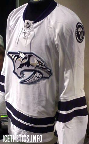
The "limited edition" jersey / Nashville PredatorsDon't bet on this jersey. (Pun.)

The Nashville Predators hosted the GnashVegas Casino Gala and Auction on Thursday night. It's one of those events teams put on to let rich fans rub elbows with players in a casual setting. And it's only noteworthy here because of what the players showed up wearing.

The jerseys they sported for the event, fully customized with their surnames and numbers (even on the sleeves), are nothing they've ever worn on the ice. Nor will they.

Last month just prior to the inaugural edition of NHL JerseyWatch 2011, we got our first look at what might've been the Preds' new road sweater next season. Only there were many indications that it wouldn't be.
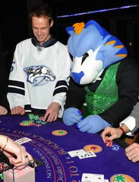
GnashVegas Casino Gala / Nashville PredatorsRumors had circulated for some time that the Predators wanted to simplify their color palette and exile their present home and road uniforms in favor of their current alternate along with a white version of it.

Said white version showed on a silent auction table during a game recently. It fanned the flames, feeding rumors about jersey changes. As did the fact that every player was wearing one on GnashVegas night. But the club's Facebook folks threw a bucket of cold water on that theory.

They posted a photo album from the event and the first person to comment on it asked, "Any mention about these jerseys becoming the new away uniforms next season with the current 3rds [sic] the new home uniforms?"

The direct reply from the Predators: "These jerseys are limited edition jerseys that were auctioned off at tonight's event."

But the ensuing commenters weren't deterred, one asking, "why do I get a feeling that we will be seeing a lot more of these amazing, fantastic awesomely cool jerseys?"

The team's Facebook operator tersely reiterated, "These jerseys will not be used next season."

Of course that leaves the door open to indeed using new jerseys next season, just not these. Which we already know to be the case, thanks to Reebok. If you'd like to see more pictures of the players sporting their "limited edition" jerseys on casino night, there's an additional photo gallery on the team's website.

And the point of all of this is that we still aren't quite sure what to expect from Nashville in 2011. By the way, I must've gotten more than a dozen emails about this so thanks to all of you who sent in links.

The other bit of news has to do with the Tampa Bay Lightning, who just unveiled their rebranding plans a couple weeks ago to mixed reviews. Turns out, those plans may not necessarily be set in stone. Or they are and some don't want to believe it.

On Friday, the always reliable Uni Watch posted a note in the ticker that I have to question as more wishful thinking than actual fact. But if it's good enough for Paul, it's good enough for me.

Very interesting NHL news from Cork Gaines, who writes: “One of the Lightning radio broadcasters was on a local station in Tampa talking and mentioned that what they unveiled last week may not be exactly what they wear on the ice next season. He mentioned possibly adding a lightning bolt to the shorts and some other unspecified tweaks. This makes me think we got a mid-season unveiling just so the team could gauge reaction and make adjustments — a concept I’m surprised we don’t see more often.”

First of all, can anyone corroborate this? The Lightning have two radio guys — Dave Mishkin, the PxP dude, and Phil Esposito who provides color for home games. I don't see Mishkin stepping outside the lines on this — unless it was a clever attempt by the team to drop a hint to fans unhappy with the recently revealed changes. Either that or Espo spilled the beans. Which would not surprise me in the least.

I'm not sure I agree with Cork that the midseason unveiling was a way to gauge reaction. That's what focus groups are for. I take Leiweke at his word that the timing was all about making sure they got the new logo out there the way they wanted, rather than some crappy website (like this one) leaking it before the summer.

Management said they expected some resistance from fans as it's a pretty sweeping change. But I think they may have gotten a little more than they bargained for. And one thing they've reiterated since the beginning is their intent to listen to the fans. If tweaks are being considered, I'd chalk it up to that.
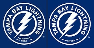
Lightning customize logo for social avatarsOne more thing. I know the last time I talked about the Bolts, I referenced the makeover of their web presence but I didn't really offer much outside of the background image from the website. They also added new social website avatars, customized versions of their new secondary logo.

On the actual logo, it reads HOCKEY CLUB between the two mini-bolts at the bottom of the circle. It's replaced by Facebook and Twitter in these versions. It's not a big deal, just kind of a cool branding thing.

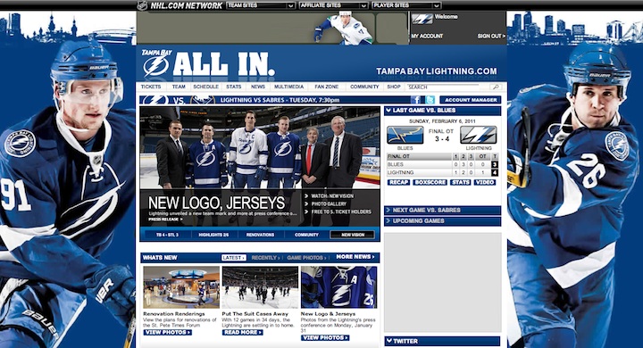
And in case you haven't checked out the Lightning's website lately, here's how it looks in the new colors:
Sunday
Jan162011

Predators Peering Into the Future?

Predators "limited edition" jersey / from Seth WrightIt seems Nashville Predators fans at tonight's game may have been treated to a preview of a possible new sweater.

Teams hold special auctions and giveaways at games all the time. But Icethetics reader Seth W. wrote in to let us know about one in Nashville that involved a rather unique prize. He sent this photo (right) along with the following note:

I'm a graphic designer from McMinnville, TN and a Nashville Predators fan and season ticket holder and also a big fan of your blog. Your blog combines two of my biggest obsessions: design and hockey. Thanks for all you do.

At tonight's Predators-Blackhawks game, they had this jersey on display at the silent auction table where they auction off memorabilia for charity. The card next to this jersey identified it as a "limited edition" jersey that will be auctioned off for the Predators Foundation.

It seemed to match up with all the speculation I have read on your site about what the rumored new Preds road jerseys will look like next year. That's all I know about it. Hopefully you can shed some light on it for me.

First of all, as you can see, it's exactly what was rumored through most of the JerseyWatch 2010 updates. We believed the Predators were adding this design to their arsenal all the way up until September. Even The Hockey News was unaware of the last-minute change.

In case you weren't following along, here's the gist: Last year, the Predators were planning to ditch their current home and road sweaters, promote the new third jersey to home and add a white version for the road. It seems at some point over the summer, these plans were nixed.

To see the jersey now being auctioned off means it clearly moved beyond the prototype phase. So what do you do with a product that won't see action this year? Sell it to the highest bidder, of course, as a "limited edition" item. Not only that, but it serves as a convenient way to get feedback from the fans.

Jersey koozie / from PredatorsBy the way, this is unrelated to the auction jersey, but it is timely. Tonight the Predators tweeted a photo of a jersey koozie they were giving away at the game. What I wouldn't give to have a Lightning one like that.

Anyway, my impression is that last year's sweater-swapping plan will be revisited and this jersey will hit the ice to open the 2011-12 season. I think the Predators have been looking to lose the current look for a while, in favor of simplified logos and sweaters.

Things probably didn't materialize properly to get the jerseys out this season. If I had to guess, I'd say the league wasn't happy with a third jersey being promoted that quickly. It would've been an awfully fast turnaround.

We'll see where it goes when summer rolls around, but I think it's a good sign to see fans now getting a look at the jersey at least. And hey, if it's not a popular design, maybe they'll go another route. What's your theory and do you like this white jersey better their current one?

Sunday
Sep262010

The Uncertainty Principle

The more we think we learn about unreleased jerseys, the more we find we really don't know a thing. I mean absolutely nothing.

Another Winter Classic rumorAs a follow-up to yesterday's post about the Winter Classic rumors, it's been pointed out that UniWatchBlog had its own plausible speculation for the Pittsburgh Penguins. This new information found its way onto Paul Lukas' site on Thursday:

A little birdie tells me that the Penguins’ Winter Classic jersey will look like this: “Take the 1967 jersey (the diagonal Pittsburgh), flip the navy and powder blues, and put the circle logo with the ‘scarfed’ fatbody penguin on the front instead of the diagonal lettering. The numbers on the jersey will be rounded, as on the 1967 jerseys. It sounds like a hot mess, but in my opinion they’re very sharp.”

Almost immediately, Hockey Week put together the concept to the right. And just within the last 24 hours, Icethetics' own "little birdie" corroborates with the following note:

I wanted to give you a heads up that the powder blue jersey you just posted isn't the actual jersey. It's correct as far as the logo and number style goes, but the jersey body itself is identical to the 1967 jersey, only the body is navy blue and the trim is powder blue. ... The first thought is how similar it may look from a distance to Florida's alternate jersey. All in all, it's still very sharp.

What it really comes down to is this: we have to have patience. We'll wait and see what the Penguins unveil — now some saying it could be as late as November before that happens.

If that doesn't have you scratching your head, this should.

All summer, Icethetics JerseyWatch 2010 has been reminding you that the Nashville Predators will have new home and road uniforms this year — elevating the third jersey and adding a white partner.

Then on Sept. 10, Chris Creamer of SportsLogos.net tweeted this:

@sportslogosnet Nashville Predators back off on new unis for 2011, pushed back to '12 #nhl #nashvillepredators

He cited an anonymous source previously used by Icethetics but try as I might, I haven't been able to dig up any other confirmation. By the way, to clarify, I assume he means they're backing off plans for 2010-11 (this season), pushing them back to 2011-12 (next).

THN says Preds are changingWell that wasn't the good news we were hoping for but it was all well and good until Max B. posted on the Icethetics Facebook page The Hockey News was still reporting a change in the works on page 52 of their latest issue.

No. 6 NEW JERSEYS: Toronto and the New York Islanders revealed new duds this summer, while Anaheim is closely guarding its new third sweater, to be revealed in late November. Vancouver and Buffalo celebrate their 40th anniversaries with new gear, while Columbus and the New York Rangers also have new third jerseys coming down the pipeline. Also, look out for a purple and gold throwback from the L.A. Kings and a change in Nashville.

Now, if we're being honest, the Preds' mention does seem a little like an afterthought. But be that as it may, this is the current issue of THN and Creamer's news came more than two weeks ago. Who's got it right?

Here's the tally: Creamer says status quo, both Reebok and THN say a change is coming. That's 2-1 for the rumor. Nashville opens the season on Oct. 9. We'll know by then.

Wednesday
Aug182010

“P” is for Patches & Primary Logos

So it's been a good seven days since the last blog update. I feel really bad about that, but then I was on a cruise for at least four of them — so, I don't feel that bad. But I do have a bunch of updates to get through now — dealing with all three NHL teams whose names start with "P." Total coincidence!

Penguins Put Out New Arena Patch

Pens' new commemorative patchOver the weekend, the Pittsburgh Penguins started selling a new jersey patch that commemorates the inaugural season of the team's new arena.

Season ticket holders got their first look at the patch and the new CONSOL Energy Center at an open house event this past Saturday.

I don't have any information as to whether the patch will be worn on the uniforms, but why wouldn't they be? If you're wondering what that might look like, Steve Z. has been kind enough to share a photo. Though my guess is we'll see it on the front rather than the shoulder, if it's used on the sweater at all.

Also special thanks to Jeff S. for the above photo of the patch itself. Got lots of emails about this while I was gone. Thanks to all of you!

And if you're in Pittsburgh and dying to see the new building for yourself, here's a useful link.

Panthers Mulling a Reduction of Red?

Miami Herald writer and Florida Panthers blogger George Richards posted an article on Monday mulling the possibility that the team may drop the red, not this season, but the next.

He says the Panthers are considering using their new third jersey design as a base for new home and road sweaters, while keeping the same leaping panther primary logo. But he says it more colorfully:

Word on the street is the Panthers are likely going to keep the leaping Panther as their primary logo in 2011-12 while changing the team's colors from the H. Wayne picked blue-gold-red to the Tampa Bay Rays scheme we saw last year.

The blue-on-blue color scheme (what do we call it? The JetBlues? The Sunrise Rays?) apparently will be the Panthers uniform look by that season.

In 2011-12, the current thirds would become the home jersey with a new white/blue/light blue coming for the road. The third jersey — if the stick breaking panther is indeed the primary logo — could incorporate the head crest. If there is a third jersey. Probably won't [be] for the first few years of the redesign.

I'm sure there are people hard at work on this as we speak. Here's hoping they fix the dopey FLA logo... And leave the palm tree/hockey stick shoulder patch alone...

There's a lot more to the article, very much worth reading, but I don't want to copy it all here. Richards does say that he has yet to confirm these "plans" with team brass and that the stick-biting panther is the "logo of the future."

Meanwhile, the team's official website was recently redesigned to highlight the two-tone blue and gold color scheme. Red is still a key accent color, but it does appear the Cats are headed in a new direction with their marketing efforts. We'll keep an eye on all this.

Related: Panthers Reworking Primary Logo?

Predators Sending Out Mixed Messages

Taking bets now. Which logo will the Predators use this fall?

In the spring, it was all but confirmed by Reebok that the Nashville Predators would have new home and road jerseys for the 2010-11 season. The assumption being that the Preds would give the spotlight to their third jersey — along with a white version of it.

Lately, we've heard lots of reports from Nashville-area hockey retailers that nothing is changing with regard to the Predators uniforms. But at the same time, notice the redesign of the team's website to accentuate the dark blue and silver — the colors of the logo on the alternate sweater.

New Logo on Social LinksCheck out the graphics they use to link fans to their Twitter and Facebook pages right there on the home page! Where's the orange and gold? Gone, that's where!

I know it's getting late in the summer, but the Sabres are waiting until the start of the preseason before they give up their new look. Who's to say the Predators aren't doing the same? — just much more quietly.

In fact, if you remember back to the draft a couple months ago, the Predators only handed out hats with the recolored primary logo. Then again, they've still been handing out the current jerseys all summer.

When Shea Weber was announced as captain, he got one. As did the club's new bosses just last week. So I don't know.

It seems like an obvious choice, but we'll really just have to wait and see. The suspense is just killing you, I know.