


Rock Your Green!
;) Splash graphic on Devils website featuring red-green jersey
Splash graphic on Devils website featuring red-green jersey

;) Devils break in the greenIt's St. Patrick's Day and that means wear green or get pinched.
Devils break in the greenIt's St. Patrick's Day and that means wear green or get pinched.
The New Jersey Devils will certainly not get pinched tonight, as they'll be wearing replicas of the red and green uniforms not seen in NHL action since 1992.
And they've been teasing us with photos in the weeks leading up to tonight. Just yesterday, the players broke in some of their their throwback gear during practice, including red helmets, special socks and green pant shells. The Devils posted photos on their website.
The Devs have also revamped their website with a bunch of green — I'm guessing for today only. But it features a picture of Martin Brodeur as a rookie in 1991! Here's a look at the background image, in case it disappears before you get a chance to see it.
;) Devils limited time green-infused website
Devils limited time green-infused website
By the way, he'll be wearing a helmet with that same design tonight. Definitely a game you won't want to miss. Makes me glad to have a subscription to NHL GameCenter.
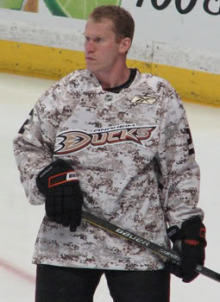
Preds, Thrash Warm Up to Green

;) Preds don the greenThe Nashville Predators took the ice for warm-ups prior to last night's game against the Flyers in their green threads.
Preds don the greenThe Nashville Predators took the ice for warm-ups prior to last night's game against the Flyers in their green threads.
Couple of things to note about these jerseys. First, it's not a typical shade of green — which is cool. It's almost a really dark teal, a little bluer than the Sharks' teal.
But more importantly, check out the crest. It's the logo from the third jersey. Does this signal a shift in the Predators' primary logo?
You'll remember back in December that Howard Berger said the Preds would be making a "significant alteration" to their uniforms next season. Will the thirds get the full-time treatment so soon? Will the gold and orange disappear for good? Am I reading too much into a warm-up jersey?

;) Green for Atlanta too!The Atlanta Thrashers also wore green during their pre-game skate last night. Here (right) you see Maxim Afinogenov in the special jersey.
Green for Atlanta too!The Atlanta Thrashers also wore green during their pre-game skate last night. Here (right) you see Maxim Afinogenov in the special jersey.
The sweaters were subsequently autographed and auctioned off during the game, resulting in $16,000 for the Thrashers Foundation.
Naturally, the jerseys worn by Chris Chelios and Evander Kane nabbed the highest dollar figures at $1,200 a piece.
Perhaps taking advantage of the Irish's luck, both the Predators and Thrashers walked away with wins last night after donning the green.
 Chris
Chris
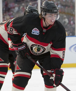
;) Devils throwback jersey in actionThe Devils' green-infused throwback jerseys were a big hit the other night. It's always cool to seeing the past come back to life on the hockey rink.
Devils throwback jersey in actionThe Devils' green-infused throwback jerseys were a big hit the other night. It's always cool to seeing the past come back to life on the hockey rink.
Devils specialty jersey gallery
In fact, the Devils weren't the only team rocking the vintage threads this season. The Calgary Flames also wore their '80s sweaters five times against Canadian rivals.
And the team just announced that these jerseys are coming back another dozen or so times in 2010-11 as a third jersey. The Devils are probably happy to keep this a one-time deal, but imagine if they went a little further. That got me thinking...
;) Devils vs Flames, 1984This photo was taken in 1984 and the 1991-92 season was the last time we would see those jerseys on the ice together. Now, 20 years later, I don't think it's out of the realm of possibility that we could actually see it again.
Devils vs Flames, 1984This photo was taken in 1984 and the 1991-92 season was the last time we would see those jerseys on the ice together. Now, 20 years later, I don't think it's out of the realm of possibility that we could actually see it again.
Maybe at some point teams like this will see that the 1980s was the pinnacle decade for the hockey sweater. They were bright, colorful and easily identifiable.
Today almost every team wears some shade of blue, red or black. How original and diverse. I know it's all about the money grab with these jerseys, but I'm all for it if it means the NHL looks like it should again.
It's great to see hockey jersey designs trending back toward the classics these days. Anyone else agree?


;)

;)

;)
;)


;)

;)


