Entries in nashville predators (29)

Monday
Jul272009

Sabres Wow With Web Remake

If you've been following Icethetics on Twitter, then you know I'm tracking the league-wide web site makeovers. Teams are adopting a new template that's closer to NHL.com. This is good news because that old template really needed to go.

Today, the Buffalo Sabres became the latest team to make the transition and I can't stop looking at it. I've got a screenshot, but I highly recommend you take a trip to sabres.nhl.com on your own to fully experience it.

It's just a phenomenal look, something we're not used to seeing on NHL team sites, generally speaking. The way the vintage logo is so prominently placed in the banner certainly indicates a shift in the way this team is being marketed — to actual fans! But mostly, it's the gold sabers running up and down the page. Is there anything more attention-grabbing? I'm way impressed.

To be fair to the other teams, the Sabres aren't the only ones who got this redesign right. Seven others have already made the switch and none has disappointed. The Avalanche and Coyotes were the first. Both, solid.

The Oilers, Thrashers and Blues followed. I think one of the elements making these sites more visually appealing is the attention to detail in the background images. It goes a long way. All three of these teams, along with the Avs, rotate multiple background images, primarily featuring different players.

The Panthers too, and along with the Predators are two of the most recent members of the makeover club. The Preds make use of a really cool sweeping view of the inside of the Sommet Center on game night.

I mean that's just cool.

There are also a handful of teams who are currently in the process of making the change and I can offer you previews, courtesy of Tim. The Flames, Flyers, Stars, Kings and Bruins have redesigns in the pipeline.

For the Bruins, not a big change, although Zdeno Chara does figure in prominently. The Flyers are loading down on the orange. And the Kings still prefer black to purple. The Flames and Stars seem to be most worthy of an advanced preview.

Calgary has taken to lighting their players on fire for the sake of the internet. Even the players' equipment hasn't escaped the blaze. However, I really like the background depicting the roof the Saddledome. You get a good look at all those banners hanging from the rafters.

The Stars will offer a sneak peek into the locker room with their background image.

The thing that struck me was the ad, a version of which can be seen on their current web site. It looks to me like they've colorized the jerseys to make them green. And they look spectacular. But here's an idea: Why not actually wear green home jerseys?!

No idea when these teams will make their official switches, but I'll keep an eye on it. In fact, I think this is definitely something to watch throughout the summer as each team makes its transition to the new NHL web format. Might even be the subject of a tournament at some point in the future. Who has the best web site?

We'll see. In the meantime, what do you guys think of the new site templates being employed across the league? Like 'em? Hate 'em? Indifferent? Comment.

Friday
Jul242009

O6 Style for Preds 3rd

The Nashville Predators will be among a half-dozen teams to debut third jerseys in the fall. Now we're getting more information on that subject from Tennessean beat writer John Glennon.

In his blog Inside Predators, Glennon wrote about yesterday's Skate of the Union Address at the Sommet Center. The first two paragraphs are all about the team's upcoming alternate sweater.

Preds owner David Freeman said the team’s new third jersey is likely to be revealed publicly in September. He described it as a very traditional-looking jersey, with a design that "came purely from some of the original six teams."

Freeman said the third jerseys will frequently be worn at home on Saturdays. Nashville has 15 home Saturday games this season.

Good news for a team that has all too commonly been the butt of jersey jokes, with its attempts at being cutting edge. After all, at just over 10 years old, it's not like the Predators have a lot of tradition to draw on. The "mustard jersey" was certainly memorable but I'm not sure how fondly it will be held.

It'll be interesting to see what "traditional-looking" Original Six elements designers will borrow for this new uniform. I'm anticipating a common color like blue, more horizontal lines and a simplification of the color scheme. That would fit well with the alleged leak I posted a few weeks ago.

In addition, we now have an unveiling date to look forward to. As with the Wild, the third jersey is expected to be unveiled in September. Of course if anything comes out any sooner, count on Icethetics.

By the way, the Predators web site has undergone its' change to the new league-wide format.

Friday
Jul032009

Claims of a Predators Preview

I'm normally opposed to posts based entirely upon rumor, but I can make an exception in the name of a slow news day. Yesterday, a commenter called LF3240 left us a couple of links to interesting message board threads that explore potential third jersey options for the Nashville Predators.

I'll start with the realistic and slowly move into the silly. To start, a user at HFBoards (echlfreak) claimed to have had an "inside look" at the new alternate sweater. Whether this is true or wishful thinking remains to be seen, but I'll take a page out of CNN's book and report on the reports of others for a moment.

The following is that user's description of the jersey, verbatim.

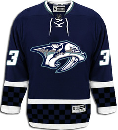
There is no yellow or gold at all. They have brought in a steel grey, same blue color and some other shades of grey to the logo. Same Pred logo...just different color scheme.

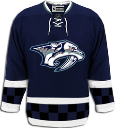
The arms and bottom have two white stripes separating a thick middle stripe. The middle stripe is black and blue checkers. Tie on the front.

Thats it. Looks cool from far. But, the checkers is kind of dumb up close. From far away the checkers are not noticeable.

That spurred another user to create the following concept design.

I'm not a fan, but then it's not geared toward me. It's more for the Nashville/NASCAR fan, I think. (The checkered pattern?) What I do like is the simplified color scheme. However, echlfreak replied, "The checkers are only two rows and the Pred's eye is red." Mulligan.

Not much different, but also not any better. Typically a lot is lost in translation when people get a quick glance at a new sweater. So we'll just have to see when in comes time for the Preds to release the real thing.

The aforementioned message board threads also featured a handful of other concepts based on what fans are hoping for. Two stuck out for me — both featuring the relatively new saber-toothed skull logo. The first is based on a more traditional striped look.

The other looks like something you might seen on someone working in a construction zone.

Philadelphia can get away with orange. Maybe even the Ducks one day. This concept convinces me the Predators should never attempt it.

I wish I had more to offer tonight. But unfortunately, rumors reign when facts are few and far between. Take all of this with a grain of salt and believe none of it until you read the word "official" in the Icethetics post headline.

And Happy 4th of July!

Wednesday
Jul012009

Alternate Expectations

The most important events of the off-season calendar are behind us. The Stanley Cup has been awarded. The prospects drafted. And now the biggest day of free agency is at an end with players like Mattias Ohlund, Nikolai Khabibulin, Marian Hossa, Dwayne Roloson and Marian Gaborik finding new teams.

Now more than three months away from the new season's debut in Europe, what does that leave us to look forward to this summer? New third jerseys, of course. I have to be honest and up front when I say that this post isn't so much about disseminating new information as it is creating a reference for what's to coming in the next several months.

Ever since the revival of Icethetics, I get emails every day from folks asking if a certain team will be getting a new third jersey this year. This post will contain all the information I have and any predictions or expectations I'm willing to share — presented alphabetically.

Calgary Flames. The days of the flaming horse head are clearly behind them, however that very design does indicate a willingness on the Flames' part to experiment with alternate logos. If you remember, last September I wrote about this very subject.

At that time, Flames president Ken King said the sweater design was being finalized and that there would be a departure from the Flaming C. What sort of a departure remains to be seen. He also hints that the jersey will be black, but that's no surprise considering the team already wears red and white.

King was confident fans will embrace the alternate look and I'm sure I speak for most of us here when I say I can't wait to find out.

Chicago Blackhawks. As previously reported, the 'Hawks have said their Winter Classic sweater will be used in games with roofs beginning in 2009-10 as it takes on the new role of third jersey — banishing the old black one.

For the first time, I will have absolutely nothing bad to say about a Blackhawks uniform. I'm sure many of you will appreciate that.

Colorado Avalanche. Icethetics last reported on a future Avs third jersey back in December when a Denver Post writer indicated the team's plans. The article didn't go into detail about the design, but rather expressed a hope that it would include some sort of Quebec connection. Not a bad idea now that the Avalanche are playing more like the Nordiques.

But I digress. I would expect to see a burgundy alternate much like what the Avs wore until the Age of Reebok. However, I'm not sure how well the diagonal text would work after the issues the Rangers had with the EDGE cut. And personally, I'd rather see Colorado go in a different direction. Pun.

Florida Panthers. We have little information on the Panthers, but they are expected to be one of a handful of teams to debut new thirds in the fall. I fully expect more of the same from the Cats. In other words, a red sweater with the logo that features a stick-biting panther.

If the Panthers were to try to exceed my expectations, they might try something completely different. Perhaps a new logo featuring the profile of a big cat on a red jersey with a unique design. But I think we all know not to set our goals too high.

Minnesota Wild. Green will make its glorious return! Gone for just a couple of seasons, it's my understanding that the Wild will use this opportunity to relaunch the green sweaters for their 10th anniversary season.

I imagine design will be much like the current road uniform. And despite that, I hope it doesn't overtake their red one anytime soon. Despite its ubiquitous color, it's got that classic hockey feel that we just don't get to see much of anymore.

Nashville Predators. The Preds officially announced plans to release a third sweater back in March during my leave of absence. So I'm telling you about it now. The article tells us that the old "mustard jersey" it describes as both "revered and reviled" will not be back. (Between us, I think they were playing it fast and loose with the definition of one of those words.)

Then Preds Business Ops President Ed Lang started speaking incoherently. "I don’t want to give too much away," he teases, "but ours will be kind of a mix between a traditional and a retro look." If anyone knows what that means, you know how to get in touch.

It's almost like he said it's going to be cobalt crossed with denim. Why don't we just call it "faded blue"? Speaking of which, that brings up an important question. If mustard is out, what color will this new sweater be? Grey can be done right if done carefully.

We're told to expect the debut of the new threads prior to Christmas. Hint, hint. You can even get one for free if you're willing to shell out for season tickets.

Those are the only teams who have talked officially about bringing third jerseys into the mix this year. I've said it before, but I'm really hoping the Rangers and Capitals get on board. We could use a blue Weagle sweater and Lady Liberty needs to be free again. But that's just my two cents.

However, you may recall the Detroit Red Wings recycled their Winter Classic jerseys for their final game last season against the Chicago Blackhawks. Icethetics reader Bill writes in wondering if this could be an indication from the club that they are in fact open to an alternate sweater.

I sure wouldn't mind seeing it on the ice more. The Wings have said nothing publicly about this so as always, we'll just have to play that wait-and-see game.

What's left? The New Jersey Devils, who have never worn a third jersey, the Anaheim Ducks and Columbus Blue Jackets have announced no sweater-adding plans. The Montreal Canadiens still have a couple more 100th anniversary throwbacks to debut this season.

You are now up to date on what to expect in terms of third jerseys as we press on this summer. And of course, keep checking back for the latest news and updates.

By the way, if you haven't been by lately, check out NHLUniforms.com, which is now called the Hockey Uniform Database. It has recently been given a facelift and is cooler than ever.

Page 1 ... 2 3 4 5 6