Entries in stadium series (18)

Tuesday
Nov262013

Islanders' Stadium Look Revealed

Newsday provides uniform sneak peek 10 hours early

Photo from Newsday (via New York Islanders)Late tonight, the Long Island newspaper Newsday presented an early look at the uniform the New York Islanders will wear for their 2014 Stadium Series appearance on Jan. 29.

The photos appeared on the paper's website just after midnight ET, presumably with the team's permission (a reporter announced it was coming earlier in the day).

According to a later tweet from @NewsdaySports, the official unveiling is scheduled for Wednesay morning at 10 AM ET. What's unclear is whether the Isles will go it alone or if the league plans to unveil all seven Stadium Series uniforms in one shot.

But as we're now just hours away, it won't be long before we find out.

Regardless, the Isles' newest uniform is here now. So let's discuss. Here are a few details I noticed: 

  • The crest — believe it or not — is the chrome logo the NHL recently unveiled. So that's an interesting development. My guess: It's not embroidered. It may be screen printed like the guitar-string numbers on the Predators' uniforms.
  • A flat version of the NY logo, however, is also visible on the pants — bigger than most pant logos.
  • The shoulder yoke is unusual, not unlike what we see on the Blues' uniforms — though without the piping on the front.
  • The right shoulder bears the Stadium Series patch while the left shoulder has the classic primary mark to remind us all it's not going anywhere.
  • Looks like everything is on an angle. The pant detail is new and different as is whatever is happening on the sleeves. Hard to judge based on this.
  • What is clear on the sleeves is the stripes do not wrap all the way around the arm (probably because they can't if they're angled).
  • The elongated numbers we talked about last week do not appear on the sleeves. They do, however, appear on the helmet.
  • Haven't seen the back of the jersey yet. That'll come in the morning.
  • The collar laces seem to be tied on the inside of the jersey rather than outside. Player preference or design feature?
  • The CCM branding is very prominent in this photo, clearly seen on the helmet, gloves, pants and skates. The only Reebok logo is on the stick and barely detectable. Of course, CCM is Reebok, but I have to wonder if this is significant beyond Tavares' own deal with the company.

I don't like to make instant judgments on the blog, but my initial reaction to the overall design is positive. There are certainly some unique aspects to it, but that only makes me like it more.

In an NHL being overrun by "traditional" and "retro" uniform designs, it's refreshing to get something out of left field every so often. If the look of this uniform is any indication, I'm really going to like the Stadium Series.

Check back tomorrow for more on the official unveiling.

Thursday
Nov212013

Sabres, Sens and Stadiums Redux

Several recent stories require follow-ups so I'm squeezing them all into tonight's post.

Sabres release 2013-14 third jersey schedule

Believe it or not, there are still skeptics out there. Those who don't believe the gold third jersey unveiled by Buffalo Sabres in September was the real deal. Those who thought that Steve Ott business was just a prank. Wishful thinking, I suppose.

Either way, this faction will finally and officially be proven wrong on Sunday when the Sabres debut their controversial new threads. The team released its 10-game third jersey schedule today. You can see it in the graphic below.
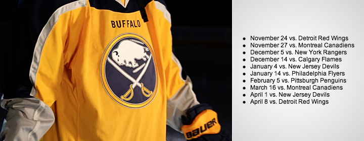
Photo from Buffalo Sabres

The schedule begins and ends with Detroit, a new divisional rival for the Sabres in the Atlantic Division. The jersey will not see action on the road this season.

Before I move on, it should be noted that the genesis of this design is explained for the first time in today's press release. Take a look:

The third jersey, which was revealed via the team’s social media platforms in September, was designed by the Sabres’ creative team in collaboration with Reebok. Challenged by Sabres ownership to use gold as the primary jersey color for the first time in team history, the design team looked at jerseys and uniforms from across the full spectrum of professional sports for inspiration. The result was a two-tone jersey with gold as the primary color on the front and navy blue on the back. This design concept is believed to be a first for the NHL.

"Believed to be a first"? The NHL's jersey history is fully documented. There aren't any mysteries. (In fact, if you've never been to NHLUniforms.com, I highly recommend it.) Point is, this is definitely a first, for better or worse.

Now, to Ottawa.

Senators start offering up Heritage teasers

We're now a week away from the Ottawa Senators unveiling of their 2014 Heritage Classic jersey and the ancipated teasers are well underway. In fact, we've gotten two this week.
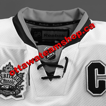
Photo from Ottawa Senators (via Facebook)

This photo (right) was posted to the Sens' various social media platforms, including Facebook, Twitter and Instagram.

It's a gray-scaled photo of the top portion of the sweater. Because of the lack of color, though, it's tough to tell whether the jersey is white or "vintage white" — but I still made a vintage white graphic for the top of this story.

I'm not sure that's a great color for a jersey, however, so it's probably white in reality. A future teaser may answer that question for us before next week.

The "C" on the chest is the only element that gives anything away. But so far, it's looking like a reverse of the black Heritage third jersey the Sens have been wearing for a couple years.

In other words, it'll probably look a lot like this concept by Mat Ware.

But this wasn't the Sens' first teaser. On Tuesday, they gave us a bizarre video of Erik Karlsson and Jason Spezza recounting their reactions to seeing the sweater for the first time. As teasers go, this was one of the worst I've ever seen. And there have been some bad ones this year.

Video stills from Ottawa Senators

Nonetheless, it's worth reporting, so let's get through it. Erik Karlsson went first. He said:

It's different. I think it looks good with the color that it is. And it actually looks like it is old. The combination is a little bit older than probably what team uses nowadays. The first time I saw it I right away thought of something old. But still good looking.

I like it. I like it a lot. I think it tells a lot of history with the way it looks. I think the numbers on the back are looking a little better I think than maybe the red and the white. It's a little more special. And everybody on the team says the same thing. It's a great looking jersey that right away gives away a lot of history.

Based on Karlsson's description, it doesn't sound as similar to the black jersey as we're expecting. He makes specific note of how "old" it looks (perhaps it could be vintage white after all?) and the numbers on the back (different from the third jersey?).

But then again, I'd be very surprised if Karlsson put as much thought into hockey sweaters as we do here, so I don't want to put too much stock into what he's saying just yet. The photo below was shown while Karlsson was speaking.
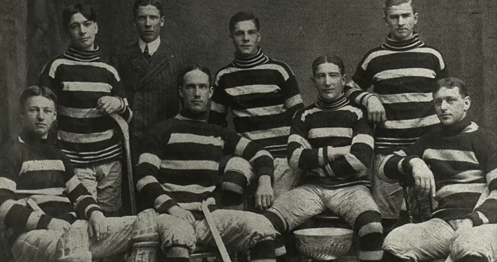
Video still from Ottawa Senators

Could it be anymore clear? 

Then Jason Spezza expressed his take:

It's something that, to me, seems like a hockey jersey. It's a traditional jersey. I like the way it looks and I think it's been good for us. It's a great jersey. I think they've done a great job with it. It's something that the players will like, the fans will like. It kind of ties in to the whole "heritage" aspect of it all.

I think whenever you can take a modern jersey and put a bit of a traditional twist to it, I think it's a cool thing. It's something you can tell is well thought out. And it's nice to tie to the two generations together.

What stuck out to me was "it's been good for us." Yet they've never worn it before. So either it is the reverse of the black jersey, or Spezza misspoke. The following photo was shown while he spoke.
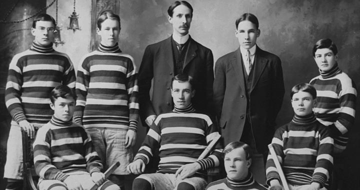
Video still from Ottawa Senators

When I first watched this video, I was thinking the jersey could be full-on barber pole with stripes top to bottom. But today's teaser photo killed that theory, of course. In fact, there's not a single stripe visible in the teaser.

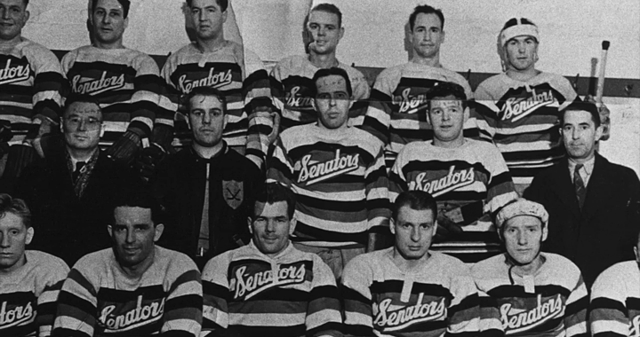
One more thing caught my eye. This old Senators sweater was also shown during the interviews.
Video still from Ottawa Senators

Is it possible the Sens could revive this script on the new sweater as opposed to falling back to the big black "O"? It would definitely stand out and wordmark-based throwbacks seem to be trending lately. What would you prefer?
Video still from Ottawa Senators

Canucks sticking with Millionaires sweater?

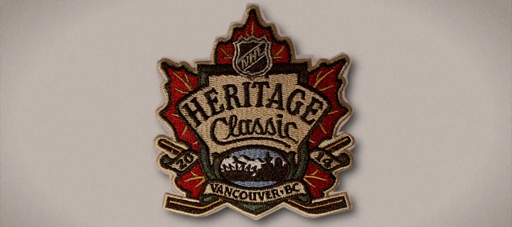
While we're on the subject of the Heritage Classic, an email sent to Vancouver Canucks fans today regarding tickets was decked out in Millionaires colors. That combined with the lack of any talk about a new Vancouver jersey is making it look more and more like that's what the Canucks will wear on March 2. And that's definitely a good thing.

More clue-laden Stadium Series gear shows up

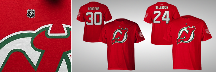
Since we last spoke (two days ago), more 2014 NHL Stadium Series gear has appeared online. First, we've gotten front and back looks at the New Jersey Devils' T-shirts. Take a look.
Photos from Shop.NHL.com

This version doesn't make use of the chrome logo, as you can see. Turns out this series of shirts includes two versions for every team — one with chrome, one without. Here's what I mean.

Source unknown

This might be a good time to point out some news about the Devils' Stadium Series jersey. Beat reporter Tom Gulitti tweeted the following on Wednesday morning.

So it sounds like those St. Patrick's Day jerseys will be returning — and perhaps "futuristic" doesn't accurately describe all seven Stadium Series sweaters. Time will tell for sure.

Now on to more treats from Shop.NHL.com.
Photos from Shop.NHL.com

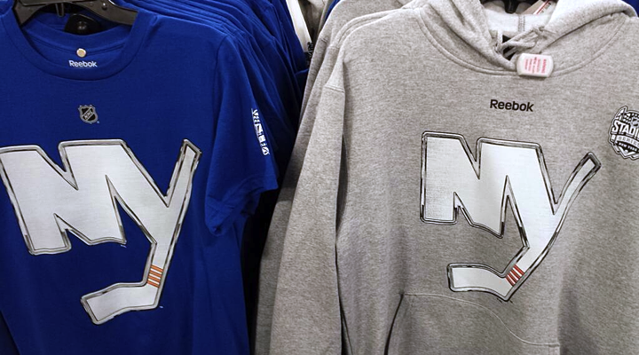
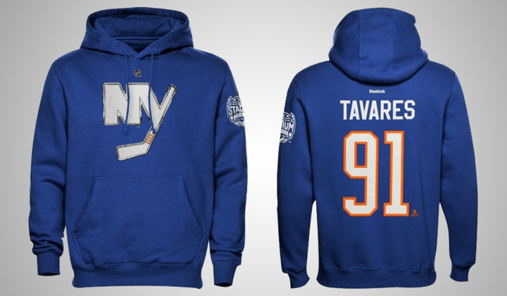
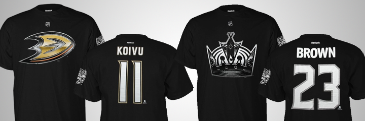
This blue hoodie gives us a look at the Islanders' elongated numbers — a lot like what we saw Tuesday with the Rangers, Blackhawks and Penguins, but not the Devils, interestingly. And if you're still wondering about the California clubs, they too have elongated numbers.
Photos from Shop.NHL.com

Of course these shirts are confusing because both are black. So maybe these shirts don't say as much about the jerseys as we thought. Plus, we already know the Ducks will be wearing orange. The question then, is about the numbers. Will they look like this after all?

Let's wrap this thing up with a few unusual Stadium Series shirts.
Photos from Shop.NHL.com

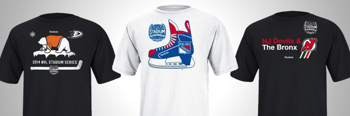
What's with the "Hockey Bear" on the Ducks shirt? Is that a thing I'm unaware of? (UPDATE: Everyone is telling me it's a nod to the state flag of California. I can see that. And it fits thematically with the others.) The other two at least make a little sense to me.

Anyway, these jerseys should be unveiled soon so we can stop all this speculating.

Tuesday
Nov192013

What's in Store for the Stadium Series?

New event merchandise could be full of clues

I rarely get the opportunity for a good headline pun. Tonight we're taking a look at some new NHL Stadium Series T-shirts that are now showing up in stores. The designs could be offering some insight into what the forthcoming jerseys will look like.

We'll dive in with the New York Rangers first.

Photos from ebay (o_sports_gear)

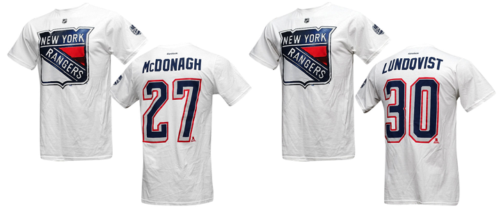
A few things to note. First, the shirt is white. We'll see that's not the case with all of them and there's reason to believe they may suggest the colors of each team's Stadium Series jersey. For one thing, a source tells me the Rangers' jersey is, in fact, white.

It makes sense as the Rangers will be the designated "road team" for both of their Yankee Stadium games against the Islanders and Devils. Speaking of the Devils... (On a roll with these awful puns!)

Photo by @TheJerseyNYRFan (via Twitter)

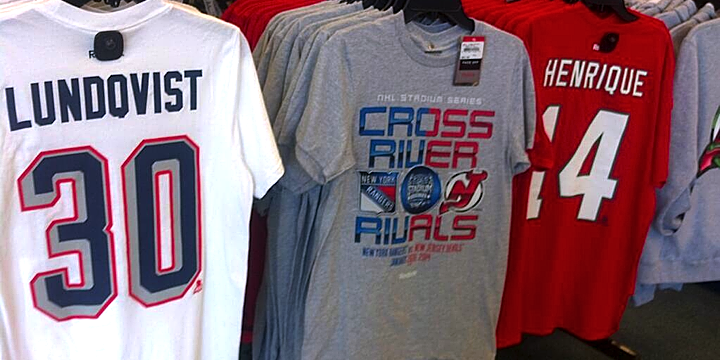
A photo posted to Twitter by @TheJerseyNYRFan on Monday shows the back of the New Jersey Devils shirt. It's red with white numbers.

The tweeter also pointed out the coloring of the Devils' chrome Stadium Series logo on the "Cross River Rivals" tee seen in the middle. There's no green in sight. But it's likely that has more to do with the production costs associated with the number of colors used in the screen printing process.

Back to the Rangers for a moment.  The number treatment seen on these shirts is unlike anything the team has used before. The grey/silver evokes the design used on the Lady Liberty jerseys from back in the late '90s. But those numbers used red for the shadow rather than a thin outline.

Photo by Jessica D'Agata (@ayojess via Twitter)

This blue New York Islanders tee seems to confirm the idea that the shirts match the jersey colors. But look closely and you'll see this chrome Isles logo doesn't quite match the one released last week. The one on the shirt has rounded corners and an angled corner at the top of the Y.
To sum up, these are the colors and logos that will be representing these teams in January.

As far as jersey crests, I think it's accurate only for the Devils and Islanders. It sounds like the Rangers will, as usual, go with a wordmark across their chests and the shield will be used on the shoulders. Whether the crests will make use of this chrome-treated effect is anyone's guess. But I hope not.

Let's switch gears now to the Soldier Field game in Chicago.

Photos from ebay (o_sports_gear)

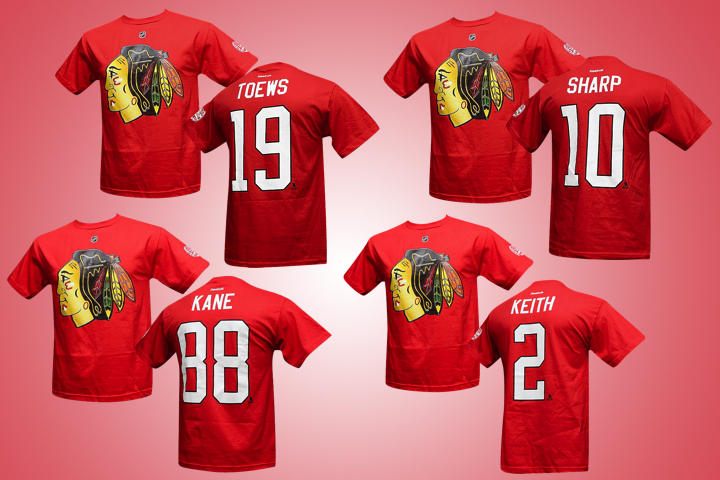
The Chicago Blackhawks have red Stadium Series T-shirts. As the home team, this makes sense. But the noteworthy element of these photos is the elongated number design. It's the standard Blackhawks font, but it's stretched out.

If you look back at the Rangers' shirts you'll notice the same thing. It's just more pronounced here.

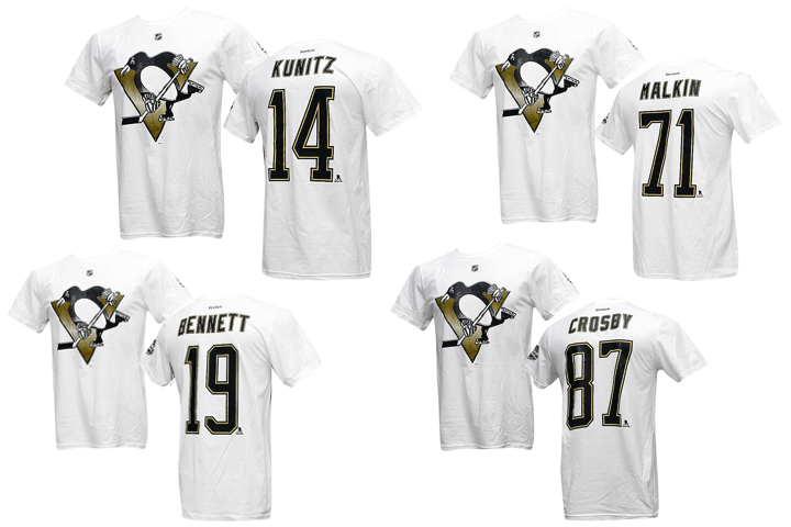
The elongated design is very noticeable on the Pittsburgh Penguins shirts. Their jersey numbers are usually rather wide. Definitely not the case here. So could these number redesigns be an element of the "futuristic" jerseys we've heard about?

Based on the colors and crests, it doesn't appear things will look too different for Chicago's Stadium Series game. Here are the colors and crests based on what we've seen so far.

That leaves us with the California game at Dodger Stadium.

Just today, a new T-shirt showed up for the Los Angeles Kings with another new logo.

Photo from TEAM LA Store

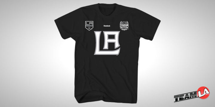
The TEAM LA Store started selling this, described as a "ligature logo T-shirt." A ligature is basically a couple of letters joined together to create a unique letterform. It's the letters from the Kings' primary logo — which is also featured on the tee. However, it is not the same as the chrome logo unveiled last week. So that's nice and confusing.

What will be on the front of the Kings' Stadium Series sweater? Your guess is as good as mine, but I doubt it's this ligature. This shirt is different from the previous ones seen in this post. The others have the NHL shield in place of the Reebok logo near the neck — and apart from that and the chrome logo, there's nothing else on the front of them.

In other words, this shirt doesn't seem to be part of the same series as the others.

As for the Anaheim Ducks, I haven't seen a shirt yet. All I know is the jersey will be orange. That's according to a tweet by Ducks PR guy Adam Brady. This means the L.A.-based outdoor game may feature orange versus black. We already know the 2014 Winter Classic will see red versus blue. Nice to see the league branching out.

We don't have enough information to be certain yet, so this graphic is a bit of an educated guess on my part. Like I said, the Kings could end up wearing white. (I'm just hoping they don't.)

As we piece together the looks for the upcoming Stadium Series, what are you hoping to see or not see?

Tuesday
Nov122013

Chrome Logos for Stadium Series

Effected logos to represent seven participating teams

Today, in a bizarre move, the NHL unveiled a collection of what it calls "chrome-treated" logos for the seven teams participating in the 2014 NHL Stadium Series. In essence, it was the result of someone goofing around with Photoshop — a fact eluding exactly no one. But there were some interesting revelations to discuss.

First, a new version of the New York Islanders primary logo was added to the mix — without the map of Long Island, the wordmark or the classic blue circle. The team has never used the NY on its own before. But check out the graphic posted on the front page of the Isles' website today.
It shows us that the new logo — un-chromed — was designed to sit on a blue background. So it appears we should be anticipating a blue jersey for the Isles' Stadium Series appearance.

By the way, said jersey is now on sale to Islanders' season ticket holders — sight unseen, no less. I'm not sure I could bring myself to part with that much money to buy something I've never seen.

The chrome logo for the New Jersey Devils re-introduces an old color palette. Green is back! But does this mean the Devils will simply break out the throwback jerseys they've been wearing in recent years for St. Patrick's Day? Based on what I've been hearing, I'm not so sure. Read on, I'll explain.

The Isles and Devils will both face the New York Rangers at Yankee Stadium in late January. And while this chrome-ified shield would indicate a Blueshirts throwback to the 1970s, I understand this logo will be little more than a shoulder patch.

The Rangers are known for the diagonal text across the front of their uniforms, and it may well be "NEW YORK" on the chest rather than the club's nickname — not unlike their Heritage Jersey, which debuted in 2011. Something to keep an eye on as we wait for the unveiling.

Speaking of which, the Rangers' own press release tells us the league will reveal all of the Stadium Series jerseys together "in the coming weeks." When that is exactly is anyone's guess.

The Los Angeles Kings are going back to the crown for their Stadium Series logo. But note the conspicuous lack of purple. Perhaps a sign the Kings could sport a Gretzky-era look? Maybe, but again I'm not so sure. Stay with me here.

The Kings' Dodger Stadium foe will be the Anaheim Ducks. But didn't we hear recently that Mighty Ducks might be making another appearance this season? Not if we assume this logo is the crest of the team's new sweater. On the other hand, I do still expect it to be orange. This would allow the Kings to wear black or white.

The Chicago Blackhawks and Pittsburgh Penguins will wrap up the Stadium Series on March 1 at Soldier Field. But their fancy chrome logos give us nothing. They're exactly the same as their existing primary marks — you know except for all that fancy chrome stuff.

I swear I did a logo treatment like this for Icethetics several years back. I'll have to try to track that stuff down. It didn't last long because you guys told me it looked terrible. And it did. Guess no one told them.

Stadium Series aesthetics will not be inspired by tradition

Since 2008, we've become accustomed to outdoor NHL games requiring a certain historical aesthetic. It's right there in the name. The Winter Classic. The Heritage Classic (double there!). Teams wear throwback jerseys and the whole event is designed to evoke feelings of the game's origin out there on the frozen pond in a world that could barely imagine our immense 20,000-seat arenas.

But there's a reason they didn't call this the Stadium Classic Series. (And it's not just the extra syllables.) The word "classic" conjures old-time hockey thanks to the Winter and Heritage Classics. It's my understanding the NHL is going in the opposite direction for these events. In a way, the goofy chrome logo treatment is to get fans out of that retro mindset.

It's right there in the Rangers' press release, actually.

The NHL also unveiled today the NHL Chrome Collection, chrome-treated team logos specifically designed for use in connection with the 2014 Coors Light NHL Stadium Series™. The Chrome logo designs are unique to the NHL Stadium Series and inspired from the chrome details on the NHL shield, bringing a dynamic and modern perspective to conventional team identities.

We might be wise to read a little more into that last line. Bringing a "modern perspective to conventional team identities." Likely a frightening thought to the traditionalists among us, but probably an important idea to consider.

In fact, someone with knowledge of the Stadium Series jersey designs recently described them to me as "futuristic." Later, another source told me the NHL and Reebok took the lead designing them. The teams were merely "consulted" as opposed to being directly involved.

Think about that as we wait for the league to finally unveil the jerseys. What sort of futuristic ideas could you imagine Reebok incorporating into these new uniforms?

Tuesday
Oct292013

Where Are All the Stadium Jerseys?

There are still nine sweaters we haven't seen yet

The question I'm asked most these days is the title of this post. Where are all the NHL Stadium Series jerseys? Why haven't any of them been unveiled — or leaked — yet? 

Now that all of this year's new third jerseys are out, I thought I'd address it. The short answer is, I don't know. But I'm happy to engage in a little educated speculation if it gives us something to talk about.

To begin, really the only concrete thing we've heard on this subject was back in June when Islanders GM Garth Snow mentioned it briefly. He said his team had something special in development and that every Stadium Series participant does as well.

With seven clubs taking part in the series, it's a great opportunity for the NHL to add a whole mess of new merchandise to the mix. But when do they make the designs public? As someone who makes a living in marketing, that's probably the best way for me to approach this. Hence the educated speculation.

Make the new stuff available by Black Friday

Depending upon how long the new designs have been in the works, the smartest option — in my opinion — would be to get everything on store shelves by the biggest shopping day of the year — Black Friday. (This year, that's Nov. 29.) These jerseys would probably make great Christmas gifts. And the timing would be great since the first Stadium Series game takes place exactly a month after Christmas.

But that begs the question, when do you reveal the designs to fans? The week of Thanksgiving (only talking U.S. since Canada's not involved in the Stadium Series) is tricky because people are out of their normal routines and may miss the announcement. Not ideal for maximizing exposure.

The week before might be good, though. So should the teams hold individual unveilings or should the NHL knock out all seven in one fell swoop? (I'm assuming the Rangers get only one jersey despite playing in two separate stadium games.) All at once would be more efficient but you're probably only buying the jersey if you're a fan of the team. So maybe it's better left to the individual clubs.

But there's a problem. If you introduce a sweater in November and tell people it won't be used for two months or more, it's possible they could simply lose interest. So what's another option?

Hold off on any unveilings until Winter Classic

Another plan could be to wait and get the new sweaters in front of more eyeballs across the U.S. and Canada. Forget about Christmas. Wait a week and unveil them all in Ann Arbor during one of the intermissions of the 2014 Winter Classic. Put them in stores the next day.

There's still plenty of time until the first of the four games, which takes place in L.A. on Jan. 25. And let's not forget about the Heritage Classic. There's two more jerseys right there — but they're Canadian so NBC won't care about that. Still, with the Leafs in the Winter Classic, Canadians will surely be watching.

This idea may be kind of a bummer for jersey geeks like us because it means waiting longer, but it has a lot of merit from a marketing standpoint. It could certainly play into the excitement of the first outdoor game of the season.

What's your theory?

Those are my two theories and, of course, they could both be completely wrong. What's your take?

By the way, my Flames third jersey review is still to come. Just wanted to get this out of the way first.