Penguins Tease Stadium Jersey
 Photos from Pittsburgh Penguins (via Twitter)
Friday will bring Pens' third outdoor jersey in five years
The Pittsburgh Penguins hopped on the jersey teaser bandwagon today — seems like they've been coming nonstop from around the league since last spring. The Pens offered up a pair of photos today that, frankly, don't tell us very much.
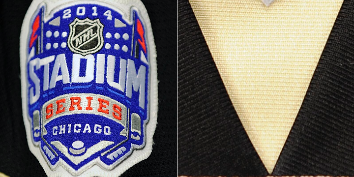
The team will travel to Chicago after the Olympics to face the Blackhawks at Soldier Field. It'll be the Pens' third outdoor appearance since the NHL started making a habit out of it in 2008. Earlier today, the Penguins announced they will unveil their 2014 Stadium Series jersey on Friday at 2 PM ET.
No word yet on whether the Blackhawks will join them.
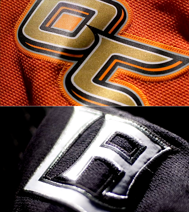
The Pens followed up their Twitter announcement with a sneak peek of the jersey — if you can call it that. We got a close-up of the Stadium Series shoulder patch (above, left). Then a few hours later came a second teaser photo. It showed a gold triangle over a swatch of black.
I'll be honest. I have absolutely no idea what we're looking at there. There is a small white triangle at the top of that photo, which could be a patch. But is it on the shoulder? There's something going on at the bottom edge of the photo. Maybe a sleeve number?
What do you see in these photos? Share your theories below!
 Chris
Chris
Pens share another cryptic teaser photo
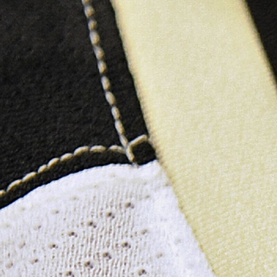 Photo from Pittsburgh Penguins (via Twitter)The Penguins will unveil their Stadium Series jersey in about 16 hours. But to hold us over, they've shared a third "teaser" photo.
I'm not sure the point though. They're definitely "Sabering" this. Yeah, I just said that.
Sabering. It's a verb. To "Sabre" a jersey unveiling (yep, two different spellings) is to reveal teaser photos that are so vague they weren't even worth seeing.
Case in point, I haven't been on Twitter all day so I didn't see the Pens tweet out this photo this morning. But it's so useless that not a single one of my 7,300 Twitter followers bothered to point it out to me. Which is unusual.
For what it's worth, Sabering has an antonym. Hurricaning your jersey unveiling means you're doing it right. (Used in a sentence: The Wild Hurricaned the crap out of their road jersey unveiling this summer.)
These terms have no relation to the design quality of the jerseys in question.
All right.
For immediate news on the Penguins' new Stadium jersey, keep an eye on Twitter tomorrow. I'll have the blog updated as soon as I'm able.