Some of you have been concerned by my lack of updates lately. Sorry, I'm just one person. And while I have been enjoying all that Super Mario Galaxy 2 has to offer, it's actually vacation prep that's been keeping me away from Icethetics. I'm out of the country all next week so hopefully this extended post will tide you over until I get back.
Anniversary logos appearing
Chris Creamer's SportsLogos.net is a resource I know many of you can't live without. Earlier this week, new NHL team anniversary logos started appearing on the message boards. Typically there are no big unveilings for these things, they just tend to come out in drips and drabs. So let's take a look.
 The Vancouver Canucks celebrate their 40th NHL season in 2010-11. This mark will likely find its way onto the jersey somehow. It's a pretty standard birthday logo, although for some reason it reads as a tombstone to me, the festive ribbon notwithstanding. Maybe it's the dash between 1970 and 2010.
In any case, it's basically the stick-in-the-rink logo sans the stick, replaced by a big 40. Not the most creative thing they could've done, but creativity isn't that organization's strong suit these days. Just one opinion. It's plain.
 The San Jose Sharks are turning 20 in 2011, but they're getting the festivities started a little early. You'll note that the 20 refers to how many years the team has existed not how many seasons it's played. Anyway, it's a solid logo, built on a pair of Xs with the shark in between.
It features a great use of color and type so I can't complain. It is rather wide, however. And just try to count all the triangles and partial triangles that cover the thing. Overall, thumbs up.
 Lastly, the Columbus Blue Jackets will join the Wild in beginning their 10th NHL season this fall. Rumors of a cannon taking center stage on the forthcoming third jersey next season are not substantiated by this mark, which gives us an alternate perspective of the Ohio state flag instead.
For whatever reason, the waving flag just screams Civil War to me. I like it. Definitely furthers the brand of the club. So kudos to all these logo designers. Sharp work for logos that will only be in use for a single season.
Thanks to those of you who pointed them out to me.
Maple Leafs jersey changes
 It should be news to no one that the Toronto Maple Leafs will don altered jerseys beginning with the 2010-11 season. And by "altered," I mean "fixed." The missing stripes will return as will a much-needed shoulder patch.
 Will the Leafs wear these in 2010-11?Mike Burse of Bleacher Report offers up an in-depth look at how Leaf fashion directly correlates to Leaf success/failure. He also offers up this mock-up/concept (right, from LeafsHQ, see below) of what these new jerseys might look like.
As I've mentioned prior, no final decision has yet been made public. To this point, all we have is what team management has said. But for the record, Burse also says the Leafs have had these alterations in the pipeline since April 2009.
The article also says that a new third jersey is in the works to replace the current one, but that won't happen until the 2011-12 season at the earliest. There's a lot of history to choose from.
Whalers reincarnate
 Howard Baldwin wants to bring hockey back to Hartford. NHL hockey. Whaler hockey. For those that have missed that iconic logo, he's trying to bring it all back.
Icethetics reader Gennaro Schiano writes in about the newly announced Whalers Hockey Fest which will consist of a series of outdoor hockey games to take place in February 2011. You can read more about it on Baldwin's website, WhalersSports.com.
Man, all this talk about changes to the league; will any of them happen? Will the Coyotes stay in Phoenix? Will Hartford get a team back? Will Winnipeg? Kansas City? What about new markets like Las Vegas? It's all kind of exciting.
Hopefully Whalers Hockey Fest is a big success. I'll be keeping an eye on it.
 Tampa Bay Rays in hockey sweatersBy the way, if you're interested, over the weekend the MLB's Tampa Bay Rays sported NHL jerseys on a road trip to Toronto. They had Blackhawks, Penguins and of course Lightning jerseys. Even the Bruins and Predators made an appearance.
There's more to this story and TSN has it covered for you.
Update on Friday · Jun 4 · 2010 | 8:48 PM PDT by
 Chris
Chris
It was brought to my attention that the above Maple Leafs jerseys were actually created by Jeff of LeafsHQ. You can see more images and his take on the forthcoming sweaters over there. Plus, as the Leafs ponder a new historical third jersey for 2011-12, Jeff has put together some concepts based on past uniforms. All worth checking out. Enjoy!


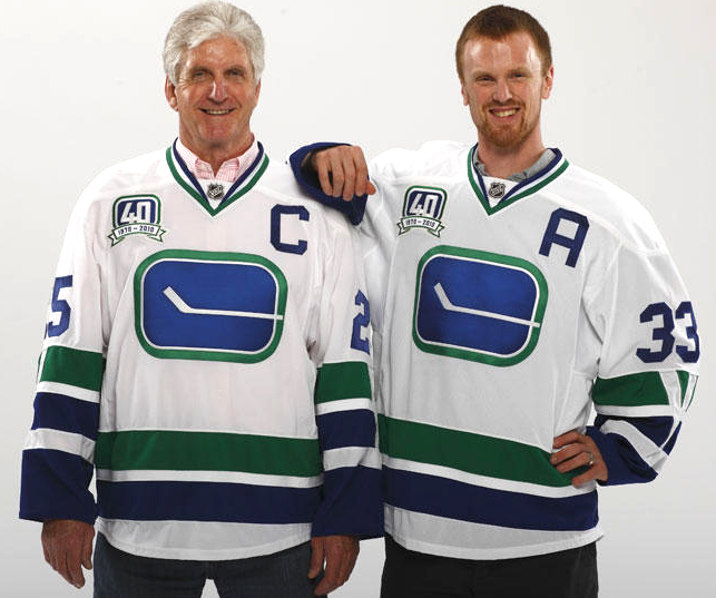 Canucks unveil throwback sweaterThe Vancouver Canucks unveiled their new throwback jersey Wednesday night at the Summer Summit event for season ticket holders. The sweater is part of the team's 40th anniversary celebration and will be worn five times throughout the 2010-11 season.
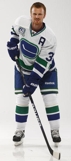 Sedin sports retro lookThe Canucks also used the event to officially unveil their 40th anniversary logo, which now appears in the banner of the team's website. An anniversary patch will be worn on all jerseys throughout the season.
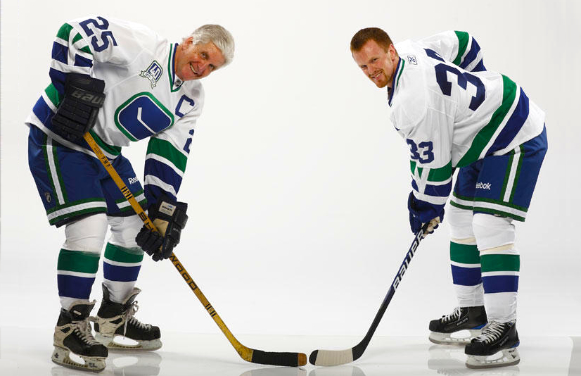


;)
;)


