Entries from January 20, 2013 - January 26, 2013

Saturday
Jan262013

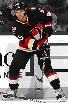
Arena Logos: The West

I put together something fun for this weekend, a little two-parter. Arena logos. A little out there? Maybe. No doubt you're quite familiar with your team's arena logo, but how about the rest of the NHL? And just like with team logos, there are good ones and bad ones.

Today, we start with the Western Conference. (Tomorrow we'll do the east.)

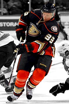
The Anaheim Ducks call the Honda Center home — and have done since entering the league in 1993. Only back then, it was called the Arrowhead Pond of Anaheim. An appropriate name for the home of a team called the Mighty Ducks. "The Duck Pond" got its current name in 2006.

The Saddledome has been home to the Calgary Flames since 1983. In that time, it's gone through a number of official names — though its always been the Saddledome thanks to its uniquely designed roof. When the arena was built, they called it the Olympic Saddledome as it was designed to host Winter Olympic events in 1988. In 1995, Canadian Airlines picked up the naming rights until it was absorbed by Air Canada in 2000. At that point, Pengrowth Energy tacked on their brand for a decade. Scotiabank took over in 2010.

Chicagoans know it as "The Madhouse on Madison," but the United Center has housed the Chicago Blackhawks since 1995 — though it actually opened in 1994. Thanks, NHL lockout. The logo changed in the fall of 2011 to sync up with the owner of the naming rights, United Airlines. When United merged with Continental, it took on Continental's globe logo.

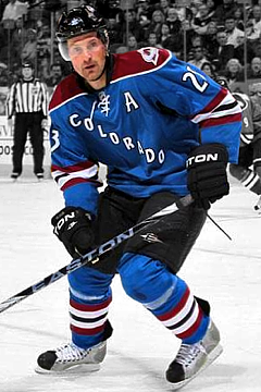
Denver's Pepsi Center — sometimes called "The Can" — is where the Colorado Avalanche hang their skates. When it opened in 1999, it allowed the Avs to upgrade from the aging McNichols Sports Arena — which was demolished a few months later. Much like the aforementioned United Center, the Pepsi Center saw a logo change in 2009 to coincide with its naming sponsor's rebranding. By the way, before they left Quebec in 1995, the Nordiques played at the Colisée Pepsi. Coincidence?

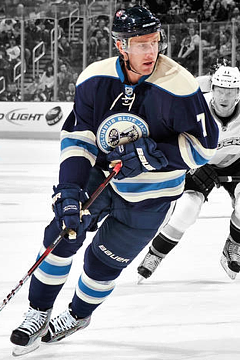
When Ohio's capital city put in its bid for an NHL expansion franchise in 1997, things weren't looking too good on the arena front. Voters opted against paying for one. Then Nationwide Mutual Insurance Company swooped in and offered to foot the entire bill — and of course named the building after itself. Shortly thereafter, the Columbus Blue Jackets were born. They hit the ice when Nationwide Arena opened in 2000.

In 2001, the Dallas Stars left Reunion Arena for the brand new American Airlines Center. They had played in Reunion Arena since moving from Minnesota in 1993. The building was torn down in 2009.

What more needs to be said? Joe Louis Arena and the Detroit Red Wings are positively synonymous. "The Joe" has housed the Wings since it opened in 1979. And it has the best address ever — 19 Steve Yzerman Drive. Prior to that, the Wings played at the Detroit Olympia, which opened in 1927. It was demolished in 1987. Last month, the owner operator of Joe Louis Arena, Olympia Entertainment, announced plans for a downtown development which would include a new arena for the Red Wings.

Rexall Place has been surrounded by drama as of late. The Edmonton Oilers have called it home since their WHA days in the 1970s, but after almost 40 years, they're eager for a new building. The rink opened in 1974, named Northlands Coliseum after a local nonprofit. It was renamed Edmonton Coliseum about two decades later. Then in 1998, Skyreach Equipment paid to have it called Skyreach Centre. Rexall bought the naming rights in 2003 — five years before its chairman, Daryl Katz, bought the Oilers.

The Los Angeles Kings moved in to Staples Center in 1999 after 32 years at The L.A. Forum. The building stays busy as it is home to not one but two NBA franchises as well as the Kings. At one point, Staples Center had a pretty cool logo, but I think they dropped it at some point for the simpler wordmark seen above. Correct me if I'm wrong, L.A. readers.

In order to bring NHL hockey back to Minnesota, the state funded the construction of a new arena in 1998. The Xcel Energy Center opened just in time for the arrival of the Minnesota Wild in 2000.

Bridgestone Arena has been home to the Nashville Predators since their inception in 1998. But when it opened in 1996, it was simply known as Nashville Arena. Three years later, it became the Gaylord Entertainment Center when one of the Predators' stakeholders signed a 20-year naming agreement. However in 2005, Gaylord sold its stake in the company and agreed to give up the naming rights.

The building was called Nashville Arena again until 2007 when it was renamed Sommet Center. But when the Sommet Group stopped making payments — and the FBI and IRS subsequently went knocking on their door for other reasons — another named vanished into thin air. It was back to Nashville Arena once more briefly in 2010. That's when Bridgestone came along and made an offer.

In 2003, the Phoenix Coyotes departed the America West Arena — and the city of Phoenix for that matter — for what is now Jobing.com Arena. America West — now US Airways Center — was horrible for hockey so the team had a new arena built in Glendale, Arizona. The Glendale Arena at Westgate opened and welcomed the Coyotes in the middle of the 2003-04 season. Jobing.com paid for 10 years worth of naming rights in 2006. Not to be an ass, but who here thinks the Yotes will still be playing there when the contract runs out?

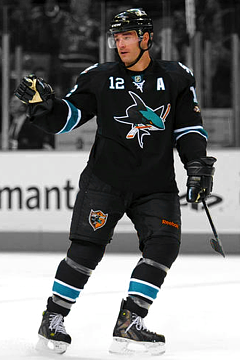
Perhaps one of the coolest arena names in the NHL belongs to HP Pavilion at San Jose — at least since the Ice Palace was renamed. The Pavilion is home to the San Jose Sharks, who moved in when the building opened in 1993. The team played its first two seasons at the tiny Cow Palace in Daly City, California. Upon arriving at "The Shark Tank," it was officially known only as San Jose Arena. It got its first naming sponsor in 2001 when it became the Compaq Center. When HP bought Compaq, they renamed the building after their line of personal computers — and it fit like a glove.

The St. Louis Blues moved from St. Louis Arena to Scottrade Center in 1994 — only back then it was known as Kiel Center. The name was changed to Savvis Center in 2000 but the naming rights were bought mostly with company stock — which turned out to be nearly worthless after the dot-com bubble burst. Ouch. Scottrade partnered up with the Blues in 2006 and the arena name was changed once more.

After nearly three decades of hockey at the Pacific Coliseum, the Vancouver Canucks departed for a new downtown home called General Motors Place in 1995. When the city of Vancouver hosted the Winter Olympics in 2010, the building was temporarily renamed Canada Hockey Place due to IOC restrictions on event site sponsors. Not long after that, the name was changed to Rogers Arena — and will stay that way until at least 2020 — after Rogers Communications picked up the naming rights.

Well, you made it to the end. Hopefully you found this post a little bit interesting. Check back tomorrow for all the arena logos in the NHL's Eastern Conference.

Thursday
Jan242013

Lagers Jersey Arrives!

It's here! The IceHL jersey that became a reality arrived at my door this week. Feast your eyes on an actual Milwaukee Lagers sweater! All thanks to the great folks at RinkGear. For those unfamiliar with this fantasy hockey league project, I recommend downloading the IceHL 2012 Yearbook. It's free!

As you can see in these close-ups, the quality is absolutely spectacular! It's like nothing I would've expected — especially for a fantasy hockey team that existed only in cyberspace until now. The logos and numbers are fully embroidered and the jersey itself is made of a substantial material. After all, RinkGear manufactures their jerseys to be worn in actual hockey games.

I can't get over how cool it is to watch the continued evolution of the IceHL Project. Never in my craziest dreams did I imagine I'd get to touch an IceHL jersey, much less hang it in my closet. Again, I have to give a huge thanks to RinkGear for helping to make this happen.

And because RinkGear considers this IceHL jersey to be a success, they want to do another one! Beginning this weekend, I'll be conducting another series of polls to determine which one will be produced next. I've come up with a list of 16 jerseys that will be involved in this next round of voting. The list is based on how the jerseys finished in the last round of voting. In no particular order:

  • Montreal Olympiques
  • Winnipeg Winterhawks
  • Quebec Armada (white)
  • Seattle Aviators
  • Hartford Mariners
  • New Orleans Gators (white)
  • Boston Colonials
  • Alaska Huskies
  • Calgary Cavalry
  • Regina Renegades
  • New York Guardians
  • North Carolina Nighthawks
  • Tampa Bay Barracudas
  • Northwest Narwhals
  • Salt Lake City Scorpions
  • Washington Sentinels

Can't wait to see the next IceHL jersey hanging in my closet!

If you bought a Lagers jersey, let us know what you think of it in the comments. I can tell you that Winterhawks GM Dan Raposo loves his — and is probably hoping the Hawks are next!

Tuesday
Jan222013

2013 NHL Third Jersey Schedules

A handful of NHL teams have released their third jersey schedules for the abbreviated 2013 season. I'm collecting them all here, so if you know of any others floating around, drop me a line.

Boston Bruins

The Bruins will sport their alternate sweater 7 times this season — including its season debut on Monday night.

  • Mon., Jan. 21 — vs. Winnipeg Jets
  • Tues., Jan. 29 — vs. New Jersey Devils
  • Tues., Feb. 12 — vs. New York Rangers
  • Sat., Mar. 2 — vs. Tampa Bay Lightning
  • Sat., Mar. 16 — vs. Washington Capitals
  • Mon., Apr. 8 — vs. Carolina Hurricanes
  • Fri., Apr. 19 — vs. Pittsburgh Penguins

All third jersey nights this year are home games at TD Garden and there are no repeat opponents.

The Bruins unveiled and debuted this third jersey during the 2008-09 season. This is its fifth season in use.


Carolina Hurricanes

Hurricanes fans will have to wait a while to see their team's third jersey again. It's not set to make its 2013 season debut for another month. But once it does, the black sweater will be used 7 times, including once on the road. 

  • Sat., Feb. 23 — vs. Tampa Bay Lightning
  • Sat., Mar. 2 — vs. Florida Panthers
  • Thurs., Mar. 7 — vs. Montreal Canadiens
  • Thurs., Mar. 14 — vs. Washington Capitals
  • Tues., Mar. 26 — vs. Winnipeg Jets
  • Sat., Apr. 6 — vs. New York Rangers
  • Sun., Apr. 21 — at Tampa Bay Lightning

The Canes' third jersey will see action against all four Southeast Division opponents this year.

The sweater was unveiled and debuted during the 2008-09 season. It's now in its fifth season of use.

Colorado Avalanche

The Avalanche will also wear their third jersey 7 times this season. Starting to see a pattern here? All 2013 occasions will take place at home.

  • Mon., Feb. 4 — vs. Dallas Stars
  • Wed., Feb. 20 — vs. St. Louis Blues
  • Sun., Mar. 10 — vs. San Jose Sharks
  • Sat., Mar. 16 — vs. Minnesota Wild
  • Sat., Mar. 30 — vs. Nashville Predators
  • Fri., Apr. 8 — vs. Calgary Flames
  • Tues., Apr. 19 — vs. Edmonton Oilers

From Colorado's press release:

The Avalanche initially unveiled the third sweater to the public on Nov. 12, 2009 and wore it for the first time two nights later against the Vancouver Canucks.

The third jersey design is a collaboration of ideas from the Colorado Avalanche (including Kroenke Sports Enterprises Creative Imaging), the National Hockey League and Reebok.

The third jersey has a predominantly blue color scheme with a diagonal COLORADO type, laces at the neckline and stripes on the sleeves. Two rounds of sweater prototypes were tested and ran on ice before the final version was made.

Columbus Blue Jackets

The Blue Jackets will also wear their third jersey 7 times this season — all home games at Nationwide Arena. Here are the actual dates, as released by the club.

  • Sat., Feb. 2 — vs. Detroit Red Wings
  • Sun., Feb. 10 — vs. Edmonton Oilers
  • Tues., Feb. 26 — vs. Dallas Stars
  • Thurs., Mar. 7 — vs. Vancouver Canucks
  • Tues., Mar. 19 — vs. Nashville Predators
  • Sun., Apr. 7 — vs. Minnesota Wild
  • Fri., Apr. 12 — vs. St. Louis Blues

The Blue Jackets introduced their third jersey on Nov. 24, 2010. This is its third season in action.

Here's more from the team's website:

The phrase "We Fight, We March!," which appears on the interior of the jersey's collar, was first introduced during the 2008-09 season to describe the Blue Jackets’ first-ever march to the Stanley Cup Playoffs.

The expression continues to represent the team's intention each year to fight and march throughout the regular season and into the playoffs. Below "We Fight, We March!," 10 stars commemorate the introduction of the jersey in the club's 10th season.

Minnesota Wild

The Wild are breaking the mold, wearing their green third jersey a whopping 9 times during the 2013 season. All dates are home games.

  • Sun., Jan. 20 — vs. Dallas Stars
  • Wed., Jan. 30 — vs. Chicago Blackhawks
  • Sat., Feb. 9 — vs. Nashville Predators
  • Sun., Feb. 17 — vs. Detroit Red Wings
  • Sat., Mar. 23 — vs. San Jose Sharks
  • Sat., Mar. 30 — vs. Los Angeles Kings
  • Tues., Apr. 9 — vs. Chicago Blackhawks
  • Sun., Apr. 21 — vs. Calgary Flames
  • Fri., Apr. 26 — vs. Edmonton Oilers

It's always great seeing the Wild wearing green and they'll be doing that a lot this season.

My search has only turned up third jersey schedules for these five teams. If you've come across any others, drop me a line and I'll keep adding on to this post.

Monday
Jan212013

20 Years After the Redesigned Penguin

Design firm reveals work that led up to new logo in 1992

It was the summer of 1992. The Pittsburgh Penguins had just completed two consecutive Stanley Cup victories. Enter a controversial new owner and a controversial new logo. Now, the company that Howard Baldwin hired to design that new mark is taking a look back at how it all came together.

First of all, believe it or not, it wasn't Baldwin's idea to rebrand the Penguins in the first place. He was just following through on a plan that had already been set in motion prior to his arrival. Vance Wright Adams was the Pittsburgh firm he called upon to come up with the team's modern new look.

And no matter what you think of that look, it's always refreshing to see the design process and some of the options that were rejected on the way to the final look. Vance Wright Adams is now sharing a few of them with all of us two decades later.

A nickname jersey proposed before it was "cool"

These are some of the hand-drawn options that were considered during the design process. Note that Vance Wright Adams came up with a "PENS" jersey long before those "BOLTS" and "SENS" jerseys ever became a reality. And what do you think of the more realistic looking penguin trapped inside the gold triangle?

Vance Wright Adams proposed the Penguins use 4 jerseys

According to a video produced by the Penguins to introduce their new look, VWA actually proposed four jerseys that season — two homes and two roads. The NHL wasn't too keen on that, of course. But those four sweaters might've looked a little something like what you see above. Really like the black one on the right!

Vegas gold was a possibility long before it was a reality

And here's proof that Vegas gold was in the running long before the third jersey it was introduced with in 2000. That third jersey, by the way, resurrected the classic skating penguin eight seasons after it was retired. Only two years after that, the new streamlined penguin was relegated to the shoulder patch by owner Mario Lemieux. And when Reebok came along in 2007, it disappeared from the uniforms for good, ending a 15-year run.

See more concepts and sketches from Vance Wright Adams

You can find more high-resolution uniform concepts and sketches from Vance Wright Adams by visiting their website. I highly recommend it. I also have to send up a huge thanks to those guys for posting their old work. It's not often we get to see this stuff but always a treat when we do.

Vance Wright Adams is also responsible for creating the AHL's Wilkes-Barre/Scranton Penguins logo as well as logos for a number of other teams.

Now I'll leave you with the video the "Back-Checking the Penguins" video produced by the team to launch their new look back in 1992.

Sunday
Jan202013

Exploring NHL Helmet Decals

Yeah, this is gonna be a weird one. We're all aware how NHL uniforms are loaded down with various team insignia, but it's the helmet that's home to more logos than you may think. In fact, one team's helmet decal is getting a lot of attention in the early part of this season.

Buffalo Sabres introduce new version of primary logo

I've been surprised by the volume of tweets and emails I've received on this subject. Apparently, the Buffalo Sabres have introduced a decal on their helmets this season. It's not a new logo as much as a portion of the existing primary logo — the crossed swords.

It wouldn't seem all that groundbreaking, but most readers are asking whether it could be a clue to the Sabres forthcoming third jersey in 2013-14. Personally, I don't see it. This doesn't make for a very strong standalone logo. As a decal on the back of a helmet, however, it's fine.

There's a lot of stuff on NHL player helmets

With the Sabres out of the way — and in the interest of balance — I decided to research the other 29 teams to see what kinds of decals they wear. For one thing, most teams wear big decals on each side of their helmets. The logos vary. Some are primaries, some secondaries — some are even wordmarks.

Then of course each player wears his sweater number on the front and back of his helmet for identification purposes. You'd think that would fill up the helmet, but there's actually room at the back across the bottom — on either side of the uniform number.

On the right side, every player wears the NHL shield. On the left side, it varies by team. Most teams feel like their helmets are cluttered enough. But a few have found room for one more decal — including the Sabres. So let's take a look at the rest of the league — specifically that back left side.

The Florida Panthers' back-of-helmet decal is the same logo found on their shoulders. It's the secondary logo that's been in use since the club's inception back in 1993.

It's not uncommon to find memorial decals on players' helmets. The Los Angeles Kings use the black and silver version of their crown logo with the names ACE and MARK surrounding it. Garnet "Ace" Bailey and Mark Bavis were scouts for the Kings on their way back to Los Angeles from Boston on the morning of September 11, 2001. They were flying on United Airlines Flight 175 when it was hijacked and flown into the south tower of the World Trade Center.

The logo found on the back of Minnesota Wild players' heads is their new wordmark — introduced alongside a new shoulder patch last season.

The Ottawa Senators used this mark on the shoulders of a third jersey they launched in 2000. It disappeared in 2007 when that sweater did — or so you might think. The logo, which depicts the Peace Tower and a red maple leaf — the universal symbol of Canada, can currently be found as a decal on the back of players' helmets.

The Phoenix Coyotes are continuing to wear a decal in honor of team massage therapist Jukka Nieminen, who died in June 2010. It's been in use since the start of the 2010-11 season.

New this season, the San Jose Sharks have a memorial helmet decal to honor the team's original owner, George Gund III. Gund died Jan. 15. According to the Sharks, the helmet decal will be joined by a sweater patch — which the team wasn't wearing to open the season Sunday night (at least not that I could see). They did unveil the patch Saturday via Facebook.

The Washington Capitals wear their famous Weagle logo on the backs of their helmets. The secondary mark also serves as a shoulder patch on the club's home and road uniforms. Double duty for the Weagle.

And the Winnipeg Jets continue to honor Rick Rypien, who died in the summer of 2011 before he ever had the chance to wear a Jets jersey. The memorial decal was also used last season.

That doesn't quite wrap things up, however. The New York Rangers are wearing some kind of decal on the back of their helmets this season, though I haven't been able to identify it yet. If you can help, drop me a line. This collection feels incomplete without it — whatever it is.

Also, I haven't yet been able to find a clear picture of the back of the Columbus Blue Jackets helmet to determine whether or not they are using a decal this season. Other than that, any team not mentioned in this post is confirmed to not be wearing a decal on the back left side of their helmets.

Anyway, hope this post offered some interesting insights. Helmet decals. What will they think of next?