Before we get into the details of the newly unveiled San Jose Sharks primary uniforms, it might help to ask why they redesigned them in the first place. After all, they just redesigned their entire identity — logos and jerseys — in 2007. Why do it again after just six years?
Performance, in a word. According to the Sharks, the players love the lightweight third jersey. Why do you think they wear black every year come playoff time? So the main idea behind revamping the primary jerseys was to drop weight.
Sure, we can ask whether a few ounces here or there really makes any kind of difference. But then we've never played hockey at the NHL level, so what would we really know about that?
 All photos and images from San Jose Sharks
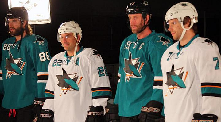
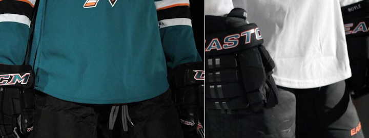
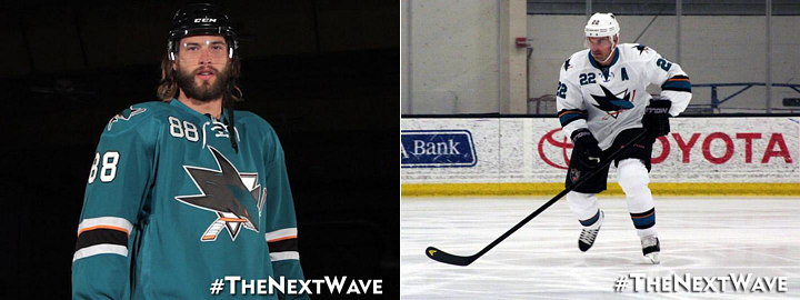
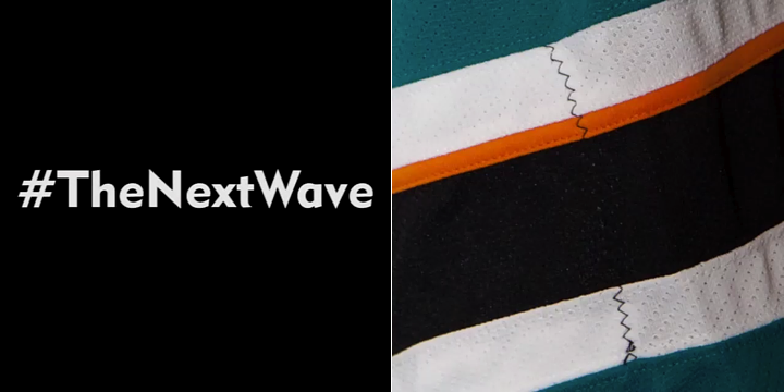
On first glance, we see a highly simplified style compared to the previous jerseys. No shoulder yoke and no waist stripes. Now the teaser photos from the last couple of days make sense. The details they showed us were the only details they could. There's not really much else to see.
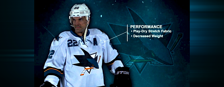
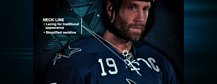
We'll start with the features the Sharks are touting in one of their new videos.

Right off the bat, it's all about performance. This is a unique story this summer. The Stars wanted a color palette they could own and the Hurricanes wanted a more traditional sweater design. The Sharks, however, wanted to keep their players from being weighed down by a heavy jersey.
This was made very clear in another video the Sharks posted, in which Sharks GM Doug Wilson and COO John Tortora talk about the design process. Here's what Wilson said:
The jersey was designed mainly with performance in mind. Remove extra weighting. Make it as efficient as our third jersey, the black jersey.
From the performance side, just the weight of it. If you take a look at our black jersey, the players really love that one. Not only the success they had with it, but weight of it. For movement and everything.
The players and trainers had the most input.
Interesting here how involved the players and trainers were. Clearly, these jerseys are more about utility and less about vanity. So good or bad, they probably won't be favorites among Icethetics readers.

Even if the look wasn't the primary focus, it's still a critical part of any jersey. While it's important to have something the players like, the reality is it's just as important to have something the fans like. They're the ones who are supposed to be buying them.
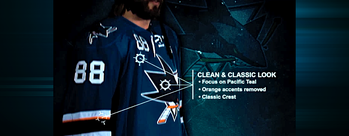
That in mind, the Sharks listened to the feedback they were getting from fans. And if it's anything like what I read on a regular basis, they wanted the orange gone. I'll admit the original teal and grey jerseys were nice, but the orange accents were an upgrade in 2007. Sounds like I was in the minority there.

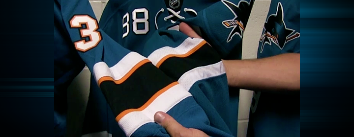
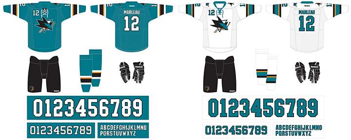
To that end, the orange has been removed entirely from the numbering and lettering. And there's now just one thin stripe on the sleeves to keep that part of the palette represented. It still works, and hopefully it will incur less wrath from Sharks fans. The picture above shows a side-by-side comparison of the old design (left) and the new.
And is it just me, or has the shade of teal been changed again? Looks the smallest bit greener.

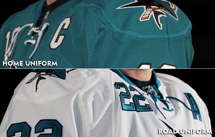
One of the big changes was to the neck line of the jerseys. The multi-color collar has been simplified to teal — even on the teal jersey where it blends right in. And new this year are the laces you find on the black jersey. My first thought was, wouldn't the laces add extra weight? But it's become clear the Sharks just want teal and white versions of the third jersey the players love so much.
And the "traditional appearance" argument is getting harder and harder to sell in this NHL. So far, every new jersey we've seen this summer has them — except Buffalo's third which hasn't actually been released yet. Counting San Jose, 17 of 30 teams are now sporting lace-up collars. That's more than half the league.
Guess how many teams wore lace-up collars 20 years ago. Zero. How about 30 years ago? Still zero. If we go back 40 years, we find that just five of 16 team wore them. And the Sharks never have — until the black third. The point is, this is a new trend in hockey.
I'm not saying I dislike this collar style. I'm just asking that we stop using the word "traditional" to describe them. It's just not accurate.

Let's move to the shoulders. The yoke and its piping are gone, which is a relief to some. The reason I like it is that it does have the feel of a more traditional Sharks jersey. Their original sweaters didn't have shoulder yokes and they looked great.
What I am disappointed about is the shoulder patch. I was hoping for an update in that department to one of the other marks in their arsenal. In particular, I had my fingers crossed for the fin logo I included in yesterday's post. But perhaps it has too much orange. All I know is that the existing patch is basically the primary logo without the triangle. Why not try another option?
It's also disappointing to see them stick to their guns on the chest numbers. I really hoped that was going away. Only the Sharks and Sabres are still using them and it looks awful. On a more practical note, wouldn't those numbers add weight? I guess as a player you could just switch to one digit to cut weight. I assume No. 1 would be lightest but none of San Jose's goalies use it.

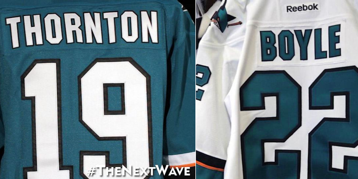
Here's something I like. The simplified palette of the numbers and letters was definitely a good move. Yes, it reduces weight by losing the orange layer, but it just looks more... "Sharks" to me. I don't know how else to put it. Might be a good time to use the word "traditional."

Now here's something I don't l ike. Where are the stripes? Logically, I get it. I understand the weight reduction aspect of these redesign. But I just can't reconcile that with my desire for good hockey sweater design. Twitter's ablaze with commentary on how much these resemble practice jerseys because of the lack of waist striping. And I don't disagree with the sentiment.
But if the players want it, if they say it makes a difference, we'll just have to live with it.
By the way, I shudder to even suggest this, but strictly as a way to keep the waist striping, I think I would've been all right with a little sublimation. I know, it sounds awful. But would it be worse than this?

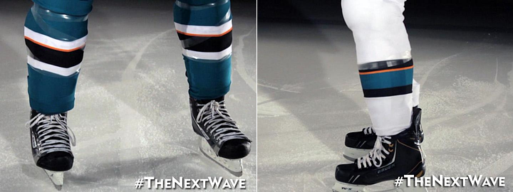
It should also be noted that the sock striping was changed to match the sleeves.
I think I've hit all the important points in this review. I'm sure you guys will let me know if I missed anything. As I've said in previous reviews, I'm not good at giving out grades, but I can do a summary.

Summary
Here at Icethetics, we're so accustomed to thinking of hockey sweaters as simply pieces of design. We can therefore describe why the design is good or why it's bad. Or both. But if the Sharks' redesign has reminded us of one thing, it's that hockey sweaters are critical pieces of equipment to some of the planet's most talented athletes.
What may look cool doesn't necessarily translate to athletic performance. Anyone remember Cooperalls? I'm not trying to say they were cool, but it was an instance where design curbed performance. Those things were flat out dangerous if you took a spill. Here, it's not as drastic, but it's just as understandable.
The players asked for lighter weight jerseys. But there also needs to be a good design. It's hard to be the servant of multiple masters. With that in mind, I think the final product works. They used the opportunity to address fan issues such as the use of orange while also addressing player concerns.
The end result is a bit of a mixed bag. But then with multiple masters, so was the starting point.

Now that you've read my take, get to the comments and let me read yours.
 Thursday · Aug 22 · 2013 | 5:00 PM PDT
  35 Comments


