Entries by Chris (777)

Saturday
Dec212013

Jersey Cookies Star in HBO's 24/7

Part 2 of 2014 Winter Classic documentary airs tonight

Perhaps one of the best things about the NHL Winter Classic in the last few years is HBO's contribution. Their 24/7 camera crews are granted unlimited access and present the game in a way you've never seen before — unless you've played it professionally.

In last week's premiere episode, we got a quick glimpse at how well the Detroit Red Wings are treated while on the road. For example, every player received a specially made cookie with his name (and number) on it — literally! These jersey cookies were too cool not to share.

The second installment of the four-part series, 24/7 Red Wings/Maple Leafs: Road to the NHL Winter Classic, airs tonight at 10 PM on HBO. This show alone is worth the subscription fee for any hockey fan.

Friday
Dec202013

Rangers, Hawks Reveal Stadium Jerseys

Photos from New York Rangers

Rangers set to sport white at Yankee Stadium

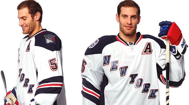
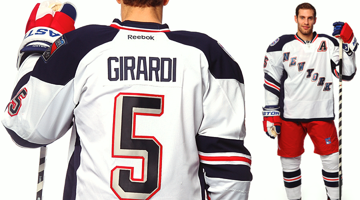
The New York Rangers unveiled their NHL Stadium Series uniform today. And if you read last night's blog post, you weren't surprised by what you saw.

Our first taste came by way of a goofy video starring Dan Girardi. He enters the Rangers locker room to scope out the new jerseys hanging in the stalls. He's then horrified to find that in his stall is a Yankees jersey — not again! Yuck, yuck, yuck. No.

For a white jersey, it's pretty slick. White jerseys tend to be bland, if you ask me, so I was impressed by how this one turned out. (Not so much with Pittsburgh.) I really like the sleeve striping. It's a style not seen with any other team and it's uniquely New York.

Photos from New York Rangers

On seeing the full uniform, one of the comments that was repeatedly expressed on Twitter was how much it reminded folks of the Hartford Wolf Pack — the Rangers' AHL affiliate. Well, yeah. The Wolf Pack's original uniforms were modeled after the Rangers' Lady Liberty jerseys in 1997.

In other words, they're not copying a minor league team so much as digging into their own recent history a little. Personally, I wish they would've gone a little farther.

This was the perfect opportunity to resurrect the Statue of Liberty logo that graced the team's third jersey for 10 great years between 1997 and 2007. The perfect opportunity! One game, not intended for throwbacks. Plus in terms of striping and colors — navy blue, specifically — this jersey was tailor-made for Lady Liberty.

Like I said, it's not a bad jersey, but I might've actually paid for one myself if it had that logo on it. (A Brad Richards one, of course!)

Photos from Chicago Blackhawks

Chicago goes "back in black" for outdoor game

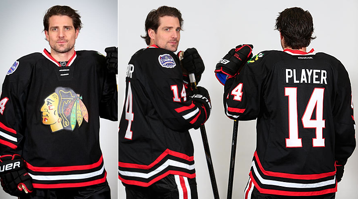
The Chicago Blackhawks caught us by surprise this morning when they suddenly announced plans to unveil their Stadium Series jersey later in the day. Two hours later came a teaser photo. Two hours after that, we got the whole jersey. (They just beat Sharking at its own game. Remember Hurricaning and Sabering?)

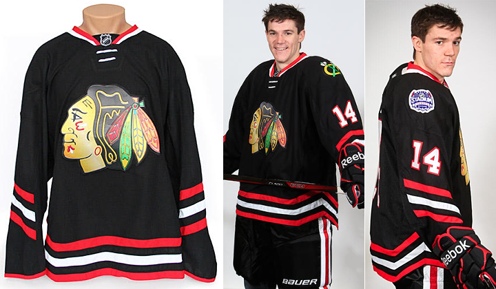
Like the Rangers, the Hawks gave us a cheesy video — this one set to the first 20 seconds of AC/DC's "Back in Black." The music plays under behind-the-scenes video of Patrick Sharp and Andrew Shaw sporting the new sweater for a photo shoot.

Once again, though, last night's post previewed this look. The Hawks are essentially bringing back their black third jersey from the late '90s. It was a good one. The biggest difference here is in the striping.

Photos from Chicago Blackhawks

Some will no doubt bemoan the half-stripes on the sleeves. But for whatever reason, I think it works here. Those colors really are striking. The only thing I'm still not sold on is the whole angled thing. Will it really make a difference in terms of visibility, as all the marketing mumbo-jumbo claims?

But there is one thing I really dislike about this jersey. It's front and center.

Compare this screen-printed mess with the traditional stitching of a Blackhawks crest. You're right, there is no comparison. If Reebok is trying to cheapen their product, they're on the right track. Good luck getting anyone to drop $300 on something that looks like it came out of an ink-jet. I hope this doesn't become a trend.

For now, I'll chalk it up to the rush job. As we heard from L.A. Kings management, these jerseys were all pumped out within a matter of months by the same design team. That's just asking for a poor product. Hopefully future events like this will be better planned.

Your turn to weigh in! What do you think of these new sweaters?

Thursday
Dec192013

Stadium Series: What's Left?

Rangers to unveil Stadium jersey Friday afternoon

The time has come to catch up on the three remaining NHL Stadium Series jerseys that have yet to be released. I'm now able to share with you some details about what's to come.

To begin, the New York Rangers announced this afternoon that they will unveil their outdoor jersey on Friday afternoon. It's been rumored it would come this week. Now it's official. Word is, the release will happen online around 3 PM ET via their website. I assume we'll get some photos and a nice video — like the other teams have done.

Fan snaps sneak peek of jersey ahead of unveiling

But you don't have to wait until tomorrow to get your fill of pre-release details.

Photo by Reddit user SMIRTLE

For one thing, a photo of the jersey was leaked tonight by Reddit user "SMIRTLE," who wrote: "At MSG for a basketball game and happened to pass by a gift store where the unreleased winter classic [sic] jerseys are lying on the floor!"

He obviously meant Stadium Series, not Winter Classic. But the point is, you can see parts of the jersey from his cell phone shot. A nice little sneak peek.

New sweater includes mix of past jersey features

As it happens, I was able to get a look at the full front and back of the Rangers' Stadium Series jersey today. So I'd like to give the diehards an idea of what to expect tomorrow.
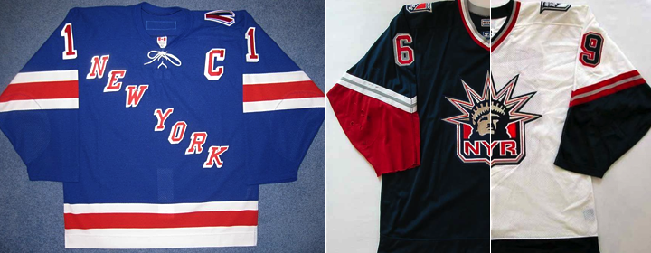
Photo (left) by @CJ_Matthews

The jersey features elements of each of the above uniforms previously worn by the Rangers. I'll explain with some bullet points. 

  • It's white. (That's obvious from the leaked photo.)
  • The Rangers' tradition of diagonal text running down the chest continues. But instead of "RANGERS," it says "NEW YORK." (That design was used back in the early '80s as well as for a 9/11 tribute sweater.)
  • In this case, "NEW YORK" will be blue, outlined in silver and red. It's been chrome-ified.
  • The color scheme harkens back to the Lady Liberty third jersey from the 2000s. That is, the navy blue and silver are back. No royal blue on the jersey.
  • Also, the sleeve striping is based on that NYR sweater. In this case, a thin red stripe lies between two thick navy blue ones with some white space between them. (That's also visible in the leaked photo.)
  • The template most closely resembles the Ducks' jersey. Navy blue on the shoulders and down the sides with one solid blue stripe at the base. The new lace-up collar style.
  • The Rangers' shield logo is featured on the left shoulder. The Stadium Series patch on the right.
  • The name and number style matches what we saw on T-shirts last month. (And on the white version of the Lady Liberty jersey above.)
  • The back numbers are elongated and the sleeve numbers are angled.

One more note. You may recall the Rangers — despite playing on their "home field" at Yankee Stadium — are designated as the "visiting team" for both outdoor games. Their opponents, the Islanders and Devils will count these as "home" games. And as is standard, the road team wears white while the home team dons their dark uniforms.

I can't imagine I've left any stone unturned here, but if you have any questions, feel free to ask. Or, you know, just wait until tomorrow afternoon.

Devils fight back against Stadium Series modernization

Speaking of the New Jersey Devils, they are the one team I don't have solid information on. But in this case, I trust the rumors. And you probably will too once I lay it all out.

Knowing as we do Lou Lamoriello's stance on jerseys — that is, the Devils wear red, white or, begrudgingly, a throwback and NOTHING else — it's no surprise to hear that New Jersey will apparently be sporting their red and green retros this winter.

They've been used on or around St. Patrick's Day in recent seasons since 2010.
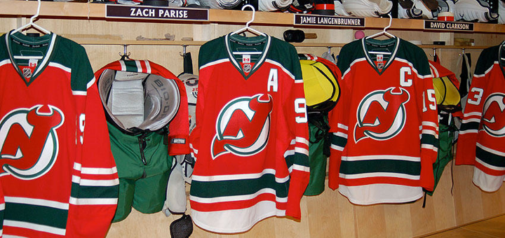
Photo from New Jersey Devils (2010)

This goes against the decidedly modernized jersey designs being implemented for the Stadium Series. And it's speaks to Lamoriello's sweater conservatism in a big way. Was he able to fight back against the powers at Reebok and the NHL?

But there's a twist. Even if the colors and striping survive, it sounds like we're still getting that chrome crest. There are some battles you just can't win, I suppose. I'm eager to see how it all comes together. The Devils have not announced a public unveiling date yet.

Neither have the Blackhawks.

UPDATE 12/20 (10:34 AM): The Blackhawks tweeted this morning that they're "gearing up for a special unveiling this afternoon!" So it looks like we'll get the Rangers' and Hawks' jerseys around the same time — today.

Hawks bringing back black for Stadium Series

Here's one we should've seen coming. Instead of a red Stadium Series jersey for the Chicago Blackhawks, they'll actually be wearing black. (That's going to be one dull-looking game at Soldier Field, I'm afraid to say.)

As far as the design itself, there's good news and bad news. I'll start with the bad. The template lives on and it does some unpleasant things to one of the game's most universally loved sweaters. The good news — it's still kind of a throwback and it's one of the best-looking Stadium jerseys!

Remember the Hawks' black third jersey? It debuted in 1996 (like the Burger King and Wild Wing monstrosities, in fact) and lasted until the Age of Reebok in 2007. It was brought back the following year in the Edge cut before being replaced by the 2009 Winter Classic jersey.

It's back! Imagine this jersey on the new Stadium Series template. It doesn't totally ruin it, but it does make it less awesome. The stripes don't wrap completely around the sleeve and there's no black space at the very bottom of the jersey. Then there's the chrome thing. And the angled and elongated numbers.

The classic yellow "C" patch is emblazoned on the left shoulder — although I believe it was spared the chrome treatment. Of course, the Stadium Series patch is on the other shoulder. The new modern collar laces are also in play here. They're white.

This one will easily be the least-hated jersey among traditionalists who dislike the new-fangled template. And I'd say it was the best thing the Blackhawks could've hoped for given the parameters of it.

Which of the three jerseys are you looking forward to most?

Wednesday
Dec182013

ECHL Opens All-Star Jersey Voting

Three finalists selected; voting ends Monday

Polls have officially opened on the 2015 ECHL All-Star Classic jersey design contest hosted by the Orlando Solar Bears. Last week, the Solar Bears began accepting submissions from fans. Today, the three finalists were revealed as voting began. Take a look at the options presented to voters.

Image from Orlando Solar Bears

According to the press release, the Solar Bears received more than a hundred entries and the finalists were selected by "a group made up of individuals from the ECHL, CCM, the Joe Bosack Design Co. and the Orlando Solar Bears."

Polls close Mon., Dec. 23 at noon ET so VOTE NOW!

Icethetics contributor's design among finalists

Unfortunately, the Solar Bears elected not to include the designers' names with their entries in the poll of finalists. However, we do know "C" was designed by frequent Icethetics concept contributor Matt McElroy, who tweeted about it earlier today. It also showcases his IceBorn concept template, which is featured here on Icethetics. Good luck to Matt!

For a look at some other all-star jersey submissions which were not among the finalists, check out yesterday's post on the Concepts page.

What do you think of the finalists? And which one will you be voting for?

Sunday
Dec152013

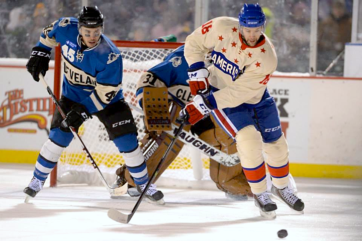
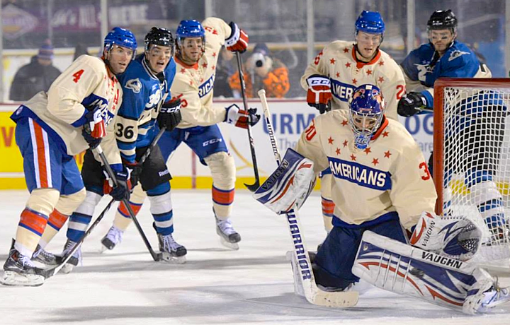
Frozen Frontier Sweaters Shine

All photos by Micheline Veluvolu

AHL's Americans and Monsters meet at Frontier Field

The first outdoor game of the hockey season happened Friday night in Rochester, New York. The Rochester Americans hosted the Lake Erie Monsters in a game with a very distinct look. In typical outdoor fashion, the opponents sported throwback jerseys.

The Amerks were dressed to look like they did back in the late 1950s. The Monsters, meanwhile, took on the look of an even older team that preceded them in their hometown of Cleveland — the Cleveland Barons.

A photo gallery posted on the Amerks' Facebook page allows us to enjoy the aesthetics of the game in all their splendor. I recommend spending some time there.

What do you think? Are you over the throwback trend? Or is it a welcome relief from the onslaught of modern Olympic and NHL Stadium Series jerseys?