NHL Tournament of Logos

Entries in blue jackets (36)

Monday
Oct012007

Rbk EDGE Review: Blue Jackets

Part 8 of 30. All 30 NHL clubs have unveiled new jerseys under the new Rbk EDGE Uniform System for the 2007-08 season. Here at the NHLToL, we're going to review every one of them. Read up and then rate the new sweaters. We'll do a full ranking after completing all of the reviews.

Rbk EDGE Uniform System

Columbus Blue Jackets


New Uniforms

Old Uniforms

The Unveiling
Friday, June 22. The Blue Jackets unveiled their jerseys at the 2007 NHL Draft in Columbus.

Home vs. Road
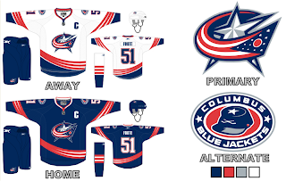
Home: Blue. Road: White. The two sweaters are essentially mirror images of each other and both feature secondary logo patches on the shoulders.

The blue home jerseys feature white and red piping that extends down the sleeves to the cuff. A white star is placed on each wrist and red piping goes around the cuff. The bottom of the jersey has red and white piping and the collar is also striped in red and white. The primary logo serves as the crest.

The white home jerseys feature a thick blue stripe extending down the sleeves, bordered by white and red piping that extends to the cuff. A white star is placed on each wrist and red piping goes around the cuff. The bottom of the jersey has blue and red piping and the collar is also striped in red and blue. The primary logo serves as the crest.

In The Details
The white stars at the wrist are a unique feature to these uniforms. The same numbering and lettering style has been retained.

New & Old
There are many changes between this year's new jersey and last year's. For one, the Blue Jackets have adopted their third jersey as a primary sweater, dumping the old logos altogether. Red is also less prominent in the new logo as well as uniforms. The horizontal stripes around the waist are gone.

Standard FAQ
Numbers on the front? No.
Laces at the collar? No.

NHLToL Editorial by Chris
When the first Blue Jackets logo was unveiled and it featured a bug, I was almost sure it was a joke. Yet it appeared on that jersey for way too many years. In adopting a new primary logo this year, the Jackets have quickly become a great-looking team. I think the new logo is a huge improvement and better than most currently seen in the NHL. And the uniform is fitting. The stars on the wrists are a nice touch. I also like the shoulder patch but could see it working better without the outer oval spelling out the team name. My one other quarrel is with the sleeves on the home sweater. I think they should be black like they were on the third jersey. But that's just my opinion. A decent effort. 3/5


Buy your new Blue Jackets jersey!

Saturday
Sep292007

Result: Blue Jackets Logo History

BEST ALL-TIME
2007

78% 3,317 votes

4,256 total votes

2000
28% 939 votes


Poll opening date
Sep 21 @ 4:35 AM
Poll closing date
Sep 28 @ 11:59 PM

07BONLH | LHCBJ

Thursday
Sep272007

Jersey Concept Art Galore

Busy day today. Shame I'm only getting to my first post at 5 PM, but some days, that's the way it goes.

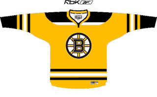
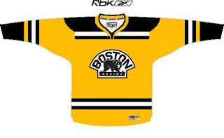
Always gotta kick things off with some good concepts. So let's dive in with the Boston Bruins.

I like these logos much better on a yellow jersey than the old bear head. Although, I say that now but to be fair, when it came out I thought it was pretty damn cool.

I also like the striping patterns on both jerseys. When the third jersey program is reinstated next fall, I hope the Bruins consider something like this. It's very sharp.

Then, one thing a lot of people have been contemplating is what the Atlanta Thrashers would look like if the road jersey matched the home jersey.

Perhaps it would look like this. That's really nice, if you ask me. I really love the asymmetry of that light blue jersey. The city down the arm looks great and it's so unique to this team. I'm really impressed and I only wish the Lightning had thought of it first.

One reader also emailed me a handful of concept designs. I wish I had larger images, but this is what was sent.


My favorite in that set is the Kings but I think the red Blue Jackets sweater is ironic and very sharp. Not a fan of the black Wings jersey and the blue Isles jersey reminds me of the Lightning's old black sweaters with the white along the shoulders.

Now it's time for your input. Let us know what you think in the comments below.

Friday
Sep212007

Poll: Blue Jackets Logo History


2000
2007


Place your vote and then feel free to leave a comment as to how you came to your decision. Tell all your friends to drop in and vote! The more voices heard, the more accurate the results!

Poll opening date
Sep 21 @ 4:35 AM
Poll closing date
Sep 28 @ 11:59 PM

07BONLH | LHCBJ

Saturday
Aug252007

Result: Blue Jackets vs Oilers

Edmonton
OILERS

62% 6,467 votes

Columbus
BLUE JACKETS

38% 3,888 votes

10,355 total votes

Edmonton Oilers
Advancing to Quarterfinals to face Chicago Blackhawks

Columbus Blue Jackets
Eliminated


Poll opening date
Aug 17 @ 4:26 AM
Poll closing date
Aug 24 @ 11:59 PM

07CHTRN | #W1C | CBJvEDM

Friday
Aug172007

Poll: Blue Jackets vs Oilers


vs
Columbus
BLUE JACKETS
Edmonton
OILERS


Place your vote and then feel free to leave a comment as to how you came to your decision. Tell all your friends to drop in and vote! The more voices heard, the more accurate the results!

Poll opening date
Aug 17 @ 4:26 AM
Poll closing date
Aug 24 @ 11:59 PM

07CHTRN | #W1C | CBJvEDM

Thursday
Aug092007

Revisiting Some New Uniforms

The designs in this post are for teams that have already unveiled new uniforms so, like the rest of the concepts I post, it's just for fun. Hey, I can't post artwork the caliber of that Anaheim stuff everyday.

Here is what one fan thought the new Columbus Blue Jackets jerseys should look like.

I really like the curved stripes. Very interesting. I'm a big fan of the real Blue Jackets uniforms, but these aren't bad either. Maybe the team could consider something in this vein for an alternate once that program is reinstated in a year or two.

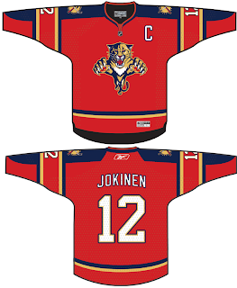
Then I also had a few ideas for the Florida Panthers emailed to me.

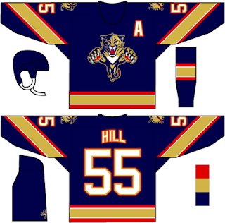
We've never seen that kind of gold on a Panther jersey. I wonder how it would look on the ice. I feel like the Panthers have always been more associated with red than blue, which is why I thought it was strange their home Rbk EDGE jerseys are blue. Then there's these two.

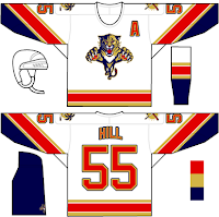
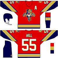
The white jersey seems really familiar and the red is almost how it should be. Speaking of red, one fan based a red jersey off of the new ones just released last month.

They also tried wrapping the elbow stripes completely around the sleeve as opposed to just halfway. I think it makes a world of difference. But I don't really mind the elbow stripes the way they are. I just know there are a number of people who are annoyed by it.

Any thoughts on these designs? Remember, if you would like to send in a design or you own or one you've seen elsewhere on the web, you can submit it at nhllogos@gmail.com.

Saturday
Aug042007

Blue Jackets vs Coyotes


vs
BLUE JACKETS
COYOTES
11-2
5-6

The Aesthetics
These are a couple of young logos — less than five years under their belts. The Coyotes logo certainly says desert but not any better than the old one. I like it, but not more than the Blue Jackets logo. These is where small detail can actually help.
Blue Jackets

The Nickname
If a Coyote snuck up on a Blue Jacket while he was sleeping, do you think he'd be able to react quick enough to avoid becoming dinner? I have my doubts.
Coyotes

The Analysis
The Blue Jackets logo features an Ohio flag forming a "C" for Columbus. How can you improve on that? The Jackets definitely hit the mark with this logo. Nice to see them going with it as the primary this season. The Coyotes logo doesn't really have anything like that and it just looks awkward to me. By the way, this is the finale for the Jackets.
Blue Jackets


WINNER
2-1


Friday
Aug032007

Kings vs Blue Jackets


vs
KINGS
BLUE JACKETS
7-5
10-2

The Aesthetics
Both of these logos have lots of pointy edges. I don't know why that matters. Anyway, I like the color schemes in each logo and despite the fact that neither one has existed for very long, I see the Blue Jackets logo becoming a classic... you know, one day when the team actually makes the playoffs and that sort of thing. The Kings have struggled to find an identity when it comes to logos and I feel like this is just another in a long line.
Blue Jackets

The Nickname
An army is usually at the King's command. But in fact, it was the ancestors of the Blue Jackets who overthrew the King almost a hundred years before. So it's in their blood.
Blue Jackets

The Analysis
I know it isn't vital for a logo to incorporate the home city, but it's always a nice touch. You've got suns on either side of the crown in the Kings logo and the Ohio flag wrapping around a silver star for the Blue Jackets. I'm also a fan of subtlety in logos and the Kings are guilty. Check out those hockey sticks on top of the crown. If they were blatant, I'd be hesitant, but since they aren't, they'll help the Kings logo avoid the sweep. One more match left for each logo in this tournament.
Kings


WINNER
2-1


Thursday
Aug022007

Blue Jackets vs Stars


vs
BLUE JACKETS
STARS
10-1
6-5

The Aesthetics
Both of these logos have five-pointed stars as a primary element. You could even say the Stars have two stars — a gold one and a green one. Ah, but the Blue Jackets logo has the most when you count the 12 in the Ohio flag. So I'll give them this point for that and the fact that there are no words in it. A logo is a symbol in my book. (And don't start in with how words are symbols too. I don't want to hear about it.)
Blue Jackets

The Nickname
I don't think the Blue Jackets win this war. A bayonet doesn't stop a Star from burning. Not even a little bit.
Stars

The Analysis
This is a difficult decision. Both of these logos are appropriate. I've talked about the big "lone star" in the Stars logo a number of times. The Ohio flag almost forms a "jacket" around the silver star. But I like the Stars logo's Texas reference. It's clever.
Stars


WINNER
2-1