NHL Tournament of Logos

Entries in canucks (108)

Sunday
Jul012007

Blue Jackets vs Canucks


vs
BLUE JACKETS
CANUCKS
2-1
2-1

The Aesthetics
The Canucks have a unique color scheme and that gives them a leg up. Red, white and blue tends to be overused. I was never a fan of the electric green in the old Blue Jackets logo and I know these colors fit well, but still. Purely on looks, which logo would I rather be wearing?
Canucks

The Nickname
Blue Jackets carry bayonets and Canucks are, what, woodsman? So axes, then. Jackets win in a "war."
Blue Jackets

The Analysis
This is what you call a resounding point win. Look at these two logos and what they're meant to represent. A silver star draped in the Ohio flag for a team from Columbus named for the Union soldiers could be a more fitting logo. What's a Canuck? Well it sure isn't an orca whale or a Native American tribe.
Blue Jackets


WINNER
2-1


Wednesday
Jun272007

Canucks vs Oilers


vs
CANUCKS
OILERS
1-1
1-6

The Aesthetics
It's a Northwest Division showdown. The Canucks logo has great colors and a subtle "C" while the Oilers logo only has one of those two things. I'll let you figure out which.
Canucks

The Nickname
I'm trying to envision a fistfight between a Canuck and an Oiler. They're both rather rugged. It's a real crapshoot. But I bet the Canuck fights dirty. He gets the edge.
Canucks

The Analysis
Instead of a Canuck, all I'm seeing in this logo is a whale. When will that change? At least the Oilers logo has a copper drop of oil in it to represent the name of the team. Don't get me wrong, I love the Canucks logo but I can't find what relevance it has to the name of the club.
Oilers


WINNER
2-1


Sunday
Jun242007

Blues vs Canucks


vs
BLUES
CANUCKS
4-1
0-1

The Aesthetics
This is a tough one so we'll cut right to the end here. The color scheme in the Canucks logo is so much cooler. Give them a point, please.
Canucks

The Nickname
Hmm. We're going to say that Canucks are outdoorsy, lumberjack-types who could totally beat up a Blues-playing saxist. Right?
Canucks

The Analysis
As much as I like the Canucks logo, it just doesn't really seem to represent the team name very well. On the other hand, a musical note is the best way of symbolizing the Blues.
Blues


WINNER
2-1


Thursday
Jun142007

Predators vs Canucks


vs
PREDATORS
CANUCKS
0-1
0-0

The Aesthetics
I've always thought the Canucks had one of the coolest color schemes in the league. Now I understand they have plans to change it — again. The Predators logo makes use of color well also, but its minute detail loses it another point.
Canucks

The Nickname
Were a Canuck to happen upon a Predator during a walk in the woods, it wouldn't be surprising if he got eaten.
Predators

The Analysis
Aside from its parent company being named Orca Bay, I can't quite work out how a killer whale ended up in the Canucks logo. Frankly, I've never been a fan of any of the Canucks logos as far as symbolizing the team name. The Predators logo does a lot better job with that.
Predators


WINNER
2-1


Wednesday
Jun062007

HF&P, Part 19: Vancouver Canucks

Readers, you deserve better — the three of you out there. I promised posts every day and here yesterday came and went without a word from moi. I apologize and will try to keep that from happening in the future. On the other hand, it was my birthday yesterday so therefore I get a free pass.

Anyway, having said that, the illustrious "Hockey Fans & Photoshop" series continues today with the Vancouver Canucks.

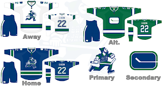
It's our favorite nostalgic artists taking a whack at Johnny Canuck, now. One thing we know for sure is that the Canucks won't be donning the blue and red next season. A logo/uniform change is coming August 1, according to retailers.

But this was a classic design. People seemed to like the green and blue scheme. Personally I'm not a fan but then I don't have to look at the uniforms every night. Anyway, it's a neat look, recapturing the Johnny Canuck logo of yesteryear and making due with the old '70s logo on the shoulder — which you currently find on Canuck uniforms.

Overall, I'd have to say I like it — not love it, but like it. How do you feel about it? Comment away!

Up next: you know you want it — the Boston Bruins.

Sunday
May132007

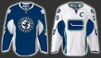
FanFic Canucks Jerseys

Okay, people, we're down to less than a month before the tournament begins but that doesn't mean this site is useless until then. Everyday (hopefully), over the next several weeks I'll be posting information regarding new logos and uniforms. So keep checking back. You know you want to.

First, I have to start out by scolding myself for forgetting the name of the blog where I found this image. With regard to the coming announcement about new uniforms and logo adjustments, a Vancouver Canucks fan had a little fun with Photoshop.

Quite honestly, I don't hate the design they came up with. On the other hand, I'm fairly sure the final product won't be anything close to this. Plus, I've always been a fan of teams using different logos on their home and away jerseys. I want to say Atlanta was the first to do that when they entered the league, but Washington would've been pretty close. Currently, Ottawa does that as well. In the case of the Sens and Caps, though, the dark jerseys are former third jerseys that have been promoted.

Anyway, just wanted to share that tidbit with you tonight. Like I said, keep checking back for more every day.

Saturday
May122007

Retro Returning, Now For Canucks

a Cathode Rays & Power Plays cross-post from April 26, 2007

I know this news is a couple months old, but since I just posted about the Caps, I figured it was relevant.

The Vancouver Canucks will apparently be donning new threads come the fall as well. And just like Washington, the Canucks are planning a return to their original '70s colors of blue, green and white. No word on whether they'll be keeping the orca logo, going back to the original logo, or designing a completely new one all together.

Either way, we find out on August 1.

I found the original post at Canucks Hockey Blog.

You can catch a glimpse of Johnny Canuck painted on the side of Roberto Luongo's mask on nights when the local team wears its vintage blue, green and white uniforms. And the question begs: "Is the artwork on Luongo's mask a hint of things to come?"

The modern day Canucks' marketing machine has instructed its large army of merchandising retailers to stand by for an announcement on Aug. 1.

"Right now we're ordering next year's inventory blindly," says the owner of a sporting goods outlet in North Vancouver. "All we've been told is that the colours of the uniforms will be blue, green and white, but we don't know what the crest is going to look like. The current killer whale [or orca] jersey, as we understand it, will be kept in reserve and occasionally be used as a 'classic' uniform."


So far, I've learned of six teams that have definite plans to change their logos. I have a source in retail that would probably rather not be named. (Look at me trying to be all cryptic.) Aside from Vancouver and Washington, the other four teams that I know of which will see major- or minor-scale uniform and logo changes are the Boston Bruins, San Jose Sharks, Ottawa Senators, and thankfully, the Tampa Bay Lightning.

We'll follow along this summer and see what happens.

Sunday
Apr292007

Canucks


Vancouver CANUCKS


Team Information
Team Colors / deep blue, sky blue, green, white, silver
Inaugural Season / 1970-71 (37 years)
Current Logo / 2007-08 (0 years)

Tournament History

2007 Qualifying Tournament
5-9, 19 pts
Finished 9th in West; 18th overall

Page 1 ... 7 8 9 10 11