NHL Tournament of Logos

Entries in canucks (108)

Friday
Aug032007

Oh, Canada!

I just posted Maple Leafs news with a tidbit about the Oilers' unveiling date. But wait! I have three more Canadian teams to work in today. Let's start out with the Montreal Canadiens because I haven't really had anything to post for them.

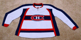
This is allegedly a photo of the Habs' new Rbk EDGE road jersey. But so much about it jumps out at me indicating that its not the real deal. First off, it's ugly as fuck (pardon that, please). Apologies to the person who designed it, but the stripage — yeesh! Anyway, the color at the cuff is off and the whole thing just feels very... fake, to me. Anybody else getting that feeling?

Next, we have another alleged photo of a Calgary Flames home jersey.

Don't we love how all these photos look so crystal clear? I get that many cell phone cameras are substandard, but are we to assume that everyone who has sneaky access to the new uniforms can't afford better than a $20 phone? And, exit soap box.

It's an interesting design and one that feels like something we've seen before. Anyway, if anyone can cull anything from that secondary logo, let us know. Can we find it on the shoulder of some minor league team someplace? Or are the Flames actually getting a new one as the horse with the flaming nostrils meets his maker?

Finally, I wanted to leave you with something to laugh at. It is in fact a Photoshop job, just as the upper right corner of the image informs us. The designer was just adapting a photo to the potentially leaked images we saw the other day if for no other reason than to supply us with a better visual.

So what are your thoughts everybody? The only other Canadian team I didn't cover today is the Ottawa Senators but we took care of them on Wednesday.

Wednesday
Aug012007

Nothing Official From Canucks Today?

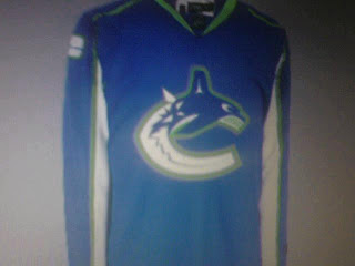
Damn. As it turns out, the Vancouver Canucks are supposedly having a private shoot today with the new Rbk EDGE jerseys. Yeah, not so much with the public unveiling thing. However, there's another alleged leak.

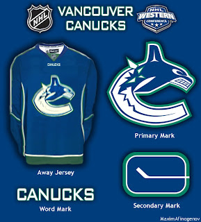
Saw it on the Canucks official message board. They're calling it a cell phone photo of the new jersey but you know how these things go. With it, one fan apparently finished off what could be the look which you can see in the graphic below.

I don't know now. I'm reading dates like mid to late August for the team's official announcement. I don't know if they team has said anything specific about a date, but I have seen August 29. I'm not holding my breath, though. So it probably won't be in the sidebar countdown — until we do get some sort of confirmation.

Shame about that. Though I can't say I'm surprised. The Canucks seem to be yanking their fans around quite a bit on this topic. I think they should just unveil the thing and be done with it.

Wednesday
Aug012007

Canucks vs Kings


vs
CANUCKS
KINGS
5-7
6-5

The Aesthetics
This is a hard one. I like both of these logos. How to choose. I actually like the Canucks logo's color scheme better than the Kings. I also like the Haida style artwork. It's very unique in this league. But both of these teams have struggled with an identity for decades, changing logos constantly. But as for right now, I'm going with the Canucks.
Canucks

The Nickname
A King pretty much gets whatever he wants. He can have Canucks do... anything really. Go whaling or something. I don't know. Where are my creative juices when I need them?
Kings

The Analysis
As far as logos pertaining to the team names, a Canuck is not a whale. A King is not a crown, but he wears one. I also like the subtle hockey sticks in the top of the crown and the suns on either side of it. The Canucks logo doesn't offer anything cool like that.
Kings


WINNER
2-1


Tuesday
Jul312007

Last Of The Canucks Surmising (Hopefully)

We're anticipating the unveiling of the new Vancouver Canucks uniform tomorrow despite having no official word on that from the team itself. So having said that, there's a little more fan-created artwork I wanted to post prior to that because Canucks fans seem to be the most interested in what's going to happen to their club's uniforms this year.

This design is based off of what appears to be "Fin's Friends" promotional material posted yesterday. The only thing is we've been hearing that the bottom part of the "C" will be white, not blue like it has been in the past. You gotta figure this is at least worth a look anyway and may even possibly be close to what gets unveiled by the team.

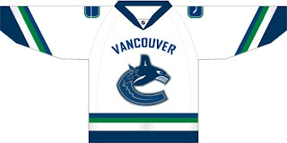
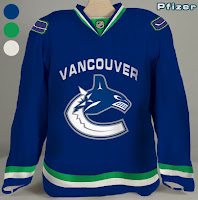
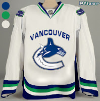
Another fan came up with these designs.

Personally, I'm not a fan of "Vancouver" being written above the logo but I guess it's not for me to say. You Canucks fans have any opinion on that? Tacky? Cool? Doesn't matter?

If I come across anything else, I'll try to get it posted by the end of the day. Meantime, keep your fingers crossed for an official announcement tomorrow.

Monday
Jul302007

Possible New Canucks Jersey?

All right, so I thought I wasn't going to have anymore news tonight, but it turns out I stumbled upon something very interesting on the Vancouver Canucks official message board. This.

I didn't have time to read the full details in those posts, but obviously, the skeptics abound. You can go here if you want to learn more. First reactions are that it's a Photoshopped job based on the Washington Capitals or Columbus Blue Jackets jerseys since they've already been unveiled.

Still, I thought it was worth a look. And I don't think it'd be the worst thing in the world if that was the actual Canucks home jersey. The colors are all right and I say that despite the fact that I really did like the two-tone blues, silver and maroon from before.

Any thoughts? Is it a fake-out? Is it the real thing? The Canucks will supposedly answer that question on Wednesday.

Monday
Jul302007

Yes, More Canucks Stuff

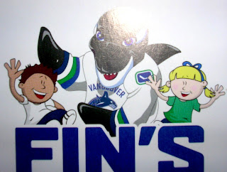
I saw this graphic on the Canucks Central message board. Aren't you guys impressed I remembered? I even snatched a link just to prove it. It's apparently artwork on some new kid-oriented promotional material from the Vancouver Canucks. It's called "Fin's Friends" as I understand it.

You see Canucks mascot Fin wearing a rather unique jersey. I can't speak to its veracity, but so far I haven't determined a real reason to doubt it. It has a lot of what we've heard including: dropping the maroon from the logo, the word "VANCOUVER" appearing over the crest on the road white sweaters, and the return to vintage colors blue and green.

Also, on the shoulder of Fin's jersey is this logo. It's kind of an edgier version of the vintage stick-in-rink logo. I think it works.

So... Canucks fans? What do you think of all this? You think this could be the real deal for your uniforms come the fall? Or is it just more annoying speculation?

Though the Canucks have made nothing publicly official, we've been hearing that a new logo/jersey unveiling is set for Wednesday. Whether or not it will actually happen remains to be seen.

Monday
Jul302007

Flames vs Canucks


vs
FLAMES
CANUCKS
9-1
5-6

The Aesthetics
Both of these logos are made from the letter "C." One forms a Haida-style whale while other emits fire. I like the simplicity of the Flames logo but also the color scheme of the Canucks logo. Since word on the street is that these colors aren't long for this earth, I'm going to give them this point.
Canucks

The Nickname
Flames burn everything, Canucks included.
Flames

The Analysis
Looking at the Canucks logo, I'm continually confused by the whale. This isn't to say that I believe the orca has no connection to the Canucks as a team (as opposed to the organization), but I really like the design John Slabyk came up with. You know the one. Anyway, they can't win for the "C" (symbolizing "Canucks" and "Canada") because the Flames have one of those too. Plus, how can you improve on a logo for a team called the Calgary Flames, anyway?
Flames


WINNER
2-1


Saturday
Jul282007

Fans Design Canucks Concept Logos

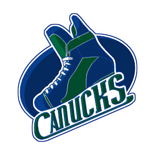
I came across this fan-made design on a Vancouver Canucks message board. The artist put a new spin on the flying skate logo and combined it with the traditional blue and green color scheme. What do you think?

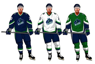
That's a skate all right. If you're curious to see what it would look like on a uniform, the designer took the liberty of putting it on the jersey template designed by John Slabyk to go with his logo redesign (which, frankly, I like a lot better).

Incidentally, with all this about the colors being altered for the Canucks logo in the coming season, another fan toyed with the idea of bringing in the green to go along with the blue. He also trades out silver for black. Have a look.

Anyway, that's all I've got for the Canucks today. Comment below if the spirit compels you. (By the way, I apologize for the late posts today. Got a late start due to prior commitments.)

Wednesday
Jul252007

Possible New Canucks Logo?

Try not to filet me, Canucks fans, but I may have stumbled upon your team's new logo.

I can't speak to the veracity of this image. It may well be the work of a fan toying with rumors learned of on various web sites and message boards. Still, it's something to consider.

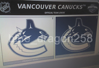
This image appears to be a cell phone photo of a computer screen showing the logos on official NHL stationery. But don't be so quick to take it as fact. From what I've seen of these design sheets, the fonts don't quite match and that makes me question whether this is someone just trying to have a go at the hockey world. However, there's no reason why the league couldn't change the font on the stationery. So it at least seems to be a possibility for us all to consider.

Now my feeble analysis: I feel it's more a downgrade than an upgrade on a logo I thought was great as it was. To lose the maroon and light blue only serves to hurt the symbol which now no longer has the feel of the Pacific Northwest that it once did. I might eat my words if the maroon or light blue was simply replaced with the classic Canucks green. But it remains to be seen whether this is the real deal or not.

According to various sports retailers, the Canucks have apparently told them that there will be changes to the logo and uniforms for the new season. They've evidently also been told to expect an announcement regarding such changes on August 1. That is a controversial date to Canucks fans who would prefer to hear it from the horse's mouth. But team executives have their lips sealed tighter than a cow's ass in fly season (which is to say they aren't talking).

What do you guys think of all this? Speculate below in the comments.

Wednesday
Jul252007

Canucks vs Ducks


vs
CANUCKS
DUCKS
4-6
1-9

The Aesthetics
This is easy. The wordmark the Ducks are claiming is a logo... isnt. Meanwhile, the color combination in the Canucks logo is cool, not that the Ducks colors aren't — but they need a better logo.
Canucks

The Nickname
If he was a good shot, a Canuck might be able to successfully hunt a Duck.
Canucks

The Analysis
Aside from the "C" formed the logo itself, the Canucks logo doesn't do much to represent the very team name it's meant to — but neither does the Ducks logo. A webbed duck foot in the form of a "D" isn't enough of a saving grace for this logo. And it gets swept again.
Canucks


WINNER
3-0