NHL Tournament of Logos

Entries in canucks (108)

Tuesday
Aug212007

The New Canucks Logo! (Just Kidding)

A reader posted something that I feel is gold in its truest sense. Vancouver Canucks fans who frequent the team's official message board may have perhaps already seen this. For those of you, who haven't, prepare yourselves.

One fan took all four of the Canucks' past logos and... mated them. It turned out one hell of an offspring. You have to see it to believe it. It's incredible.

I haven't decided whether that's in a good way or a bad way. Just have a look for yourself.

How about that? Thoughts?

The Canucks will unveil their new logo and uniforms on August 29.

Monday
Aug202007

It's Official! Canucks Unveiling Unis August 29

Canucks fans, you've waited what must've felt like a lifetime for official word from your team and now it's here.

The Vancouver Canucks have announced that they will be unveiling their new Rbk EDGE uniforms on August 29 at GM Place. And based on that picture of Roberto Luongo, they look very white.

The date is already in the sidebar, but now it comes officially from the team which is what we've been waiting for. Should be an exciting day. As the graphic says, the uniforms will be unveiled at 12:30 PM so as soon as images are available, I'll post them here. We're expecting to see something similar to the alleged leaks that I've posted — likely the orca logo recolored to green, blue and silver a la the old days.

In the meantime, the announcement is on the team's official web site. Enjoy!

Sunday
Aug192007

A Handful Of Uniform Concepts

My web travels today led me to Erik Kuhre's Portfolio of Art & Design site. Found a handful of jersey concepts I thought I'd share this afternoon. So let's dive right in.

Buffalo Sabres fans, you want blue and gold? Here's blue and gold. And a lot of it.

That's quite something, I thought. A little too much to actually be an NHL jersey, but there it is. I'm a big fan of that crossed-sabres logo but I like it better in black and red.

Here he had some fun with the Edmonton Oilers' third jersey logo — a logo I'm rather fond of. I don't like the orange in it, though. The blue looks better. That being said, I don't hate it on the blue jersey. I think the silver along the sleeves is pretty cool too. The Gretzky 99 sells me completely.

We know the Vancouver Canucks are getting new colors for this season, but take a look at this design anyway. I like the use of the "V" around the collar of this jersey, but the recolored '80s logo is too far down the sleeve at the cuff. The gloves would hide it. I also like the "V" on the sleeves and pants of this uniform concept.

I've got one more design to share from this artist, but I'm going to save it for a later post. I've got a bunch of New York Islanders concepts to add in the near future.

But anyway, what do you guys think of all these? Good work or not so much?

Saturday
Aug182007

Canucks Logo Leaked Via Stickers?

Apolgies for the late posts today. Went to the movies this afternoon. Superbad was hilarious.

I got emailed a photo claiming to be that of sticker produced by the Vancouver Canucks bearing the alleged new logo. I should clarify. The sticker wasn't claiming anything so much as the sender of the email. Anyway, for your viewing pleasure:

For a better look at it, I was also sent this rendering of the logo. I really like it better with the green, but who am I to say, really? The question is what do you guys think? Is the blue/black/silver combo too Lightning? (It is for me.) Do you like it better than the blue/maroon/silver combo of the last decade?

I also want to be clear on the fact that I can't vouch for the veracity of this photo. Just know that it was something emailed to me and that the Canucks will supposedly make their official announcement regarding new uniforms and logos on August 29. We'll all be watching and waiting.

Friday
Aug172007

Mailbag: You Can Stop Sending These Now

All right, I've said I don't want to get bogged down in the whole video game screen grab thing, but I think popular demand almost requires this one. I've gotten about a dozen emails in the last 24 hours with the following images attached or linked.

From what I've been told, what you're seeing in these pictures is a page from the official Xbox magazine — a yet-to-be released issue I'm assuming. Apparently, the picture above shows a game between the Coyotes and Sharks (a completely new San Jose design we've yet to be treated to officially) in EA Sports' NHL 08. The picture you see here to the left, although blurry, supposedly shows the Oilers and Canucks.

I can't speak to the veracity of these pictures nor really anything else with regard to them. But I just wanted to post them in the hopes that my awesome readers would stop sending me them.

Once again, I don't mind you guys sending in screen grabs from video games, but don't expect me to post them too often. If we're going to see official new jerseys, I'd prefer photos. Thanks everyone!

Wednesday
Aug152007

Canucks, Pens Fan Concepts

When I don't have real news, I invent news. That should be my slogan. No, this isn't news. This is just fun. The fan concepts keep on rolling in. Let's start with the Vancouver Canucks.

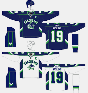
I think the only problem with these is the giant "VANCOUVER" sprawled across the chest. Kind of unncessary and not aesthetically pleasing. I'm liking the side stripes on the sleeves and pants. They form Vs if you didn't pick up on that.

Anyway, I've also got some Pittsburgh Penguins artwork to share with you all. Check this out.

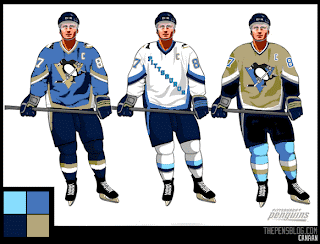
While you're trying to process that, let me fill you in with some background. The folks over at The Pensblog submitted this idea for a new series of Pens uniforms. For those unfamiliar with the history of the club, their original uniforms were pale blue a la the current home jersey of the Atlanta Thrashers. This, despite the fact that the triangle in the penguin logo was always yellow. But that yellow and the blue worked well together. I'm not too sure about the two-tone blues on the Vegas gold.

Anyway, I mean no offense to the designers as I share my opinion. I think the re-introduction of the blue wouldn't be all bad if done right. What do you guys think on that subject?

While you ponder on that, I'll share with you a design tweak someone emailed me for the much-loved Penguins logo.

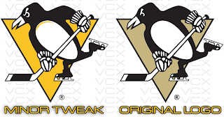
Look close at the eyes. He's more pissed off than ever. Somebody woke up on the wrong side of the Antarctic ice shelf. Oh, and he's got a nice new shiny belly. Improvement or not?

Saturday
Aug112007

Canucks New Logo Leaked?

Tonight I found what appears to be a sneaky picture of a hat with the new Vancouver Canucks logo on it. Take a look and tell me if you think it's real.

If it is fake, it's the best job I've ever seen. We've been getting conflicting reports over just how much green there will be in the new logo. At first we were hearing blue and silver then it was blue and silver and green. I just don't know what to believe. Anyway, on this hat, while the logo is blue and silver, it has a small bit of green stitching as you can see.

Incidentally, I added August 29 to the sidebar countdown for the Vancouver Canucks big unveiling event. This comes not from the team directly but rather someone apparently working for a graphics firm hired by the team. Said someone emailed me directly and told me I should post the date. That being said, take it for what its worth. I can't verify that claim any more than you but there it is.

I really hope that is the date for the sake of Canucks fans everywhere. You guys have been getting yanked around so bad this summer. It's not even right.

Friday
Aug102007

Sharks vs Canucks


vs
SHARKS
CANUCKS
5-8
5-8

The Aesthetics
Water-based creatures bearing teeth are prominently featured in these two logos. And they're both breaking things. The shark is breaking a hockey stick and the whale is breaking through ice. But as far as the overall look, I have to go with the Canucks. It's always been one of my favorites. As for the Sharks logo, while the recent change was an upgrade, they could've done better.
Canucks

The Nickname
Canucks are people and by and large, people are not impervious to Sharks. In fact, sometimes they lose limbs to big fish.
Sharks

The Analysis
Even though there isn't a "Canuck" in this logo, per se, I'm willing to give them a pass on that this time around. I love the Haida-style art and you can't say an orca in ice has nothing to do with Vancouver (which I may or may not have previously said). So here's why they're still getting beat by the Sharks. Call me slow, but I just found the "SJ" hidden in the Sharks' new logo and it's awesome! If you want to find it, check out the black in the fins. Look hard. You have to really want it. It's the last day of the tournament, so it's the final match for each logo.
Sharks


WINNER
2-1


Monday
Aug062007

Fan-Created Canucks, Isles Jersey Designs

I know I've sort of been beating a dead horse with these two teams, but I've got a couple more fan concepts for the Vancouver Canucks and New York Islanders. These Canucks uniforms seem to be based off of speculation regarding the new sweaters that we have yet to see. Word on the street is Vancouver is keeping the orca logo but reverting it to the traditional blue and green colors.

Supposedly, the new Canucks jerseys will be officially unveiled later this month. But with no official date from the team at this time, it's difficult to say when we'll actually see them. And from what I understand Vancouver fans everywhere are on pins and needles waiting for word. (Guys, as soon as I know, you'll know.)

Then, from the same artist is this uniform set for the Isles. It appears to be based off that alleged cell phone photo that is now everywhere.

I'm still on the fence about it. It could work, but I think simpler is better in this case.

Remember, if you have any artwork of your own or which hasn't been posted on this blog, feel free to send it along and I'll try to post it at some point. You can submit questions, comments and fan art at nhllogos@gmail.com.

Sunday
Aug052007

New Stuff For Ducks, Canucks

Got some fun stuff for your Sunday. The first is a jersey design for the Anaheim Ducks that playfully (and pitifully) attempts to look like a "leak." Thought it was funny.

The designer himself said it's a manipulation of the old Nashville road jersey. As far as the webbed duck foot "D" logo, I'm really hoping its what Anaheim goes with this season. I've heard that they will be dropping the wordmark on the uniforms, but we have yet to see anything official from them. Anyway, enjoy this and try not to take it seriously. It's not the real thing.

Looks like another fan came up with this concept for a new Vancouver Canucks uniform.

It seems to borrow from the newly unveiled Florida jerseys. It's not a well-balanced logo, but what do you Canucks fans think? Would you like to see something like this? Or do you prefer the orca logo, which we're hearing will stay on the new Rbk EDGE jerseys (in new colors)?

And for everybody else, what do you think about all this stuff? Don't be fooled. None of it is actual team artwork — just fan-created fun. But do you think it's good work? Or should it have stayed in the minds of these fans and off this site? Be gentle.

Page 1 ... 6 7 8 9 10 ... 11 Next 10 Entries »