NHL Tournament of Logos

Entries in devils (53)

Saturday
Sep152007

First Photos Of Coyotes' Sweaters

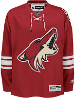
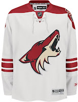
Greetings, all. With much thanks to Paul and Wayne for their lightning quick responses to my previous post, we finally have actual photographs of the new uniforms for the Phoenix Coyotes.

We'll start with the NHL.com Shop images. The photos haven't been released on the site yet but have been uploaded to the servers.

The biggest alteration to the sweaters are the brick red sholder yokes now present on the road sweaters. I like that because although it's an irrational thought, I always feel like solid white jerseys blend into the ice too much. Also, the horizontal stripes around the bottom of the jersey are gone.

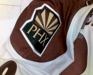
One more minor note is that the "PHX" patch is now located on the left shoulder. It was moved from the right. Not sure why though.

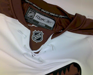
These photos were just posted over at HFBoards.com so I thought I'd keep them circulating. Apologies for the color. I would've done some retouching, but I just wanted to get them posted quickly.

I feel like the Wizard of Oz standing behind a curtain when I tell you to pay no mind to those iron-on letters that appear to be detaching themselves from the back of this jersey. If I were to guess, I'd say it was worn by a prospect at a recent tournament. Anyone want to confirm?

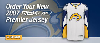
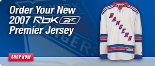
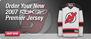
And as a special treat, our friend Wayne has also dug up the following graphics deep from the bowels of the NHL web servers. Have a look at the Sabres', Rangers' and Devils' new road jerseys.


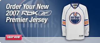
But wait, if you thought that was it, get ready for this. Here's our first photograph of the Edmonton Oilers' new road sweater.

I just want to know what happened to the sleeves. At least when Florida did the whole interrupted elbow stripes, it was because of a swatch of color riding down the arm. Here, I just don't know. I'll wait to pass judgment until we see more photos.

Thursday
Sep132007

Devils Unveil New Uniforms! (Sort Of)

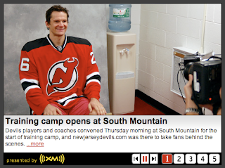
All right, so Lou Lamoriello has already said there will be no unveiling ceremony for the New Jersey Devils new Rbk EDGE uniforms, but they've got a picture of the new home sweater on their official web site.

There you see Patrik Elias getting his picture taken prior to training camp. Exact same design. Lou didn't lie.

It's not earth-shattering but I felt it was worth posting. Thanks to Jeff for the tip!

Thursday
Sep132007

Random Concepts To Share

Aside from the NHL 08 news, it's been a rather slow day so it would be wrong of me to leave you without a concept post to get you through the night. But before I do that, I wanted to thank you all for continuing to visit and read this blog. Yesterday, we passed the two million hit mark. For those keeping track, it was over 1,000,000 hits in just two weeks. I'm still in shock.

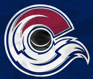
But moving along now. We'll begin with an amazingly cool concept logo which was emailed to me yesterday. It originates from the SportsLogos.net message board. It combines the tradition of the Colorado Rockies and the symbol on the flag of the state itself.

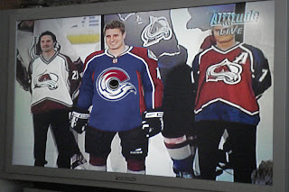
For my money, I'm sure it's just the thing hockey conservatives love. But the thing is, it's actually really good. Personally, I'm still partial to the "A" logo, but this could serve as show-stealing secondary mark for sure. I mention it because shortly after Altitude had the new Avs jerseys, somebody reworked it.

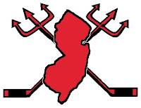
I never cease to be amused by people. Speaking of amusing — the New Jersey Devils have never had a secondary logo. Here's what one might look like.

Needs something to hold it all together, perhaps a circle or something. But I don't think it's half bad. Too boring for a primary but it's exactly what secondary marks are supposed to be.

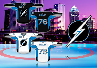
But while we're busy altering logos, I was emailed this Tampa Bay Lightning design.

While the silver and blue on black make a solid color combination, there really isn't anything to the logo. It's just... dull. I know we all like simple over busy but there's something to be said for finding a happy medium.

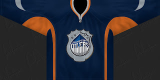
But let's not stop now. What if the Oilers were to don a redesigned logo at some point in the future? The riots in Edmonton's streets aside, it could look something like this if the right people were on the job.

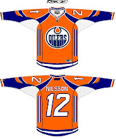
I can't speak for Edmontonians, but I like it, myself. What I don't like is an orange — and I do mean orange — jersey.

Like this one.

Yes it's a little busy but I can look beyond that. What I can't get past is all that orange. I'd take a copper jersey over that. What does that say?

Anyway, that'll do it for tonight. Leave your comments below as the designers who email me often peruse the feedback on their work. I'm sure they'll be interested in seeing what you all have to say.

I'll have more tomorrow if I don't get too bogged down in the four different teams unveiling jerseys.

One last thing... HOCKEY SEASON IS ALMOST HERE!!!

Wednesday
Sep122007

Result: Devils vs Canadiens

Montreal
CANADIENS

64% 11,920 votes

New Jersey
DEVILS

36% 6,698 votes

18,618 total votes

Montreal Canadiens
Advancing to face Senators or Flyers

New Jersey Devils
Eliminated


Poll opening date
Sep 5 @ 4:27 AM
Poll closing date
Sep 12 @ 11:59 PM

07CHTRN | #E3A | NJDvMTL

Tuesday
Sep112007

EA Leaks Devils, Sabres Sweaters?

All right, you guys know how much I hate video game renderings because they aren't actual photos but I'm not just writing this blog for myself anymore. I recognize I need to show appreciation for the more than 20,000 individuals who visit the site everyday. And you guys want it.

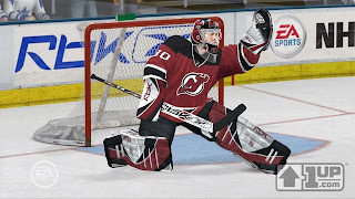
It would appear the new Rbk EDGE uniforms of the New Jersey Devils and Buffalo Sabres have shown up in some NHL 08 screen shots. We'll start with the Devils and an image that was sent to me by Jordon over at Flames Daily.

You can see the NHL shield at the collar and all the stripes appear to be staying the same. Below you see a Sabres player from the video game.

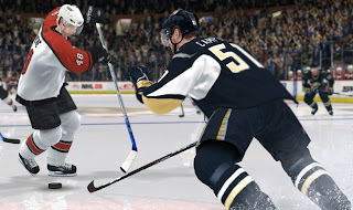
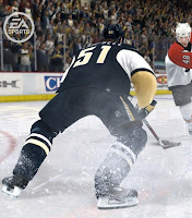
The rounded bottom at the back is the reason this appears to be an EDGE jersey. You'll notice the Flyers player is wearing last year's road sweater. Here are a couple more from that same image set.

It should go without saying, but sometimes people don't think and so I'm going to say it. There seems to me to be no good reason why these couldn't have been made up by a very Photoshop-inclined fan. I'm not saying they're fake, but I'm not saying they aren't. Just take them for what they're worth and enjoy the anticipation leading up the big unveilings.

If they are really from EA (somebody's in trouble, for one thing), then it does give us a decent idea of what the design will look like. The reason I don't like these images is that I'm trying to keep to posting photographs of the new uniforms.

Anyway, as you know, I'll have them when they are available. Word on the street is we'll see these jerseys on Saturday for Buffalo and Monday for New Jersey. But keep checking back for updates, of course.

Saturday
Sep082007

Atlantic Division Concepts

I've been going through my email looking at all the concept art I've been sent in the past several weeks. Let the Concepts Gallery serve as a small indication. Anyway, I've grabbed a couple of designs for the Flyers and Devils I thought were interesting.

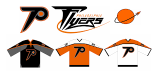
First off, one designer said, let's rebrand the Philadelphia Flyers a little. Here's what he came up with.

The designer had this to say about his creation.

The idea for the primary is just an updated Flying P - a little faster and sleeker looking than the current one. I've always been bothered that the current logo just doesn't evoke speed to me. As for the secondary, it's supposed to suggest something flying away from a planet or something.

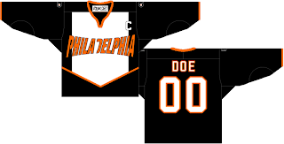
Just something interesting to share. There's also this design which has been floating around a little bit. I think the idea was to fit as many letters as possible horizontally across the front of the sweater. Mission accomplished.

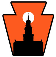
I can't see the Flyers ever wearing anything like that, though. However, something interesting that was sent to me was this concept for a secondary logo for the Flyers. Many who've suggested a secondary logo for Philly have simply gone with the Liberty Bell. What woudl you Flyers fans think of something like this?

Pennsylvania's nickname is the Keystone State. That should explain the outer shape — a keystone. What I like is the white sun in the background because the first thing I thought of was the orange circle in the Flyers' primary logo. Very clever.

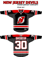
I was impressed with that. I was also impressed by a third jersey someone came up with for the New Jersey Devils.

I know the league is abandoning those this year, but I think it could work just as well as a home sweater. I've always thought a black jersey would make the logo on the chest stand out more.

But I guess we'll never know. Devils brass have stated that the jerseys will be the same as the previous design, merely adapted to Reebok's new cut. Still, I figured this was worth a look.

Expect to see the Flyers' new sweaters on September 16, followed by the Devils' a day later in their first preseason game.

Friday
Sep072007

No Change Is Word From Avs, Devs

We have news today regarding the new jerseys for the Colorado Avalanche and New Jersey Devils — who you might have noticed are absent from the sidebar countdown (along with the Anaheim Ducks).

Let's start with the Colorado Avalanche news. You might notice that the Avs have been added to the sidebar countdown with a jersey unveiling date of Wednesday, September 12. This information comes from The Denver Post. Beat writer Adrian Dater said yesterday in a blog post not to expect any big alterations.

We're anticipating an adaptation of the old sweaters to the Rbk EDGE style and cut. Here's an excerpt from Dater's post.

September 6, 2007

NEW UNIFORMS COMING

The Avalanche will unveil new uniforms on Wednesday, in a press conference. The uniforms will not have a newly designed logo or colors, but are representative of the new prototypes sponsored by Reebok that will be worn by all NHL teams this season.

The new uniforms are made of a different material that is supposed to absorb sweat better, are tighter on the bodies of players and allow them faster skating speeds.

In addition, the New Jersey Devils will apparently not be holding any unveiling ceremony or event for their new Rbk EDGE jerseys. According to The Record writer Tom Gulitti's blog, the jerseys will first be seen publicly in their first preseason game on Monday, September 17 against the Philadelphia Flyers.

Gulitti quoted Devils GM Lou Lamoriello as saying that the jerseys will not change. Basically what we were expected from the Devils. Here's the post.

September 6, 2007

No new jersey unveiling

Unlike most of the rest of the teams in the NHL, the Devils will not hold a press conference to show off their new Rbk Edge jerseys before the opening of training camp. All teams in the league will switch to the lighter, form-fitting uniforms (which also includes new, lighter socks) and some teams have taken this opportunity to make some cosmetic alterations, too, but Devils general manager Lou Lamoriello said that his team's jerseys will look essentially the same.

"Our jersey will still be our jersey," he said.

Fans can get their first look at them when the Devils play their first preseason game on Sept. 17 in Trenton against Philadelphia.

So to sum up, the Avalanche and Devils will simply convert their old sweaters without really changing anything. We'll see the Avs' on Wednesday and the Devils' five days later.

So to the fans who have been asking, there's your news. (Ducks fans, along with you, I'm still waiting for something.)

Wednesday
Sep052007

Poll: Devils vs Canadiens


vs
New Jersey
DEVILS
Montreal
CANADIENS


Round Three has begun! We're getting closer to determining the best logo in the NHL! Place your vote and then feel free to leave a comment as to how you came to your decision. Tell all your friends to drop in and vote! The more voices heard, the more accurate the results!

Poll opening date
Sep 5 @ 4:27 AM
Poll closing date
Sep 12 @ 11:59 PM

07CHTRN | #E3A | NJDvMTL

Sunday
Sep022007

Result: Hurricanes vs Devils

New Jersey
DEVILS

71% 8,633 votes

Carolina
HURRICANES

29% 3,593 votes

12,226 total votes

New Jersey Devils
Advancing to Quarterfinals to face Penguins or Canadiens

Carolina Hurricanes
Eliminated


Poll opening date
Aug 26 @ 7:05 AM
Poll closing date
Sep 2 @ 11:59 PM

07CHTRN | #E2A | CARvNJD

Sunday
Sep022007

Concepts For 'Hawks, Ducks, Devils

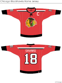
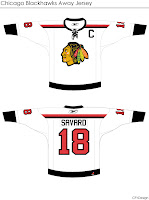
I'm curious to see the reaction in this one. A lot of you profess the Chicago Blackhawks to have the "most beautiful" uniform in all of sports. I don't see it but that's only me. However, I could very much get behind a design like this.

Even the white one is awfully sharp. The striping is clean and very minimalist. But would something like that result in an upheaval of the hockey world? Do things always have to stay the same?

Either way, the design work is very clean and I'm curious to see comments on this set.

This next one will be met with nothing but hate I'm sure. The striping is one thing. The name above the logo is another.

I'm sure that would result in even more blowback than 'VANCOUVER" across the front of the Canucks' jersey. But of course, these are all just fan-created concept designs. A bunch of what-ifs.

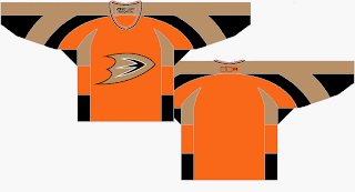
Here's a thought for the Anaheim Ducks.

It's the orange sweater Flyers fans have been begging for. Personally, I think it's too much for the Ducks. I think orange needs to be an accent for them. Let gold be the main color. As much as I don't like black jerseys, I think the Ducks' look sort of requires it. Thoughts on that?

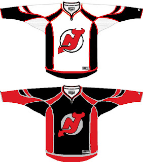
And then we have a look at all-star template-based New Jersey Devils concept.

You know you love the piping. I like the idea of a black Devils jersey — despite that fact that I just said I don't like black jerseys. The reason here being that too many teams have red jerseys now. You can add the Wild and Capitals to the fray this season. Red's a good color until it gets overused. Which is right about now.

I'll have more later. By the way, I have tons of Canadiens and Flames concepts for tomorrow — they day before their big unveilings!