NHL Tournament of Logos

Entries in fan art (328)

Sunday
Jul222007

No Big Changes In Store For Avs

Any Avs fans looking for jersey info? A reader just pointed me the way of this post which seems to indicate we shouldn't expect any big changes for the Colorado Avalanche when they unveil their new Rbk EDGE uniforms. A retailer called Altitude Authentics put the following in an email.

The Avs jersey will not be drastically different, same logos and looks. The main difference will be the material of the jersey. We will have these in stock sometime in mid September.


As with anything, take it how you will. Of course we haven't gotten any word from the team yet, so all we know is what retailers say they've heard.
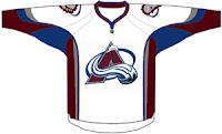
As it happens, I also recently came across a fan-made design to share with you. But don't expect to see anything in this vein if the quote there proves to be true. This looks nothing like what they currently wear and more like (as a few readers might point out) the 2007 all-star jersey with some colors swapped out. Take it for what it is.
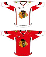
While we're on the topic, I also ran across this design for the Chicago Blackhawks. Once again its the all-star uniform template with some colors and logos changed. But if nothing else, it's something to stare at for a spell while we await official announcements league-wide.

Briefly I'd like to once again extend my thanks to the readers who have been sending in information. It's been extremely helpful and the more I know, the more I can post. So if you've seen any cool (or uncool as the case may be) designs, feel free to send them my way. I'd love to see them.

Sunday
Jul222007

Canucks Fans, Prepare Yourselves

A link to this blog was recently posted on the Vancouver Canucks' message board. Most of you over there seem to like the site. A handful of you are skeptical as to where I procure my information, specifically the bit about the August 1 unveiling date for your team. I don't blame you.

First, I should tell you I was hesitant about putting that date in the countdown. It comes from a retailer who spoke in an article printed in the Vancouver Sun. Consult this post for further details on that. Second, all of the information I post here is secondhand. I don't intend to pass myself off as an authority on the subject, merely an information-gathering resource. I surf the web and find a lot of nonsense and I try to parse it for factuality. Obviously things will slip through the cracks but then take from this what you want.

In the meantime, everything I post I try to explain. Whether it's artwork designed by a fan or rumors or an official announcement from a team, you can trust me when I tell you I'm not going to make anything up out of thin air. What would be the point? Still, take everything I post here with a grain of salt. As I keep saying, until teams make official announcements, all we have is speculation.

Now then, as a thank-you to whoever noticed the site and decided it was worth mentioning, I have a treat for you. Well, actually that depends on how you respond to this little gem.

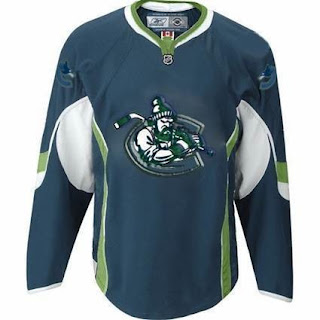
Now, don't be fooled, Canucks fans. What you're looking at will only make its way onto the ice they day you ride a unicorn to games. But I thought it was an interesting design, with colors we haven't seen before. I came across it on the Miami Herald's Florida Panthers blog while looking up information I posted earlier today.

It's like a tougher version of Johnny Canuck inside the orca "C." The designer also placed the current orca logo on the shoulders (backwards on one side for some reason).

Once again, don't freak out. It's not something that's been leaked by the team (or I'd hope not). It's obviously artwork designed by a fan and clearly not the work of a graphics professional (no offense to the person who came up with the idea). Having said that, what do you think of it? Would you like to see something similar on jerseys for the fall?

Saturday
Jul212007

Flyers Jersey Concept Designs

Hope you're enjoying the tournament. In the last few days, the traffic here on this blog has skyrocketed, due in part, I believe, to links being posted on various message boards. I thank you all for dropping in and I hope the information regarding new jersey and logo designs for this fall that I've been providing is helpful.

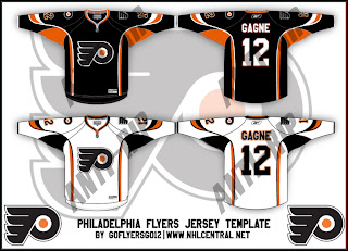
Today we get a look at a fan-made concept for the new Philadelphia Flyers uniforms. These designs have the Rbk EDGE cut but use the same layout scheme as the all-star uniforms, which is why I know its fan art and nothing official from the team. I'm under the impression the Flyers will be going with black for their home jerseys this season. Take a gander.

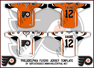
If you were wondering what the home uniforms might look like in orange, check out the design below.

Once again, these were of course designed by a fan and despite the fact that the Flyers are taking pre-orders for the 2007-08 jerseys, we have yet to see what one will actually look like. As usual, keep it here for info on that as it becomes available.

Friday
Jul202007

Lightning Jersey Concept Designs

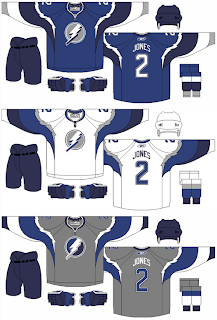
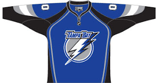
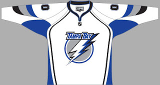
In the weeks prior to the "possible leak" of what may be the new Tampa Bay Lightning logo, I came across the fan-made uniform design below.

The designer was attempting to redesign the Lightning's logo and uniforms without black. Personally, I think black is an integral part of any Lightning design, but that's just me — a lifelong fan of the team.

Just thought you'd all like to see it. Form your own opinions. As for me, I don't like the color combination but I am a fan of the Lightning bolts around the shoulders.

Friday
Jul202007

Canucks Jersey Concept Designs

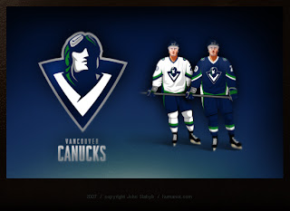
Last week, I posted some fan-made designs for the Vancouver Canucks' new logo and uniforms. We've heard that they're going to be unveiling a new logo this summer so everyone's wondering how it will look. So here are some more.


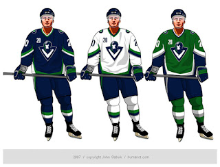
These way-too-cool designs come from John Slabyk, he of Blue & Gold Project fame. He's a graphic designer who was implored by fans to take his artwork to Larry Quinn with the Buffalo Sabres. They liked his work a lot but a meeting with the team's GM yielded nothing. Not to be discouraged, he has come up with a potential new design for the Vancouver Canucks.

And this is it. It's really cool but it's probably a little too high-quality for the NHL. The design is really clean and even incorporates the classic stick-in-rink logo of the 1970s while sticking with those traditional colors. So far, responses I've read to the design are mixed, though. I think the gist is that a lot of people like it but aren't naïve enough to think the design would actually ever been worn by the team.

Personally, I'm not giving up hope on the Canucks or the NHL. Anything is possible and one day soon I hope to see them donning a logo that doesn't feature a whale more prominently than, well, a Canuck.

Wednesday
Jul182007

Jersey Design Concept For Lightning

So I thought I was finished with that whole "Hockey Fans & Photoshop" series but it turns out there's more. After the possible leak of what may be the new logo for the Tampa Bay Lightning, a fan had some fun designing a uniform based on it. I honestly can't remember where I found it, but I'd have to guess ModSquadHockey since that's where I originally came across the logo itself.


This is what he came up with. It's pretty cool. I'm a big fan of switching to blue for the home jerseys. The black has gotten old. And despite there being a number of other teams that wear blue (the Thrashers, Rangers, Maple Leafs, Blues, Predators, Oilers, Blue Jackets and Canucks...) I still think the Lightning could pull it off. And should.

Obviously, it's not the offiicial design. If you consult the sidebar, you'll see we still have 38 days to wait for the big announcement and unveiling by the Bolts. Personally, I can't wait. I'm on pins and needles.

By the way, as a complete side note, I would like to thank those of you who drop by here on a regular basis. A while back I mentioned hitting a record of over 300 hits in a single day. That was surpassed yesterday with 514. I'm kind of surprised, actually. Incidentally, we're already over 400 today at it's not even 5 PM. It'll be interesting to see if we can beat yesterday's record.

Once again, thanks for dropping by.

Monday
Jun112007

HF&P, Part 30: Tampa Bay Lightning II

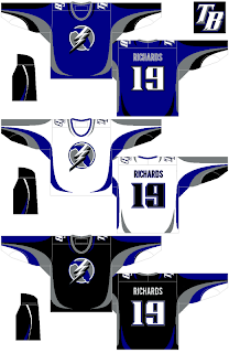
You know, the fact that this is the 30th segment in a series about the NHL — which has 30 teams — might lead you to believe I've covered all my bases. Unfortunately this is not the case. More about that in a moment. First, we're going to take another look at a design for the Tampa Bay Lightning. We last looked at them in Part 1 of the "Hockey Fans & Photoshop" series — the original.

So there it is. We've come full circle. Overall, I like it. The stripes are surely different. The designer has taken the secondary logo and made it the crest with some minor adjustments. I don't hate it, but if it were me, I'd come up with an entirely new logo for the team. But that's me.

The "TB" logo for the shoulder is nice if not a little overdone and generic. I say that, but generally speaking, this design is far better than what the team currently wears — or should I say, wore until the end of the 2006-07 season.

So as I was saying, due to the nature of this series, a number of deserving teams got missed in this series — which isn't to say it's over necessarily. If you have any designs — your own or something you found on the web — that I've overlooked, please feel free to send them along.

The teams I haven't seen any fan-made artwork for are the Buffalo Sabres, Atlanta Thrashers, Florida Panthers, Chicago Blackhawks, Colorado Avalanche, Phoenix Coyotes, Minnesota Wild and Nashville Predators.

Anyway, if you know of or have a graphic I haven't posted here, drop me a line in the comments and tell me all about it. I might even post it as part of the series.

Sunday
Jun102007

HF&P, Part 29: Montreal Canadiens II

Can you believe the tournament begins in only two days? I can't. It's going to be a lot of work — but also a lot of fun. Be sure to check in on Tuesday to be part of that fun.

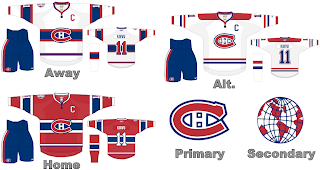
In the meantime, the "Hockey Fans & Photoshop" series continues as we look at uniform designs for the Montreal Canadiens once again. We previously saw fan artwork for them in Part 5 of this series.

This design indicates how striping can work as that seems to be the primary complaint of ultra-traditionalists with regard to the new RbK EDGE uniform system. Seems like it will be just fine. I like the jersey designs here. They're classic and regal. Hard to complain. I don't get the secondary logo but maybe someone can explain that to me.

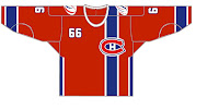
But wait, there's more. Yesterday we got a look at what might happen if the logo was moved to the side of the jersey and the number shown on the front by way of an Edmonton Oilers design. Well that same artist has taken a shot at the Canadiens — complete with the vertical stripe and off-center crest.

Like I said yesterday, it's different and that makes it cool in my eyes. I'm not sure how I'd feel about a team actually wearing it, but as a concept it's a good one. I've always like the giant crest in the middle of the front of the sweater. Strangely, it's not that common in professional sports.

And that does it for today. Tomorrow will be the last day before the tournament begins so I've saved up something special — it's another fan-made design for the Tampa Bay Lightning. They're my team so they have to get special treatment. You're sure to enjoy it.

Along with that, I've also come across some rather interesting concept logos if various clubs were to change theirs. Not only that but I have a few bonus fan-designed jerseys to share before this blog becomes almost completely about the tournament.

Sunday
Jun102007

HF&P, Part 28: Ottawa Senators II

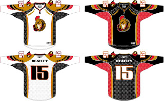
Today we're revisiting a couple of Canadian teams as part of the "Hockey Fans & Photoshop" series. We last saw the Ottawa Senators back early on in Part 6. Well we've got more where that came from. Right now.

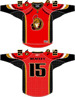
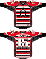
The Sens may not have won the Stanley Cup but I think they would be coolest jerseys in all of hockey if they nailed these suckers down. Tell me that sweater doesn't frighten you. One of my favorite parts of this design is the use of the logo's helmet element along the shoulders and arms. These would be seriously classy jerseys. Unfortunately, this design is the work of a fan and therefore it's not likely we'll ever see it on NHL ice.


The graphics you see here to the left come from the same designer, obviously. With the red, we see what can be done in the alternative of a black home jersey — though I rather like the black in this case. And below is the horror from the '20s or something. I am not amused. Seriously, I hate that design. A lot. I'm all for throwbacks but horizontal stripes going the length of the jersey don't do it for me. I'm sorry.

In any case, that's what we've got for Ottawa today. I honestly hope you enjoyed it. Or if you didn't, whatever. Feel free to comment with your thoughts on these designs. Disclaimer: Again, I am NOT the designer. All I've done is scour the web for these images so as to bring them all to one place for fans like you and me.

Later today: the Montreal Canadiens — again.

Sunday
Jun102007

HF&P, Part 27: New Jersey Devils

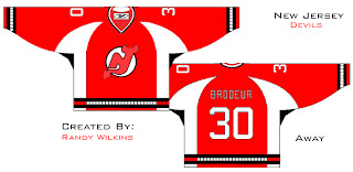
This "Hockey Fans & Photoshop" series seems to be winding down, but I assure you there's still so much more if you're a fan of hockey jersey designs. Let's move along with the New Jersey Devils.

So that's an interesting design coming from Randy Wilkins, apparently. It's cool and I like the idea of the horns at the shoulders, but unfortunately this is not an Rbk EDGE uniform design so the chances of ever seeing it on the ice are rather nil. That and the fact that it was designed by a fan and not a professional hired by the club or the league.

Still, I wanted to share it because it's something different. And that's what I'm all about. Not sure about the bars at the wrists and bottom of the jersey. A little close to the Hurricanes.

Anyway, I know, short posts today. Not much to say, really. If you have anything to add, please feel free to comment. I'd love to hear from you or anyone else.

Coming tomorrow: We're going to revisit both the Ottawa Senators and Montreal Canadiens and you won't want to miss this.