NHL Tournament of Logos

Entries in jerseys (477)

Wednesday
Oct102007

Rbk EDGE Review: Kings

Part 17 of 30. All 30 NHL clubs have unveiled new jerseys under the new Rbk EDGE Uniform System for the 2007-08 season. Here at the NHLToL, we're going to review every one of them. Read up and then rate the new sweaters. We'll do a full ranking after completing all of the reviews.

Rbk EDGE Uniform System

Los Angeles Kings


New Uniforms

Old Uniforms

The Unveiling
Friday, June 22. The Kings unveiled their new jerseys to fans at a draft day party in Los Angeles.

Home vs. Road
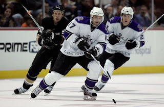
Home: Black. Road: White. The two sweaters are essentially mirror images of each other and feature secondary logo patches on the shoulders.

The black home jerseys feature purple shoulder yokes with silver trim. Spaced silver-purple-silver stripes wrap around the elbow with the purple stripe being the thickest. The text "LOS ANGELES" runs across the bottom of the front of the sweater in silver letters with a purple stroke. The collar is silver with purple trim on the inside and the primary logo serves as the crest.

The white road jerseys feature purple shoulder yokes with silver trim. Black-silver-purple-black-silver stripes wrap around the elbow with the purple stripe being the thickest. The text "LOS ANGELES" runs across the bottom of the front of the sweater in purple letters with a silver stroke. The collar is silver with black trim on the inside and the primary logo serves as the crest.

In The Details
A unique aspect of the Kings' uniforms is the city name across the bottom. The same numbering and lettering style has been retained.

New & Old
The new sweaters are primarily the same as the old with some slight modifications. The horizontal striping around the waist is gone and the shoulder yokes are rounded at the end instead of coming to a point as they did on the old jerseys. The elbow striping remains the same, however.

Standard FAQ
Numbers on the front? No.
Laces at the collar? No.

NHLToL Editorial by Chris
The Kings are one of the most interesting-looking teams if for no other reason than their use of the color purple — an element unique to them. Their color scheme is one of my favorites, league-wide. It doesn't adhere to the red/blue standard. In fact, it sort of mixes them. Even the name across the bottom is cool — so long as it doesn't get stolen by other teams. My one quibble would be with the color of the home sweater. I'd love to see them go with the purple jersey they wore as an alternate last year on a permanent basis. But we can't have everything, can we? 4/5


Buy your new Kings jersey!

Wednesday
Oct102007

Odd Art, Part II

First off, if you missed Part I then click here. Now that you know what's going on, let's dive right in. You know you like the weird stuff I post here.

We'll get things going with some imaginative Original Six designs.

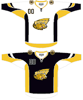
Let me begin by saying the new Bruins jersey is not something you'd be wanting to mess around with. Trust me. It's that awesome. Now, as far as this concept goes, history has taught me that logos like this were probably not originated by the creator of the jersey design itself. If anyone would like to explain from where this particular Bruins logo is derived, leave a comment.

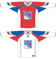
The Rangers jersey is interesting because there's actually a logo on it. A novel concept, not exactly, but it's something I feel the Rangers have struggled with. The 1970s taught us that this might not be the best use of the logo. I'm also concerned about the whole Broadway Blueshirts thing. For those of you lacking the ability to tell one color from another, that is red.

I will say this though, I am a huge proponent of the Lady Liberty logo and those jerseys. They've used a blue one and a white one and both looked better than anything the Rangers have ever worn. I might even go so far as to say it's the best any team has ever worn. But my suggestion to the Rangers is go with the NYR logo full time, and save the current sweater as a third jersey — beginning next season of course.

But who would want to listen to me anyway?

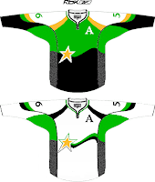
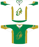
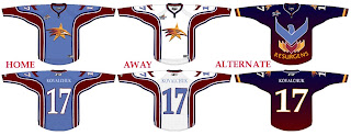
I haven't yet been able to fully grasp what's going on here but near as I can figure, we're looking at a couple of concepts for the Dallas Stars/Minnesota North Stars franchise. I get the shooting star thing in the one on the left, but I really can't work out what's going on in the one on the right. If you have any ideas I'd be happy to hear them. Comment away.

But that's not all. I'll leave you with one more today.

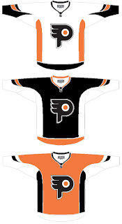
I understand what the designer is trying to do here, but I don't think the "P" in the real logo is that difficult to see. It doesn't jump out at you, but it shouldn't. Logos are meant to be looked at over and over again, so they're more effective when you discover something new every time you see it.

I know a lot of folks would disagree with me on that, but I think it's the reason the Minnesota Wild's logo is so spectacular.

But back to this. The striping is not great and the logo doesn't really need a change. But I feel like an ass for having nothing good to say about it. It's not like it's the worst thing in the world, I'm only thinking that Philly fans would revolt.

But that's all just my opinion. Feel free to share yours below.

And if you or someone you know has been afflicted by the concept art disease and would like help with public dissemination, you know how to reach me. Send an email to nhllogos@gmail.com.

Tuesday
Oct092007

Rbk EDGE Review: Blackhawks

Part 16 of 30. All 30 NHL clubs have unveiled new jerseys under the new Rbk EDGE Uniform System for the 2007-08 season. Here at the NHLToL, we're going to review every one of them. Read up and then rate the new sweaters. We'll do a full ranking after completing all of the reviews.

Rbk EDGE Uniform System

Chicago Blackhawks


New Uniforms

Old Uniforms

The Unveiling
Friday, September 14. The Blackhawks unveiled their new jerseys at a press conference in Chicago. Martin Havlat, Jonathan Toews, Patrick Kane and Brent Seabrook were on hand to model the uniforms.

Home vs. Road
Home: Red. Road: White. The two sweaters are essentially mirror images of each other with slight differences in striping patterns and feature secondary logo patches on the shoulders.

The red home jerseys feature white-black-white stripes around the elbows and white-black-white-black stripes around the waist with white extending down to the bottom. The collar is white with black trim on the inside and the primary logo serves as the crest.

The white road jerseys feature spaced black-red-black stripes around the elbows and the waist with black cuffs extending to the the wrist around the sleeves. The collar is red with black trim on the inside and the primary logo serves as the crest.

In The Details
The colors are different on the shoulder patch between the home and road sweaters. The same numbering and lettering style has been retained.

New & Old
There is hardly a difference at all between the two uniforms. The old design was simply adapted to the new EDGE cut. The one noticeable difference is in the collar, which now, like all new jerseys, features the NHL shield.

Standard FAQ
Numbers on the front? No.
Laces at the collar? No.

NHLToL Editorial by Chris
By now all of you must be aware of my aversion to the Blackhawks' logo and uniforms. It's just a personal preference thing. I don't see what's so special about it and why it's often been called the best uniform in all of sports. I don't think it's ugly by any means, but I don't understand it's allure. One thing is for sure, though. You always know when you're watching a Blackhawks game. But personally, I think you could do just as much better as worse with this one. It's not bad but it's not great either. Now go on, tell me how ridiculous I am for holding such an opinion. 3/5


Buy your new Blackhawks jersey!

Tuesday
Oct092007

Caps, Sharks, Leafs Get Cool Concepts

Today I've got a post with some very cool artwork. Take a look.

Lots of folks have suggested using the Washington Capitals' secondary logo as a primary. Here's a sweater design with that in mind.

The only problem I have is the star beneath the wings. Other than that, it's the best design I've seen with the "Weagle" logo, as it's been dubbed. Even the stripes on the sleeves look awesome with that logo.

These San Jose Sharks sweaters are nice if not slightly reminiscent of the new Blues jerseys with the piping and the Islanders jerseys on the sleeves. I like the shield logo being used on the shoulders, but I think it needs to be bigger. For being a design I like, it sure sounds like I have a lot of complaints. But honestly, though, I am a fan.

Finally, I have a concept with the best Toronto Maple Leafs logo I've seen yet. It's the one on the right.

While I'm not loving the striping pattern, I really like that logo. It mixes the current leaf silhouette with the old Toronto Arenas logo. It kicks ass, to put it quite simply. Any Leafs fans out there that like that idea? Or is it just me?

And remember, if you have any concept art you'd like to see posted here or in the Concepts Gallery, feel free to send them along to nhllogos@gmail.com.

Monday
Oct082007

Odd Art, Part I

Do you know how much I love my multi-part series? As much as I write them, how could you not?

Anyway, I'm looking at stuff that borders on being worthy of a Freak Out Friday. Unfortunately, it's not quite there but nor is it to the point where I'd want it to be taken seriously as far as that goes. Don't try and figure out what I just said. It's not worth it.

Let's move along. We'll start with the Atlanta Thrashers.

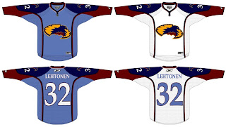
If anyone can work out what's going on here, I congratulate you. And fill the rest of us in, if you wouldn't mind.

Interesting choice going with the old unused Atlanta All-Star Game logo. I kind of like the head logo on its own. That way it doesn't look like the bird is stirring itself in a bowl. Yummy thrasher!

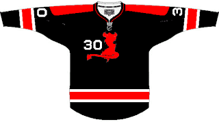
I wanted to let you look at this one before I explained it. It took me a minute, but if you stare at it for a very long time, you'll slowly begin to see the shape of the state of New Jersey appear in there somewhere. Oh yeah, it has horns and a tail. That's probably what's tripping you up. This was spawned along the lines of using state/province outlines in team logos.

Not sure how I feel about the placement of that number on the front, but I would someday like to see a black third jersey for the Devils. That would look pretty killer.

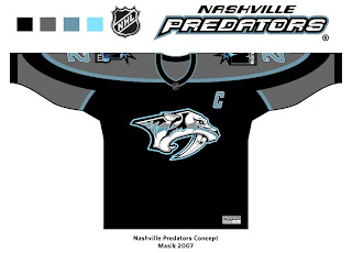
And finally, the Nashville Predators.

This is a very interesting color scheme. However, I think the only way you can really get away with limiting the colors is by first simplifying the logo itself. It's a very detailed mark and all of its colors do work in its favor. But then I've always like the Preds' logo the way it was. Crazy? Perhaps.

I'll have more where that came from tomorrow, if you're good. Eat your peas and don't stay up past your bedtime.

Sunday
Oct072007

Rbk EDGE Review: Oilers

Part 14 of 30. All 30 NHL clubs have unveiled new jerseys under the new Rbk EDGE Uniform System for the 2007-08 season. Here at the NHLToL, we're going to review every one of them. Read up and then rate the new sweaters. We'll do a full ranking after completing all of the reviews.

Rbk EDGE Uniform System

Edmonton Oilers


New Uniforms

Old Uniforms

The Unveiling
Sunday, September 16. The Oilers unveiled their new jerseys to fans at the Joey Moss Cup event in Edmonton.

Home vs. Road
Home: Blue. Road: White. The two sweaters are essentially mirror images of each other.

The blue home jerseys feature copper piping on the front that extends from the collar to the bottom of the jersey. Spaced white-copper-white stripes wrap under the elbow but not completely around the sleeve. The copper stripe has red trim. The collar is copper and the primary logo serves as the crest.

The white road jerseys feature blue piping on the front that extends from the collar to the bottom of the jersey. Spaced blue-copper-blue stripes wrap under the elbow but not completely around the sleeve. The copper stripe has red trim. The collar is blue and the primary logo serves as the crest.

In The Details
This uniform is the only one with the unique striping pattern at the elbows. The stripes to do not wrap completely around the arm, rather leaving a large gap on the outside of the elbow. The same numbering and lettering style has been retained.

New & Old
The striping pattern remains primarly the same around the sleeves with the exception being the gap at the elbow. The horizontal striping on the bottom of the sweater is gone as are the shoulder patches. The addition of the piping on the front and the altered collar are the only other differences.

Standard FAQ
Numbers on the front? No.
Laces at the collar? No.

NHLToL Editorial by Chris
Upon first seeing the Oilers' new jerseys, I was stunned. Not in the good way. I've always liked this team's sweaters — the caveat being the WHA years. Even when orange was replaced by copper and red, I still thought the Oil had one of the best jerseys in the NHL. That is so far from the truth now. The biggest problem is obviously the elbow stripes, but the list goes on. Adding to the banality of these sweaters is the the lack of a shoulder patch. Edmonton had one of the best up until last season. These monstrosities, and I do not use the word lightly, do honestly look so plain and unimaginative as to almost warrant being called practice jerseys. They are my least favorite of all. 1/5


Buy your new Oilers jersey!

Saturday
Oct062007

Rbk EDGE Review: Hurricanes

Part 13 of 30. All 30 NHL clubs have unveiled new jerseys under the new Rbk EDGE Uniform System for the 2007-08 season. Here at the NHLToL, we're going to review every one of them. Read up and then rate the new sweaters. We'll do a full ranking after completing all of the reviews.

Rbk EDGE Uniform System

Carolina Hurricanes


New Uniforms

Old Uniforms

The Unveiling
Thursday, September 6. The Hurricanes unveiled their new jerseys at a press conference where they also discussed plans for the 10th anniversary season.

Home vs. Road
Home: Red. Road: White. The two sweaters are essentially mirror images of each other and feature secondary logo patches on both shoulders.

The red home jerseys feature the signature hurricane flags wrapped horizontally around the waist with a silver-white stripe above it and a white-black stripe below it. A silver stripe wraps around the elbow above a larger white stripe. The cuff is black. White piping extends around the sholders from the collar which is white with a thin black stripe on the inside. The primary logo serves as the crest.

The white road jerseys feature the signature hurricane flags wrapped horizontally around the waist with a red-white stripe above it and a white-black stripe below it. A silver stripe wraps around the elbow above a larger red stripe. The cuff is black. Red piping extends around the sholders from the collar which is black with a thin red stripe on the inside. The primary logo serves as the crest.

In The Details
The Hurricanes jersey, when compared to the rest of the league, has the most going on in terms of horizontal striping around the waist.

New & Old
The striping remains primarly the same between the old and new uniforms. The only differences are the piping around the shoulders and addition of the NHL shield at the collar which is a league-wide change.

Standard FAQ
Numbers on the front? No.
Laces at the collar? No.

NHLToL Editorial by Chris
When we talk about "busy" jerseys, these are the first ones that come to my mind. I do like the originality, however. The hurricane flags (technically tropical storm flags) are are a nice touch. And I think both the primary and secondary logos are top-notch. But those stripes! Not to mention, I for one, could live without the piping around the shoulders. I think it only detracts from the jersey. I don't hate it, but I don't love it either. 3/5


Buy your new Hurricanes jersey!

Saturday
Oct062007

Sabres, Here's How You Fix It

Apologies for the late posts tonight. I've been working on something I'll tell you more about later. But at the moment, I'm watching the Lightning game via NHL.tv since I no longer live in the Tampa market (sadly). I'm debating whether to go ahead and buy the Center Ice package.

Anyway, that's not what this post is about. We all know the Buffalo Sabres' new uniforms need fixing. I mean it kind of goes without saying. And I think we all know exactly how.

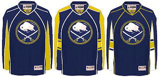
As any Sabres fan knows, John Slabyk's work epitomizes exactly what needs to be done for this team. There should be no question, yet for some reason these designs have yet to hit the ice. What are you guys waiting for anyway?

Anyway, here are a couple of other options borrowing from the designs of some of the other new Rbk EDGE sweaters.

Not sure how I feel about the chest piping, though. I think if you're going to go with a traditional-style logo, you should have the jersey match it. My exception to that rule is the San Jose Sharks.

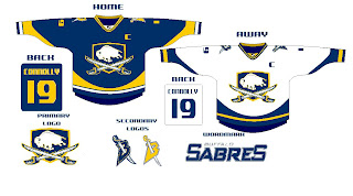
I also just got sent this design which I really like, as well.

The artwork needs a little cleaning up, so try to see past that. But here we see how to use the buffalo and sword elements without just arbitrarily placing them inside a circle.

But I know there are a lot of Sabres fans reading here, so I'm really interested to see what you guys think your team needs to be wearing. The floor is yours.

Saturday
Oct062007

Bolts Add Numbers At Home

I made reference to this in the Rbk EDGE Review for the Tampa Bay Lightning, but I thought I'd do a separate post to keep everyone up to date.

After the jerseys were unveiled initially, the Lightning were the only team to have numbers on the front of one jersey but not the other. In this case, the white road sweaters had them but not the black ones. Seems the team has changed their mind though. The numbers are now on the front of the black jerseys too.

You can see that in this picture from Thursday's opening night game against the New Jersey Devils.

Speaking as a Lightning fan, I kind of like them as a design element by themselves. With the white shoulder yoke gone, the jerseys would've looked very plain up there for guys who don't have an "A" to wear. Anyway, just thought I'd share that.

Friday
Oct052007

Rbk EDGE Review: Ducks

Part 12 of 30. All 30 NHL clubs have unveiled new jerseys under the new Rbk EDGE Uniform System for the 2007-08 season. Here at the NHLToL, we're going to review every one of them. Read up and then rate the new sweaters. We'll do a full ranking after completing all of the reviews.

Rbk EDGE Uniform System

Anaheim Ducks


New Uniforms

Old Uniforms

The Unveiling
Friday, September 14. The Ducks unveiled their new jerseys to fans during their first preseason game.

Home vs. Road
Home: Black. Road: White. The two sweaters are essentially mirror images of each other.

The black home jerseys feature swooshing gold-white-black-orange stripes around the bottom. These stripes are broken up by solid side paneling. Similar stripes are found around the sleeves. The collar is orange with gold trim and the primary logo serves as the crest.

The white road jerseys feature swooshing gold-white-black-orange stripes around the bottom. Black extends down to the bottom of the jersey from the orange stripe. These stripes are broken up by solid side paneling. Similar stripes are found around the sleeves. The collar is orange with gold trim and the primary logo serves as the crest.

In The Details
Because of its proportions, the crest is the smallest on any of the new Rbk EDGE sweaters. The same numbering and lettering style has been retained.

New & Old
Little has been changed on the new sweaters as the Ducks just introduced new ones last summer. Some slight differences include the collar (as with all of the jerseys) along with the way the side paneling breaks up the striping of the jersey.

Standard FAQ
Numbers on the front? No.
Laces at the collar? No.

NHLToL Editorial by Chris
I know these jerseys now have a Stanley Cup behind them, but I cannot get over how poor the logo is. I understand the marketing team wanting to disassociate themselves with the "Mighty" name, but surely there are better ways of doing that. I should say that without the logo, I really do like these jerseys. But a uniform is more than just colors and stripes. The logo is the biggest part and I have never been a big fan of it. That and the numbers and captains' letters are oversized when compared with the crest. The lack of imagination has spurred me to award my lowest rating yet. 2/5


Buy your new Ducks jersey!