NHL Tournament of Logos

Entries in jerseys (477)

Tuesday
Oct022007

Stars, Here's How You Fix It

Now that I'm posting the ninth part of this series, I think I should note that, by and large, I'm a big fan of all the new Rbk EDGE jerseys so don't let the fact that I'm posting so-called "fixes" make you think otherwise. I just think it makes for an interesting feature to ponder what might have been.

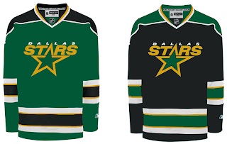
That said, let's see what we can do about the Dallas Stars. I think the home black jersey — which now features the city name as its crest — is very cool and unique. I like it if only because no one else has done it.
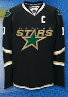
I think this is probably the easiest and most obvious fix — essentially the white jersey in black.

It uses the primary logo on the crest and the secondary logos on the shoulders along with a bit of piping at the bottom of the sweater. The current black jersey has the word "DALLAS" arched above the jersey number on the front and the primary logo on the shoulders. It's also solid black all the way to the bottom.

Personally, I like the real one better.

Moving along, we have a completely different design. Imagine more green and more apparent striping.

Obviously that's not a home-and-away set as neither is white, but it would make a good home-and-alternate set. While I do like the new black jerseys, I was always a fan of the Stars wearing green. Seems like teams aren't liking that much these days as the Wild also recently ditched their green sweaters.

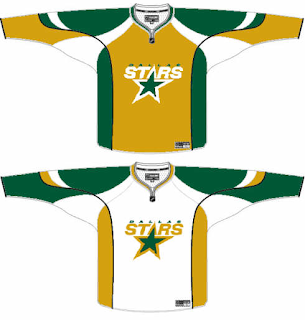
So if green's not your thing, what about gold?

While it's a decent concept, I don't think it would translate well to a uniform. I can't imagine that looking very good on the ice.

How do you feel about it? Do the Stars need to rethink their new duds? Or will keeping the jerseys make them look like studs? Har.

Coming up: Toronto Maple Leafs.

Tuesday
Oct022007

What A Wild Work Of Art!

You know, surprisingly, it has been a lot of work getting the new site up and running in the last few days. If you haven't seen it yet, check out the Tournament of Hockey Logos blog, the spinoff to NHLToL. If you're a minor league hockey fan, head over there and vote for which league will get the first tournament — AHL or ECHL.
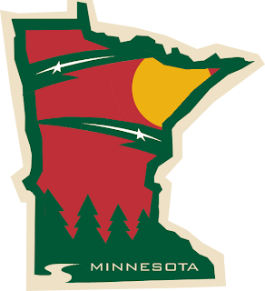
Now onto today's news — or something like that. Two months ago I posted a really cool secondary logo someone designed for the Minnesota Wild using the outline of the state itself. Well another one was sent to me and I think it's even better!

I can't get over how many talented people read and contribute to this blog. It's really a great thing. That logo matches so well with the primary while at the same time maintaining its own identity. That is very impressive work and I'd like to be the first to say so.

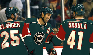
On a separate yet Wild-related note, several fans have suggested the team return to green home jerseys and keep the red for an alternate sweater. So here's what the current home jersey would look like in green.

It certainly is unique and not all that bad, if you ask me. Yet for some reason this one conjures up Christmas for me — unlike the red one. So I'm posing the question to you all. What do you think?

Beyond that, what do you think of that logo? Impressive work isn't it? I look forward to reading your comments as always.

Monday
Oct012007

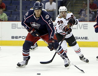
Rbk EDGE Review: Blue Jackets

Part 8 of 30. All 30 NHL clubs have unveiled new jerseys under the new Rbk EDGE Uniform System for the 2007-08 season. Here at the NHLToL, we're going to review every one of them. Read up and then rate the new sweaters. We'll do a full ranking after completing all of the reviews.

Rbk EDGE Uniform System

Columbus Blue Jackets


New Uniforms

Old Uniforms

The Unveiling
Friday, June 22. The Blue Jackets unveiled their jerseys at the 2007 NHL Draft in Columbus.

Home vs. Road
Home: Blue. Road: White. The two sweaters are essentially mirror images of each other and both feature secondary logo patches on the shoulders.

The blue home jerseys feature white and red piping that extends down the sleeves to the cuff. A white star is placed on each wrist and red piping goes around the cuff. The bottom of the jersey has red and white piping and the collar is also striped in red and white. The primary logo serves as the crest.

The white home jerseys feature a thick blue stripe extending down the sleeves, bordered by white and red piping that extends to the cuff. A white star is placed on each wrist and red piping goes around the cuff. The bottom of the jersey has blue and red piping and the collar is also striped in red and blue. The primary logo serves as the crest.

In The Details
The white stars at the wrist are a unique feature to these uniforms. The same numbering and lettering style has been retained.

New & Old
There are many changes between this year's new jersey and last year's. For one, the Blue Jackets have adopted their third jersey as a primary sweater, dumping the old logos altogether. Red is also less prominent in the new logo as well as uniforms. The horizontal stripes around the waist are gone.

Standard FAQ
Numbers on the front? No.
Laces at the collar? No.

NHLToL Editorial by Chris
When the first Blue Jackets logo was unveiled and it featured a bug, I was almost sure it was a joke. Yet it appeared on that jersey for way too many years. In adopting a new primary logo this year, the Jackets have quickly become a great-looking team. I think the new logo is a huge improvement and better than most currently seen in the NHL. And the uniform is fitting. The stars on the wrists are a nice touch. I also like the shoulder patch but could see it working better without the outer oval spelling out the team name. My one other quarrel is with the sleeves on the home sweater. I think they should be black like they were on the third jersey. But that's just my opinion. A decent effort. 3/5


Buy your new Blue Jackets jersey!

Monday
Oct012007

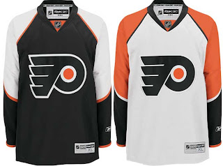
Flyers, Here's How You Fix It

I think many Philadelphia Flyers fans would argue specifically that if it needed changing, the only thing that would be necessary is an orange jersey instead of a black one. Having said that, the Flyers have already announced plans to introduce an orange third jersey next season.

Still, one fan emailed me this suggestion that extends the sleeve panel down past the elbow and shrinks the stripe around it. Have a look for yourself.

It's a minor tweak that, in my eyes doesn't really look that much different.

On a totally separate note, another fan emailed in an interesting concept that looks at altering the captains' letters.

Any thoughts? I'd love to hear them. Comment below.

By the way, apologies for the limited posts today. I've been a bit under the weather and I'm going to be needing to get to bed soon. Coming shortly will be the uniform review for the Columbus Blue Jackets.

Next up: Dallas Stars.

Sunday
Sep302007

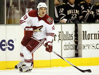
Rbk EDGE Review: Coyotes

Part 7 of 30. All 30 NHL clubs have unveiled new jerseys under the new Rbk EDGE Uniform System for the 2007-08 season. Here at the NHLToL, we're going to review every one of them. Read up and then rate the new sweaters. We'll do a full ranking after completing all of the reviews.

Rbk EDGE Uniform System

Phoenix Coyotes


New Uniforms

Old Uniforms

The Unveiling
Saturday, September 15. The Coyotes unveiled their jerseys at CoyotesFest in Phoenix.

Home vs. Road
Home: Brick red. Road: White. The two sweaters are essentially mirror images of each other but for the shoulders and both feature secondary logo patches on the left shoulder.

The brick red home jerseys are completely solid in color except for three white stripes around each elbow. The middle stripe is about twice the thickness of the other two. White laces hang from the collar and the primary logo serves as the crest.

The white home jerseys feature a brick red shoulder yoke and three brick red stripes around each elbow. The middle stripe is about twice the thickness of the other two. White laces hang from the collar and the primary logo serves as the crest.

In The Details
The shoulder patch featuring the secondary logo is found only on the left shoulder of each sweater. The same numbering and lettering style has been retained.

New & Old
The biggest differences in the new jerseys are the lack of stripes around the waist and the addition of the shoulder yoke to the road sweater. One minor change seen here is that the shoulder patch has switched sides. It was previously worn on the right shoulder.

Standard FAQ
Numbers on the front? No.
Laces at the collar? Yes.

NHLToL Editorial by Chris
I have to say that I was always among the fools that loved the original Coyotes jerseys. They may have been a little busy, but boy were they unique. They looked like no other team on the ice. I especially liked the old logo as well. I'm not nearly as fond of the new one. Still, it's simplicity that works. I like the addition of the shoulder yoke to the road jersey and I think the "PHX" patch is top-notch. As a uniform, I won't say it's among my favorites, but I respect it. 3/5


Buy your new Coyotes jersey!

Sunday
Sep302007

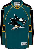
Sharks, Here's How You Fix It

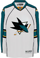
Speaking personally, I'm a fan of the San Jose Sharks' new logo and uniforms. So I don't see a need for "fixing" it necessarily. But others have complained that the modern logo design clashes with the more traditional jersey design.

One alternative to the stripes they currently wear would be something more along the lines of what the Florida Panthers do. I guess those designs match a little better. But for my money, I'd go with white piping over the orange on the home sweater.

Other complaints deal with not being able to move past orange gaining more prominence on the jerseys. Here's a solution.

I like this one because it looks like there are shark fins under wavy water on the sleeves. I think it works a little better on the white. But here's hoping the Sharks consider something of the like for a future third jersey. Speaking of the whole "fin" element, here are a bunch of ideas, seen with orange versus silver.

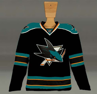
What I really like is the black jersey. Perhaps that would serve as a better third jersey as it has the last few years for the Sharks. But what do we think of it with the current striping pattern?

I know I said I like how the San Jose sweaters are now, but I'd be lying if I didn't say these were pretty awesome too. I guess it's hard to go wrong with the Sharks. So if they need fixing, there are plenty of ways of doing it.

Next up: Philadelphia Flyers.

Sunday
Sep302007

We Like Concept Art

Yes, we do. And concept art loves us. First off I just want to thank everyone who sends in their cool and crazy work. I love opening my email everyday to see what surprises await me.

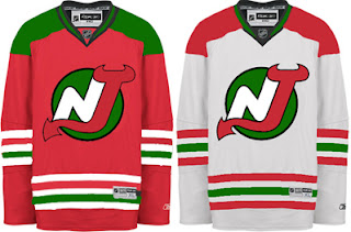
One such surprise was this New Jersey Devils uniform concept. If I'm to understand right, the logo seen here is one of the original designs that never made the final cut.

The Christmas colors don't work. If you want to see how to make green and red work together, see the Minnesota Wild.

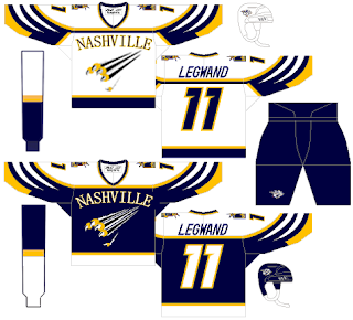
Here's an interesting Nashville Predators design that was actually a little too good to be considered for the Friday Freak Outs.

I say "good," but not necessarily on the level of the NHL. If not as a Preds third jersey, I could totally see something like this passing in the AHL or ECHL. I like the white swipes across the sleeves. Need to find a different font for the wordmark, though. That one doesn't work.

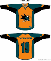
And then I have this San Jose Sharks concept which I think I'm only posting because the orange seems to annoy Sharks fans to no end. And I like a little ribbing now and then.

I was going to try to say this isn't that bad of a design, but it really is. The teal works too well for the Sharks. No need to go playing up the orange when you already have the best color in hockey. I would like to see more silver come back though.

They need to bring that back. Moving right along now.

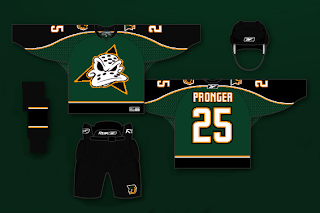
This Anaheim Ducks design is a bit of a mix between concepts I've posted here in the past. While this jersey looked great with the flying duck logo, I can't honestly say it looks horrible with this one. I know it's a Disney cartoon, but they do some of the best animation work in the world, so let's not knock them there. And despite the fact that they're similar to the Dallas Stars, I think these colors would serve the Ducks well. Maybe use the logo on a third jersey, though.

That's enough out of me. What do you guys thinks of these? Are they total duds or do they have some redeeming qualities?

Saturday
Sep292007

Rbk EDGE Review: Predators

Part 6 of 30. All 30 NHL clubs have unveiled new jerseys under the new Rbk EDGE Uniform System for the 2007-08 season. Here at the NHLToL, we're going to review every one of them. Read up and then rate the new sweaters. We'll do a full ranking after completing all of the reviews.

Rbk EDGE Uniform System

Nashville Predators


New Uniforms

Old Uniforms

The Unveiling
Thursday, July 19. The Predators unveiled their jerseys at a fan event at Sommet Center in Nashville.

Home vs. Road
Home: Blue. Road: White. The two sweaters are essentially mirror images of each other but for minor alterations in terms of overall design and both feature secondary logo patches on each shoulder.

The blue home jerseys feature yellow piping extending down from the collar. The side panels are white. A thick stripe of silver outlined in blue extends from the neck to the cuff on the sleeves which are otherwise blue from the shoulder to the elbow and white to the cuff with blue piping around the wrist. The collar is blue and yellow and the primary logo serves as the crest.

The white road jerseys feature blue piping extending down from the collar. The side panels are blue. A thick stripe of silver outlined in blue extends from the neck to the cuff on the sleeves which are otherwise white with blue piping around the wrist. The collar is blue and yellow and the primary logo on a blue triangle serves as the crest with the word "NASHVILLE" just above it.

In The Details
The same shoulder patches featuring the secondary logo are found on both shoulders of each sweater. The white sweaters feature the city name above the logo, slightly differentiating it from the blue sweaters. The same numbering and lettering style has been retained.

New & Old
There are several differences in the overall design of the new sweaters when compared to the old. The silver shoulder yoke now extends completely down the arm. It also had yellow piping and a much thicker blue stripe around it that curved down to the wrist. The stripe and elements around the waist are also gone but replaced by side paneling. The new white sweaters do not include as much blue as the old ones did. On the ice, the jerseys look relatively similar, but you can find differences if you're really looking.

Standard FAQ
Numbers on the front? No.
Laces at the collar? No.

NHLToL Editorial by Chris
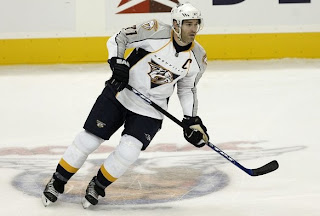
I've always been a fan of the Predators' jerseys. The old white is one of two non-Lightning jerseys that I actually own. (The other being a 1996 Mighty Ducks third jersey so that may not be a good barometer.) Looking at the home sweater on a rack, it can make you think of a t-shirt, the way the blue extends only down to the elbow. But I think that just adds to its uniqueness while many find that it's a fault. Another thing a lot of folks aren't fond of is the city name above the logo on the road sweater. That's one element I'm on the fence about. I see the merits of it while at the same time am bothered by it as a design element. On top of that, seeing these jerseys on a rack versus in action are two very different animals. I really don't care for how the whites look on the ice. I am impressed with the blues though. I'll call it a wash. 3/5


Buy your new Predators jersey!

Saturday
Sep292007

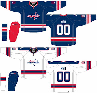
Capitals, Here's How You Fix It

The sixth entry in the Here's How You Fix It series will take a look at the Washington Capitals' new duds.

One of seven teams to introduce new or updated logos, the Caps we the route of the old days by creating a wordmark logo that harkens back to the 1970s and the arrival of the team on the NHL scene. Now it may just be a personal complaint I'm voicing, but I don't really understand the striping patterns on the new sweaters. They just do something strange along the arms and sides if you ask me.

So in the interest of considering a more traditional — heaven forbid — striping pattern, I thought I'd post this concept which was emailed to me by a reader.

The striping is simple and I love the stars on the shoulders. I also like the Capitals in blue as opposed to red or black — like the had been wearing. Another neat aspect of this concept is that the colors of the logo are swapped for the home and road jerseys. Little things like that are what make me like a uniform.

How do you feel about it? Leave your comments below.

Coming up: San Jose Sharks.

Friday
Sep282007

Just To Freak You Out VIII

The Freak Out series continues this week with a brand new episode. Some of this stuff is just unbelievable.

We'll kick things off with some small but significant Atlanta Thrashers concept attempts.

I'm not sure I can find the words to describe this. The thrasher head, while being used as a major element of the crest, has also been employed as a rather horrid stripe. It points up the arm the shoulders along the sleeves and runs across the waist.

The secondary logo is used on the front of the jersey on the right side while the player number is on the left. Captains be damned. The full primary logo is also featured on the front, but not as the crest. No, you'll find that at the bottom on the left.

The crest being used features only the bird's head on an "A." But hey, at least there's three to choose from. Also notice that the panel under the arms is blue on all three.

This jersey set is an eye sore of the worst kind. But just look at the socks. I've never seen a logo on a sock. These socks have three — each! And that's just the side we can see. Imagine if they appeared on twice or even three times.

It hurts my brain to imagine what these would look like on the ice.

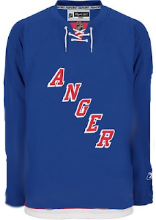
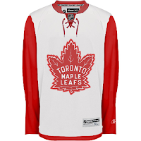
And then this. Anyone who thought the Maple Leafs introduced a rather plain jersey should see this.

And though I'm not sure who's conjuring the anger, I can only guess that it's fans who feel like they've been somehow cheated because the letters were spread vertically (not squeezed horizontally).

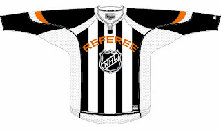
We're just now hearing of the NHL's plan to expand once again.

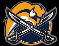
We don't yet know what city they'll play in, but the new club will be named the Referees. I don't know why this was made. But it made me laugh — and then it freaked me out some. Speaking of which, we've all seen the mish-mash logos created by Pfizer. Well this one was created by another artist, but it's almost equally as disturbing.

It seems some folks hate the slug so much, they feel a beheading is the only solution. Indeed.

Oh, this deserves an explanation. The fervor over the Calgary Flames claiming the Albertan flag on their shoulder has spurred the Toronto Maple Leafs to go all out and convert their entire uniform into a Canadian flag. With the vintage logo, of course. No other way to go.

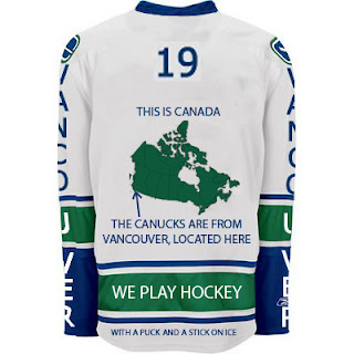
And finally, if you thought the text on the front of the new Vancouver Canucks jersey was as bad as it gets, wow. Just wait until you look at this.

I never cease to be amazed — or freaked out — by the things people send me. If you have come up with anything wacky and would like to make it a part of the Freak Out series, send it along to nhllogos@gmail.com.

I hope you all enjoyed your Freak Out Friday and are looking forward to the ninth installment coming in one week's time.

Can anyone tell me where the Canucks play? I seem to have forgotten.