NHL Tournament of Logos

Entries in lightning (75)

Wednesday
Jul182007

Jersey Design Concept For Lightning

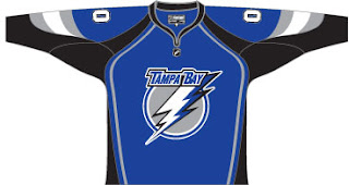
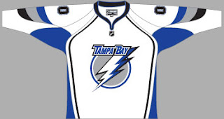
So I thought I was finished with that whole "Hockey Fans & Photoshop" series but it turns out there's more. After the possible leak of what may be the new logo for the Tampa Bay Lightning, a fan had some fun designing a uniform based on it. I honestly can't remember where I found it, but I'd have to guess ModSquadHockey since that's where I originally came across the logo itself.


This is what he came up with. It's pretty cool. I'm a big fan of switching to blue for the home jerseys. The black has gotten old. And despite there being a number of other teams that wear blue (the Thrashers, Rangers, Maple Leafs, Blues, Predators, Oilers, Blue Jackets and Canucks...) I still think the Lightning could pull it off. And should.

Obviously, it's not the offiicial design. If you consult the sidebar, you'll see we still have 38 days to wait for the big announcement and unveiling by the Bolts. Personally, I can't wait. I'm on pins and needles.

By the way, as a complete side note, I would like to thank those of you who drop by here on a regular basis. A while back I mentioned hitting a record of over 300 hits in a single day. That was surpassed yesterday with 514. I'm kind of surprised, actually. Incidentally, we're already over 400 today at it's not even 5 PM. It'll be interesting to see if we can beat yesterday's record.

Once again, thanks for dropping by.

Monday
Jul162007

Lightning vs Penguins


vs
LIGHTNING
PENGUINS
3-4
0-5

The Aesthetics
Both logos have simple color schemes. The Lightning logo lacks the movement seen in the Penguins. The hockey stick gives it a demerit but the Lightning logo goes all out with the team name. That doesn't win points.
Penguins

The Nickname
If a Penguin got struck by Lightning, that would be that.
Lightning

The Analysis
Not only is the penguin in the Penguins logo carrying a hockey stick, but he's donning hockey gear with the gloves and skates. It's cute — if he's in a comic book, not on the front of a jersey. The '90s era logo was an improvement, though I am a fan of the Vegas gold. Fortunately for the Pens, despite all of that, the Lightning logo's use of a '90s era lettering and a flat yet 3-D bolt wins them the point.
Penguins


WINNER
2-1


Friday
Jul132007

Possible New Lightning Logo?


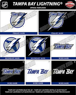
If you thought the San Jose Sharks logo I just posted was bad, you ain't seen nothing yet. This gem was posted on the same web site and I just saw it on Boltsmag and needed to post it here.

It's not the best I've ever seen. The city is still there. See that one there labeled "secondary mark" underneath? Love that one! Put it on the front of the jersey! Anyway, there's no official word from the team yet so this may or may not be the real deal. I suppose we'll find out for sure sometime this summer.

Leave your comments below and let us all know what you think.

UPDATE (6:44 PM): According to Tampa Trib Lightning beat writer Erik Erlendsson, the Lightning will unveil their new logo and uniforms at a "fan festival" on August 25. This is the first I'm hearing of an actual date. Incidentally, Erik wrote that he knows of the leaked logos I posted earlier and seems to believe they are in fact the real deal. When asked, the Lightning would neither confirm nor deny their veracity. Regardless, we should know for sure 43 days from now.

Friday
Jul132007

Panthers vs Lightning


vs
PANTHERS
LIGHTNING
7-1
3-3

The Aesthetics
Time to look at a pair of cross-state rivals. The two logos have almost no commonalities. And that works in favor of the Panthers. That being said, this is an easy point to determine. Just so I'm not cutting corners, I won't neglect the explanations. While the Panthers logo is a little more detailed, the words in the Lightning logo do it no favors. I love the bolt across the middle, but it needs more. Good thing for the Bolts, a new logo is in the offing this summer.
Panthers

The Nickname
Like most outdoor creatures, Panthers are vulnerable to a bolt of Lightning.
Lightning

The Analysis
Neither logo makes any effort at referencing their home cities, not that its really necessary as the team name does that for them. The colors are appropriate and cool and its tough to say who deserves this point. Unfortunately for the Lightning, this is one more instance where the 17 letters strewn across the logo will be detrimental.
Panthers


WINNER
2-1


Saturday
Jul072007

Lightning vs Flyers


vs
LIGHTNING
FLYERS
2-3
4-5

The Aesthetics
You would think the fact that the entire team name being spelled out would automatically lose this point for the Lightning. But that's not quite the case. The Lightning logo makes much better use of color in that there's more of it. Despite wearing black home jerseys, the only black in the logo is the drop shadow on the bolt. The Flyers logo is almost all black but for the orange circle in the middle.
Lightning

The Nickname
No bird can Fly through a Lightning storm. It would get zapped!
Lightning

The Analysis
Neither logo makes a representation of its home city. The Lightning wear a shoulder patch with the outline of the state of Florida behind the bolt, but that logo's not in this competition. This one spells out the whole name and therefore defeats the purpose of what a symbol should be. The Flyers, however, does that very well. It's a "P" for Philly with a wing attached. (I guess the "P" flies.)
Flyers


WINNER
2-1


Thursday
Jul052007

New Lightning Logo Coming!

Well, we'll just have to see if it's new. According to St. Petersburg Times Lightning beat writer Damian Cristodero mentioned the other day in the paper that the Bolts will be unveiling a "modernization" of the logo "some time this summer." No word yet on when, but I'm pretty excited.

I understand there won't be sweeping changes. Minor upgrades is what "modernization" sounds like to me. And that's fine. Just make them count. I'll have the updates here.

Monday
Jul022007

Lightning vs Islanders


vs
LIGHTNING
ISLANDERS
1-3
0-5

The Aesthetics
With a combined one win and nine matches between them, these are two rather weak logos. Both spell out the team names and the creativity of making the bottom end of the "Y" in NY into a hockey stick almost overcomes the use of the stick itself and the puck. It's almost like choosing the lesser of two evils here. The Bolts will get the point.
Lightning

The Nickname
Lightning would strike an Islander dead, especially if he's out on his boat in the middle of a storm. Where do I come up with this shit?
Lightning

The Analysis
There'll be no sweep here. The Long Island map keeps winning me over, especially when the Lightning logo has no relevance to the Tampa Bay area outside of the wordmark.
Islanders


WINNER
2-1


Friday
Jun292007

Lightning vs Devils


vs
LIGHTNING
DEVILS
1-2
2-0

The Aesthetics
Both logos have smart colors and designs stemming from circles. The Devils logo makes use of a very subtle "NJ" while there is nothing subtle about the Lightning logo. They're my team and I hate to see it, but they lose the point here.
Devils

The Nickname
You think the Devil is so all-powerful? He's got nothing on Lightning.
Lightning

The Analysis
The Lightning primary logo really has no redeeming qualities. Its one saving grace is on the shoulder with the words gone and a map of Florida in the background. If that were the primary, maybe we could talk. Despite no real representation of its home town, the Devils get this point for combining subtle letters with a strong, name-reflecting logo.
Devils


WINNER
2-1


Wednesday
Jun272007

Senators vs Lightning


vs
SENATORS
LIGHTNING
2-2
1-1

The Aesthetics
This point goes the way of the Senators for other reasons than just that the Lightning logo spells out the team's name. It's also overly simplistic — like something a five-year-old child would draw. The Senators logo has the power to strike fear.
Senators

The Nickname
A bolt of Lightning would strike a Senator dead — or at least unconscious.
Lightning

The Analysis
With Tampa considered by some to be the Lightning capital of the world, no name could be more appropriate. On the other hand, a better logo might be what's required. If only we could lose all the letters from it. Did you know there are 17? The Senators logo gets the point for a better depiction of its namesake.
Senators


WINNER
2-1


Tuesday
Jun262007

Lightning vs Hurricanes


vs
LIGHTNING
HURRICANES
1-0
1-0

The Aesthetics
We have a Southeast Division battle on our hands. Mad props to the Hurricanes for not spelling out the team name as well as what I would consider to be the subtle use of a puck in the eye of the storm. Now I may be hypocritical about many things but here's the thing: subtlety in logos rocks! You have to look at it over and over again so if you discover something new each time, you've got yourself a winner.
Hurricanes

The Nickname
You know, you would think these two go hand-in-hand right. Well as any gulf coast resident can tell you, there is no Lightning in a Hurricane. Just wind to blow everything away.
Hurricanes

The Analysis
As a Lightning fan, I find myself rather despressed at the prospect of my team being shut out in a tournament I designed. Sadly, however, this is the case. Our logo is just not good. But don't let that take away from how good the Hurricanes logo is. I've always thought it was among the best. My only complaint would be that its aspect ratio is a little off. Can we have it a little more circular please?
Hurricanes


WINNER
3-0