NHL Tournament of Logos

Entries in lightning (75)

Friday
Aug242007

Poll: Lightning vs Flyers


vs
Tampa Bay
LIGHTNING
Philadelphia
FLYERS


Place your vote and then feel free to leave a comment as to how you came to your decision. Tell all your friends to drop in and vote! The more voices heard, the more accurate the results! By the way, just like with the Senators in their match with the Rangers, when the Lightning unveil their new logo on August 25, it will take effect on this poll that day or the day after. So the "old logo" will only be here for just one or two days. I know the timing is funky but bear with me if you can.

Poll opening date
Aug 24 @ 4:15 AM
Poll closing date
Aug 31 @ 11:59 PM

07CHTRN | #E1G | TBLvPHI

Saturday
Aug182007

Concept Jerseys For Everybody

I may be playing with fire here, but I've decided to make an Rbk EDGE jersey template available to anyone interested in trying their hand at a creating a uniform concept. God knows I'm not hurting for content, but a lot of people have been asking where to get a template, so I thought I'd try to be helpful for once. If you want to download it, you'll find it toward the bottom of the sidebar on the right.

Having said that, I too decided to try my own hand at a concept for my Tampa Bay Lightning. I put only about 10 minutes into it so the quality and overall design might be poor, but I just wanted to show that anyone can do it.

It's not much, but it works in the "leaked" new logos we'll likely see unveiled a week from today at the St. Pete Times Forum. I have a background in graphic design having worked as a newspaper ad designer for about six years (but you might not know it based on that). I know my way around Photoshop, but it is quite expensive and I am quite cheap. So I have to deal with what little I do have.

What I really wanted to do was see how the Bolts' home sweater might look in blue. I've always thought that would be a neat direction to go. Again, very basic and simplistic, but that's been the Lightning's style. I'm rather anxious to see what they've come up with. What would you all think of a blue Tampa Bay uniform? Too much like the Leafs?

So if you've never made a concept, now is your chance to take a stab at it. I mean, just go nuts. And if you think there's something to it, you've got my email address. Send it along.

UPDATE (8:41 PM): Just noticed an oversight on my part. No numbers on the sleeves. Oops.

Friday
Aug172007

Getting All Conceptual On Logos

One of my favorite things is seeing the ideas people have come up with for new team logos. I always like to start off with the most outrageous stuff. So Montreal Canadiens fans, prepare to gouge out your own eyes (because I know you will).

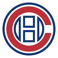
That's an idea someone came up with to update the Habs' logo. Personally, I think it's interesting but that it doesn't outdo what they have now.

I'm sure the Montreal faithful have lost their lunch, but I'm all right with that. But in all fairness, what do you guys think? Is it really that bad, or would this be the way to go if things needed to change?

This next concept logo comes from designer Ian Baker. He worked on an idea for the New Jersey Devils.

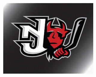
It's interesting, I kind of like it but again I'm not sure it would be much of an improvement on what they currently wear. I really like the Devils logo. It's one of those logos that will live on as an NHL classic a century from now.

It turns out the same ad agency who designed the first Tampa Bay Lightning logo I posted on Wednesday, came up with another idea. More of a word mark, but here it is.

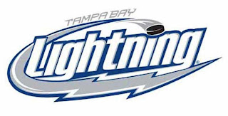
It's pretty cool. I don't like the puck in it, but that's just me.

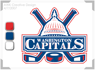
And finally, I'll leave you with a design that I feel would actually be an improvement for the Washington Capitals. I don't really like their new logo. I was a fan of the bronze and blue. But even if they had to switch back to the red, white and blue, what about keeping the logo. Something like this?

If you've got any thoughts or comments on these designs or any others, you know where to put them. Right down there in the comments section.

Thursday
Aug162007

Bolts Promo New Logo, Uniform

The Tampa Bay Lightning have officially announced on their web site they will be holding ICEfest on August 25 where they will unveil the new logo and uniforms.

I believe this is the first time the team has actually referenced a new logo — even though we've apparently already seen it. But not to worry, despite the fact that I now live 120 miles away from Tampa, I'll be there next Saturday to get video and pictures of my own to bring back and post right here. Can't wait!

Wednesday
Aug152007

A Few Ideas For Bolts

As is probably more than painfully clear, I am a huge Tampa Bay Lightning fan. So when artwork for my Bolts gets submitted, naturally I'm more than eager to post it. First off, as a reminder, this is allegedly the Lightning's new logo.

Anyway, today I have lots to share. We'll start off with the cream of the crop.

This pair of Lightning logos was designed by a local advertising firm, apparently. I was an overall fan until my girlfriend pointed out that the hockey sticks look more like golf clubs. Now that's all I can see. But if the sticks could look more like sticks, I think this would make for a very strong shoulder patch. Not a great primary, but definitely an awesome secondary. I like the skyline in the one on the left.

Moving along, though. Another designer emailed me some ideas for a new Lightning logo.

Everything there seems like it's about to fall over. I'm not sure why it all needs to lean so far to the right that way. I also can't speak very highly of the secondary mark, which appears to be drawn by hand. I applaud the effort in trying to make the "B" in "TB" look like a lightning bolt, but I don't think it's working out.

And finally, another fan designer sent in these concepts. How about a Lightning jersey in gray?

Same artist also came up with a design borrowed from the Vancouver Canucks' previous third jersey. Have a look at that one.

Any other Lightning fans out there? What do you think of these ideas? Anything worth considering in here or should we tie it all to a kite in a thunderstorm?

Friday
Aug102007

Wild, Lightning Fan Art

Like I said, it's a light day. Sorry about that. Things are going to get interesting this weekend though. I hope everybody drops in to start voting on Sunday. I need you all to decide which team has the best logo. Not me.

Here's a different sort of design for the Minnesota Wild.

It sort of steals the whole text across the chest thing from the Avalanche — who stole it from the Rangers. I'm not sure how Wild fans will feel. Probably won't be "wild" about it. Get it? Okay, stop. That's enough. Kind of like the "State of Hockey" logo on the shoulder. Thoughts?

This design is a reimagining of this one I posted the other day. It's kind of funny. Not to worry though. Don't expect anything like this to ever seen the light of day.

But wait, I have more. I was sent a few designs for the Tampa Bay Lightning. See the following image.

That blue might not be quite the right shade, but I've often wondered what the Bolts would look like in blue. The infamous third jerseys from the late '90s were mostly blue and I sort of liked those. As for the laced collar, I'm not sure that would work well for the Lightning.

There were also these two designs. A lot of people have commented that a gray third might be the way to go for the Bolts. I'm not so sure, but I guess it would depend on the overall design so I don't really know how I'd feel about it.

How do you all feel about these designs? You think something along these lines would be the way to go for these teams or should we let it be handled another way?

Friday
Aug102007

Lightning vs Rangers


vs
LIGHTNING
RANGERS
6-7
3-10

The Aesthetics
Well the text abounds here on the final day of the qualifying tournament. Since both logos use it in excess, we'll just have to look past the text. And call me biased (and I may well be), but I think the Lightning logo is a little more dynamic (though perhaps not as old as the Rangers'). At least there's more to it than just a shield. Maybe one day they'll take my advice and go full on with the Lady Liberty logo.
Lightning

The Nickname
Rangers work way up high in those elevated ranger stations where they are very prone to strikes of Lightning. Or something like that.
Lightning

The Analysis
Since its the last day of the tournament, we'll make this easy. The Rangers logo has the staying power of like a hundred years or something. The Lightning logo has needed an upgrade for the last 10 years. Finally, it's going to get it, though. Maybe then I'd be more apt to give it this point. Still, they sneak by with the win and finish the tournament even.
Rangers


WINNER
2-1


Wednesday
Aug082007

Thrashers vs Lightning


vs
THRASHERS
LIGHTNING
6-6
6-6

The Aesthetics
These two logos are very evenly matched at this stage of the tournament. One of the things I hate almost as much as text in hockey logos are things like blatant hockey sticks that serve no real purpose. Take the stick out of the logo and it only improves it. But even with it, I think it's one of the league's better modern marks. And it doesn't have all that text.
Thrashers

The Nickname
If a Thrasher got struck by Lightning, he would then only serve as someone's lunch.
Lightning

The Analysis
Despite its performance in this tournament to date, I think the Thrashers have one of the best logos in the league. The Lightning have one of the worst, which is why I'm glad to hear they're changing it this summer. One game left for each of these teams.
Thrashers


WINNER
2-1


Tuesday
Aug072007

Mailbag: More Lightning Logo Concepts

With the news breaking today that the Tampa Bay Lightning have been sold, I thought it'd be a good time to share some fan artwork I've received recently.

John emailed this design which is basically the allegedly leaked new Lightning logo that's been making the rounds, with a slight alteration. Instead of plastering Tampa Bay over the top of the bolt in weird lettering, he suggests going with "TB" on top of it all.

It's a cool idea. Personally, I like the TB but I'm not sure if I'd like to see anything on top of the lightning bolt itself. What do you guys think?

Then there's this design which puts the "TB" underneath the bolt. It also makes the bolt more vertical and in black and blue as opposed to white or white and blue. Would something like this work?

If you ask me, I'd like to see something entirely different from what we currently have so I can better judge. Perhaps not the giant "L" logo, though. I posted that design on Saturday. Along with it, the designer also sent jersey designs

As you can see, yellow might not be the best color to add to the Lightning uniform. But then I think he realized that and tried to correct himself.

He came up with this design, which features gray as a replacement. I don't know, though. I think it still leaves something to be desired. I do, however, like the lightning on the sleeves.

I don't know. I was always a fan of those late-'90s third jerseys that featured the storm scene. If there was some way we could revisit that without making the uniforms look silly, I'd be all for it.

Tuesday
Aug072007

Holy Shit! MacLean Buys Bolts!

Sorry, I know this doesn't fit into the uniform/logo news I typically post, but as a Tampa Bay Lightning fan, I've found myself upended by the sudden sale of my team. I didn't even know they were up for sale! Shows how much I know.

If you're inclined you can watch snippets of a press conference with Doug MacLean, Jeff Sherrin and Oren Koules from Absolute Hockey Enterprises. They now own the Bolts and — good news — say they plan on keeping the team in Tampa for the foreseeable future.

MacLean, for those of you unaware, coached the Florida Panthers to the Stanley Cup Finals in 1996 and most recently was the GM of the Columbus Blue Jackets.

Wow.

Page 1 ... 3 4 5 6 7 ... 8 Next 10 Entries »