NHL Tournament of Logos

Entries in news (596)

Monday
Sep172007

Get Ready For A New Tourney!

As you know, the hockey season is nearing and that means the inaugural NHL Tournament of Logos is winding down. After tonight, just four logos will remain as we prepare to name one the best logo in the National Hockey League.

Planning Ahead
So I'm planning ahead. A lot of you have expressed interest in this site continuing past the unveilings of all the new Rbk EDGE jerseys and the logo tournament. Well as I've said, there's so much more we have left to do.

We can decide on the best secondary logo, the best vintage logo, the best third jersey logo — the list goes on and on. But we have to go one step at a time. Today I added a new poll to the sidebar so you can vote on which logo set we should decide the best of next. You can vote for one, two or all three categories if you'd like.

Like I've said before, this blog is for you guys. Just let me know what you want to vote on next, and we'll do it. Currently, you can choose from vintage logos (we'll use a pool of 16 chosen at random), secondary logos (we'll use a pool of all the current secondary marks), and third jersey logos (the pool will consist of all third jerseys since the program was introduced in 1995).

I know many of you have inquired about doing a jersey tournament. We'll get to that. But first let's do another set of logos. The site is called the NHL Tournament of Logos after all.

Reebok Reviews
That reminds me. Beginning a week from today I'm going to start a month-long Rbk EDGE series. Each day, I'm going to review a different jersey until we've done all 30 teams. Along with each review will be a poll so you guys can rate each new uniform.

Then sometime in the winter, midway through the hockey season, we'll do a tournament of jerseys. We'll set up a new bracket and you'll be able to vote on which is the league's best. I want to wait until the winter so that we can have some time to get used to them. Don't want to go around making snap judgments now, do we? We'll give them some time to sink in and then they'll be fair game — pitting one sweater versus another.

Your Opinion Matters!
And one final thought. I know I've only offered up three categories for the next logo tournament, but if you have an idea you think should be considered, I'm all ears. You can leave a comment on this post or email me directly at nhllogos@gmail.com.

Also worth mentioning is this. You've noticed the Logo History polls that I've been conducting on the days when I don't have a new poll for the tournament itself. The same will go for the next tournament, except with a twist. You'll be voting on the best logo of a relocated franchise. For example, we'll pit Whalers against Hurricanes, Nordiques against Avalanche, and Jets against Coyotes.

Anyway, I can't tell you how excited I am about this! The response from everyone has been amazing. I really can't believe how many people continue to visit this site and vote everyday. As long as you guys keep making it worthwhile, I'll keep updating the blog. Thanks again for dropping in and please email at any time!

Monday
Sep172007

Hurricanes, Caps In Action

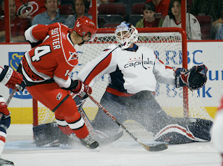
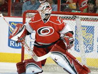
Last night, the Carolina Hurricanes defeated the Washington Capitals in overtime in each team's first game of the preseason. Both teams wore their brand new Rbk EDGE uniforms and I thought I'd share some photos.

The Capitals jersey has grown on me a little, though I don't like the wordmark posing as a logo.

Anyway, I really feel like these new sweaters look great on the ice. I may stand alone in that belief, but I'm all right with that.

Also wanted to point out that I've been collecting game photos from as many preseason games as I can for the Rbk EDGE gallery. Hope you guys are enjoying that. And if you come across any photos I don't have, please let me know. I'm trying to compile as many as possible — just for the hell of it, I guess.

Sunday
Sep162007

Ducks' Stripes Stop

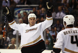
You know I'm bored when I write a post about something like this. In perusing photos from last night's preseason game between the Los Angeles Kings and Anaheim Ducks, I noticed something odd about the new Anaheim sweaters.

It's the tiniest of details, but the curved stripe doesn't extend all the way around the bottom of the jersey. The panel down the side is solid. Like I said, it couldn't matter less, but it was just something unusual I noticed.

That reminds me, I just uploaded a ton of photos from that game to the Ducks and Kings albums in the Rbk EDGE gallery. They're different from that first preseason game because while that one was in Anaheim, this one was in L.A., so you can see the Kings in black and Ducks in white.

Sunday
Sep162007

Oilers Unveil New Uniforms!

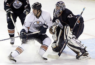
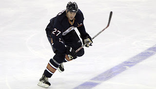
The Edmonton Oilers have unveiled their new Rbk EDGE uniforms today at the Joey Moss Cup. There are a couple of photos up on the team's official web site.

As far as the elbow striping, I'm still at a loss. But that's all right. Like all of the new Reebok sweaters, they look great on the ice and that's what matters.

I'll have more photos here once they are available. If you were there and took photos, please send them along and I'll post them here for you.

Sunday
Sep162007

Preview New Oilers Jerseys

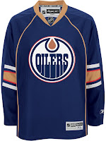
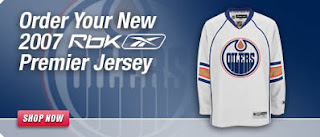
The Joey Moss Cup should just be getting underway in Edmonton but the Oilers have yet to post any photos of their new Rbk EDGE uniforms on their web site. But thanks to our pal Wayne, we have a preview courtesy of the NHL.com Shop.

I've really liked the designs of most of these new Reebok jerseys, but I just can't figure out the half-stripe thing going on at the elbows here. It at least made some sense for Florida because of the red stripes going down the arms. But here, I just don't really understand.

We'll continue to wait for official word from the Oil. Hopefully they don't take as long as the Coyotes did yesterday.

Sunday
Sep162007

Thinking About Minnesota

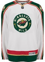
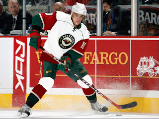
We're waiting for the Edmonton Oilers to show of their new uniforms today, the least I can do is offer up some Minnesota Wild concept art. Let's get right to it.

I don't think this design is trying to prove anything. Probably just a bored artist having a little fun. For those who didn't recognize it initially, that's the new Rbk EDGE home sweater for the Montreal Canadiens. The colors and crest have been changed. It's not bad, but I definitely think the Wild went with the right look.

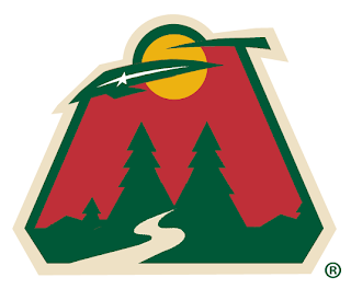
With this concept, the designer was just trying to see what the crest on the home sweater would look like on the road. Once again, I think the Wild got it right by using the large bear head logo over this circular one.

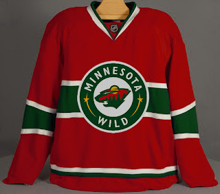
Quite honestly, I really like the Wild's logo and uniform design. Some folks have lodged Christmas-related complaints with regard to the color combination, but I find fault with that. I think the wheat color

But let's mix it up a little. What if the Wild just recolored the home pattern white and called that the road jersey. Might it look a little something like this?

It just might. Anyway I've also got some concept logos that were sent to me by John.

This redesign morphed the bear head into an "M," keeping the major elements from the original. I'm a huge fan of the bear head, but this is not a terrible idea.

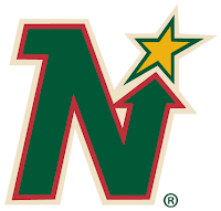
This logo is simply the Minnesota North Stars logo in the colors of the Wild. Personally, I think it was best like it was. But this does make me laugh.

So while we wait on the Oil, I might even have another concepts post at some point today. Hope you've enjoyed what you've seen here.

By the way, get ready as tomorrow I plan to open a poll where you all will get to decide on the subject of the next logo tournament.

Sunday
Sep162007

Result: Lightning Logo History

BEST ALL-TIME
2007

74% 6,546 votes

8,807 total votes

1992
26% 2,261 votes


Poll opening date
Sep 8 @ 7:40 AM
Poll closing date
Sep 15 @ 11:59 PM

07BONLH | LHTBL

Saturday
Sep152007

Bolts' New Pants

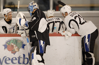
This may not be of any real interest to anyone who isn't a Tampa Bay Lightning fan, but to those who are, here's a look at the new pants being sported by players during training camp at the Ice Sports Forum in Brandon.

In what seems to be an effort to add more blue into the uniform, the Lightning bolt on the pants — which I'm so glad they kept — now has a blue stripe beneath it.

Incidentally, the new Lightning home jersey I ordered online three weeks ago just got shipped today! I can't wait for it to get here!

Saturday
Sep152007

Coyotes Unveil New Uniforms!

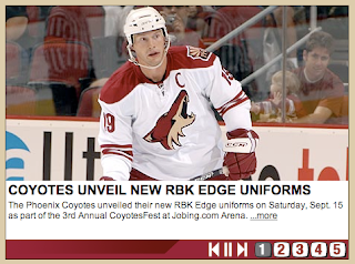
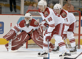
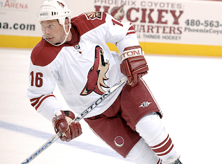
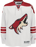
At long last, the Phoenix Coyotes have updated their web site to indicate to us that their new Rbk EDGE uniforms have actually been unveiled. Behold the proof.

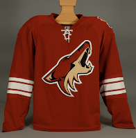
While no further photos have been posted to the site, I do have a few from the team's press packet so we'll consider them with this being the "official" post on the subject.

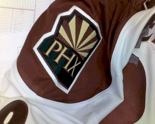
They're a little plain but I think that helps accent the logo. They're nowhere near the simplicity of the new Leafs' sweaters — which aren't helped any by the monochromatic logo. It's at least visually interesting to note that the shoulder patch is only on one side. As I pointed out earlier, it switched sides. No word yet on why.

It's a very clean and sharp uniform set and Coyotes fans should be thrilled.

UPDATE (9/16 7:50 AM): The Coyotes finally updated their web site late last night or early this morning with a great photo gallery from CoyotesFest. There were a couple of great action shots in there that really show off these uniforms.

They might be a little plain but they've got that old-time hockey feel and there's nothing wrong with that. One thing I never noticed before (since the Lightning almost never play the Coyotes) is the moon symbol from the original 1996 logo set has been retained on the pants.

Saturday
Sep152007

First Photos Of Coyotes' Sweaters

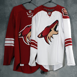
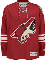
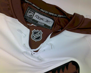
Greetings, all. With much thanks to Paul and Wayne for their lightning quick responses to my previous post, we finally have actual photographs of the new uniforms for the Phoenix Coyotes.

We'll start with the NHL.com Shop images. The photos haven't been released on the site yet but have been uploaded to the servers.

The biggest alteration to the sweaters are the brick red sholder yokes now present on the road sweaters. I like that because although it's an irrational thought, I always feel like solid white jerseys blend into the ice too much. Also, the horizontal stripes around the bottom of the jersey are gone.

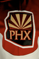
One more minor note is that the "PHX" patch is now located on the left shoulder. It was moved from the right. Not sure why though.

These photos were just posted over at HFBoards.com so I thought I'd keep them circulating. Apologies for the color. I would've done some retouching, but I just wanted to get them posted quickly.

I feel like the Wizard of Oz standing behind a curtain when I tell you to pay no mind to those iron-on letters that appear to be detaching themselves from the back of this jersey. If I were to guess, I'd say it was worn by a prospect at a recent tournament. Anyone want to confirm?

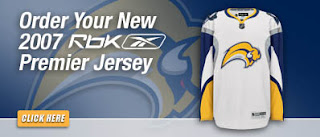
And as a special treat, our friend Wayne has also dug up the following graphics deep from the bowels of the NHL web servers. Have a look at the Sabres', Rangers' and Devils' new road jerseys.


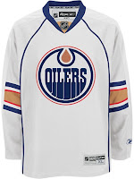
But wait, if you thought that was it, get ready for this. Here's our first photograph of the Edmonton Oilers' new road sweater.

I just want to know what happened to the sleeves. At least when Florida did the whole interrupted elbow stripes, it was because of a swatch of color riding down the arm. Here, I just don't know. I'll wait to pass judgment until we see more photos.