With the news breaking today that the Tampa Bay Lightning have been sold, I thought it'd be a good time to share some fan artwork I've received recently.
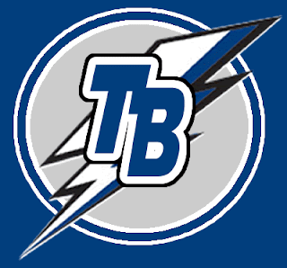
John emailed this design which is basically the allegedly leaked new Lightning logo that's been making the rounds, with a slight alteration. Instead of plastering Tampa Bay over the top of the bolt in weird lettering, he suggests going with "TB" on top of it all.
It's a cool idea. Personally, I like the TB but I'm not sure if I'd like to see anything on top of the lightning bolt itself. What do you guys think?
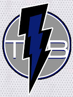 Then there's this design which puts the "TB" underneath the bolt. It also makes the bolt more vertical and in black and blue as opposed to white or white and blue. Would something like this work?
If you ask me, I'd like to see something entirely different from what we currently have so I can better judge. Perhaps not the giant "L" logo, though. I posted that design on Saturday. Along with it, the designer also sent jersey designs
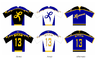 As you can see, yellow might not be the best color to add to the Lightning uniform. But then I think he realized that and tried to correct himself.
He came up with this design, which features gray as a replacement. I don't know, though. I think it still leaves something to be desired. I do, however, like the lightning on the sleeves.

I don't know. I was always a fan of those late-'90s third jerseys that featured the storm scene. If there was some way we could revisit that without making the uniforms look silly, I'd be all for it.
 Wednesday · Aug 8 · 2007 | 11:29 PM PDT
  28 Comments
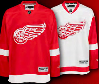
  The Red Wings join the Flyers and Rangers as teams making the new jerseys available for pre-order on the web site. The graphic to the left can be found on the Wings' web site and it links to the order form. Detroit has separated itself from the Flyers and Rangers, however, by making images of the new jersey available.






 Sorry, I know this doesn't fit into the uniform/logo news I typically post, but as a Tampa Bay Lightning fan, I've found myself upended by the sudden sale of my team. I didn't even know they were up for sale! Shows how much I know.