NHL Tournament of Logos

Entries in poll (240)

Monday
Oct222007

Rbk EDGE Review: Thrashers

Part 29 of 30. All 30 NHL clubs have unveiled new jerseys under the new Rbk EDGE Uniform System for the 2007-08 season. Here at the NHLToL, we're going to review every one of them. Read up and then rate the new sweaters. We'll do a full ranking after completing all of the reviews.

Rbk EDGE Uniform System

Atlanta Thrashers


New Uniforms

Old Uniforms

The Unveiling
Friday, September 14. The Thrashers unveiled their jerseys at a press conference in Atlanta.

Home vs. Road
Home: Blue. Road: White. The two sweaters are very different from each other in overall design.

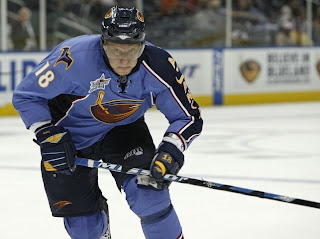
The sky blue home jerseys feature a thick dark blue stripe, trimmed in white and red, down the left sleeve. Vertical text down the sleeve spells out "ATLANTA" in yellow letters with a white stroke and red and sky blue drop shadow. The side panels are dark blue with red and white trim. White and red piping wraps around the wrists. A secondary logo patch is featured on the right shoulder. The collar is dark blue and the the primary logo serves as the crest.

The white road jerseys feature blue sleeves, with triangular white panels just above the elbows. Red piping borders the blue at the shoulders. Blue piping runs from the collar to the base of the sweater. Yellow piping wraps around the wrists and secondary logo patches don each shoulder. The collar is blue with a specialty design and red trim while the primary logo serves as the crest.

In The Details
There is no jersey number on the left sleeve of the home jersey where the city name runs down the arm. The same numbering and lettering style has been retained.

New & Old
While the overall design of the jerseys are relatively similar to the old ones, there are plenty of differences. The most noticeable is the lack of horizontal striping around the waist. A rather small but noteworthy change is the addition of the secondary logo to the shoulder of the home jersey. Overall, while similar, these jerseys are certainly different.

Standard FAQ
Numbers on the front? No.
Laces at the collar? Yes.

NHLToL Editorial by Chris
The Thrashers hit it pretty damn close with this. My favorite jersey last year was Atlanta's home sweater — adopted from a third jersey. The sky blue color is stunning. The city name down the sleeve is a unique and very cool-looking element. The numbering and lettering style is very sharp. The secondary logo is amazing! Now what I don't like. The primary logo isn't great but it's not bad. The side panels of the home jersey are weird. The blue piping on the front of the road sweater seems a little out of place, as well. But I definitely feel like the pros outweigh the cons here. It's not perfect, but it's approaching that mark. 4/5


Buy your new Thrashers jersey!

Monday
Oct222007

Poll: Flames Franchise Logos


FLAMES
(Atlanta)
FLAMES
(Calgary)


Place your vote and then feel free to leave a comment as to how you came to your decision. Tell all your friends to drop in and vote! The more voices heard, the more accurate the results!

Poll opening date
Mon Oct 22 @ 4:08 AM
Poll closing date
Fri Oct 26 @ 11:59 PM

07BONRF | RFCGY

Sunday
Oct212007

Rbk EDGE Review: Maple Leafs

Part 28 of 30. All 30 NHL clubs have unveiled new jerseys under the new Rbk EDGE Uniform System for the 2007-08 season. Here at the NHLToL, we're going to review every one of them. Read up and then rate the new sweaters. We'll do a full ranking after completing all of the reviews.

Rbk EDGE Uniform System

Toronto Maple Leafs


New Uniforms

Old Uniforms

The Unveiling
Wednesday, September 12. The Maple Leafs unveiled their jerseys at a fan event in Toronto. The event was also broadcast live on the web at Leafs TV.

Home vs. Road
Home: Blue. Road: White. The two sweaters are essentially mirror images of each other.

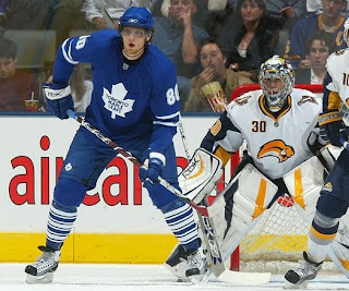
The blue home jerseys feature two white stripes around the elbows and white piping around the wrists. The white version of the primary logo serves as the crest.

The white road jerseys feature two blue stripes around the elbows and blue piping around the wrists. The collar is blue and the blue version of the primary logo serves as the crest.

In The Details
The same numbering and lettering style has been retained.

New & Old
The biggest differences between the new and old sweaters is the lack of horizontal striping across the bottom and the the secondary "TML" logo. Also, the silver in the old jersey is now gone as well. The piping at the wrists is also new.

Standard FAQ
Numbers on the front? No.
Laces at the collar? No.

NHLToL Editorial by Chris
Did somebody order a plain jersey? Oh, yes that would be the Maple Leafs. It's like going to McDonald's and ordering the hamburger without lettuce, cheese, onions, mustard or even ketchup. (Wait, that's what my brother gets.) Off subject. While not saying I dislike this uniform, I have to say it is very plain. What doesn't help is the nine stripes found on each sock, heavily weighing down the overall design of the uniform. Still, I've been trying to stick to jersey commentary here. Thing is, there really isn't anything to say about it. Except that some people call them pajamas. Not me. Can something be "very" average? Because I think this would be. At least before it had a little personality. 3/5


Buy your new Maple Leafs jersey!

Saturday
Oct202007

Rbk EDGE Review: Stars

Part 27 of 30. All 30 NHL clubs have unveiled new jerseys under the new Rbk EDGE Uniform System for the 2007-08 season. Here at the NHLToL, we're going to review every one of them. Read up and then rate the new sweaters. We'll do a full ranking after completing all of the reviews.

Rbk EDGE Uniform System

Dallas Stars


New Uniforms

Old Uniforms

The Unveiling
Friday, September 14. The Stars unveiled their jerseys at a fan event in Dallas.

Home vs. Road
Home: Black. Road: White. The two sweaters are similar in striping pattern only, but are otherwise very different.

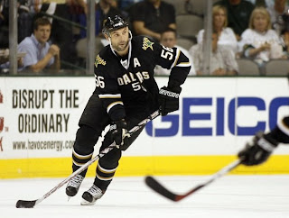
The black home jerseys feature two thin white-gold stripes with a wide gap between them around the elbows. The word "DALLAS" is white letters with gold trim is arched above the player's sweater number on the chest. The primary logo is featured as a shoulder patch. The collar is white with black trim on the inside.

The white road jerseys feature two thin green-gold stripes with a wide gap between them around the elbows. Gold-green trim wraps around the waist at the very bottom of the sweater. The secondary logo is featured as a shoulder patch. The collar is green with gold trim on the inside and the primary logo serves as the crest.

In The Details
The Stars are one of a handful of teams with crests differing between the home and road sweaters. They also join the Rangers as the only teams to have a jersey without a logo on the front. The same numbering and lettering style has been retained.

New & Old
The new uniforms have been designed completely different from the old ones. The star shape that spanned the entire sweater is now gone and there isn't even a logo on the dark jersey — which is now almost completely black instead of green.

Standard FAQ
Numbers on the front? Yes.
Laces at the collar? No.

NHLToL Editorial by Chris
First off, kudos to the Stars for trying something unique. The black jerseys look simply amazing. While I wouldn't want it to become a league-wide trend, the large number on the front gives the sweaters a great classic feel. However, I'm not as much a fan of the white jerseys. One thing this team missed the boat on was the striping. The stripes are way too thin and do not stand out like they should. To sum up, the minimalist design, I feel, works well on the black jerseys, but not so much on the whites. Still, I feel like it's overall a very nice uniform. 4/5


Buy your new Stars jersey!

Saturday
Oct202007

Poll: Hurricanes Franchise Logos


WHALERS
HURRICANES


Place your vote and then feel free to leave a comment as to how you came to your decision. Tell all your friends to drop in and vote! The more voices heard, the more accurate the results!

Poll opening date
Sat Oct 20 @ 9:40 AM
Poll closing date
Wed Oct 24 @ 11:59 PM

07BONRF | RFCAR

Friday
Oct192007

Rbk EDGE Review: Flyers

Part 26 of 30. All 30 NHL clubs have unveiled new jerseys under the new Rbk EDGE Uniform System for the 2007-08 season. Here at the NHLToL, we're going to review every one of them. Read up and then rate the new sweaters. We'll do a full ranking after completing all of the reviews.

Rbk EDGE Uniform System

Philadelphia Flyers


New Uniforms

Old Uniforms

The Unveiling
Friday, September 14. The Flyers unveiled their jerseys to fans at Virtua Health Flyers Skate Zone in Philadelphia in a joint event with the Philadelphia Phantoms of the AHL.

Home vs. Road
Home: Black. Road: White. The two sweaters are essentially mirror images of each other.

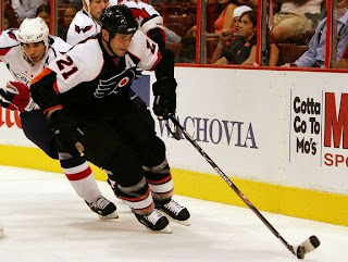
The black home jerseys feature white a white shoulder yoke with orange trim that extends almost to the elbow. The elbow is wrapped in a panel of orange which tapers to a point above the elbow. Orange piping wraps around the wrists. The collar is black and the primary logo serves as the crest.

The white road jerseys feature white an orange shoulder yoke with black trim that extends almost to the elbow. The elbow is wrapped in a panel of white which tapers to a point above the elbow. Below the elbow, the sleeve is black down to the wrists, which are wrapped in orange piping. The collar is black and the primary logo serves as the crest.

In The Details
The same numbering and lettering style has been retained.

New & Old
The sleeve pattern differs greatly on the new uniforms. The likelihood is that the cut of the Rbk EDGE sweaters isn't conducive to the style the Flyers have worn for 40 years.

Standard FAQ
Numbers on the front? No.
Laces at the collar? No.

NHLToL Editorial by Chris
The Flyers have always had a solid sweater. There really isn't much to complain about. It's one of those classics. Even though the old sleeve pattern didn't seem to work on the EDGE jerseys, I'm not bothered at all by the new style. I will say I like the old one better, but nothing is really taken away here. I'm not entirely sure what they were thinking when it comes to the elbow panel, however. That has me thrown a bit. One thing I have noticed with the lack of horizontal striping, especially on teams wearing black, the jersey and pants tend to run together. I don't know, I guess I'm just used to the contrast. I don't love it. I don't hate it. It just falls somewhere in the middle for me. 3/5


Buy your new Flyers jersey!

Friday
Oct192007

Poll: Stars Franchise Logos


NORTH STARS
STARS


Place your vote and then feel free to leave a comment as to how you came to your decision. Tell all your friends to drop in and vote! The more voices heard, the more accurate the results!

Poll opening date
Fri Oct 19 @ 4:37 AM
Poll closing date
Tue Oct 23 @ 11:59 PM

07BONRF | RFDAL

Thursday
Oct182007

Rbk EDGE Review: Canucks

Part 25 of 30. All 30 NHL clubs have unveiled new jerseys under the new Rbk EDGE Uniform System for the 2007-08 season. Here at the NHLToL, we're going to review every one of them. Read up and then rate the new sweaters. We'll do a full ranking after completing all of the reviews.

Rbk EDGE Uniform System

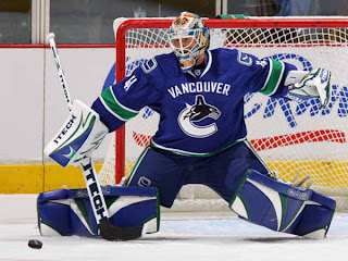
Vancouver Canucks


New Uniforms

Old Uniforms

The Unveiling
Wednesday, August 29. The Canucks unveiled their jerseys to fans at GM Place in Vancouver.

Home vs. Road
Home: Blue. Road: White. The two sweaters are essentially mirror images of each other and both feature a secondary logo patches on both shoulders.

The blue home jerseys feature white-green-white stripes around the elbows and waist. The collar is white with blue trim on the inside. White text spelling out "VANCOUVER" is arched above the primary logo which serves as the crest.

The white road jerseys feature spaced blue-green-blue stripes around the elbows and waist. The blue on the sleeve beneath the green stripe extends all the way down the cuff. The collar is white with blue trim on the inside. Blue text spelling out "VANCOUVER" is arched above the primary logo which serves as the crest.

In The Details
The primary logo's coloring is slightly altered between the two jerseys. On the blue, the ice beneath the whale is white, while it's blue on the white jersey. The dark blue seen in the logo is featured nowhere else on the jersey itself. The stick-in-rink secondary logo featured on the shoulders is a modernized version of the classic crest worn in the 1970s. A new numbering and lettering style has been introduced.

New & Old
The most significant difference is the return to the team's traditional colors of green and blue along with the addition of the city name to the front of the sweater. The striping pattern is also completely different. The Canucks were going for a revamped look for this season and they achieved their goal.

Standard FAQ
Numbers on the front? No.
Laces at the collar? No.

NHLToL Editorial by Chris
All right, I'll come right out and say it. The Canucks hit it right on the mark with these sweaters. I hardly have a single complaint to lodge against them — realizing I'm in the minority by saying so. The colors are brilliant! The logos are improved. And they look great on the ice. While it's not my favorite element of the jersey, I'm not totally opposed to the wordmark above the crest, either. So it's not perfect, but it certainly has its redeeming qualities. I cannot get over the colors. Best color combination in the NHL if you ask me. (Well, second-best to the Lightning, really.) Color me impressed. 5/5


Buy your new Canucks jersey!

Thursday
Oct182007

Poll: Capitals vs Maple Leafs


vs
Washington
CAPITALS
Toronto
MAPLE LEAFS


Place your vote and then feel free to leave a comment as to how you came to your decision. Tell all your friends to drop in and vote! The more voices heard, the more accurate the results!

Poll opening date
Thu Oct 18 @ 4:26 AM
Poll closing date
Mon Oct 22 @ 11:59 PM

07VNTRN | #2D | WSH74vTOR38

Wednesday
Oct172007

Rbk EDGE Review: Penguins

Part 24 of 30. All 30 NHL clubs have unveiled new jerseys under the new Rbk EDGE Uniform System for the 2007-08 season. Here at the NHLToL, we're going to review every one of them. Read up and then rate the new sweaters. We'll do a full ranking after completing all of the reviews.

Rbk EDGE Uniform System

Pittsburgh Penguins


New Uniforms

Old Uniforms

The Unveiling
Wednesday, September 5. The Penguins unveiled their jerseys to fans at the Galleria at Pittsbrugh Mills. Several players, including Maxime Talbot, were on hand to model the new uniforms.

Home vs. Road
Home: Black. Road: White. The two sweaters are essentially mirror images of each other and both feature a specialty patch on the right shoulder.

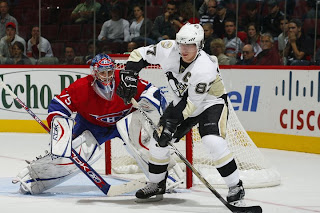
The black home jerseys have a gold panel on the elbows. The underside of the sleeves are white extending the length. There is gold side paneling toward the back of the sweater. The collar is black and primary logo serves as the crest.

The white road jerseys have a gold panel on the elbows. The underside of the sleeves are black extending the length. There is gold side paneling toward the back of the sweater. The collar is black and primary logo serves as the crest.

In The Details
The patch on the right shoulder reads "Pittsburgh 250" in honor of the city's 250th anniversary. It will only be worn this season. The numbering and lettering style has been retained.

New & Old
The striping on the new jerseys has been altered significantly. The slanted stripes at the corners of the sweater are gone as well as the stripes on the sleeves. They've been replaced with unique sleeve paneling which meshes with fabric paneling of the sweater itself. Most notably, however, is the elimination of the secondary logo from the shoulders.

Standard FAQ
Numbers on the front? No.
Laces at the collar? No.

NHLToL Editorial by Chris
These are very plain jerseys. I think the Penguins had it right on the money before, but it would seem this is a case where Reebok missed the mark. I'm not saying there was a lot going on with the old jerseys but the design was very appropriate, especially to the logo. That's not really the case anymore. In fact, the striping pattern is almost identical to what the Senators are wearing (more on that later). That being said, it's still a very nice jersey. It doesn't knock my socks off, but it's a solid effort that shouldn't be tossed aside. 3/5


Buy your new Penguins jersey!