


Polls: NHLToL Quarterfinals
 Share
Share Polls close Sunday, April 25 at 11:59 PM
Scroll down to vote in the third jersey mini-tournament.
 Montreal Canadiens |
 Calgary Flames |
NHLToL 76
|
 Chicago Blackhawks |
 New Jersey Devils |
NHLToL 77
|
 Detroit Red Wings |
 Philadelphia Flyers |
NHLToL 78
|
 Boston Bruins |
 St. Louis Blues |
NHLToL 79
|
Tournament Notes Western Conference logos dominated Wildcard Week, defeating their Eastern opponents in 11 of 15 polls. ... The Ducks logo set a new record low with 561 votes in Week 6. ... Feather symbolism is featured in 4 of the 8 logos that advanced to the Quarterfinals. Five of 8 logos include obvious letterforms. Five of 8 feature red as a primary color. Nine of 30 NHL logos feature an animal; none of which advanced.
Tie-breaking Since the playoff format is not points-based, the winning logo will be determined by the total number of votes received rather than the percentage. In the unlikely event of an exact tie, a 24-hour run-off poll will be held the following day. (This will shorten the subsequent round of voting by one day.)
MINI-TOURNAMENT of LOGOS
Polls: Third Jersey Crests Week 1
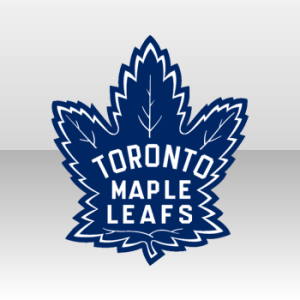 Toronto Maple Leafs |
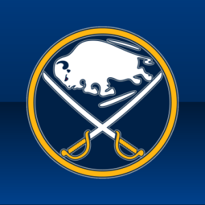 Buffalo Sabres |
NHLToTJC 01
|
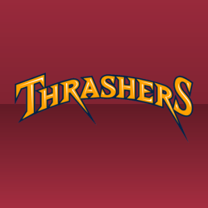 Atlanta Thrashers |
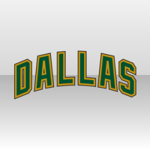 Dallas Stars |
NHLToTJC 02
|
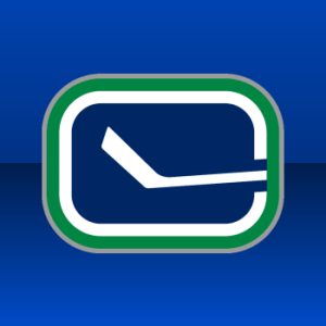 Vancouver Canucks |
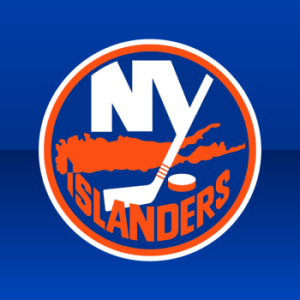 New York Islanders |
NHLToTJC 03
|
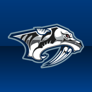 Nashville Predators |
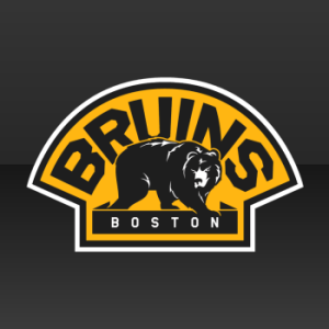 Boston Bruins |
NHLToTJC 04
|
 St. Louis Blues |
 Colorado Avalanche |
NHLToTJC 05
|
 San Jose Sharks |
 Florida Panthers |
NHLToTJC 06
|
 Edmonton Oilers |
 Tampa Bay Lightning |
NHLToTJC 07
|
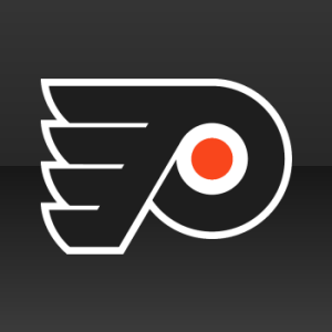 Philadelphia Flyers |
 Ottawa Senators |
NHLToTJC 08
|
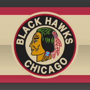 Chicago Blackhawks |
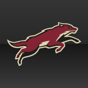 Phoenix Coyotes |
NHLToTJC 09
|
 Carolina Hurricanes |
 Los Angeles Kings |
NHLToTJC 10
|
 Pittsburgh Penguins |
 Minnesota Wild |
NHLToTJC 11
|
Commenting Feel free to add your comments about the polls below. Keep it short, relevant and friendly. Currently, commenting is unmoderated. Abuse it and commenting will go away. I'd prefer to offer an open discussion but not at the expense of civility. Also, if you choose to announce the logos you've voted for, do it in paragraph form. Comments with long lists will be removed.

Reader Comments (57)
In the battle of the 'C's. I gotta give it to the Flames. I have always thought that the C on fire was always pretty cool. Canadiens 'C', to me, is too plain against Calgary.
The Chi-NJ matchup is a good one and even though I will be in the minority, I gotta go with NJ. When I was younger I thought it was just an 'N' with a tail. When I finally realized the tail made the 'J', the logo seemed alot cooler to me.
Gotta take the Flyers over the Wings because although both are solid logos, not many teams can make orange look good.
I'm not hating on the original 6 but my final vote goes to the Blues. (The only non original 6 team that I think has a legitimate shot of winning this week)
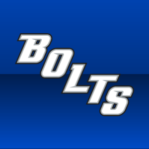
In the Mini Tourney, looks like the Flyers, Oilers and Blues have bye weeks..lol. Dallas vs Thrashers in the epic battle of wordmarks. Hurricanes vs Kings should be the closest battle of the week and I think the Sabers will probably win the whole tournament.
PS I am happy to see the full body shark. I think it is way better than the primary logo and I hope it is the dark horse of the mini tourney
Looks like we could see a Canadiens-Blues rematch in the Championship, just like the first tournament (called this before the tourney started). Simplicity and color scheme of Blues logo should carry it past Bruins. The real challenge will be beating Detroit, but I think it can be done in a 51-49 fashion.
As for Montreal, they'll cruise past Calgary, and I think they'll handle the 'Hawks pretty easily, as strong as the 'Hawks have performed thus far.
As for the alternate logos, Sabres, Blues, Hawks really have the only real chances to win that tourney.
MINI-TOURNAMENT:
TOR-BUF I love both logos.... but still, it's a leaf. Can't do a whole lot with it. At least this logo has SABRES!!! That's the name of the team; how can you have a logo with a noticible LACK OF SABRES???
ATL-DAL Why the hell are you pitting Thrashers against Dallas? How is anybody supposed to vote there?
VAN-NYI Canucks are gonna beat the Islanders for whatever reason (duh?). But at least the Islanders logo has...... an island!
NSH-BOS I really like Nashville's primary logo. People may dislike it because it has a bunch of other colors (gold, orange, etc), but that doesn't do a lot for me. I LOVE the two-tone, blue and white logo so much. The Bruins logo is nice and very classic, and I love it also. But I went NSH because it looks cleaner and more bold (the bruin is small and almost gives a "devoured in shadows" appearance).
STL-COL The Avs would be lucky to get 10% here. Hell, they were lucky to win Game 3 last night. They don't need (nor deserve) a win here.
SJ-FLA Florida stole St. Louis' look. I love the shark. Doesn't have a lot of color, but maybe the fact that it's on a black jersey makes it look a bit camouflaged. But still, the logo is great.
EDM-TB Uh........ well, I hate the Oilers logo MORE than I do the Canucks...... but at least it's the team name?..... Ah who am I kidding? They both suck. But at least EDM has its name on it.
PHI-OTT Flyers have the PERFECT logo. That's why they've used the same logo ever since inception. And "SENS"? Oy...
CHI-PHX I like the full-body coyote, but unlike SJ, I think the "head" logo is actually better for PHX. For the Hawks... I'm not sure. I don't like the primary Indian-head logo, but it looks cool here.
CAR-LA I'm biased, since I'm a Kings fan (NOT the reason I voted against VAN; I would've done that anyway). I'm really not sure what to make of the Kings logo when I try to break it down; it's a rectangle w/ "LA" inside of a triangle w/ the crown logo. But it somehow ties together. But I like the 'Canes logo also. Better than their primary...... since the Kings currently lead the poll, I suppose I can vote for them without guilt.
PIT-MIN Wild wordmark looks great on the jersey, but standing alone looks bizarre. Penguins logo, however, isn't very creative. I understand that they did it first, with the logo in circle, but St. Louis and Minnesota did it better. The font on the outer ring is too bold, and I just realized isn't perfectly aligned. Look at the "dots" separating the words. They don't line up. I look at those kind of things (like how the Kings crown logo "LOOKS" symmetric, but the shadows throw that off. And that bugs me). I go MIN here.
Thrashers vs Dallas!? I refuse to vote.
I hate that stick in the rink logo, does not deserve to be a primary on any jersey.
The Oilers logo your using is their from their home/roads, not their third jersey.
Check again, Jacob. The Oilers' previous vintage third jersey was swapped with the home sweater this season. This is the logo currently in use on the third jersey.
My Picks
Main Tourney
-----------------
MTL-CAL Gotta take Calgary here. Not by a lot though.
CHI-NJ Devils for sure. Don't like the hawks logo
DET-PHI Probably the best two (add blues for third) of the tourney. I'll take wings here though.
BOS-STL Blues easily here.
Mini Tourney
-----------------
TOR-BUF I will take the leaf. I do like Buffalo's here, but the leaf just looks cooler overall.
ATL-DAL Do I really have to pick one? OK. Let's take Dallas.
VAN-NYI Canucks by far
NSH-BOS Preds
STL-COL Blues. But only because it is against a wordmark.
SJ-FLA Both of these could be good with some tweaks. Remove the stick from the Shark and that should be their primary logo. Take the circle away and just leave the head on the panthers and I like that one too. I'll go with the sharks here though.
EDM-TB Need to ask? Oilers of course.
PHI-OTT Again. Flyers by miles.
CHI-PHX I'll go with the much less popular choice of the Coyote here. Seriously. That Blackhawks logo sucks nut. The jersey it went on was great though.
CAR-LA Hurricanes here. But I like the King's jersey that it goes with a lot better.
PIT-MIN Penguins by miles. Seriously, is that Wild logo actually winning this one so far?
I like the Penguins, but a yellow triangle inside the 2-tone blue is too much. The Minnesota one is nothing special, but I love the colours used.
I think this tournament is too biased...the primary one, anyway. It seems like people automatically vote for the more classic/traditional logo. I mean, Canadiens over Flames? come on! The Flames' logo is far better and cooler, but yet, people keep voting for MTL simply because it's "traditional."
History plays a big part over creativeness in these polls.
The reason tradition plays such a big role in my opinion is when a logo is around long enough it almost becomes a signature for a team and becomes etched into history. For example, the Flames logo is better than the Habs logo, but the Habs are the oldest hockey team in the league and have won 24 Cups. This logo has more history than any other logo. I know when people vote they don't take all of this into consideration but it plays a role.
@ Sharkfan, The N and the J also form a D.
@ Koho, Agreed, awful logo. Personally, I think that's the worst thing I've ever seen on the front of a jersey (except for Wild Wing. haha)
It's shame that basically 3 out of the 4 finalists won't be voted by design or anything but how historic they are.
Habs are historic? That's nice, but an interlocking C and H that resembles a toilet seat isn't what I like in design.
Blackhawks are historic? Yes, but it's also the profile of a native american. 5000 teams have the image of a native american as a logo. It is not creative, it is not well designed, it's just boring and doesn't seem like the best logo in all of the NHL.
The Devils are well designed and get the point across without having to rely on TRADITION TRADITION. It was conceived in the 80s, 90s, and it looks as fresh and modern as ever. The aging of the Blackhawks logo (especially the third crest) is really showing. I know I'll get replies saying BUT THERE'S HISTORY BEHIND the logo, but quite frankly, this is the best logo contest, not best story about the logo contest.
The Red Wings are well designed, but I enjoyed the Flyers rendition a bit more.
@Chris
Oh, you're right. I still think of it as their third jersey, but I guess they did wear it more often than the other this year.
I just noticed the Flames' vintage logo isn't included in the tournament. Did they not wear it enough?
Atlanta vs. Dallas alternates? Ugh, there are no winners here.
I cannot, for the life of me, understand how the Desert Dogs could even receive one vote let alone 246. Are you kidding me? This thing is brutal. It's roadkill!
The guy on the Blackhawks 3rd looks weird if you look closely.
I really don't like any of the Chicago logos....REALLY don't......of course it has history and symbolism, but quite honestly, they are boring....let's move on please....and that goes for all of the original six for that matter.....
....like do people even realize what's in some of these logos!? The New Jersey logo has and N and a J forming a devil sitting down and there's even a white hockey stick right above the tail! It's awesome!! And it's losing to a head........And the the Oilers logo that didn't even make the playoffs.....who thought of a font that looks like dripping oil!?
LOVE the Canucks' modified Stick 'n Rink. Nice logo matchup with their 1982 nemesis. It just BUGS me that the Canucks won't make this their primary look at home during the playoffs and for next season. Perhaps one of the two Johnny Canuck logos might be the primary mark in 2011-12?
Bored at work and thought I would check this as it seems to be a recurring argument about logos. People keep posting that a logo fails because it doesn't represent the nickname of the team. Example-"The Sabres logo sucks because it doesn't have Sabres." You'd be surprised at how often this happens. I am talking about PRIMARY logos here folks. I know there are exceptions when you take into consideration secondary or alternative logos.
NFL-Packers, Bears, Cowboys, Texans. Colts, Chiefs, Saints, Browns (what is a Brown?), Giants, Jets, Steelers, 49er's, Titans, and Buccaneers
NBA-Magic, Nets (hoop, no net), Cavs, Pistons, 76er's (what?), knicks, Trailblazers, Lakers, Celtics (that's a leprechaun), Clippers, Kings, Thunder, Nuggets, Jazz and Pacers
MLB-White Sox, Twns, Angels, Tigers, Royals, Yankees (is a top hat a Yankee?), Rangers, Rays, Athletics, Mariners, Reds, Cubs, Braves, Dodgers, Phillies, Nationals, Giants, Brewers and Padres.
What these logos often do is take an element of the nickname or the city and use that as a logo. Like an orca for the Canucks or water for the Padres. There are two Kings and NEITHER has an actual King. Like the Royals, they use a crown. This should not be the determing factor on whether or not a logo is successful because, clearly, it doesn't matter to MANY sports franchises.
For those of you out there still trying to justify long standing tradition as to ehy a logo such as the Habs should win against the Flames whose logo hasn't been around long enough to get the same recognition. Let's look at one historical moment that no other team will ever accomplish that a lot of people recognize with the Flames primary mark. In 1989, the Flames won their only Stanley Cup, of course we all know this. What many people overlook is the fact that they were to only visiting team in history to win the Cup in the old Montreal Forum. Not only does the Flames logo far and away look much better than the Habs. The club that bares this crest will always been known as the only team to win a cup against the oldest and most winningest franchise in their own barn. Take that "history".
As for the rest. Had to go with the Flyers. I agree with most people who say that they are one of the few sports franchises who can pull off orange. Wheras the Red Wings look is very stale and dated. The Devils and Blackhawks one is tough for me, I like them both. So I will compromise and alternate voting for one each day. The Blues get my vote against Boston, however, both are solid logos.
Perhaps the traditional white flaming "C" could beat the Habs' crest, but the awful black-for-black's sake "C"? No way.
PHI > DET
NJ > CHI
STL > BOS
--------------------
The Devils have a great logo, it is simple and can stand on its own.
Surprises me how worked up people get about this. Calling 'bias' on an online subjective poll is a little redundant. It's not called the "vote for the logo with the best modern design aesthetic contest." It asks "which is better?" It's a subjective question. Some people value 'classicness,' some people originality, and some people think a stick in a rink is a real logo ;) It's all up to the individual.
The Blues are just destroying the Avalanche
Chris, you stated above that the logo displayed for the oilers is in fact the third jersey, thus the home being the retro. But why wasn't the retro logo on the primary contest then?
Chris, how the &$#% do you expect us to pick either Thrashers or Stars 3rd? They both suck.
@oilcountry
For the Primary logo contest, the logo is what is on the website. Look at http://oilers.nhl.com/ and you'll see that the color scheme is ACTUALLY the copper and bronze. The logo at the top comes from the road/"current alternate" jersey.
why does everyone like montreal's "C" SOOO much?!?!?!
its not that good. its quite boring actually!
I agree completely.
For a wordmark, Colorado's is pretty brilliant...does anyone else see the letters forming a cascading avalanche down the side of a 45 degree mountain?
No.
someone please remind me what's so great about the kings' 3rd jersey logo... personally i think the coat of arms they used to use is better than this and their primary. and the fact that this logo contains their primary only serves to make it worse as far as i'm concerned. that crown looks so dumb.
Warb, you had better be kidding because that is hysterical.
That Colorado thing is worse than the Buffaslug. The amazing part is that it took them 3 years to develop that.
NO. MORE. WORDMARKS. PLEASE.
How sad is it that I didn't realize the Canucks third crest forms the C with the rink, broken by the stick? I just figured it was a rectangular rink, unbroken, with the stick. Oh well.
i don't see why people don't like the blackhawks logos, i mean they're classics. there's a reason they've been voted best sports logo so many times.
One thing that I don't like about the Panthers alternate is that the ears cover up the "L" and "D".
@ Kevin Y... Lol don't you mean copper and blue? And the logo in this tourny is the exact same one as the one in the main tourny. But the one in the main tourny should of been the retro - which doesn't have the red ring around it, lighter blue and orange instead of copper.
@Oilcountry - the problem is that that logo is still the "official" current Oilers logo. If it were just home jersey crests, then the circled Wild logo and the Rangers wordmark would have been used instead of the head and the shield, respectively. Although in that case you could make a legitimate claim that the red version of the flaming C should've been used instead of the black...
I have continued to refuse to vote in that Atlanta-Dallas mess. I'm glad that in the other matchups, the only wordmark that's not getting beaten down is the Minnesota script (which is far superior to all of the other wordmarks up there!)
I don't get what people like so much about the Blues.
Blues logo is kinda like the Flyers: it symbolizes the team's nickname perfectly, and is one of those '67 logos that just can't be improved upon.
In fact, now I'm starting to think that the Flyers and Blues logo were designed by the same designer. Can anybody look into this?
In other news, if you turn the Habs logo on either side, it turns into a happy face.
Minnesota-Pittsburgh to close to call!
@ headsigh: Also looks like a toilet seat.
Take the circle away from the Panthers' alternate logo, and it suddenly becomes one of the favorites.
No Glen, it becomes even worse...if thats even possible