


Polls: NHLToL Semifinals
 Share
Share Polls close Sunday, May 2 at 11:59 PM
Scroll down to vote in the third jersey mini-tournament.
 Montreal Canadiens |
 Chicago Blackhawks |
NHLToL 80
|
 Detroit Red Wings |
 St. Louis Blues |
NHLToL 81
|
Tie-breaking Since the playoff format is not points-based, the winning/advancing logo will be determined by the total number of votes received rather than the percentage. In the unlikely event of an exact tie, a 24-hour run-off poll will be held the following day. (This will shorten the subsequent round of voting by one day.)
MINI-TOURNAMENT of LOGOS
Polls: Third Jersey Crests Week 2
 Ottawa Senators |
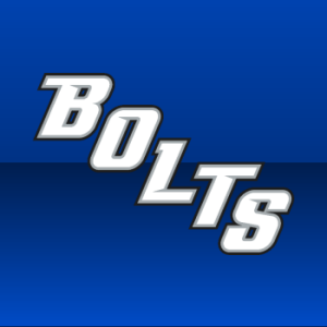 Tampa Bay Lightning |
NHLToTJC 12
|
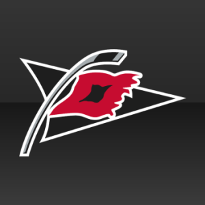 Carolina Hurricanes |
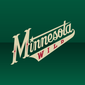 Minnesota Wild |
NHLToTJC 13
|
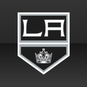 Los Angeles Kings |
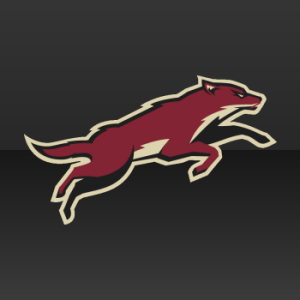 Phoenix Coyotes |
NHLToTJC 14
|
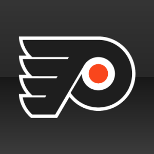 Philadelphia Flyers |
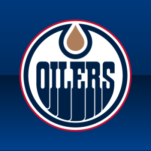 Edmonton Oilers |
NHLToTJC 15
|
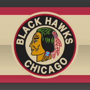 Chicago Blackhawks |
 Pittsburgh Penguins |
NHLToTJC 16
|
 St. Louis Blues |
 Nashville Predators |
NHLToTJC 17
|
 San Jose Sharks |
 Colorado Avalanche |
NHLToTJC 18
|
 Florida Panthers |
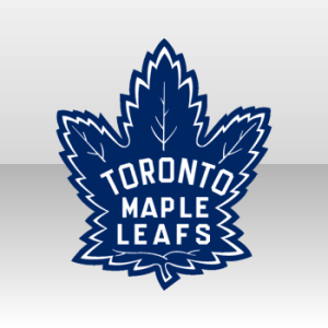 Toronto Maple Leafs |
NHLToTJC 19
|
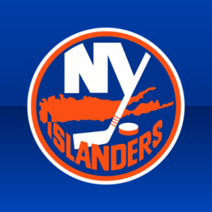 New York Islanders |
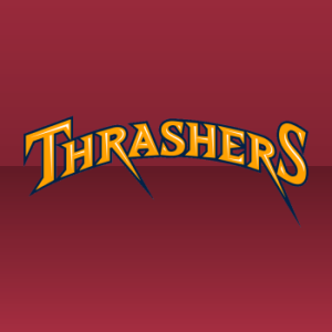 Atlanta Thrashers |
NHLToTJC 20
|
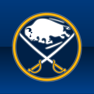 Buffalo Sabres |
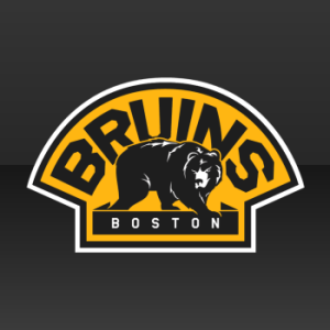 Boston Bruins |
NHLToTJC 21
|
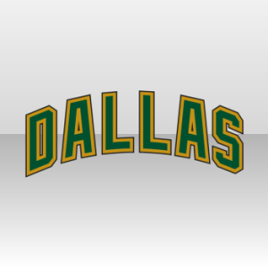 Dallas Stars |
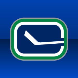 Vancouver Canucks |
NHLToTJC 22
|
Tournament Notes The Blues took the widest margin of victory in Week 1 with a 90-10 defeat of the Avalanche. ... The Wild and Penguins were the first to tie in the Third Jersey Crests tournament. ... Only one more week of preliminary round voting remains after this week before the final championship poll, comprised of the top point-earner from each Group.
Commenting Feel free to add your comments about the polls below. Keep it short, relevant and friendly. Currently, commenting is unmoderated. Abuse it and commenting will go away. I'd prefer to offer an open discussion but not at the expense of civility. Also, if you choose to announce the logos you've voted for, do it in paragraph form. Comments with long lists will be removed.

Reader Comments (43)
Main Tourney
-----------------
MTL-CHI I'll go with Montreal. Although I am not a fan of either of these logos. But Montreal's is a simpler, cleaner logo even if it is overly so.
DET-STL Two very good logos, but I'll take Detroit. Either way, the winner of this is better by far than the winner of the other two.
Third Jersey Tourney
--------------------------
OTT-TB I'll pick TB, but only because I have to pick one. Do I ever hate wordmarks as logos.
CAR-MIN Carolina of course. Why are so many people voting for that Minnesota monstrosity. Even as wordmarks go it is bad. It looks like it belongs on a baseball jersey.
LA-PHX Phoenix. Not that LA has a terrible one here, just that it is a little more wordmark than logo.
PHI-EDM In the battle of the recoloured main logos I'll go with the Flyers since their main logo is better. Strange, but this is the only matchup in group A that I agree with the majority of voters at this point.
CHI-PIT I really don't like the idea of a logo with a circle around it containing the team name. Why is this done so much. It is lame. Just take the fricken logo from the middle. I will take the Pens here because the logo in the middle is my preference over the other.
STL-NAS After I just said I hate the whole circle around a logo thing, I gotta say that the Blues do it better than the others. But I still don't like it. Especially since they have such a great main logo that they are wrapping the circle around. Just for that, I will go with the preds here.
SJ-COL Sharks for sure.
FLO-TOR Leafs easily. See, another of these stupid circle covered logos.
NY-ATL Islanders. I don't have a problem with circle logos where the logo itself is a circle.
BUF-BOS Sabres. Nice, clean logo. This Bruins one is just weird for me.
DAL-VAN Canucks easily.
It's gonna be Blues v. Canadiens in the Finals..... again. Thus making this a virtual waste of time.
OTT-TB: Basically DAL/ATL from last week, but this takes it to a whole new level. Unfortunately, Chris, they aren't the "Bolts". So OTT gets it here.
CAR-MIN: Logo beats wordmark, any day.
LA-PHX: I'm bummed my Kings got KO'ed last night, so they need to win something.
PHI-EDM: This isn't even really an "alternate" logo match; they're basically their primary logos. But anyway, PHI is AWESOME!
CHI-PIT: Symmetry folks? Neither of these appear to be perfectly aligned, which really bothers me. But CHI is closer, so they get my vote.
STL-NSH: I love STL's logo, and their third jersey is PERFECT, but I like what NSH did with their logo on their alternate. I'll give it to them.
SJ-COL: Just like the playoffs, SJ gets it here (but in more convincing fashion).
FLA-TOR: .......ugh. Whisker-less panther versus... a leaf. IT'S A FREAKING LEAF!!!
NYI-ATL: ATL wordmark is... bleh. I don't like the Islanders logo in general, but... IDK. I won't vote here.
BUF-BOS: I think this is a case where the black (for BOS) really hurts it. It's too dull and dark for me, so I have BUF.
DAL-VAN: Well, VAN beat the Kings..... I can't allow that. Of course, they'll manage to win this convincingly (and rightfully so), but I can't help but vote against them. Even if DAL's "wordmark" is CRAP!
Why on earth would that be a waste of time? Just because its a rematch of the last final? It's a fan poll...
If anyone would like to look back at Chris' original post about the new tournament, I would like to point out that I did in fact call Canadiens vs. Blues rematch...Blues will probably win this time, seems to be a lot more support for the logo.
Chi vs StL for the final...
Most logo's of the original or older teams have superior jerseys from back from when the league doubled in size for the 1967–68 season, adding the Los Angeles Kings, Minnesota North Stars, Philadelphia Flyers, Pittsburgh Penguins, Oakland Seals and St. Louis Blues
the rest are expansion-revenue based teams. fitting one of the winners would/should come from the original six or second set of teams.
Sens vs Bolts? I refuse to support either of these atrocities. I vote C: None of the above.
GO BLACKHAWKS AGAINST THE CANADIENS IN THE NHLTOL SEMIS!!
Habs vs Blackhawks, a battle of tradition. I personally like the red, white and blue C. It's better designed and more creative than the indian. Its not that the Blackhawks logo is an indian, its the fact that it's just a lack of creativity. Why couldn't it have been an indian shooting a bow and arrow in a good logo, like the IceHL's St. Louis Archers.
Blackhawks vs Blues in the final. St Louis will win the alternate logo tournament as well. It is by far the best one.
@brandon
their called the blackhawks not the archers
I just cast the 666th vote for the Vancouver Canucks 3rd.
D:
I vote "Kill them both with fire" for the Sens-Bolts matchup.
Am I the only one that hates the Canucks' third jersey crest? It just seems like they were trying to make it too "hip" and "cool". Looks like they should use it for the "Krazy Kanuckz Kidz Klub" or something.
@Trick Rider and to be kool they will kall themsevels the KKKK....
STL is walking away with both of these, sorry folks.... GO BLUES!!!
@Trick Rider...
Nope, you're not the only one. Seriously, a "stick in a rink"? I can't believe they found something that represents "Canucks" even LESS than the orca... but somehow, they've found a way.
I love the Blues primary logo, but not the third. I love the clean lines and simplicity of the primary logo, but the third looks like it was designed by committee. "We need the main logo" "and the arch" "and a yellow ring" "and a blue ring" "and the team name" "and some dots"
MTL/CHI - Very tough IMO. Both are classics. I honestly just flipped a coin and the Hawks won my vote.
STL/DET - Another battle of worthy logos, but I'm going with the Blues.
-------------------------
OTT/TBL - Do I HAVE to vote? Seriously? Ugh. Fine... under my breath stupid workmark logos. T-Bay, but only because I really like the shade of blue they use on the jerseys.
CAR/MIN - Another friggin wordmark = Carolina win
LAK/PHO - It's kinda wordmark-ish, but I'm taking LA because I think the Coyote looks ridiculous on the jersey.
PHI/EDM - Edmonton (gotta vote for the home team)
CHI/PIT - I agree with Nathan... I hate circle logos with text wrapped around it.... flip the coin... the Pens get my vote I guess.
STL/NAS - I like the recolored Preds logo, but only because of the circled text thing that St Louis did
SJS/COL - Sharks by a landslide
FLA/TOR - As an Oiler fan, it's against my better judgment vote for anything Calgary or Toronto related. :D
NYI/ATL - It's long overdue that the Isles logo go the way of the dodo, but because it's a retro 3rd (and ATL uses a wordmark), NYI gets the vote.
BUF/BOS - We all know that Buffalo's going to the finals and likely the win (again)
DAL/VAN - Gotta be the Nucks.
Blues all the way.
"I can't believe they found something that represents "Canucks" even LESS than the orca... "
I can't believe that people are still making these ridiculous comments. Do you have ANY IDEA how many professional sports teams do not have their nickname represented in their logo?? Find my comment from last week. You'd be surprised.
@kevin y -- you do realize that "canuck" is another name for a canadian, right? what is better than a rink and hockey stick to represent canadians?
@trick rider -- that was one of the original logos for the team 40 years ago... hardly trying too hard to be 'hip' or 'cool'.
I love that blues third mark, but it irks me to no end that the tip of the note/wing overlaps the gold circle. How hard is it to center a logo??? Or at least enlarge the circle by the 2-3 pixels. I can't let it win until it gets fixed by the St.Louis officials. Anyone else notice this little piss off?
@ bcbound: it is an update of the old stick-in-rink. the stick is angled, the white outline is thicker and broken, and the green outline is not broken by the stick. and a gray outline was added. it looks to me like they did try to make the old logo more hip.
I hate the stick in the rink logo too. I think it's time for Johnny Canuck! A skating Canadian logger is the best symbol presented thus far... Especially the variations where it is just a JC (whoa did not notice until now!) head in a V as a secondary logo.
I have to say the Orca is better than the stick in the rink. But I think we can agree that the "Vancouver" wordmark above the logo is the first thing that should be tossed!
Out of what's left in the tournament I think the Habs have the best designed logo (not in tradition)
PS. @ Ryan
A couple days ago you corrected my comment. The St. Louis Archers are a team in the IceHL. A fantasy hockey league on Icethetics that was post poned due to lack of designs being sent in for the league's teams. Go to the search bar between the "ABOUT" and "CONTEST" buttons at the top of the page and search IceHL and you will find it.
I remember when I was 8 and I asked my dad everytime Vancouver was playing:
"Dad why are they called the canucks but have a fish as their logo?"
"Because Vancouver doesn't know how to design logos, son."
"Is Canuck a kind of fish?"
"No its another word for Canadians"
"Wow, thats stupid"
8 year old logic can even distinguish why people dont like the Cancucks logo
An Orca is a mammal not a fish!!! Canucks are also mammals. Therefore, it makes sense.
But seriously, I hate that stick-in-rink logo. It's the only one that will make me vote for wordmarks.
Speaking of wordmarks, how the heck is the freaking awesome Hurricane flag losing to a wordmark!?
"I hate that stick-in-rink logo. It's the only one that will make me vote for wordmarks." AGREED!!!
@ Jonny......I guess it's a freaking awesome woodmark but I'm bias because I'm an Oilers fan and haven't really been too fond of anything to do with Carolina since 06.....
The Stick 'n Rink is a classic. Like the old saying goes, "simple is more". What I love about the modified version is that it has more of an edge to it and the white C inside the green border stands out a lot more. However, if I had to choose just ONE crest for my Canucks, it would be the full-body Johnny Canuck. However, I would be more than happy with the S 'n R, should it replace the orca full-time.
I will agree that the updated stick in rink isn't nearly as bad as the old one.
The Dallas script looks like it belongs on a college basketball jersey.
rly some stupid note is gunna beat the famed winged wheel come on people
rly some stupid wing is gunna beat the famed bluenote come on people
kinda works both ways doesn't it...
@Bill Blazina - I never noticed the wing of the Blue note overlapping the circle until you brought it up. That is infuriating!
I can't believe people like the leafs' 3rd jersey....
that maple leaf is just weird....
But that's just my opinion.
@danglezzz hahah i guess your right i just have a tad from detroit bias ;D
I also can't stand the updated stick in rink Canuck logo. Its exactly as someone else pointed out: they were just trying to make the old logo "hip" and "cool" for the new generation. It sucks!! I never thought I'd say this but I prefer the orca over that abomination.
You know, the Avs third isn't as bad as it seems. So the jersey uses a wordmark instead of a logo. The coloring and design are good.
I personally love the kings third jersey logo, and go hawks!