


Polls: NHLToL Championship
 Share
Share Polls close Sunday, May 9 at 11:59 PM
Scroll down to vote in the third jersey mini-tournament.
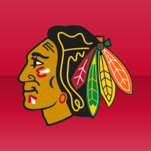 Chicago Blackhawks |
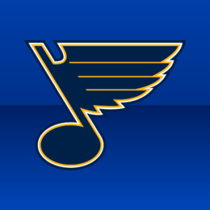 St. Louis Blues |
NHLToL 82
|
Results hidden until poll closes. Winner announced Monday, May 10.
Tie-breaking Since the playoff format is not points-based, the winning/advancing logo will be determined by the total number of votes received rather than the percentage. In the unlikely event of an exact tie, a 24-hour run-off poll will be held the following day.
MINI-TOURNAMENT of LOGOS
Polls: Third Jersey Crests Week 3
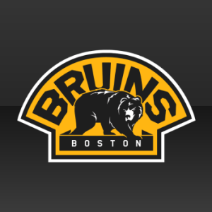 Boston Bruins |
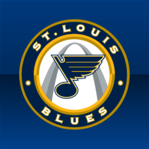 St. Louis Blues |
NHLToTJC 23
|
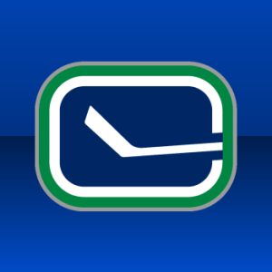 Vancouver Canucks |
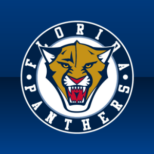 Florida Panthers |
NHLToTJC 24
|
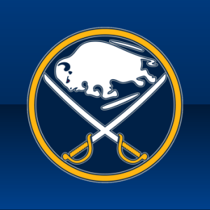 Buffalo Sabres |
 Nashville Predators |
NHLToTJC 25
|
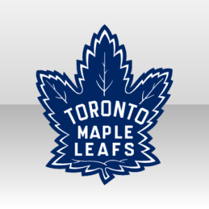 Toronto Maple Leafs |
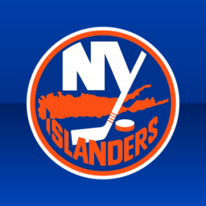 New York Islanders |
NHLToTJC 26
|
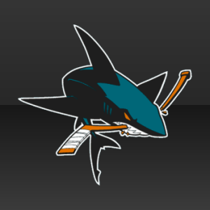 San Jose Sharks |
 Dallas Stars |
NHLToTJC 27
|
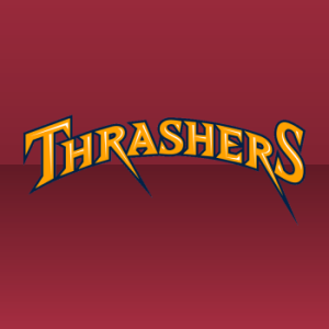 Atlanta Thrashers |
 Colorado Avalanche |
NHLToTJC 28
|
 Los Angeles Kings |
 Chicago Blackhawks |
NHLToTJC 29
|
 Philadelphia Flyers |
 Tampa Bay Lightning |
NHLToTJC 30
|
 Minnesota Wild |
 Ottawa Senators |
NHLToTJC 31
|
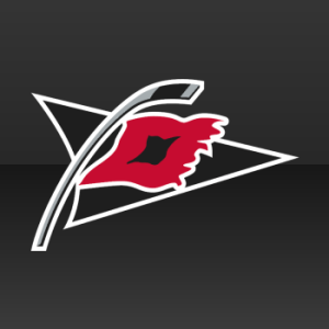 Carolina Hurricanes |
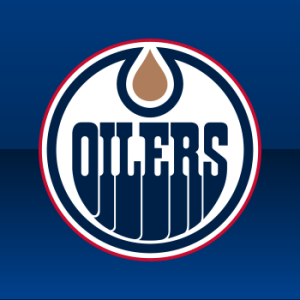 Edmonton Oilers |
NHLToTJC 32
|
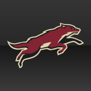 Phoenix Coyotes |
 Pittsburgh Penguins |
NHLToTJC 33
|
Tournament Notes The Avalanche met another defeat by the widest margin of the week with its 89-11 loss. ... Group B standings did not change from Week 1 to Week 2. ... I'm considering a semifinal round for this tournament. Weigh in if you think the Top 2 logos from each group (4 total) should advance instead of only the two leaders.
Commenting Feel free to add your comments about the polls below. Keep it short, relevant and friendly. Currently, commenting is unmoderated. Abuse it and commenting will go away. I'd prefer to offer an open discussion but not at the expense of civility. Also, if you choose to announce the logos you've voted for, do it in paragraph form. Comments with long lists will be removed.

Reader Comments (28)
Top 2 from each? Why not top 4?
Top 2 - more polls the better.
Jim: My reasoning there is that this is a mini-tournament. If we advance 8 logos, that's three weeks of voting required. It needs to wrap up quicker than that. I can justify two weeks of playoff voting max. Plus I'd like to get the next tournament started little sooner as well.
I say definitely do a semi-final round.
BTW, I feel sick to my stomach today because I had to vote for those stupid Blues twice. Again.
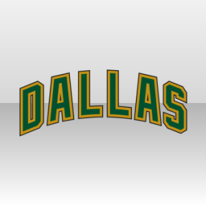
Seriously those, some of those thirds are real turds. Obviously Dallas, TB & Ottawa lead that charge... And Philly, Edmonton, & the Isles are not that different from their regular logo.
The Coyotes' would look great on the shoulder of their home & away...
I hate wordmarks as a rule, but the Thrashers doesn't look bad. And for some reason that I can't figure out, the Wild's just seems right.
As a thrashers fan I really think the script is ok but would fare better not on the horrid thirds.
Am I the only one that isn't a big fan of the Canucks stick in rink, though? It's a great third patch, but it looks kind of derpy as the primary on a first jersey.
OOOOOOOOOO 2006 Stanley Cup rematch! Canes win in my book. :)
Main: I have STL. It's too good.
3rd jersey tourney:
STL beats BOS; BOS doesn't have enough color, so it looks too bland to me
FLA beats VAN; Only because I hate the Canucks
NSH beats BUF; The re-coloring really did it a huge favor, and I still hate the idea of a buffalo in a "Sabres" logo. Plus, it looks like somebody's taking the sabres to the buffalo.
TOR beats NYI: Both logos suck IMO, but TOR is at least pleasing to look at.
SJ beats DAL: DUH!!!
ATL beats COL: #&^%@ Um... ATL color is better?
LA beats CHI: Bias
PHI beats "Bolts": Sorry, Chris... that's a kick-ass logo (I'm talking about PHI, not TB)
MIN beats "Sens": Barely. If it were "Senators", then MAYBE I'd give it to OTT, but no.
CAR beats EDM: Really, I don't understand what's so great about the Oilers logo. Can somebody explain it to me?
PIT beats PHX: I like the color, although the gold doesn't fit. But the Coyotes' coloring is dull and boring.
Main: Chicago
And in the Mini tournament: St Louis. Simply its really just about the only one worth voting for besides the Leaf logo.
This won't work at all because whichever teams faced the worst logos (Colorado, Atlanta, Ottawa, Tampa, Dallas) are the ones with the most points.
Chris, I don't see how this can be a mini-tournament. For us to TRULY decide the winner, it needs to go on longer.
I'm a die hard Blues fan, but i really don't like the third jersey that they have currently. I wish they would bring back the red.
top 4
BOS/STL - Two logos that I'm not a fan of... coin flip...Blues win this one.
VAN/FLA - Canucks because I hate circled text logos.
BUF/NAS - Once again, I predict the Sabres will win it all. Nashville doesn't stand a chance.
TOR/NYI - Edmonton fans can't vote for anything Leafs or Flames related. Isles get the win by default.
SJS/DAL - Easiest win the Sharks have ever had
ATL/COL - Ugh. Stupid wordmark logos. I'll give the vote to Atlanta though because at least they put A LITTLE work into it.
LAK/CHI - Circled text logo loses by default. Kings logo still isn't anything special though.
PHI/TBL - Philly by default.
MIN/OTT - Wordmarks... again.... Minny gets my vote for putting SOMETHING into the design at least.
CAR/EDM - Voting for the home team (Oil)
PHO/PIT - I hate circled text logos, but I dislike the Coyote even more because all I can think of is the ugly uniform as a whole. The Pens win the battle of the uninspired.
Yeah I think the top 4 form each group should advance becuase right now the fact that some teams get to face wordmark while others face legit logos is unfair.
theres really no mystery here. all it takes is basic math to see it will be sharks v. flyers in the final because the sharks essentially got three byes
If the Sharks weren't against WORDS, I wouldn't vote for them. I don't think it deserves the praise it gets. Its practically the same as the main logo. It's like if the Canucks had the new stick-in-rink logo as their main logo, and the original stick-in-rink as the secondary, which we would all think was retarded.
Huh... Yeah it's a real coincidence that the Flyers will finish top in group B after facing two horrible wordmarks that aren't even the teams' names...
/sarcasm
If you're dead-set against having the top 4, at least go for 2. Otherwise, there was no point in voting. If you had laid out the match-ups, anybody could have told you that the Flyers would be top in B.
I think that Hurricanes 3rd is extremely underrated. As is the Preds' new color scheme on their 3rd. Both logos came up against tough competition this week.
Just wonderin', if it's a 3rd logo tournament, why isn't the oilers logo royal blue and orange?
I was looking at the main bracket and I realized that 3 Central Division teams (Blues, Hawks, Wings) made the semi-final round and 2 (Blues, Hawks) made the finals, and 2 Northeast (Bruins, Habs) and 2 Atlantic (Flyers, Devils) made the Quarterfinals. Just thought it was kind of cool.
In response to the people against the Sharks alternate logo. The full body shark is the best logo they have had and compared to the other logos in group A its easily in the top 3 with the Preds and the Sabres. I like how the Blues put the arch in their 3rd, but they killed it by putting it in a circular wordmark and did not center the note. So I rank the Blues 4th.
@Kenny T
This was brought up last week.
The "logos" here for the third jersey mini-tournament are extracted straight from the jerseys. The Oilers now use the dark-blue and dark-orange jersey as their alternate.
For the main tournament, the logo was taken from the team website, where the Oilers still use that logo, rather than the "current 'primary'". That's why the same logo was used for both tournaments.
Die, "hip, cool, modernized" Stick-in-Rink logo, Die!
Blues will dominate both tournaments.
Too bad there's no "they both reek" category for the Panthers/Canucks logo battle... :)
The Panthers' logo could be very cool if they'd hire a real graphic designer to do something with it, and the "Stick-In-Rink" logo just blows. I'm pretty fond of the green-and-blue color scheme with the Orca Bay logo for the 'Nucks though...
Once again, I refuse to vote on Atlanta and Colorado. Neither are better. Both are awful.
The writing on the Penguins 3rd logo is off balance. The right side dot is higher.
wow, it is.
Blues Third Logo would be the best in the NHL if not for their inability to centre that damn note :)