


Polls: 3rd Jersey Crests Quarterfinals
 Share
Share MINI-TOURNAMENT of LOGOS
Polls close Sunday, May 16 at 11:59 PM
 San Jose Sharks |
 Edmonton Oilers |
NHLToTJC 34
|
 Minnesota Wild |
 Buffalo Sabres |
NHLToTJC 35
|
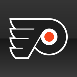 Philadelphia Flyers |
 Vancouver Canucks |
NHLToTJC 36
|
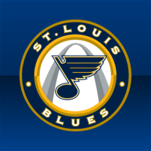 St. Louis Blues |
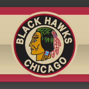 Chicago Blackhawks |
NHLToTJC 37
|
Tie-breaking Since the playoff format is not points-based, the winning/advancing logo will be determined by the total number of votes received rather than the percentage. In the unlikely event of an exact tie, a 24-hour run-off poll will be held the following day.
Tournament Notes By popular request, the playoff format has been changed to advance four teams from each group to the finals. This change was made due to some lopsided scores and the short preliminary round.
Commenting Feel free to add your comments about the polls below. Keep it short, relevant and friendly. Currently, commenting is unmoderated. Abuse it and commenting will go away. I'd prefer to offer an open discussion but not at the expense of civility. Also, if you choose to announce the logos you've voted for, do it in paragraph form. Comments with long lists will be removed.

Reader Comments (28)
First to vote! (Sharks, Sabres, 'Nucks, Blues)
The Chicago and St. Louis 3rd are getting the shaft!! Both would kill the Canucks, Flyers, Wild and Oilers logo
Well, that settles it. The Blues are gonna sweep across the board. I think its Chicagos red jersey that makes the logo so special. When you think of that jersey, theres just nothing that tops it.
I voted the same as Eric (Sharks, Sabres, Canucks, Blues)
How in the heck did Minnesota make it this far. That is a butt ugly logo I tell you. In fact, it is even ugly for a wordmark. But at least the Sabres logo is going to kill it.
And I have to disagree with FOBJ3000. I wouldn't vote for Chicago or St Louis over any of the others except the Wild.
Am I the only one that doesn't see the appeal of the Sabres logo? It's obviously better than the Buffaslug but there's only so much you can give when you have a logo with a bovine hopping over swords. Look at it for a bit and it's cartoonish.
I'd still vote it over the Wild logo, which is a great wordmark but not a third logo. Wordmarks =/= Logos.
And I'll still say that I don't see the appeal of the stick in rink. I prefer it over the Flyers just a slight bit, but I think it looks unbelievably dumb as the first logo on Vancouver's third jerseys.
Hey Chris, When you do the secondary logos tournament are you going to have recolered logos like the Blues light blue away logo and the Flames red away logo. Iwas just wondering
Wow. St. Louis and Chicago. NHLTOL finals rematch.
The Flyers crest is a fantastic logo! It was well thought out and has an abstract and unique and identifiable look to it... There is no reason why it should be losing to that horrible "Stink n' Rink" logo. I am a through and through Canucks fan and I can't STAND that thing anymore... I would take a full body Johnny Canuck or the flying skate over that crapfest!
YES! BLUES WIN!
Congrats to the Blues for the Main Logo win.
Mini Tourney
SJ/EDM- As a Sharks fan, I naturally want to pick the Sharks (which I did). I have stated before that I love this logo over their primary. An alternative is about trying a new look and while some fail miserably and some are great, the Oilers didnt try. I kinda liked their old 3rd, they should have worked off of that one.
MIN/BUF-I thought that BUF would win this thing from the start and still think they might. Unless my Sharks can upset next round. (If they make it)
PHI/VAN-Again with Philly didnt try something new, but the logo is a great logo so you cant complain too much. The stick in rink logo is a nice shoulder patch but not as a primary.
STL/CHI-I think the blues win this rematch. I like the blackhawks jersey better but the indian logo looks strange.
"And I'll still say that I don't see the appeal of the stick in rink. I prefer it over the Flyers just a slight bit, but I think it looks unbelievably dumb as the first logo on Vancouver's third jerseys"
I couldn't agree more and I don't know how that logo is beating the Flyers'.
The Sabres Logo is prob my fav. on her by a slight margin over the blues. The Blue and gold look great together. The Sabres logo really pops out at you with the new silver outlines around a classic logo.
Soo good to hear the "slug" died up there in Buffalo. Cant wait to see the road white sweater come to my rink.. Best sweater in the NHL i think..
BTW This Tourney is unfair to most of the teams. Every team should face each other, to give every team a chance to go head to head against teams like the SENS BOLTS etc Teams who get to play them blow them out of the water with 80%-95% scores!! Can't even look at this tourney with that same respect. Maybe next time!
How did the 'Canes lose to that god-awful wild logo?
Agreed Matt H.
im a die hard canucks fan ......and how the hell are they beating the flyers in this tourney
I really wish for this tournament that you had refrained from using the logos that are primary logos when putting them up against actual alternates. But alas, this is what it is. I like the new Sabres Logo, the classic Hawks, and of course I cannot go against the amazing Flyers. But the Flyers logo is not an alternate. The Oilers I can see, maybe, because of the alteration to the colour scheme but, it really is the logo that is on one of the primary sweaters. Perhaps a tourney for all time logos should be considered, as every team has rebranded itself at least once or twice. Including the Flyers' when they added the silver trim. I think that a tourney of logos from that point of view would be neat. To see once and for all which NHL logo, past and present is the best. What do you think?
I am a little peeved that the flyers (and to some extent the oilers) have made it this far in the voting. Neither of these crests are unique third jersey logos. The flyers is simply a black jersey, and the oilers is there old home jersey (being used as a third, after they brought back the popular gretzky-era blue and orange throwbacks). Both logos are fantastic, but are not UNIQUE to either teams third jersey.
The Oiler's 3rd jersey logo doesn't have the red ring. Then again, I'm not sure what they consider their 3rd this season. Is it the vintage one with orange shoulders? If so, it doesn't have the red ring. As far as I'm concerned, the red ring is pointless and should be deleted all together.
I want to see a playoff between all the Canuck logos.
Blues vs. Hawks almost seems like it should be a FINALS matchup. Such beautiful logos! Hawks need to make a comeback! VOTE HAWKS PEOPLE!!!
The Blues logo is by far the better logo of that match-up. I know it's about tradition, and I may be the only one, but I really don't like that Hawks logo. It just doesn't appeal to me. And how is the stick-in-rink logo beating the Flyers logo? I mean, it's a good logo, but the Flyers logo is better. Sharks and Sabers should definitely advance as well.
im sorry but i just love the canucks logo (the stick in the rink). its prolly my favorite in the nhl
What is the appeal of the Stick-in-Rink logo? I just I don't get it. I don't think that it looks that great at all.
Is it just me or are these tournaments taking forever? Perhaps three days per round would be more beneficial in finding a winner than taking up a whole week.
Being from St. Louis and a die-hard Blues fan, of course I'm going to back my Bluenote! But the vintage Hawks logo isn't bad, lotta tradition there.
I'm hoping it takes on the charging Buffalo in the final!
It's just you, Ted. Not everyone visits Icethetics every day. Some people only drop in once a week and we would lose out on hundreds of votes if we started cutting these polls short. And most importantly, these tournaments require a lot of behind the scenes work I'm sure you don't care about. But I have enough on my plate and weekly updates is about as much as I can muster. Happy voting!
What! The Minnesota jerseys are sick, I dont get whats bad abput them. The hawks one is sick