


Polls: AJHLToL Semifinals
 Share
Share Polls close Sunday, August 29 at 11:59 PM
 Sherwood Park Crusaders |
 Olds Grizzlys |
AJHLToL 29
|
 Calgary Mustangs |
 Bonnyville Pontiacs |
AJHLToL 30
|
Tournament Notes Scroll down to vote in this week's set of bonus NHL logo polls.
Tie-breaking Since the playoff format is not points-based, the winning logo will be determined by the total number of votes received rather than the percentage. In the unlikely event of an exact tie, a 24-hour run-off poll will be held the following day. (This will shorten the subsequent round of voting by one day.)
BONUS LOGO POLLS
Polls: NHL Modest Modifications
 Whalers 1979–1992 |
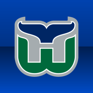 Whalers 1992–1997 |
NHLBLP 16
|
 Blues 1987–1998 |
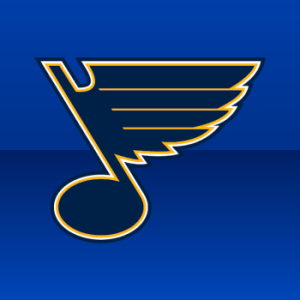 Blues 1997–present |
NHLBLP 17
|
 Bruins 1949–1995 |
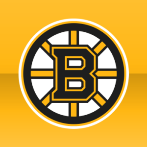 Bruins 2007–present |
NHLBLP 18
|
 Canucks 1970–1978 |
 Canucks 2007–present |
NHLBLP 19
|
 Flames 1980–1994 |
 Flames 1995–2000 |
NHLBLP 20
|
 Maple Leafs 1967–1970 |
 Maple Leafs 1970–present |
NHLBLP 21
|
 Lightning 1992–2007 |
 Lightning 2007–present |
NHLBLP 22
|
 Oilers 1979–1996 |
 Oilers 1996–present |
NHLBLP 23
|
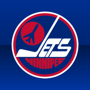 Jets 1979–1990 |
 Jets 1990–1996 |
NHLBLP 24
|
 Senators 1997–2007 |
 Senators 2007–present |
NHLBLP 25
|
 Sharks 1991–2007 |
 Sharks 2007–present |
NHLBLP 26
|
 Rangers 1978–present |
 Rangers 1996–2007 |
NHLBLP 27
|
 Capitals 1974–1995 |
 Capitals 2007–present |
NHLBLP 28
|
Notes What would you guys like to see for next week's set of bonus polls? I'm open to suggestions. I'll be announcing the next mini-tournament next week as well. For those wondering, a jersey tournament is on the schedule, but I'm waiting until all the uniforms are nailed down for 2010-11 first.
Commenting Feel free to add your comments about the polls below. Keep it short, relevant and friendly. Currently, commenting is unmoderated. Abuse it and commenting will go away. I'd prefer to offer an open discussion but not at the expense of civility. Also, if you choose to announce the logos you've voted for, do it in paragraph form. Comments with long lists will be removed.

Reader Comments (44)
mustangs vs pontiacs? really?
Minor Modifications is the best poll yet! Love seeing the little changes to different logos!
Mustangs vs Pontiacs is appropriate and should be the final matchup in my opinion. Actually, they are the only two logos that I like in the entire league. And as for the best logo, Pontiacs by miles. None of the others come close and that includes the Mustangs. However, of course this is my own opinion and I see that the Mustangs are winning so far, so my opinion is obviously not the same as most of you.
In the logo changes competition I appear to be in the majority on every vote except my own team (the Canucks)
When was that rangers logo used???
Jerry, that logo of the Rangers was used as a patch on the 3rd jersey the rangers used.
Although I don't know recall ever seeing that modified Rangers logo, it is awful.
@Connor, That's okay the Pontiac brand is being phased out by GM by the end of this year anyways. But it looks like the Ford Mustang will be here for a long time....
What about the 2D sens logo VS the 3d one (either)?
yeah wow, i don't recall ever seeing that weird NYR logo either. That little notch above the N is hideous. I think that newer Flames logo looks better, but their old uniforms (that they used as a 3rd last year) are far, far better than their current ones.
Seems odd to use that Maple Leaf logo as opposed to the 38-67 multiple point leaf.
I don't understand some of the landslide voting, especially if its the fans of said towns voting on the logo. AND what is it with newer logo's slanting to the right? San Jose fans really gonna pick the new over the original, it's like a lot of current teams fans hate their heritage where as sabres fans, thats all that they want back. >< I wonder if the more modern rangers shield wasn't lopsided would the vote be different? Because it is bad enough the rangers don't have a logo, think thats why rangers fans would be thrilled for the lady liberty to come back, but damn does that old shield look ugly and not even remotely symmetrical. TBH I still think the best rangers duds though were the pre-winnepeg jerseys that at least used a logo, albeit an ugly one, but a logo not script none the least.
I got to also add, and not to talk smack or anything, but I am an avid reader of the hf boards where almost all sharks fans have avatars that say something about choke artists etc. You would rather vote for the logo that your team has fell apart with over the vintage?! The logo that your team pulled one of the biggest upsets ever when they bested the Wings in seven games back in the 90's?!!! If i was a sharks fan i would proudly rather sport the original duds over the newer stuff, not that the new stuff looks bad or anything, but its not your HERITAGE!!!! lol
Just so everyone knows, the second Rangers logo was the shoulder patch on the Lady Liberty jerseys.
Just curious though, where's the Devils logos? Seems like a big omission to me.
ducks vs mgihty ducks!
I don't mean to be disagreeable, ReadBetweenTheLines, just stepping in here to champion what's going unsaid. My least favorite argument in these tournaments when it comes to quality logo design is "heritage"... also known as "being stuck in the past." It's 2010. A team created in 1991 doesn't have "heritage"— which is a word I use mainly when describing Original Six teams.
The Sharks' old logo wasn't what upset the Red Wings in 7 games back in 1994. It was the players. And when you say "not that the new stuff looks bad..." it's clear you're missing the point of these logo tournaments. The Sharks didn't ask Terry Smith to redesign the logo so he could make it worse. Just because a given logo came first doesn't necessarily make it better than what comes after.
With the Sabres, indeed what came first is the best they've offered in 40 years, so they should go back to it. For another team like the Lightning, the newer logo may not be perfect, but it's clearly a better design. My Bolts won the Stanley Cup wearing the old logo, but I prefer my newer jerseys — not because I don't appreciate the team's history, but because I just like the look of the new stuff better.
Anyway, you have every right to have the opinion that a team's first logo is always the best... I just don't agree.
Seeing the old and new Sens logos side by side, one thing becomes apparently likeable: there's no skin tone. The one on the right looks way better, but if I could have my way, the Sens would go back to their 2D profile logo that they entered the league with. Having said that, supposing they did remain with the 1992-2007 profile logo, I'm not sure it would fit on the RBK Edge cut. I own a 2007 pro jersey size, 54 and the three pointed edges or "fins" on the left side of the logo nearly reach around and under the armpit and that's with the baggy material that the old 6100 CCM cut featured. With less material and the more form fitting Edge cut, I can only imagine that's why the Sens introduced an updated profile (yet to be used on a jersey). I still hope to see the day they switch to their profile logo. One can hope...
NO NO Chris re-read, I said NOT that it looks bad or anything. I just liked the original sharks duds tbh :P I'm glad you responded though was getting worried no one would lol. ( btw did you mean champion in or chime in or challenge? lol) No Chris I totally agree with your points but as a "bolts" fan you really prefer the new almost practice jersey-esque jerseys the lightning wear now? Thats odd coming from you, I always thought the old bolts jersey and the original caps red threads were awesome because they were probably if my memory serves correct, th only teams with white shoulder yokes. Too me thats just vintageish or even heritageish. Again maybe its just my hate for the reebok stuff taling, but to me shoulder yokes are meant to be on hockey SWEATERS! (i should slap myself for calling them jerseys all this time as should you lol) The correct term in hockey is sweaters lol. Tell me though don't you think with some some old school(not the shitty oval yokes reebok uses, i'm talking CCM KOHO days) yokes would not liven up and make the new bolts jerseys look that much better. (although i still love their older uni's)
Again though Chris.. WERE IS OUR Chat box thing where you give a history lesson and show us links of the new sabres jersey's!!!? :P I miss those ._.
You all are high, there's no way the new Sharks logo is better
The actually good Leafs logo is from the second-last time they won the cup: 1964 (the logo from their alternate jerseys). Also, Sharks' new logo, jersey -- everything, is better than their previous jerseys. The teal-and-marigold colour scheme does not exist anywhere else in sports, and gives the Sharks a far more unique, far less generic identity than they ever had prior to this new epoch.
lol ReadBetweenTheLines somebody needs vocab lessons...
Idea for next mini-poll. Similar to this one, but different enough. How about a 'Relocated Teams' poll. Nordiques vs. Avalanch, Whalers vs. Hurricanes, ect. ?
Griesmonkey, you must've missed that one. We already did it.
So i did
It may be a little boring, but anyone interested in recolored logos? Canucks, Devils and Penguins immediately come to mind.
I've always preferred the original Jets' logo.
olds put so much effort into theirs and all crusaders did was throw on a C...don't get it
as simple as the Crusaders logo is, I think it is still far mroe visually appealing than most of the other logos in this league are, Grizzlies included.
How about a bonus poll between Nhl logos and minor league teams that have based their logos off of them i.e. (blackhawks-Portland Winter Hawks; NJ Devils-Albany Devils) etc.
CosmicMonkey, we could do that but I'm not sure it's worth the time. Before even one vote is cast, I can tell you it'd be a landslide for every NHL team across the board. What about something bigger and more varied... such as every NHL logo vs its AHL affiliate? There are some quality AHL logos out there that could probably stand up against their big league counterparts.
"such as every NHL logo vs its AHL affiliate? There are some quality AHL logos out there that could probably stand up against their big league counterparts."
I love that idea! Maybe when the Texas Stars' LOGO landslides the Dallas Stars' wordmark, that FO will wisen up...
Kings vs Monarchs! Pens vs Baby Pens! Thrashers vs Wolves! I can hardly contain myself.
For the record, I'd pick Albany's logo over New Jersey's...
What about taking it a step further and doing an opening round of ECHL/CHL teams vs their AHL affiliates?
NHL logos vs. AHL logos would be cool. Maybe make it a 3-way and throw the ECHL affiliates in there, too. I can tell you right now my Amerks are laying a beatdown on the Panthers.
For the Bruins, I wish I could have voted 'neither' - I prefer the 1995-2006 logo
Sounds like a neat idea, Alex, but a lot of ECHL teams are doubled up on NHL affiliates and some don't have AHL affiliates. NHL/AHL is easier because of the uniform 1:1 matching through both leagues.
@Readbetweenthellines, I have been a huge Sharks fan since the beginning when i was 10. And even though I liked their older logo, I have to say I actually like the newer logo more. It's not like the new logo is nothing like the old one, just a nice modern makeover. The new shark looks somewhat intimidating, the old shark kinda looks dead or sleeping. All of the Original 6 teams have made some minor changes over the years. Sure the newer SJ logo is a little more than minor. I have to say that I like their older SWEATERS over the new ones and to be honest I'd prefer the full body 3rd logo over both of these logos.
Chris: Do NHL-AHL match up 1:1? I'm trying to think if any teams don't have affiliates...
@Glen As of this year the NHL/AHL matches up 1:1
I would just like to point out as a Rangers fan, that the alternate shield may look ugly out of context, but when placed on the jersey looked very nice. It fits in much better than the current shield would have,even if you changed the colors from royal blue to the navy blue the alts had.
i think an nhl vs ahl would be pretty cool. i would vote for the hershey bears over the caps, the bears logo is great.
good point alex, i like the lady liberty shield.
(Warning: long post!)
AJHL Tourney notes: Alberta has some good logos, but personally I prefer some BCHL logos (well I'm from BC, so its home-province bragging), but by the looks of it, Sherwood and Bonnyville will go head-to-head. Can't wait for Chris to get to the BCHL at some point later this year.
----
What this site needs is another "centre ice" tournament, as it fits in with the "ICE" in "icethetics". The only thing different than last time (2-3 years ago, current ices were used, graphics were provided by me if anybody knows me from "The Breakaway". Pittsburgh (Civic/Mellon Arena) won over Edmonton (Rexall Place), would that we try and do the ices from the 1990-91 season, as I had made ice graphics for NHL 09 for such an add-on (which was a tortured development BTW!), now wouldn't that sound nice if Chris thinks about it?
You know where to contact me (my email provided if you can see it), Chris, if you're interested.
- CanuckFanatic92
I think we need a goalie mask tournament soon, would be sick.
ReadBetweenTheLines,
As Chris and a few others have said, this isn't about heritage, this is about good-lookin' logos. I loved the old logo, but I love the the new logo more because it just looks better. And as far as the heritage of the old Sharks logo goes, the Red Wings upset was only in the first round. Not to mention that that logo was also ours when the team set the record for most losses in NHL history with 71.
And as far as the "choke artist" signatures, that's because you're on the HF boards... That's like taking Ryan Garner's opinions on the Sharks seriously.
It blows my mind that the 92-97 Whalers logo is beating the 79-92 green and white version. Having at least a couple of green teams adds variety to the league's colour chart, which was dying in the dreaded 90s. What the Whalers could have done was tone down the shade of green a bit instead. A blue uniform with green trimming is for the Canucks. The reverse holds true to the Whalers.