Third Jersey Fan Concepts & More
 31 Comments
  Tuesday · Oct 21 · 2008 | 8:48 AM PDT
 We haven't had a good concept art post in almost a month because of the explosion of third jersey news. Now that we're getting a little bit of a break from it, let's take a look at what some fans would like to see as alternate sweaters. And get comfortable, because this is going to be a long one.
We'll start with some update Flyers logos that were submitted.
My personal favorite is the bottom right corner in the sketches. Up next is a great set with some uniquely updated logos.
And speaking of updated logos, check out these for the Sharks.
The artist who submitted these prefers the one on the left but I thought I'd post them both and let you decide for yourself.
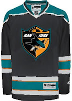
Now let's get into those third jersey concepts I was telling you about. We'll start with San Jose. Rumors have circulated that the shield logo could go on the front, but I wouldn't expect to see any white or orange anywhere else on the jersey.
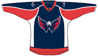
And the Predators concept is purely from the mind of the artist. The Predators haven't announced any plans for a third jersey either this year or next. Neither have the Capitals, but many people are wishing for something like this.
Many Canucks fans were hoping for a green third jersey. Maybe something like this isn't too far off.
Yeah, maybe not the one on the right, though.
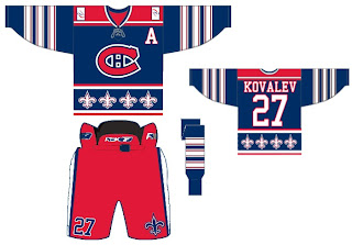
Here's a very busy idea for the Canadiens.
Maybe if your jersey was distracting enough, you could just win that way. Sticking with the Canada theme for a moment, how about these for the Senators?
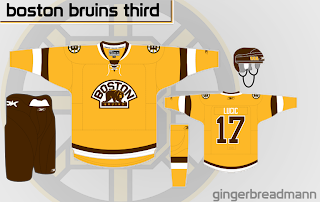
And finally, hoping for the return of a yellow third jersey for the Bruins? Here's one of my favorite concepts from this batch.
What do you think of these? if you have any concept art of your own, feel free to send it along.


Reader Comments (31)
Wow, that Flyers logo concept has got to be just about the worst logo ever... Well, discounting the old Mighty Duck head.
I disagree with Matthew. While I think that the Flyers logos all need a little work, I'm excited to see something different and conceptual rather than the same old bland, tired, reworking of a logo that hasn't been updated since its inception. My personal favorite is the top right of the sketches, although I'd like to see it without the PHILADELPHIA and circle. Nice effort.
I love that Ottawa jersey. And I really wish that Canucks jersey on the left was their third.
The Ottawa Jersey is a pretty good design. I would rather that instead of the stripes going around jersey like an inner tube, It was just a crest with the O. Otherwise not bad at all though. Not sure what they are referencing though with the roman numerals. They have 1894 on the shoulder crest. Not sure what happened then. The original team was founded in 1883 and the modern team was founded in 1990.
Wow! I check this site every day wondering if my designs were good enough to post, and it looks like someone did it for me! (Mine is the second Flyers set with the jerseys.) To be honest, I was always more proud of the liberty bell logo than I was of the main bird-head logo. Those jersey designs are a bit outdated, and were mostly my response to the HIDEOUS orange Flyers third jersey with the 3D logo (I liked the logo, hated the jersey). So I tried to successfully update the logo and jersey with some added silver highlights and 3D logos. Looking at what the Flyers have now with their RBK jerseys, these designs might recieve some tweaking ;)
The Ottawa design looks good, but the big O looks a bit like an U of Oregon rip off.
I absolutely love the Johnny Canuck sweater.
These Flyers logo/sweater redesigns don't cut the mustard. There's just no need to redesign a classic logo just because you're bored. It's a classic because it was good to begin with upon its introduction in 1967.
I have no problem with tweaking the sweater design - as the Flyers have done over the years, but you can't mess with the logo. Many have tried to re-introduce something, but they all fail.
I was going pick them apart, but that's just mean-spirited. I'll just say that the new Flyers logos don't work ... much like the stinkin' defense this year! ugh.
I would like nothing more than to see the Sens wearing what amounts to a big zero on their jerseys.
The Flyers' ones are quite slick, and I particularly like the Liberty Bell treatment, though it might be better as a patch.
The Sharks logos look a little garish to me with the orange so prominent. Excellent artwork, though.
The Canadiens jersey is as you say, pretty busy. The yellow Bruins look is neat, but with the brown it has a sort of...disgusting quality to it. And I don't know what it is about Canucks Green that makes me want to curl up in a blanket and fall asleep.
Not a big fan of the Flyers logos and the Vancouver and Ottawa, the Bruins one isn't that great either., i really like the sharks logo on the right and loved the Caps one
First, to respond to Roberts concern about the Ottawa logo being a rip off of Oregon's I can assure you it isn't. The 'O' used on the sweater is the logo they used back in 1918 during the first existence of the Ottawa Senators.
Second, I thought I should let whoever decided to alter the Canadiens jersey just committed a federal offence here in Canada. The Habs jersey is untouchable much like the Yankees, Packers, or Red Sox. A person should not even entertain the idea of trying to change/"fix" the Habs jersey. 'nough said.
just to clarify,
Robert,
that ottawa logo predates university of oregon's teams by a long shot. that O logo was used by the original team in the early days of the NHL, and even in their pre-NHL days. It's a solid effort actually.
i like that bruins sweater, but it needs more sleeve striping to really do the 20s teams justice. the habs sweater is a cross between an old leafs sweater (circa 1930s) and the nords sweaters - two montreal rivals: blasphemy! i like the bottom left flyers logo sketch, idk why, but that looks nifty. i love the predators JERSEY, but the logo and the team need to be lost. someone seriously needs to pick up that color scheme again.
I just can't get into the Flyers changing their logo at all.
Hey Hockey Week, this is a site about hockey art...not team bashing. The Nashville Predators have as much right to be in the NHL as any of the other 29 teams. Come down here and experience a game and see what its like, rather than just bashing them.
i really like the bruins one, as long as the brown is black.
Glad to see concepts again. I missed seeing what some creative people can come up with.
I like a couple of the Flyers logos but I don't think they're better than what's currently in use. Very good work, though.
Drop the fleur-de-lis and that Candiens jersey would be pretty nice!
I really like both the Ottawa and Boston sets, Boston especially. Although Ottawa needs the help more in reality.
i remember when i was in nashville, and nobody knew that the preds even existed. they couldn't leave nashville because suddenly fans came out of the woodwork, and then can't sell out except for a handful of playoff games. i don't have to bash them, the numbers speak for themselves.
but i wasn't actually bashing the team in my previous comment. I was stating that that jersey and color scheme aren't right for that team. The preds are navy, silver, and mustard, are they not? not navy and powder blue. that secondary logo only makes it worse, because i don't think it translates well into that color scheme...nor should it, they're bones. Make that a thrashers jersey (another team with a lot of financial problems, but they keep pushing the blue), make it a penguins jersey (though the black and gold needs to stay, they DID have a jersey with similar aspects from 1976-79), or something completely crazy like vancouver or tampa bay...but at least the logos would make more logical sense in that color scheme.
think that there might be more than one way to read text next time instead of being so defensive, not everyone is out to get your team
Hockey Week, I think part of the idea behind that Nashville third is what the team would look like if it had (in the creator's mind) better colors.
Personally, I like David Baretta's rendition of the "new" Flyers logo. It looks menacing. However, it does remind me of the Atlanta Falcons' logo.
The featured Sharks logo, I'd agree with the artist and would vote for the left one.
The Predators fantasy third jersey, I think is pretty creative. I like it better than the metallic ones they have now.
I would love to see the Washington Capitals third jersey to look like that. I like that logo!
I'm not a fan of the Habs one featured. Looks like a mash between the Habs and Nordiques uniforms.
That Capitals third is the perfect way to use the weagle as the crest, it very nicely cuts down the empty space and keeps the design fresh. I hope they go in that direction if they ever choose to use a weagle based third.
@ Hockey Week,
I just want to clarify something. I read The Hockey News for years (as well as other national sports media outlets) and believed what I heard - namely that the Predators were completely ignored in their hometown and would be better off moving because nobody paid any attention to them.
...and then I moved here. I live in Murfreesboro (about a half-hour's drive from Nashville) and listen to Nashville sports radio. I don't know where these national media outlets get their information, but the Preds are doing just fine here. The atmosphere at the games is great, and they get lots of attention on the radio. Even in Murfreesboro, you don't have to look very far to find Preds fans (and hockey fans in general).
So anyway, I'm not trying to start trouble. I just wanted to take the opportunity to clear up a very prevalent misconception that seems to exist everywhere outside of Nashville.
enough about nashville, untill they move, if they move leave them alone they have a good team and that concept is cool but it needs more of the team colours if it were to be a third, but as a new home jersey that would be quite nice
the sharks logos are very well done, the left is much better though
dont change montreal's jerseys ever, unless your changing the white jerseys to have the blue and red stripe acrosse the chest (opposite of their reds)
loving the johnny canuck jersey and the washington w jersey, that is one of the best logos ever put in place in the nhl
I love the Johnny Canuck logo, though I like the full body one instead of the V (looks good inside a circle logo).
I'm also loving the Shark's logo, though I'd like to see it with gray or white instead of the orange. The full shark is better too, it kind of makes an S (dorsal fin and curve of the shark).
Digging the skull/predators logo, but I hate powder blue/navy blue combos. I would just make the powder blue parts navy, and then a vegas gold inside the white stripes.
Washington = sweet. Ottawa = sweet especially the shoulder logo. Boston = sweet IF brown become black.
The Habs jersey is too much. Its part Canadiens, part Nordiques, and the sleeves are too Maple Leafs. I say get rid of all the striping on the sleeves and torso and make it all dark blue. Take the Red/white at the shoulders and stretch it all the way down the sleeves. Put a stylized fleur-de-lise on ONE shoulder. Also, the H in the middle of the logo has to be white.
If the report coming out of Toronto is true, then maybe the Predators will move up to Ontario soon.
Either way, I'm not trying to start any trouble or resume y'all guys' argument. But the concept design that the artist submitted for the Predators, I'm in love with. Makes good use of the current alternate logo, and the color scheme is rather nice.
The more weagle primary third jerseys I see, the more glad I am that George McPhee is against the team wearing a third.
The weagle does not make sense on a jersey primary unless the backdrop is white. Period. It looks awful.
Honestly, I understand why the Capitals went to their wordmark for their logo two offseasons ago: because of the whole vintage/throwback thing.
But I don't understand why they wouldn't use the Weagle logo as a primary after they bothered to introduce it. Very much like Vancouver and the Johnny Canuck logo.
It seems like it should be a crime to introduce an awesome logo and not use it as the primary. Only reason I could understand is that they don't want to use it as a primary because we'd see it for 67 games a season (subtract the 15 games for the alternate), and it would be a more special logo if it got the limited appearances.
As for the Weagle, putting it on the shoulder of the primary jerseys doesn't make a whole lot of sense. If you're gonna have it on your jersey for all 82 games, then they should do what the Kings did back in 1998-99 and have the primary on the front and the secondary on the shoulder of the home/road set, and then switch the two on the alternate jersey. Just a thought..
I wonder if the RatMan could submit a version of his jersey using the stealth bomber logo as a primary. I've said for a long time that the Flyers need a secondary logo and something like the stealth bomber logo would be excellent.
I'd be happy to! I think the stealth bomber would make a good primary for the Rbk Edge era of jerseys.
No one has pointed out that the Weagle is facing the wrong way!
I agree...the Flyers would look sleek with that logo...now if only they could, y'know, win a game!
That Ottawa one gives a nod to the original Senators sweater. That Montreal one is just hideous. Habs ain't the Nordiques!
Always wished the Caps would use the Weagle though...
It's funny that we've seen that Canucks concept with Johnny Canuck so many times on here, yet they won't be using it. It's also a shame. Here's hoping that the leak was a fake.